UFO Sightings Data Analysis: A Fun Exploration Experience 👽
 Isuri Balasooriya

Learning Python isn’t just about crunching numbers and writing complex algorithms, it’s also about having fun. Every now and then, I like to work with quirky, interesting datasets to keep things exciting and make sure I stay engaged. This time, I decided to explore something a little out of this world—UFO sightings.
What’s in the Data?
I’ve taken this dataset from Kaggle which you can find at https://www.kaggle.com/datasets/NUFORC/ufo-sightings. The dataset contains thousands of recorded UFO sightings from around the world. It includes details like,
Date and time of the sighting
Location (country, city, state)
Shape of the UFO reported
Duration of the sighting
Comments from witnesses
What I Did
Using Python, Pandas, and Matplotlib, I analyzed the data to find out,
Where UFO sightings happen the most
How sightings have changed over time
The most commonly reported UFO shapes
Cool visualizations to make sense of the trends
Interesting Findings
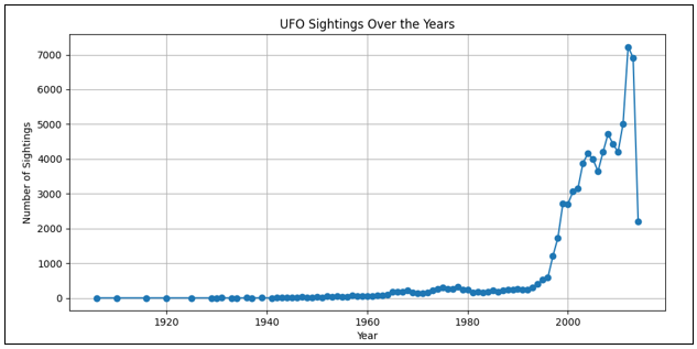
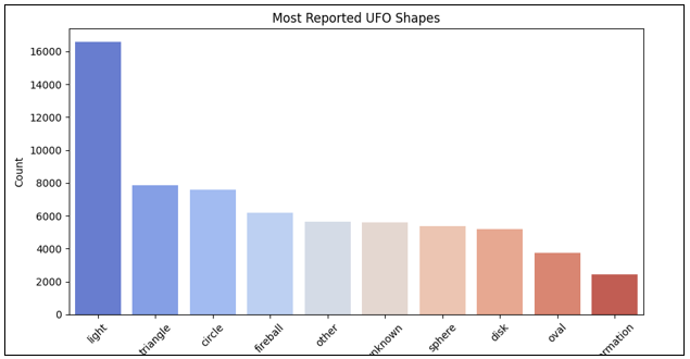
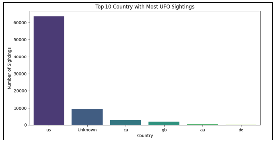
While I won’t claim to have uncovered proof of alien life yet 😆, I did find some fascinating trends. For example, the number of reported sightings has increased over time, and certain places like the United States seem to be UFO hotspots. Also, some shapes like "light" or "circle" appear way more often than others. Lets take a look at some of these findings in detail.
- UFO Sightings Over the Years
# Convert to datetime format
df['datetime'] = pd.to_datetime(df['datetime'], errors='coerce')
df['year'] = df['datetime'].dt.year

# Count sightings per year
sightings_per_year = df['year'].value_counts().sort_index()

# Plot
plt.figure(figsize=(10,5))
plt.plot(sightings_per_year.index, sightings_per_year.values, marker='o', linestyle='-')
plt.xlabel("Year")
plt.ylabel("Number of Sightings")
plt.title("UFO Sightings Over the Years")
plt.grid()
plt.show()
- The Most Common Shapes of UFOs
# Count UFO shapes
shape_counts = df['shape'].value_counts()[:10]

# Plot
plt.figure(figsize=(10,5))
sns.barplot(x=shape_counts.index, y=shape_counts.values, palette='coolwarm')
plt.xlabel("UFO Shape")
plt.ylabel("Count")
plt.title("Most Reported UFO Shapes")
plt.xticks(rotation=45)
plt.show()
- Countries with Most UFO Sightings
# Count sightings per country
country_counts = df['country'].value_counts()[:10]

# Plot
plt.figure(figsize=(10,5))
sns.barplot(x=country_counts.index, y=country_counts.values, palette='viridis')
plt.xlabel("Country")
plt.ylabel("Number of Sightings")
plt.title("Top 10 Country with Most UFO Sightings")
plt.show()
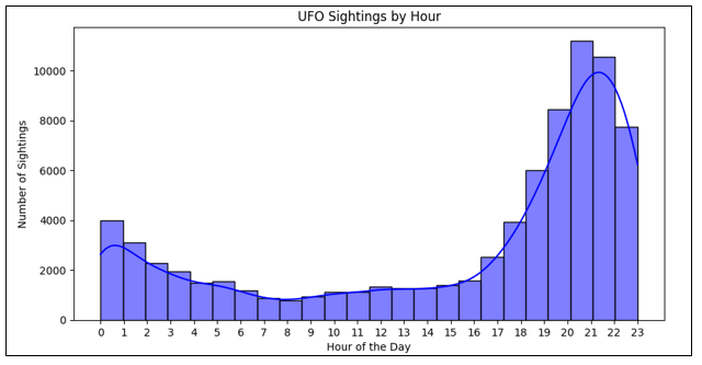
- Most Common Time for UFO Sightings
# Extract hour from datetime
df['hour'] = df['datetime'].dt.hour

# Plot
plt.figure(figsize=(10,5))
sns.histplot(df['hour'], bins=24, kde=True, color='blue')
plt.xlabel("Hour of the Day")
plt.ylabel("Number of Sightings")
plt.title("UFO Sightings by Hour")
plt.xticks(range(0,24))
plt.show()
Of course working on a project has so many steps along the way like data cleaning, data formatting which is essential before starting to analyze data. I’m not going to include everything in this article, but you can refer my GitHub folder to see the full code and other related files at https://github.com/isuri-balasooriya2/TheMathLab/tree/main/UFO_Sightings.
This project was a fun way to apply my Python skills while keeping things interesting. Working with datasets like these reminds me that data science doesn’t have to be boring. You can learn and have fun at the same time.
Subscribe to my newsletter
Read articles from Isuri Balasooriya directly inside your inbox. Subscribe to the newsletter, and don't miss out.
Written by

Isuri Balasooriya
Isuri Balasooriya
👋 Hi, I'm Isuri!🚀 Aspiring Data Analyst | Future AI Expert | Passionate about Space & Tech📊 Learning Data Science, Data Analytics, and AI📚 Exploring Machine Learning & Data Analytics Projects🌍 Dream: To work in Space Tech & AI📬 Let's connect!