Building a Custom Carousel Slider for HP's Knowledge Management Website
 Anantha Krishna R.
In December 2024, I was tasked with creating a website from scratch for HP’s internal Knowledge Management website. HP’s internal design library did not come with a carousel slider as of February 2025. This meant I had to find an existing solution or build one myself.

This article was originally posted here.
Basic Requirements
The carousel needs to:
Display a fixed number of items at a time.
Be responsive — must adjust to different screen sizes.
Have left and right navigation buttons.
Allow smooth horizontal scrolling.
I first searched online for a carousel slider component from any reputed library but found none that met my needs.
Hence I set out on my own, to plan and implement a Carousel Slider from scratch. Here’s how I did it.
Laying out the initial skeleton
First, I had to figure out the layout which had to incorporate the parent Slider and the Carousel Items.

If we add left-right buttons and hidden carousel items, then we will have the below layout…
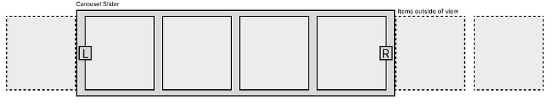
Problems I had to solve:
Making the actual Carousel Slider
L & R buttons (with gradient fade effect)
There are a few more things that had to be addressed along the way. What display types do I use for each of those components? What shall be the tag hierarchy to achieve this design?
To understand that, let’s jump straight to the code.
Part 1: Creating the Slider Pseudo Code
Pseudo-codes are a great way to depict how a problem can be solved before writing the full code.
Here, this pseudo-code depicts a minimal slider structure.

You might notice we have placed “flex-none” in every Carousel Item div. This is to avoid the flex-box setting the width of the Carousel Item. My earlier implementation didn’t have “flex-none”, but instead each Carousel Item had been encapsulated in its own div. I later migrated to use “flex-none”.
We shall be able to change the width of the Carousel Item in the future for customization purposes.
Our code will match the following…
// carousel-slider.tsx
import { RefObject, useRef } from "react";
import { CarouselItem } from "@/components/carousel-item";

export default function CarouselSliderT() {
  const carouselItemWidth = 300;
  const gapWidth = 16;

  const ref: RefObject<HTMLDivElement | null> = useRef<null | HTMLDivElement>(null); // We will need this later!

  /* Carousel Flex container*/
  return (
    <div className="w-full"> {/* "w-full" here to help flex calculate width */}
      <div ref={ref} className="flex flex-row" /* Add "overflow-auto" here  to localize scrollbar */
        style={{ gap: `${gapWidth}px` }}
      >
        {/* Carousel List Items */}
        <CarouselItem style={{ width: carouselItemWidth }} />
        <CarouselItem style={{ width: carouselItemWidth }} />
        <CarouselItem style={{ width: carouselItemWidth }} />
        <CarouselItem style={{ width: carouselItemWidth }} />
        <CarouselItem style={{ width: carouselItemWidth }} />
        <CarouselItem style={{ width: carouselItemWidth }} />
        <CarouselItem style={{ width: carouselItemWidth }} />
        <CarouselItem style={{ width: carouselItemWidth }} />
        <CarouselItem style={{ width: carouselItemWidth }} />
        <CarouselItem style={{ width: carouselItemWidth }} />
      </div>
    </div>
  );
}
…and the Carousel Item code is as follows.
// carousel-item.tsx
import { StarFavIcon } from "@/svgs/star-fav"
import { ThreeDotsIcon } from "@/svgs/three-dots"
import { CSSProperties } from "react"

export const CarouselItem = (props: { style: CSSProperties | undefined }) => {
  return <>
    <div className="border p-4 rounded-xl flex-none" {...props}>
      <div className="h-[160px] bg-[#ffecec]  rounded-xl" />
      <div className="my-2">
        {"Title in two lines just in case it's too long and we don't have space"}
      </div>

      <div className="my-2 text-sm text-[#7b7b7b]">Document type</div>

      <div className="my-2 text-sm text-[#7b7b7b]">Mth 00, 0000</div>
      <div className="flex items-center mt-5">
        <div className="flex-1 flex items-center gap-1">
          <StarFavIcon style={{ width: "16px", height: "16px" }} />
          <>4.3/5</>
        </div>
        <ThreeDotsIcon style={{ width: "16px", height: "16px" }} />
      </div>
    </div>
  </>
}
We will avoid going in-depth here. All we have to understand is that it takes in a style prop to allow us to set the width directly from the Carousel Slider component.
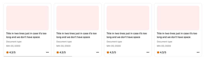
This is the result:
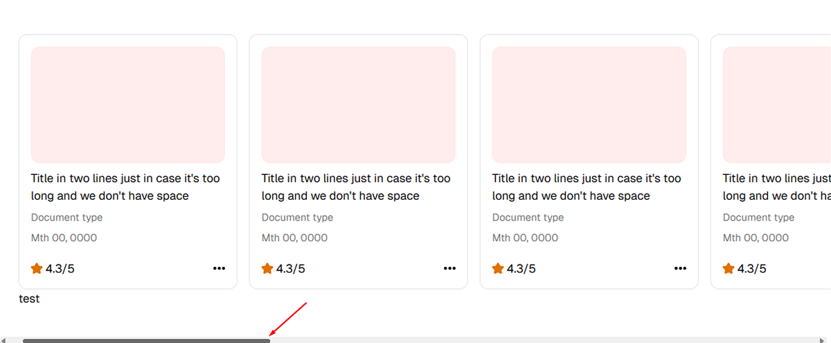
Scrollbar applied to the whole page
Unfortunately, the scrollbar is applied to the whole page. A simple “overflow-auto” on the Carousel should fix this.
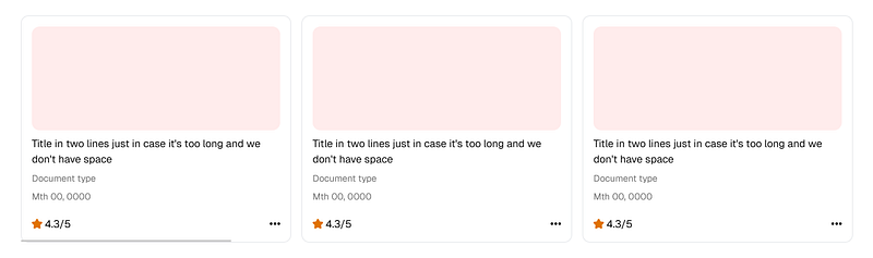
Now, the scrollbar should be applied to the component instead:
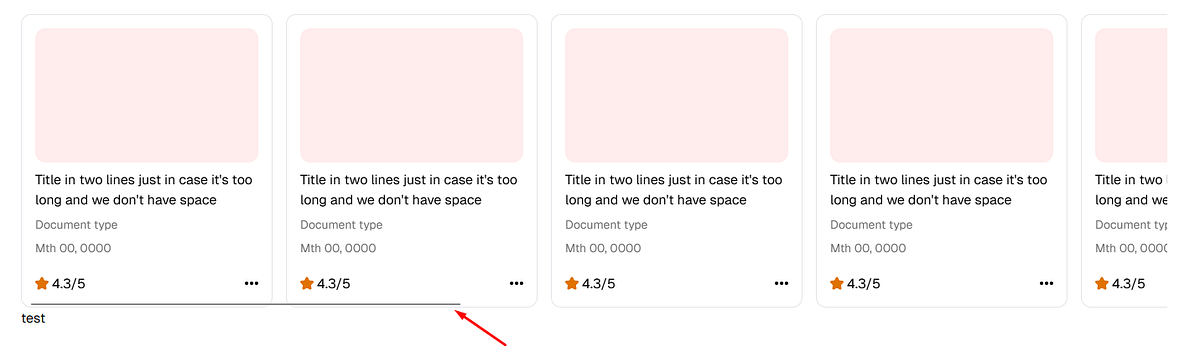
Scrollbar applied to Carousel — overflow-auto
Perfect.
But wait. This is not enough! It’s already been 30 minutes since I started working on the slider. At this point, I realized according to the design provided to me, we had to display exactly 4 items on large, 3 on medium, 2 on small, 1 on mobile screens. So how do we facilitate this?
Well, “items to display” HAS to be customizable and we need to calculate the width ourselves.
Onto the next part…
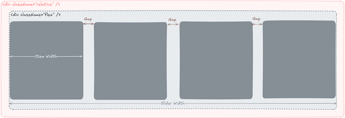
Part 2: Adding Customization to our brand new Slider
What if we would like to change the items to display? What if we would like to change the gap size?
This means we shall replace the 300px constant we set earlier for every Carousel Item, calculate this width, and apply the gap width ourselves.
Let’s say we want 4 items to display at any given time, then we will have 3 gaps.
The following are the layout splits.
Handling Dynamic Resizing
Our component needs to maintain the same count on specific screen widths. Like in the below example, I want to display exactly 4 items.
For this, initially, I tested listening for window resize, but when I deployed my code to Stackblitz, I found a bug. Resizing the sub-window didn’t count as a window resize. So I did a quick search online and found this cool blog by Codemzy about how to use ‘useRef’ to get the width and height of a DOM element in ReactJS.
const [sliderWidth, setSliderWidth] = useState(0);
const itemsToShow = 4;

const ref: RefObject<HTMLDivElement | null> = useRef<null | HTMLDivElement>(null);

useEffect(() => {
  if (!ref.current) return;

  const observer = new ResizeObserver(([entry]) => {
    setSliderWidth(entry.contentRect.width);
  });

  observer.observe(ref.current);

  return () => observer.disconnect();
}, [])
I’ve since refactored the code, so it will look slightly different from the Codemzy blog.
Don’t forget to pass the ref object down to the Carousel Flexbox!
Calculating Item Width from Slider Width
Since we have the Slider Width, let’s calculate the individual Item Width

Great! We have the formulae, now let’s put all that into code.
const itemsCount = 10;
const itemsToShow = 4;
const gapWidth = 16;
const gaps = itemsToShow - 1;
const carouselItemWidth = (sliderWidth - (gaps * gapWidth)) / itemsToShow;
itemsCount = 10→ Total carousel items.itemsToShow = 4→ Number of visible items.gaps = itemsToShow - 1→ Number of gaps.carouselItemWidth→ Formula to calculate item width dynamically.
Putting all this together, we get the following…
// carousel-slider.tsx
import { RefObject, useEffect, useRef, useState } from "react";
import { CarouselItem } from "@/components/carousel-item";

export default function CarouselSliderT() {

  const ref: RefObject<HTMLDivElement | null> = useRef<null | HTMLDivElement>(null); // We will need this later!
  const [sliderWidth, setSliderWidth] = useState(0);

  useEffect(() => {
    if (!ref.current) return;
    const observer = new ResizeObserver(([entry]) => {
        setSliderWidth(entry.contentRect.width);
    });
    observer.observe(ref.current);
    return () => observer.disconnect();
  }, []);

  const itemsCount = 10;
  const itemsToShow = 4;
  const gapWidth = 16;
  const gaps = itemsToShow - 1;
  const carouselItemWidth = (sliderWidth - (gaps * gapWidth)) / itemsToShow;

  /* Carousel Flex container*/
  return (
    <div className="w-full"> {/* "w-full" here to help flex calculate width */}
      <div ref={ref} className="flex flex-row overflow-auto" /* "overflow-auto" here  to localize scrollbar */
          style={{ gap: `${gapWidth}px` }}
      >
        {/* Carousel List Items */}
        <CarouselItem style={{ width: carouselItemWidth }} />
        <CarouselItem style={{ width: carouselItemWidth }} />
        <CarouselItem style={{ width: carouselItemWidth }} />
        <CarouselItem style={{ width: carouselItemWidth }} />
        <CarouselItem style={{ width: carouselItemWidth }} />
        <CarouselItem style={{ width: carouselItemWidth }} />
        <CarouselItem style={{ width: carouselItemWidth }} />
        <CarouselItem style={{ width: carouselItemWidth }} />
        <CarouselItem style={{ width: carouselItemWidth }} />
        <CarouselItem style={{ width: carouselItemWidth }} />
      </div>
    </div>
  );
}
Now, after applying the solution described in the Codemzy blog, we are almost done with our customization.
Notice we have a horizontal slider below our carousel?
Up next, we shall implement L & R action buttons to complete our Carousel Slider and remove this scrollbar forever!
Part 3: Making the Carousel Functional
Creating the buttons is pretty straightforward. We need to make the buttons absolute while keeping the parent relative.
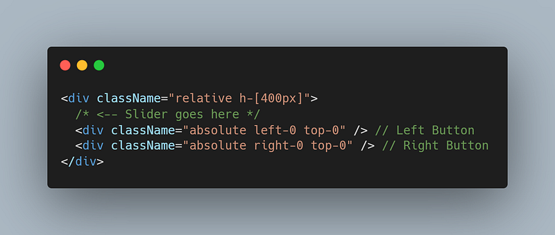
Let’s add the slider component we have developed in the previous sections.

On Scroll Functionality
Let’s also add the following onScroll function to enable horizontal scrolling.
const [scrollIndex, setScrollIndex] = useState(0);

const onScroll = (direction: "left" | "right") => {
  const scrollMultiplier = direction === "left" ? -1 : 1;
  const newIndex = scrollIndex + scrollMultiplier;

  if (newIndex < 0 || newIndex > itemsCount - itemsToShow) return;

  setScrollIndex(newIndex);
  ref.current?.scrollTo({ left: (carouselItemWidth + gapWidth) * newIndex, behavior: "smooth" });
};
Alright, now putting all this together we have the following code…
// carousel-slider.tsx
import { RefObject, useEffect, useRef, useState } from "react";
import { CarouselItem } from "@/components/carousel-item";
import { LeftArrowIcon } from "@/svgs/left-arrow";
import { RightArrowIcon } from "@/svgs/right-arrow";

export default function CarouselSliderT() {

  const ref: RefObject<HTMLDivElement | null> = useRef<null | HTMLDivElement>(null); // We will need this later!
  const [sliderWidth, setSliderWidth] = useState(0);

  useEffect(() => {
    if (!ref.current) return;
    const observer = new ResizeObserver(([entry]) => {
        setSliderWidth(entry.contentRect.width);
    });
    observer.observe(ref.current);
    return () => observer.disconnect();
  }, []);

  const itemsCount = 10;
  const itemsToShow = 4;
  const gapWidth = 16;
  const gaps = itemsToShow - 1;
  const carouselItemWidth = (sliderWidth - (gaps * gapWidth)) / itemsToShow;

  const [scrollIndex, setScrollIndex] = useState(0);
  const onScroll = (direction: "left" | "right") => {
    const scrollMultiplier = direction === "left" ? -1 : 1;
    const newIndex = scrollIndex + scrollMultiplier;

    if (newIndex < 0 || newIndex > itemsCount - itemsToShow) return;

    setScrollIndex(newIndex);
    ref.current?.scrollTo({ left: (carouselItemWidth + gapWidth) * newIndex, behavior: "smooth" });
  };

  /* Carousel Flex container*/
  return (
    <div className="relative w-full"> {/* "w-full" here to help flex calculate width */}
      <div ref={ref} className="flex flex-row overflow-auto" /* "overflow-auto" here  to localize scrollbar */
          style={{ gap: `${gapWidth}px` }}
      >
        {/* Carousel List Items */}
        <CarouselItem style={{ width: carouselItemWidth }} />
        <CarouselItem style={{ width: carouselItemWidth }} />
        <CarouselItem style={{ width: carouselItemWidth }} />
        <CarouselItem style={{ width: carouselItemWidth }} />
        <CarouselItem style={{ width: carouselItemWidth }} />
        <CarouselItem style={{ width: carouselItemWidth }} />
        <CarouselItem style={{ width: carouselItemWidth }} />
        <CarouselItem style={{ width: carouselItemWidth }} />
        <CarouselItem style={{ width: carouselItemWidth }} />
        <CarouselItem style={{ width: carouselItemWidth }} />
      </div>

      {/* Left Button */}
      {scrollIndex > 0 && <div className="absolute left-0 top-0 h-[100%] flex items-center px-3 bg-gradient-to-l from-transparent to-white">
        <div className="w-[25px] h-[25px]  flex items-center border rounded justify-items-center bg-[white] place-items-center cursor-pointer"
          onClick={() => onScroll("left")}
        >
          <LeftArrowIcon style={{ width: "20px", height: "12px", flex: 1 }} />
        </div>
      </div>}

      {/* Right Button */}
      {(scrollIndex < itemsCount - itemsToShow) && <div className="absolute right-0 top-0 h-[100%] flex items-center px-3 bg-gradient-to-r from-transparent to-white">
        <div className="w-[25px] h-[25px]  flex items-center border rounded justify-items-center bg-[white] place-items-center cursor-pointer"
          onClick={() => onScroll("right")}
        >
          <RightArrowIcon style={{ width: "20px", height: "12px", flex: 1 }} />
        </div>
      </div>}
    </div>
  );
}

Now go ahead, and change “overflow-auto” to “overflow-hidden” to remove the scrollbar. It’s no longer needed!
Checkout the Playground at https://nextjs-carousel-slider.vercel.app/
Conclusion
We have created a beautiful carousel slider from scratch using basic layout concepts in react and tailwind.
We can now expand this to add more functionalities and support across devices.
Making our component production ready:
Adds the following requirements to Carousel Slider:
Customization. — Done!
We must display constant items on window resizes — Done!
Mobile/touch Compatibility — Coming Soon…
Playground: https://nextjs-carousel-slider.vercel.app/
Codebase: https://github.com/mock-angel/nextjs-carousel-slider
References:
Subscribe to my newsletter
Read articles from Anantha Krishna R. directly inside your inbox. Subscribe to the newsletter, and don't miss out.
Written by