Law of Closure
 Pravin Shinde
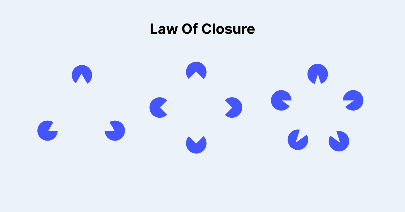
Overview
Understanding psychological concepts in UX/UI design can help users interact more effectively with digital interfaces. One such principle is the Law of Closure, a basic idea in Gestalt psychology that describes how humans see incomplete objects as complete. This phenomenon is important in digital design because it allows designers to construct intuitive, visually appealing, and readily accessible interfaces.
This article investigates the Law of Closure, its importance in UX/UI design, real-world applications, and best practices for implementing it effectively.
What is the law of closure?
According to the Law of Closure, the human brain naturally fills in missing visual information in order to comprehend a full image. Even when portions of an object are missing, our imaginations naturally fill in the gaps to create a recognised shape.
For example, if you see a circle with little breaches in its shape, your brain will still recognise it as a whole circle rather than a fragmented group of lines.
How It Works in UX/UI Design:
Visual Simplicity: Users appreciate clean and simple designs, and the Law of Closure assists in developing structured interfaces free of excessive visual clutter.
Recognition and Speed: Because consumers recognise common patterns rapidly, using closure can increase usability and minimise cognitive burden.
Aesthetic appeal: Designs that apply closure principles appear more polished and sophisticated.

Applying the Law of Closure in UX/UI Design
1. Logos and branding
Brands regularly apply the Law of Closure to create memorable, simple logos. Famous examples include:
IBM Logo: The logo comprises of horizontal lines that resemble letters, but the brain fills in the gaps to form a complete text.
WWF emblem: The Panda in the WWF emblem is not entirely drawn, but users experience a complete image due to the closure.
2. Icons and symbols
Minimalist icons without entire outlines rely on closure for recognition. This approach is beneficial for:
Navigation icons (such as home, search, and settings)
Loading animations that indicate movement without revealing the entire object
Infographics use incomplete shapes to visually represent facts.
3. Buttons and UI Elements
Buttons and cards with subtle design clues let consumers identify interactive items without overpowering them. Examples include:
Ghost buttons have merely an outline, yet the brain perceives them as filled-in buttons.
Cut-out design components allow users to mentally complete the missing shape.
4. Form and Input Fields
When creating forms, using the Law of Closure helps increase readability and user interaction.
Grouped form fields make it easier for users to detect related inputs.
Minimalist boundaries help people fill out forms intuitively.
Dotted lines indicate drag-and-drop zones.
5. Loading screens and progress indicators
Circular progress indicators frequently feature a missing piece, although users perceive the entire circle.
Skeleton loading screens provide an impression of the content before it is fully loaded.
Best Practices for Applying the Law of Closure to UX/UI Design
1. Maintain simplicity
Overcomplicating pictures might lessen the power of closure. Keep designs basic but effective by removing extraneous elements while keeping the intended shape recognizable.
2. Use negative space effectively.
The proper use of negative space (empty areas within or surrounding a design) promotes closure by allowing people to mentally complete shapes.
3. Improve readability and navigation.
Ensure that elements are organised, utilizing closure principles to improve scannability and usability. Users should know exactly where to click, scroll, or interact.
4. Use closure in CTA (call to action) elements.
Buttons and interactive components should be created to stimulate interaction without distracting from the visual appeal of the user interface.
5. Test with users.
Conduct usability testing to ensure that closure-based components are viewed correctly and increase user engagement.
Limits of the Law of Closure
While closure is an effective element in UX/UI design, misuse can lead to misinterpretation or confusion. Some limitations include:
Ambiguous Designs: The overuse of incomplete shapes might make the message unclear.
Cultural Differences: Certain visual patterns may not be universally recognised.
Accessibility Issues: Users with cognitive disabilities may have difficulty recognising incomplete patterns.
To avoid these concerns, designers should test their designs with a variety of consumers and ensure that they adhere to usability best practices.

Conclusion
The Law of Closure is important in UX/UI design because it guides users' perceptions, improves usability, and increases the visual appeal of digital interfaces. Closure improves the user experience by reducing cognitive burden and enhancing recognition speed.
Designers who apply this approach wisely can build intuitive, elegant, and effective digital experiences that users intuitively understand and appreciate. However, finding the correct balance between minimalism and clarity is critical for ensuring accessibility and use.
Subscribe to my newsletter
Read articles from Pravin Shinde directly inside your inbox. Subscribe to the newsletter, and don't miss out.
Written by
Pravin Shinde
Pravin Shinde
I've been working in UX and UI design for over 20 years, solving real-world problems in fintech, tourism, and other industries by creating seamless, emotionally engaging experiences that bring in user happiness and business success.