Law of the Common Region
 Pravin Shinde
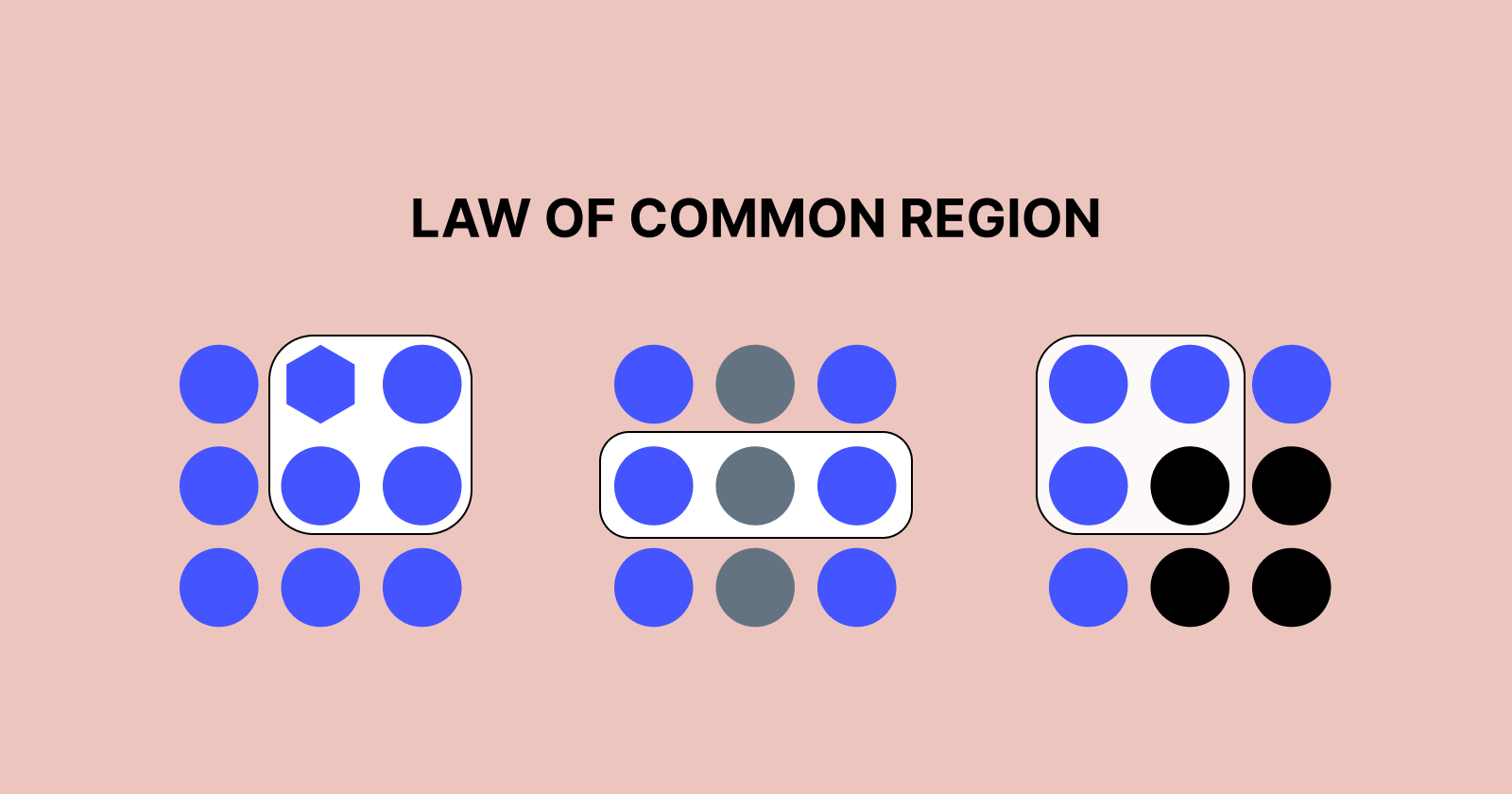
Overview
Understanding how users perceive and interact with interfaces is critical in UX/UI design because it allows you to create intuitive and usable experiences. The Law of Common Region is a fundamental notion in Gestalt psychology that can help you create more effectively. This principle argues that elements put within the same boundary or enclosed region are viewed as a group, even if they differ in shape, size, or colour.
This article delves into the importance of the Law of Common Region in UX/UI design, as well as practical applications and real-world examples that demonstrate its usefulness in increasing usability and user experience.
Understanding the Law of Common Region.
The Law of Common Region is a Gestalt principle that states that items inside a shared boundary are perceived as a whole. This barrier can be formed using graphic elements such as:
Borders and Outlines: Adding components to a defined border.
Background Colours or Shades: Using different colours to create contrast.
Whitespace and spacing refer to the use of strategic padding to group items.
Cards and Containers: Using box card-based designs to organise relevant pieces.
Using this concept, designers can build structured and organised layouts that allow users to easily comprehend information, resulting in a smoother and more engaging encounter.
Why the Law of Common Region Matters in UX/UI Design
The way information is grouped and structured in digital interfaces significantly impacts user behaviour. Applying the law of common region enhances usability by:
Readability and Comprehension: Users can quickly distinguish related information.
Reducing Cognitive Load: Organising content logically minimises decision fatigue.
Enhancing Visual Hierarchy: Creating clear distinctions between elements makes interfaces more intuitive.
Encouraging User Engagement: Well-structured layouts improve interactions and conversions.

Use of the Law of Common Regions in UX/UI Design
1. Form Design and Input Fields
When developing forms, putting relevant fields together using containers improves their usability. Users can quickly identify which fields belong together, eliminating errors and confusion.
Example, Google's sign-up form organises personal information, login credentials, and security verification into discrete sections for user convenience.
2. Navigational Menus and Sidebars
Menus that follow common region concepts let visitors distinguish between primary and secondary navigation items, which improves site navigation.
Example, Amazon's website organises product categories into distinct boxes, making it easy for consumers to find what they're looking for.
3. Card-based layouts.
Cards are a prominent UI style that implements the Law of Common Region. Each card functions as a standalone entity, making it easier to scan and comprehend text.
Example, Pinterest and Trello use card-based designs to split and organise material.
4. CTA buttons and sections
CTAs in specific areas boost visibility and interaction rates. Highlighting a CTA with a distinct background colour or surrounding it in a bordered section increases its visibility.
Example, Dropbox employs coloured portions to distinguish CTAs from generic information, making it apparent what action customers should take next.
5. E-commerce Product Listings
Product features such as photos, pricing, and descriptions are grouped into enclosed sections, making comparisons easier and browsing more efficient.
Example, E-commerce companies like Shopify and eBay employ product cards to create a seamless purchasing experience.
Best Practices for Applying the Law of Common Region to UX/UI Design
To effectively use the Law of Common Region, consider the following best practices:
Use Borders and Backgrounds Carefully: Ensure that enclosed parts are visually distinct without overwhelming the design.
Maintain Consistency: Keep the design consistent to reduce confusion and improve usability.
Combine with Other Gestalt Principles: Use closeness, resemblance, and whitespace to strengthen the perception of grouping.
Optimise for Mobile Devices: Ensure that categories are clear and usable on tiny screens.
Conduct Usability Testing: Collect user feedback to improve visual grouping tactics.
Conclusion
The Law of Common Region is a significant design guideline that improves usability by visually grouping comparable objects inside defined bounds. Designers may build structured, intuitive, and visually appealing user experiences by properly applying this approach to form design, navigation menus, card-based layouts, call-to-actions, and e-commerce interfaces.
Understanding and implementing the Law of Common Region can help designers reduce cognitive burden, increase engagement, and ultimately lead to greater product usability. By combining it with other UX principles and best practices, designers can ensure that their interfaces not only look amazing but also perform properly.
Subscribe to my newsletter
Read articles from Pravin Shinde directly inside your inbox. Subscribe to the newsletter, and don't miss out.
Written by
Pravin Shinde
Pravin Shinde
I've been working in UX and UI design for over 20 years, solving real-world problems in fintech, tourism, and other industries by creating seamless, emotionally engaging experiences that bring in user happiness and business success.