Law of Similarity
 Pravin Shinde
Overview
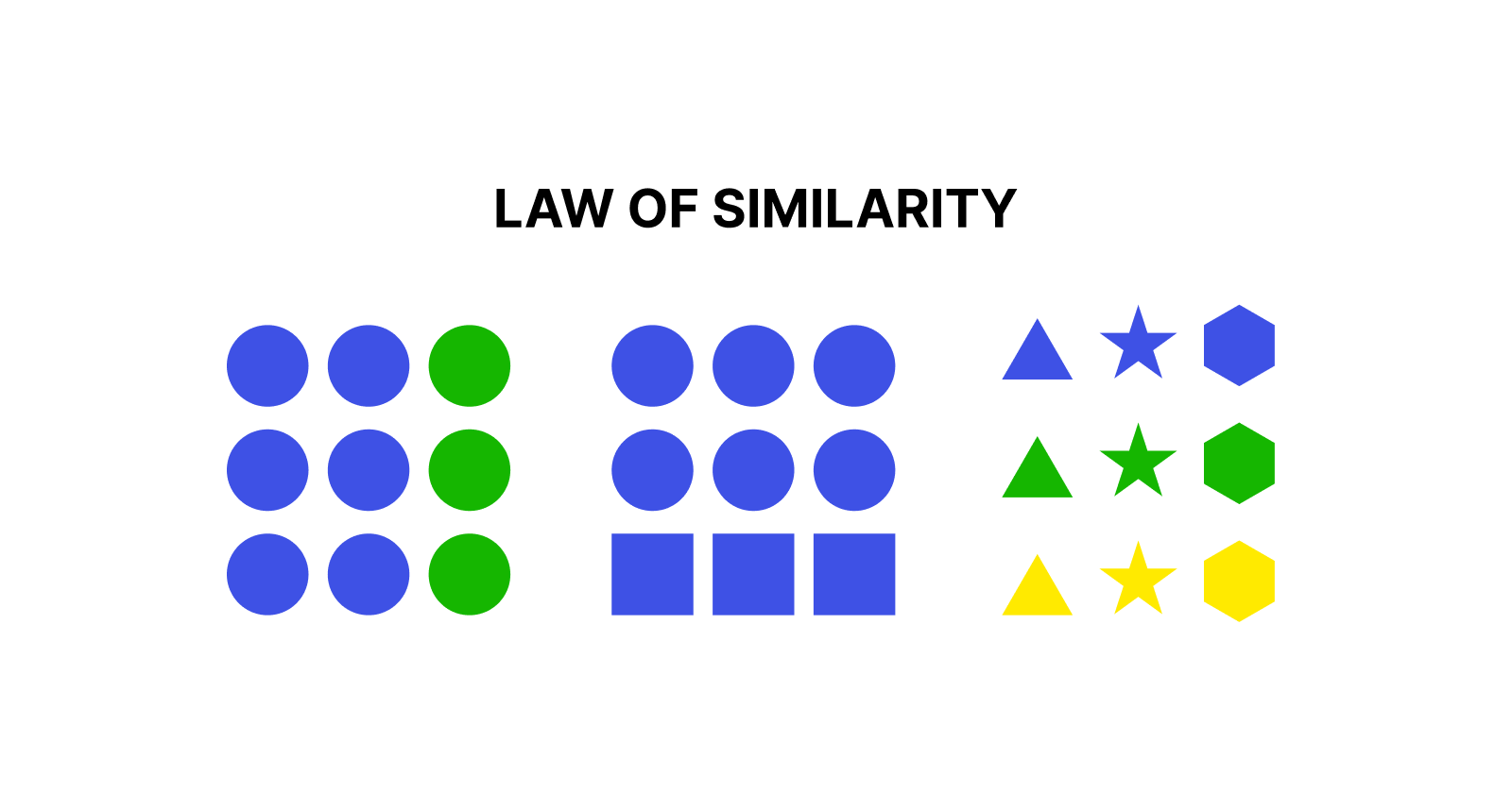
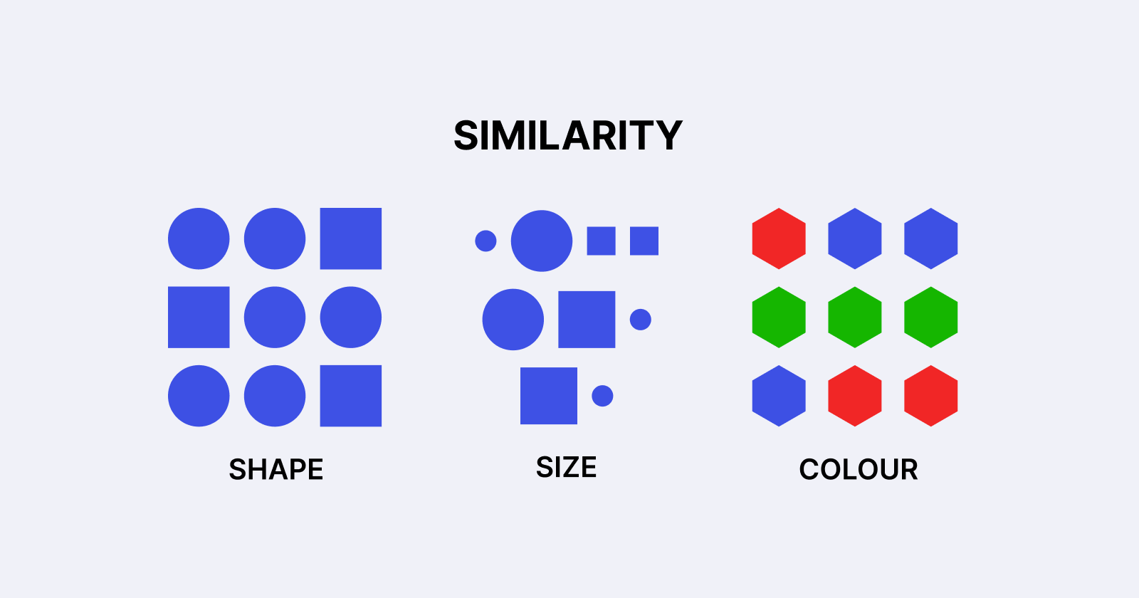
Understanding cognitive psychology is beneficial in the field of UX/UI design since it allows designers to create intuitive and successful interfaces. One such psychological principle is the Law of Similarity, which holds that elements with similar visual features (such as shape, colour, size, or texture) are thought to be related or grouped together. This Gestalt psychology-based notion is critical for improving usability and user experience.
In this post, we will look at the Law of Similarity, its relevance in UX/UI design, practical implementations, and real-world examples to demonstrate its impact.
Understanding the law of similarity.
According to the Law of Similarity, when numerous items appear to be similar, people will naturally interpret them as belonging to the same group or category. This enables users to swiftly comprehend information, recognise patterns, and traverse interfaces with ease.

Key Characteristics of Similarity:
Colour: Similar colours form a visual link between elements.
Shape: Objects with the same shape are frequently viewed as belonging to the same category.
Size: Similar-sized elements tend to be connected.
Texture and Style: Consistent design elements reinforce grouping.
Typography: Similar typefaces or text styles suggest a connection between text parts.
Importance of the Law of Similarity in UX/UI Design.
The use of the Law of Similarity in UX/UI design enhances the overall usability and accessibility of digital products. Some of its main advantages include:
Enhancing Readability: Using similar font styles and colours improves content legibility and organisation.
Reduced Cognitive Load: When pieces are visually organised, users process information more quickly.
Creating Clear Navigation: Grouping comparable buttons or links allows users to easily discover desired activities.
Improving Aesthetics: Using consistent design elements results in a more visually appealing interface.
Using similar colours and styles strengthens brand awareness.
Applying the Law of Similarity in UX/UI Design
1. Navigation menus
Navigation items with comparable typography, colour, and space make it easier for users to recognise menu areas.
For example, websites frequently utilise consistent font styles and colours to distinguish navigation links from other content.
2. Call-to-action (CTA) Buttons
CTA buttons are built with consistent colours and forms to ensure visual consistency.
For example, e-commerce systems employ similar button designs for the "Add to Cart" and "Buy Now" actions to provide clarity and accessibility.
3. Form Design and Input Fields
Forms employ consistent styles for input fields, labels, and buttons to create a structured and user-friendly experience.
For example, login and sign-up forms frequently have fields with similar borders, padding, and typeface, making them easy to traverse.
4. Product Listings for E-Commerce
Online retailers provide a structured display by using similar layouts and image sizes for product listings.
For example, Amazon organises product listings with standard thumbnail sizes, fonts, and pricing labels to make browsing easier.
5. Dashboard and Data Visualization
Analytics dashboards use colours, charts, and typography to put together comparable sorts of data.
For example, Google Analytics uses consistent colour schemes for different data categories to help users discern between traffic sources.
Real-world examples of the law of similarity
Google applies the Law of Similarity by displaying search results with the same typeface, link colour, and spacing, allowing consumers to swiftly browse information.
Example: Google search results.Spotify organises playlists with comparable cover art and typography styles, making navigating easier.
Example: Spotify playlists.Instagram uses a consistent card structure for posts, guaranteeing visual uniformity across various user-generated material.
Example: Instagram Feed
How to Apply the Law of Similarity in UX/UI Design.
To effectively use the Law of Similarity, consider the following strategies:
Use Consistent UI Elements: Keep button styles, font selections, and colour palettes all the same.
Leverage White Space Effectively: Proper spacing improves the perception of clustered parts.
Maintain a Clear Visual Hierarchy: Place comparable pieces in logical order.
Ensure accessibility compliance by using high-contrast colours and readable typefaces for all users, including those with visual impairments.
Test with Real Users: Conduct usability testing to discover flaws and enhance design consistency.
Conclusion
The Law of Similarity is an important UX/UI theory that helps consumers understand information more quickly by visually grouping comparable items. Using this approach in web and app design allows designers to build intuitive, aesthetically beautiful, and user-friendly experiences.
Incorporating the Law of Similarity improves readability, navigation, and user engagement. Businesses may improve their brand identification and usability by ensuring uniformity in design components.
Subscribe to my newsletter
Read articles from Pravin Shinde directly inside your inbox. Subscribe to the newsletter, and don't miss out.
Written by

Pravin Shinde
Pravin Shinde
I've been working in UX and UI design for over 20 years, solving real-world problems in fintech, tourism, and other industries by creating seamless, emotionally engaging experiences that bring in user happiness and business success.