Data Visualization in the digital world: How to do data visualization
 Abosede Oni
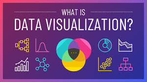
Data Visualization in the Digital World: How to Do Data Visualization
Understanding Data Visualization in the Digital Age
In today’s data-driven world, information is being generated at an unprecedented rate. To make sense of this vast amount of data, businesses, analysts, and researchers turn to data visualization. It is the graphical representation of information using charts, graphs, and other visual elements to communicate insights effectively. The digital age has transformed data visualization, making it more interactive, dynamic, and accessible across industries.
The Role of Data Visualization in the Digital World
Data visualization is not just about creating beautiful charts; it plays a crucial role in decision-making. In a business environment, executives rely on dashboards to monitor performance metrics in real time. Marketers use visual analytics to understand customer behavior. Scientists and researchers depend on data visuals to present findings. With the rise of AI, automation, and big data, visualization tools have become essential for storytelling and predictive analysis.
How to Do Data Visualization
Define Your Objective
Before diving into visualization, it is essential to determine the goal. Are you trying to identify trends, compare data points, or highlight anomalies? The objective will guide the choice of charts and tools.
Choose the Right Data
Not all data is suitable for visualization. It is crucial to filter and clean data to ensure accuracy. Structured data from databases, spreadsheets, or APIs is often used to create meaningful visuals.
Select the Appropriate Visualization Type
Choosing the right visualization is key to effectively conveying insights:
Bar Charts: Ideal for comparing categories.
Line Graphs: Best for showing trends over time.
Pie Charts: Useful for representing proportions.
Scatter Plots: Great for visualizing relationships between variables.
Heatmaps: Effective for showing patterns in large datasets.
Use the Right Tools
Various digital tools make data visualization easy and efficient. Some of the popular tools include:
Tableau: A powerful business intelligence tool for creating interactive dashboards.
Power BI: A Microsoft tool that integrates well with enterprise systems.
Google Data Studio: A free tool for integrating various data sources.
Python (Matplotlib & Seaborn): For coding custom visualizations.
Excel: Basic yet powerful for simple data visuals.
Ensure Clarity and Simplicity
A good visualization should be easy to interpret. Avoid cluttered graphs and unnecessary elements that can confuse the audience. Use appropriate colors, labels, and legends to enhance readability.
Incorporate Interactivity
Digital visualization offers opportunities for interactivity. Dashboards and dynamic charts allow users to filter data, hover over points for more details, and drill down into specifics. Tools like Power BI and Tableau excel in interactive visualization.
Industry Trends in Data Visualization
The digital world has significantly influenced how data is visualized. Some of the emerging trends include:
AI-Driven Visual Analytics: Machine learning algorithms are now helping to generate visual insights automatically.
Augmented Reality (AR) and Virtual Reality (VR): These technologies bring a new dimension to data visualization.
Real-Time Data Dashboards: Businesses rely on live dashboards to make data-driven decisions instantly.
Storytelling with Data: More companies are integrating narratives into their visual presentations to make data more engaging.
The Impact of Effective Data Visualization
Data visualization is a crucial element of the digital world, influencing industries like finance, healthcare, marketing, and e-commerce. Well-designed visuals improve decision-making, enhance data storytelling, and reveal insights that may go unnoticed in raw data.
Final Thoughts
Mastering data visualization requires a combination of analytical skills, creativity, and the right tools. By defining objectives, choosing suitable visualizations, and leveraging industry trends, anyone can create compelling data stories. In an era where data is the new oil, effective visualization ensures that valuable insights are accessible, understandable, and actionable.
Subscribe to my newsletter
Read articles from Abosede Oni directly inside your inbox. Subscribe to the newsletter, and don't miss out.
Written by
Abosede Oni
Abosede Oni
👨💻 Data Analyst | Accounting Enthusiast | Problem Solver I’m passionate about transforming complex data into clear, actionable insights. With expertise in Microsoft Excel 📊, MySQL 🗄️, PostgreSQL 🔐, and Data Visualization 🎨, I help businesses and individuals leverage data to drive smarter decisions. A strong believer in storytelling, I turn raw data into compelling narratives that make financials easy to understand. Skilled in PowerPoint 🎤, I craft presentations that communicate insights clearly and effectively.👨💻 Data Analyst | Accounting Enthusiast | Problem Solver From solving analytical challenges to optimizing processes, I'm here to share practical tips, tutorials, and strategies for those looking to master data and accounting. Let’s make numbers work for you! 💡