Implementing a Dark Mode Toggle in Laravel with Tailwind CSS 4
 David Carr
TailwindCSS 4 out the box supports prefers-color-scheme CSS media feature, I want class based dark mode support. To enable this add the following to your resources/css/app.css file
@custom-variant dark (&:where(.dark, .dark *));
This allows dark mode when the HTML tag has a class of dark.
Next create a toggle button. These has 2 icons for light mode and dark mode. Light is hidden by default. By adding a hidden class.
I’m using Heroicons that can be installed via blade-ui-kit/blade-heroicons
<button id="theme-toggle" class="p-2">
  <x-heroicon-o-sun id="theme-toggle-light" class="hidden size-5 text-yellow-500" />
  <x-heroicon-o-moon id="theme-toggle-dark" class="size-5 text-gray-900 dark:text-white" />
</button>
Next we need Javascript to handle click events when either icon is pressed.
Create a new file resources/js/dark.js reference it inside the resources/js/app.js file
import './dark';
Inside dark.js add:
document.addEventListener("DOMContentLoaded", applyTheme); // Fires on page load
document.addEventListener("livewire:navigated", applyTheme); // Fires for Livewire navigation
window.addEventListener("popstate", applyTheme); // Detects manual URL changes

function applyTheme() {
    const themeToggle = document.getElementById("theme-toggle");
    const themeToggleLight = document.getElementById("theme-toggle-light");
    const themeToggleDark = document.getElementById("theme-toggle-dark");

    function setTheme(mode) {
        if (mode === "dark") {
            document.documentElement.classList.add("dark");
            localStorage.setItem("theme", "dark");
            if (themeToggleLight && themeToggleDark) {
                themeToggleLight.classList.remove("hidden");
                themeToggleDark.classList.add("hidden");
            }
        } else {
            document.documentElement.classList.remove("dark");
            localStorage.setItem("theme", "light");
            if (themeToggleLight && themeToggleDark) {
                themeToggleDark.classList.remove("hidden");
                themeToggleLight.classList.add("hidden");
            }
        }
    }

    // Check saved theme or use system preference if no saved theme
    const savedTheme = localStorage.getItem("theme");
    if (savedTheme) {
        setTheme(savedTheme); // Apply the saved theme
    } else if (window.matchMedia("(prefers-color-scheme: dark)").matches) {
        setTheme("dark"); // Apply dark mode based on system preference
    } else {
        setTheme("light");
    }

    // Add event listener for the theme toggle button
    if (themeToggle && !themeToggle.dataset.listenerAdded) {
        themeToggle.addEventListener("click", () => {
            const isDark = document.documentElement.classList.contains("dark");
            setTheme(isDark ? "light" : "dark");
        });
        themeToggle.dataset.listenerAdded = true; // Prevent duplicate event listeners
    }
}
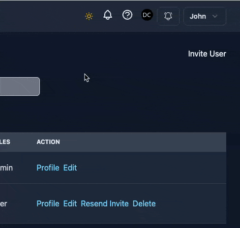
Now rebuilt your assets npm run build Now clicking on either icon should toggle the dark / light mode. Also the site will honor the visitors system preferences by default so if they are using dark mode, dark mode will load by default.
Subscribe to my newsletter
Read articles from David Carr directly inside your inbox. Subscribe to the newsletter, and don't miss out.
Written by
David Carr
David Carr
Blogger at http://dcblog.dev.