Why Is McDonald's So Depressing Now?
 Deepa Goyal
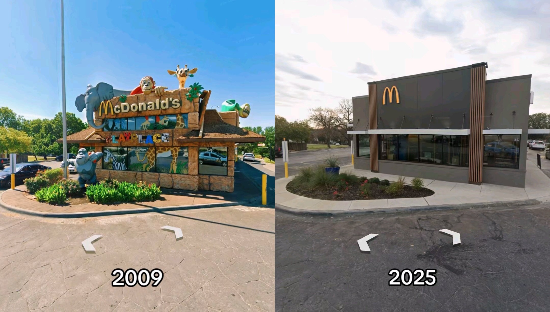
I came across a tweet recently about the grey transformation that McDonald’s has had in their new rebrand is radically stripped of color.

Walk into a McDonald's today, and you might notice something strange: it feels lifeless. The bright reds and yellows that once made it fun and exciting have been stripped away, replaced by gray walls, muted lighting, and sterile modernism.
Instead of a joyful, high-energy fast-food joint, McDonald's now looks like a bland coworking space or an airport lounge where happiness goes to die.
This isn’t an accident. McDonald's is following the Airbnb-fication of design—a trend where every space, from coffee shops to fast-food chains, slowly morphs into the same neutral, soulless aesthetic. It’s part of a global design monoculture, where everything is sleek, gray, and forgettable.
But here’s the real question: Is it working?
McDonald's Was Built on Colors That Work
For decades, McDonald's mastered color psychology. The red and yellow branding wasn’t just random—it was based on behavioral science:
Red stimulates appetite and creates urgency.
Yellow evokes warmth, happiness, and energy.
Together, these colors made McDonald's exciting, fast, and fun.
It’s why other fast-food giants—KFC, Wendy’s, Burger King, and In-N-Out—also used bold, playful colors. These brands knew that fast food should feel exciting, not like a corporate waiting room.
Yet, in an effort to look “modern”, McDonald's has traded vibrancy for sterility.
Welcome to "AirSpace": Where Everything Looks the Same
McDonald's new aesthetic is part of a larger phenomenon known as AirSpace—a term coined to describe how every space now looks like an Instagram-friendly, minimalist Airbnb listing.
The same gray walls.
The same muted tones.
The same “modern” industrial lighting.
Social media—driven largely by Silicon Valley tech platforms—has flattened global design trends into a single, homogenous aesthetic. Every coffee shop, hotel, and fast-food chain is following this sterile, digital-native look because it photographs well on Instagram and feels safe for mass appeal.
"It’s a global gentrification of aesthetics. McDonald's used to feel like McDonald's. Now it feels like an airport cafe."
This Airbnb-fication of design is why McDonald's now resembles a WeWork office instead of a place where kids celebrate birthdays and families grab fries together.
But here’s the problem: McDonald's isn’t a startup. It’s an experience. And by chasing this trendy, minimalist aesthetic, they may be losing what made them unique in the first place.
Does Gray Actually Work? The Numbers Say Otherwise
If McDonald's shift to gray minimalism was meant to increase sales and engagement, the numbers should reflect that. But in 2024, the data suggests otherwise:
Q2 2024: McDonald's reported a 1% decline in global same-store sales and a 12% drop in net profit—its first global sales decline since 2020.
Q4 2024: Global same-store sales rose by less than 1%, indicating stagnation rather than success.
These figures suggest that modernization efforts, including design changes, may not be delivering the intended results. While it’s impossible to blame just the gray aesthetic, there’s little evidence that it’s helping.
For product managers, this is a warning sign:
Are we following design trends because they work, or because they’re popular?
Are we optimizing for experience or just aesthetics?
Are we stripping away what makes a product engaging in pursuit of a fleeting trend?
Modernity ≠ Gray. There’s a Better Way.
Here’s where McDonald's got it wrong: modern doesn’t have to mean lifeless.
Many brands have successfully modernized while keeping their energy and vibrancy:
Nike redesigned its stores with a modern, sleek aesthetic—while still using bold, high-energy colors.
Spotify has a clean, minimalist interface but maintains a colorful, dynamic brand identity.
Airbnb itself—despite inspiring this trend—still uses warm, engaging colors in its branding and UX.
McDonald's could have updated its look while keeping its emotional core intact. But instead, they chased a soulless, digital-native aesthetic that might look trendy today—but risks making their spaces forgettable and uninviting.
Lessons for Product Managers: Don’t Let Trends Kill Identity
If you’re a product manager, brand strategist, or UX designer, here’s what you can learn from this shift:
Trends should support business goals—not replace them.
- Did customers actually demand a gray, minimalist McDonald's? Or was this a corporate decision based on industry trends?
Modernity doesn’t mean losing identity.
Spotify, Airbnb, and Nike prove you can be modern without being sterile.
McDonald's could have been sleek without becoming lifeless.
Understand emotional connection.
McDonald's success wasn’t just about fast food—it was about joy, energy, and nostalgia.
Their new sterile aesthetic doesn’t evoke those feelings.
Aesthetics should enhance, not dilute, brand experience.
Are gray walls making people feel more excited to eat at McDonald's?
Or are they making it feel like another generic, gentrified chain?
Should McDonald's Bring Back Color?
McDonald's is at a crossroads. If they want to reignite customer engagement and reclaim their cultural relevance, they may need to rethink their design choices.
Modern doesn’t have to mean soulless.
Trendy doesn’t always mean effective.
If McDonald's wants to win back its emotional connection, it might just have to bring back the bold, exciting colors that made it famous in the first place.
Because right now? McDonald's is starting to feel less like McDonald's—and more like a sterile waiting room with burgers.
Subscribe to my newsletter
Read articles from Deepa Goyal directly inside your inbox. Subscribe to the newsletter, and don't miss out.
Written by

Deepa Goyal
Deepa Goyal
In my free time I like to play with APIs and build small projects to feed my curiosity. Also a classically trained artist, I love to communicate my ideas visually sometimes on a canvas and sometimes through a flow chart.