Analyzing Financial Performance
 Jithin Lal
Title: Analyzing Financial Performance with an Interactive Tableau Dashboard
Introduction
Financial planning and analysis are crucial for businesses to monitor profitability, assess risk, and optimize decision-making. A well-designed Tableau dashboard enables companies to track key financial metrics and compare performance across various organizations. This blog explores a financial performance dashboard, showcasing gross profit, revenue trends, debt-equity ratios, and profitability comparisons across major companies.
Key Components of the Dashboard
The Tableau dashboard consists of multiple visualizations that provide deep insights into financial health. Let’s break them down:
1. Gross Profit Visualization
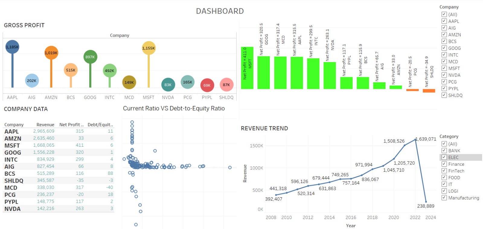
This bubble chart represents the gross profit of different companies.
Larger and brighter-colored bubbles indicate higher profits, while smaller and subdued colors represent lower profits.
Example: Apple (AAPL) and Microsoft (MSFT) show significantly higher gross profit compared to smaller companies.
2. Company Data Table
A tabular format provides a detailed comparison of Revenue, Net Profit, and Debt-to-Equity ratios.
This helps stakeholders understand which companies are financially stable and which are struggling with debt.
3. Profitability Comparison (Bar Chart)
The green bars indicate companies with positive net profit, while the red/orange bars show losses.
Example: Microsoft (MSFT) leads with the highest net profit, while companies like SHLDQ (Sears Holdings) report negative profitability.
4. Current Ratio vs. Debt-to-Equity Ratio (Scatter Plot)
This visualization helps in analyzing financial liquidity and leverage.
A higher current ratio indicates better short-term financial health, while a lower debt-to-equity ratio suggests lower financial risk.
5. Revenue Trend Over Time (Line Chart)
The line chart illustrates yearly revenue trends from 2008 to 2024.
The spike between 2018 and 2022 suggests strong financial growth, followed by a decline in 2024.
The category filter (BANK, IT, FINTECH, etc.) allows users to focus on specific industries.
Insights & Key Takeaways
Tech giants (AAPL, MSFT, GOOG) dominate in revenue and profit.
Companies with high debt-to-equity ratios (e.g., BCS, PCG) may face financial risks.
Revenue trends show strong growth in past years, but some industries face recent declines.
Scenario modeling and filtering by industry provide tailored financial analysis.
Conclusion
This interactive Tableau dashboard serves as a powerful tool for financial decision-making, offering deep insights into profitability, revenue trends, and risk factors. By leveraging such dashboards, businesses can make data-driven financial strategies and optimize growth.
Subscribe to my newsletter
Read articles from Jithin Lal directly inside your inbox. Subscribe to the newsletter, and don't miss out.
Written by

Jithin Lal
Jithin Lal
I’m passionate about transforming complex data into clear, actionable insights that drive business growth. With a background in data analytics and a deep understanding of the power of numbers, I specialize in helping businesses optimize their strategies and improve decision-making through data. In this blog, I share my knowledge on everything from basic analytics principles to advanced techniques, offering tips, tutorials, and industry insights for anyone looking to make smarter, data-backed decisions. Whether you're new to analytics or looking to sharpen your skills, I’m here to guide you on your journey to mastering the art of data. Let’s unlock the power of data together!