Flowbite React vs. Shadcn: Which UI Library Should You Choose for Your React Project?
 Sunil Joshi
Table of contents

Building a modern web app’s UI from scratch is like assembling IKEA furniture without the manual. You’ll waste hours tweaking buttons, debugging dropdowns, and crying over inconsistent spacing. That’s where UI libraries like Flowbite React and Shadcn come in — thy hand you the tools to build faster. But which one is right for your project?
In this guide, we’ll dissect both libraries, compare their strengths, and show you how pre-built admin templates can turn months of work into days.
What is Flowbite React?
Flowbite React is an open-source UI component library built for React that’s powered by Tailwind CSS. It’s designed to get you up and running fast with a collection of pre-styled, accessible components — from dropdowns and modals to slick forms and more.
Key Features:
Pre-Built Components: 50+ elements styled with Tailwind’s utility classes.
Dark Mode Toggle: Switch themes with a single line of code.
Interactive Elements: Dropdowns, tooltips, and datepickers with built-in JavaScript.
Community-Driven: Open-source updates and third-party plugins.
Code Example: Flowbite Button
import { Button } from 'flowbite-react';

// A fully styled button with hover effects
<Button color="blue" pill={true}>
  Click Me
</Button>
Pros
Speedy Setup: Super-fast integration that helps you build prototypes and MVPs quickly.
Great Documentation: Comprehensive guides and an active community make it easier to troubleshoot issues.
Responsive Design: Components look fantastic on all devices, with built-in support for dark mode.
Consistent Styling: Pre-designed elements ensure a uniform look throughout your application.
Accessibility: Components are built with accessibility in mind, reducing development headaches later.
Cons
Customization Limits: The pre-styled approach might constrain developers who want a radically unique look.
Smaller Ecosystem: Fewer third-party add-ons compared to some other libraries.
Opinionated Design: May not easily fit projects that require a completely custom aesthetic.
Dependency on Tailwind: If you’re not familiar with Tailwind CSS, there might be a learning curve.
When to Choose Flowbite React
Flowbite React is ideal if you need to build something quickly without reinventing the wheel. It works best for:
Rapid Prototyping & MVPs: Get a working model up in no time with minimal setup.
Startups & Small Teams: If you’re short on design resources, the pre-styled components ensure a professional look without hiring a UI designer.
Projects Favoring Consistency: When you need a uniform design language across your application, Flowbite React’s opinionated styling is a big plus.
Tailwind Enthusiasts: If your project already leverages Tailwind CSS, Flowbite React integrates seamlessly, reducing the time spent on custom styling.
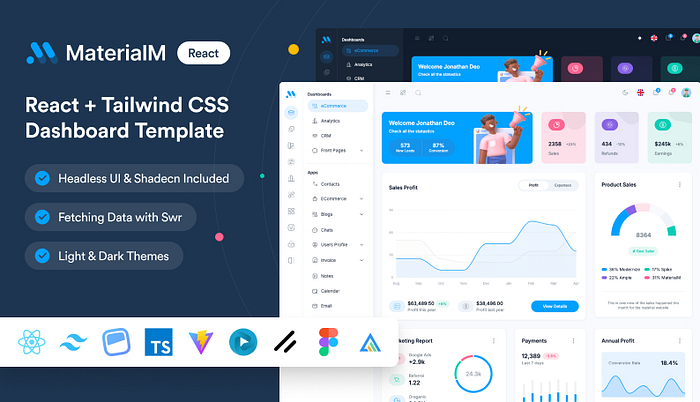
Imagine having a head start on your next project with a template that not only looks stunning but also works like a charm. The MaterialM Template is designed with Flowbite React to give you a smooth, plug-and-play experience. This template comes loaded with everything you need — from a fully responsive layout to a best collection of pre-built components, it’s crafted to save you hours of development time.

What’s Inside MaterialM Shadcn Template👇
200+ enhanced Flowbite React components (buttons, charts, forms, tables) pre-integrated with Tailwind CSS
Global dark/light mode toggling with zero CSS overrides
TypeScript-ready codebase for enterprise scalability
6 demo variations: Main Dashboard, Dark Mode Edition, RTL support, Horizontal & Mini Sidebar layouts
Integration with modern tech: Shadcn & Headless UI, Firebase Auth, SWR data fetching, and i18n React
Real-world application templates for eCommerce, Healthcare, and SaaS
Optimized, pixel-perfect responsive layouts
1-year updates and support with priority bug fixes and React 18+ compatibility
MIT License for risk-free use in client projects or internal tools.
What is Shadcn?
Shadcn takes a different approach by offering unstyled, headless components. This means you get a bare-bones foundation, leaving all the creative control in your hands. It’s perfect if you want to build something that’s truly one-of-a-kind.
Key Features:
Zero Default Styling: Style components with CSS, Tailwind, or CSS-in-JS.
Framework-Agnostic: Works with React, Vue, Svelte, or vanilla JS.
TypeScript Support: Built for type-safe enterprise apps.
Accessibility-First: ARIA labels, keyboard navigation, and screen reader support.
Code Example: Shadcn Button
import { Button } from '@shadcn/ui';

// A barebones button – you style it yourself
<Button className="bg-brand-blue text-white px-4 py-2 rounded-lg">
  Click Me
</Button>
Pros
Ultimate Customization: Offers the freedom to design every component exactly how you envision it.
Lightweight Performance: With minimal bloat, your application can load quickly and run smoothly.
Flexibility: The unstyled approach means you can integrate your own design system without fighting against preset styles.
Clean Slate: Perfect for projects where you want full control over the user interface.
Framework Agnostic: While popular with React, its design principles can be applied across multiple frameworks.
Cons
Extra Setup Required: You need to write your own styles, which might extend development time.
Steeper Learning Curve: Requires a stronger grasp of CSS and design principles to fully leverage its flexibility.
Less Out-of-the-Box: You start with a blank canvas, which can be daunting if you’re looking for a ready-made look.
Potential Inconsistencies: Without pre-defined styling, maintaining uniformity across components depends entirely on your implementation.
When to Choose Shadcn?
Shadcn shines when your project demands a bespoke design that aligns perfectly with your brand identity. Consider it if:
Custom Design is a Priority: Ideal for enterprise-level applications where unique branding is non-negotiable.
You Have a Design-Savvy Team: If your team is comfortable with CSS and enjoys crafting custom styles, Shadcn gives you all the flexibility you need.
Performance is Key: Its lean, unstyled components ensure that you can build fast-loading, efficient applications.
You Need a Blank Slate: If you want a completely customizable foundation without any pre-imposed design, Shadcn is your best friend.
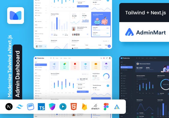
Looking for a developer-friendly, premium Tailwind CSS template packed with powerful pages and components ? Modernize has you covered. Designed by top-notch designers and built with industry-standard code, it’s your go-to choice for creating scalable web applications hassle-free.

What’s Inside Modernize Shadcn Template 👇
150+ UI Components being given with Modernize Tailwind
4+ Frontend Pages
6 Pre-defined Theme Colors with Modernize Admin
5+ stunning dashboard variations and 9+ application pages
5 Demos & 80+ Pages per demo to make it easier
i18n React support, Firebase & NextAuth demos
Built-in SWR for optimized data fetching
Google Fonts and Figma designs for most pages
Regular updates, multiple chart options, and form variations
Easy folder structure and organized code
| Parameter | Flowbite React | Shadcn |
| Styling Approach | Pre-styled, ready-to-use designs | Unstyled, complete creative freedom |
| Ease of Use | Beginner-friendly; minimal setup | Requires more CSS/design expertise |
| Customization | Limited by default styling | Unlimited customization—build your own styles |
| Performance | Optimized for rapid development | Lean and lightweight for fast load times |
| Documentation | Extensive guides and active community support | Good documentation, but assumes design knowledge |
| Community & Ecosystem | Growing community with regular updates | Smaller community; relies on individual customization |
| Ideal Use Case | MVPs, startups, projects prioritizing speed | Enterprise apps, projects needing unique branding |
| Integration with Tailwind | Seamless if already using Tailwind CSS | Framework-agnostic; works across different stacks |
How to Choose: A Decision Tree (Add Better Flowchart using Figma)
Start
                        │
        ┌───────────────┴──────────────┐
        │                              │
 "What's my timeline?"     "Do I have design resources?"
        │                              │
  ┌─────┴─────┐                     ┌──┴──┐
  │           │                     │     │
 <1 month   > 1 month              Yes    No
  │           │                     │     │
  │           |                     |     |
  │           |                     │     │
 Flowbite  Shadcn + Wrappixel    Shadcn  Flowbite
 React +   Template                 │     React
 AdminMart                          │
 Template                 "Is my app brand-heavy?"
                                    │
                                 ┌──┴───┐
                                 │      │
                                Yes     No
                                 │      │
                               Shadcn  Flowbite React
Why Pre-Built Templates Can Be a Game Changer?
Let’s be honest: no one likes reinventing the wheel. Pre-built templates can:
Save You Time: Skip the boring setup and jump right into building features.
Ensure Quality: All components are tested to work well together, reducing bugs and compatibility issues.
Boost Productivity: Focus on what really matters instead of fighting with boilerplate code.
Wrapping It Up
Choosing between Flowbite React and Shadcn really comes down to your project’s specific needs. If you value speed and a ready-to-use design, Flowbite React is a fantastic option. But if you need complete creative control and are ready to put in a bit more work, Shadcn will let you build something truly unique.
And remember, you don’t have to choose between them entirely. With AdminMart’s Flowbite React Templates & Wrappixel’s Shadcn Templates, you can enjoy the benefits of both worlds. These Admin templates are designed to help you kickstart your project, save time, and ensure you deliver a top-notch user experience.
Subscribe to my newsletter
Read articles from Sunil Joshi directly inside your inbox. Subscribe to the newsletter, and don't miss out.
Written by
