What are Muted Colors: A Guide to Their Effective Use in Design
 Suchi Kothari
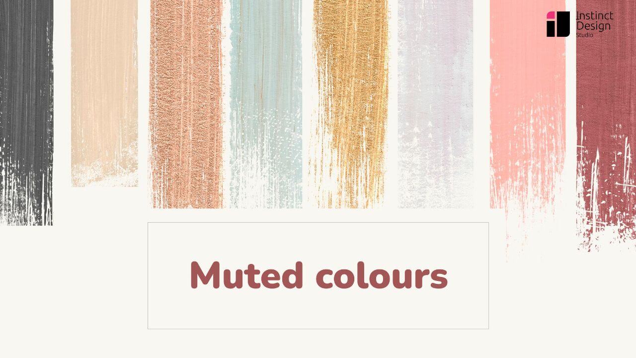
Colors are the foundation of any design, adding emotions and vitality to every creation. They set the mood and enhance brand identity simply by the first visual.
However, colors go beyond the basic palette you may have seen. These messengers of brand identity come in muted tones that offer a refined approach to design, emphasizing soft tones that create a balanced visual experience.
Using a carefully selected muted color palette can improve projects by raising calmness and sophistication, ensuring creative works remain modern and accessible.
Colors are more than just aesthetic choices; they directly impact user experience and engagement. From guiding user attention to improving readability, muted colors play a vital role in UX/UI design. Understanding why UX design is important is key to leveraging colors effectively in digital experiences.
What are Muted Colors?
Muted Colors are less saturated and more subdued tones of otherwise bright and vibrant colors. These tones have hints of gray or a complementary color and radiate refinement and softness. Muted tones add aesthetics and balance to any design, offering elegance distinct from vivid alternatives.
Difference Between Muted and Vibrant Colors
Unlike vibrant colors, muted tones are gentle and less saturated. They add subtlety and balance, whereas vibrant colors are bold and energetic. The main difference is intensity. Muted colors, like soft pastels and desaturated tones, create a relaxed feel, whereas vibrant tones demand immediate attention.
How are Muted Colors Created?
Muted color scheme is created by mixing base colors with gray or black, or lowering their saturation. By crafting this mix, the color scheme tames bright tones.
Psychological Impact of Muted Colors
Muted colors in modern design deeply affect our emotions and physiology. They evoke a sense of calmness and tranquillity, promoting relaxation.
The soft-gentle tones minimize harsh visual stimuli and create a soothing and inviting atmosphere. Their presence in the work and rest spaces supports concentration, reflection, and mental clarity.
A muted color palette has a gentle approach that can stimulate innovative thinking while promoting a peaceful mindset. As the Hayes escape the intensity of vibrant options, they inspire a sense of peace and renewed focus.
Due to their psychological impact, these soft colors are valuable in designing spaces that nurture relaxation, thoughtful engagement, and a positive state of mind.
Muted colors play a crucial role in industries where trust and clarity are essential—such as fintech. A well-designed financial app uses soft, neutral tones to create a sense of security and professionalism. Discover how Fintech UX design leverages colors to enhance user confidence and engagement.
How to Use Muted Colors Effectively?
Here’s how businesses can use muted colors in designing:
1. Branding & Identity
Branding and identity develop on consistency and subtlety, making the color palette a strategic choice. A selection of muted color tones can push a brand, evoking sophistication and reliability without overwhelming the viewer. Modern design concepts use muted colors for refined visual storytelling that balances bold brand elements with understated elegance.
2. UI/UX Design
Muted colors in modern design enhance digital interfaces by reducing visual clutter and emphasizing functionality. A careful application of a muted color scheme creates intuitive, user-friendly experiences. Designers benefit from balanced, clear layouts that support navigation and accessibility, ultimately leading to more engaging and effective interactions across platforms
3. Typography & Contrast
Pairing expressive typography with soft, muted tone colors boosts readability and balance between text and background. Designers can achieve optimal contrast by selecting fonts that complement these gentle hues. Consider examples of muted colors to balance text and background, ensuring clarity and sophistication while reinforcing an overall harmonious design.
For small businesses, muted color schemes ensure a modern, polished look while maintaining readability and professionalism. The right balance between typography and colors can enhance brand perception. Check out these web design tips for small businesses to create a strong digital presence.
4. Web App Design
Muted colors are increasingly popular in web app design for creating clean, modern interfaces that prioritize user experience.
Web designers use a carefully curated, muted color palette to balance aesthetics and functionality. Using muted tones helps reduce visual noise, ensuring the key elements shine without overwhelming the users.
This design approach fosters clarity, improves readability, and guides intuitive navigation across digital platforms.
Web applications benefit from muted colors by offering a modern, distraction-free interface. If you’re looking for expert guidance, check out our web app design services for seamless and engaging experiences.
5. Print & Packaging
Muted colors add refined elegance to print and packaging by simply elevating the product presentation. Designers choose a carefully muted color scheme to create packaging that stands out in competitive markets without overwhelming consumers. Soft, understated hues help drive attention to key product details and essential messaging.
By using a well-balanced muted color scheme, brands subtly convert modernity and trust, making it easier for consumers to connect.
A well-balanced muted color palette enhances digital interfaces by reducing visual noise and guiding users effortlessly. By mapping out the user’s journey, designers can identify where muted colors can improve accessibility and engagement. Learn more about how a UX journey map helps in structuring user flows and optimizing design decisions.
Final Thoughts about Muted Colors in UI/UX Design
Overall, muted colors redefine design by setting a quiet stage that opens space for imaginative detailing. They empower designers to layer textures and gentle gradients, creating interactive experiences that are modern, refined, and uniquely inviting.
Source: https://instinctdesignstudio.com/blog/what-are-muted-colors/
Subscribe to my newsletter
Read articles from Suchi Kothari directly inside your inbox. Subscribe to the newsletter, and don't miss out.
Written by