📚 What is Time Series Forecasting? (Complete Beginner's Guide)
 Rohit Ahire
Table of contents
- 🔍 Definition
- 🧱 Key Characteristics of Time Series Data
- 💡 Why is Time Series Analysis Important?
- 🧠 Common Applications of Time Series Analysis
- 🛠️ Tools and Techniques Used in Time Series
- ✅ Why Use XGBoost for Time Series?
- 📌 Dataset for This Blog: Hourly Energy Consumption
- Now we create our model
- Feature importance
- Forecast on test
🔍 Definition
Time Series Analysis is a method of analyzing data points collected over time to understand patterns, trends, and seasonality — and to forecast future values based on this historical data.
What makes time series data unique is that the time order matters — each observation is associated with a specific point in time, and past values often influence future ones.
🧱 Key Characteristics of Time Series Data
Temporal Dependence:
The value at a given time may depend on previous values.
For example, today’s electricity usage is influenced by yesterday’s and the day before.
Trend:
A long-term increase or decrease in the data.
E.g., global temperature rising over decades.
Seasonality:
Repeating patterns at regular intervals (e.g., daily, weekly, monthly).
E.g., more electricity used during summer afternoons due to ACs.
Cyclic Behavior:
- Patterns that occur but not at regular intervals (like economic cycles).
Noise:
- Random variation that cannot be explained by the model.
💡 Why is Time Series Analysis Important?
Time series analysis is the backbone of forecasting and decision-making in any system where behavior evolves over time. It enables organizations to:
Detect anomalies (fraud detection, network security)
Plan ahead (sales, staffing, inventory)
Optimize operations (power grid, servers)
Improve services (weather alerts, traffic systems)
🧠 Common Applications of Time Series Analysis
Let's explore how time series is applied across various industries:
📈 1. Finance
Stock Price Prediction: Estimating the future price of shares or cryptocurrencies.
Volatility Forecasting: Measuring future market risk.
Algorithmic Trading: High-frequency models that learn patterns from price fluctuations.
⚡ 2. Energy
Electricity Load Forecasting: Predicting how much power will be needed.
Smart Grid Optimization: Adjusting power distribution in real time.
Renewable Energy Planning: Forecasting solar/wind output based on weather.
🌦️ 3. Weather and Climate
Temperature Forecasting
Rainfall Prediction
Climate Change Monitoring
🛍️ 4. Retail and E-Commerce
Demand Forecasting: Predict how much stock is needed.
Sales Prediction: Forecast daily/weekly revenue.
Inventory Optimization: Reduce overstock or understock situations.
🏥 5. Healthcare
Patient Monitoring: Time series of heart rate, oxygen level, blood pressure.
Disease Progression Analysis: Tracking patterns in chronic conditions over time.
📱 6. Tech and IoT
Server Load Forecasting: Prevent crashes by predicting spikes.
User Activity Tracking: Analyzing how user engagement changes over time.
Sensor Data Analysis: In smart homes, vehicles, and machines.
🏭 7. Manufacturing
Predictive Maintenance: Forecasting machine failure before it happens.
Production Planning: Managing supply chain and production timelines.
🚓 8. Transportation
Traffic Forecasting
Ride Demand Prediction (Uber, Ola)
Flight Delay Prediction
🛠️ Tools and Techniques Used in Time Series
Depending on the problem, analysts use different methods for modeling time series:
| Method | Description |
| Moving Averages | Smoothing data by averaging past values |
| ARIMA | Classic model using autoregression and integration |
| Exponential Smoothing | Weight recent data more heavily |
| Facebook Prophet | Easy-to-use model for business forecasting |
| XGBoost/LightGBM | Powerful gradient boosting algorithms (used here) |
| LSTM/GRU | Deep learning models designed for sequence data |
✅ Why Use XGBoost for Time Series?
While XGBoost is not a traditional time series model, it performs extremely well when you engineer the right features:
Lag values (previous hours/days)
Time-based features (hour of day, day of week, etc.)
Rolling averages or windowed trends
XGBoost is fast, handles missing data well, and captures non-linear relationships — which makes it excellent for real-world forecasting problems, including hourly energy consumption.
📌 Dataset for This Blog: Hourly Energy Consumption
In this blog, we’ll use a real-world dataset from the American Electric Power (AEP) company, which records electricity usage hour by hour from 2004 to 2018.
We’ll use Python to:
Load and clean the data
Engineer useful time-based features
Train an XGBoost model
Forecast future energy usage
Visualize predictions with beautiful graphs
You can also access this code from my Kaggle here.
# This Python 3 environment comes with many helpful analytics libraries installed
# It is defined by the kaggle/python Docker image: https://github.com/kaggle/docker-python
# For example, here's several helpful packages to load

import numpy as np # linear algebra
import pandas as pd # data processing, CSV file I/O (e.g. pd.read_csv)

# Input data files are available in the read-only "../input/" directory
# For example, running this (by clicking run or pressing Shift+Enter) will list all files under the input directory

import os
for dirname, _, filenames in os.walk('/kaggle/input'):
    for filename in filenames:
        print(os.path.join(dirname, filename))

# You can write up to 20GB to the current directory (/kaggle/working/) that gets preserved as output when you create a version using "Save & Run All"
# You can also write temporary files to /kaggle/temp/, but they won't be saved outside of the current session
import matplotlib.pyplot as plt
import seaborn as sns
from sklearn.metrics import mean_squared_error
import xgboost as xgb
color_pal = sns.color_palette()
plt.style.use('fivethirtyeight')
df = pd.read_csv('/kaggle/input/hourly-energy-consumption/AEP_hourly.csv',parse_dates=['Datetime'], index_col='Datetime')
df = df.sort_index()
df = df.groupby(df.index).mean()  # handle duplicates
df.plot(style='.',
        figsize=(15,5),
        color=color_pal[0],
        title="AEP_MW")
plt.show()

from sklearn.model_selection import train_test_split from sklearn.metrics import mean_squared_error
Everything before 2016 is training data and 2016 and 2018 will be test data.
train = df.loc[df.index < '01-01-2015']
test = df.loc[df.index >= '01-01-2015']
fig ,ax = plt.subplots(figsize=(15,5))
train.plot(ax=ax, label="Training set")
test.plot(ax=ax, label="Test set")
ax.axvline('01-01-2015', color="black", ls="--")
ax.legend(['Training set', 'Test Set'])

df.loc[(df.index > '01-01-2010') & (df.index < '01-08-2010')] \
    .plot(figsize=(15, 5), title='Week Of Data')
plt.show()
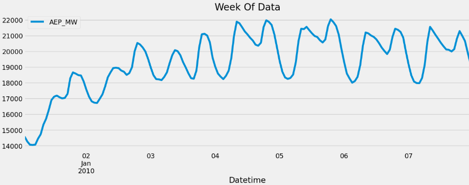
This plot shows a one-week snapshot of hourly electricity consumption from the AEP dataset, specifically from January 1st to January 8th, 2010. It clearly illustrates the daily cyclic pattern of energy usage — with consumption peaking during the daytime hours and dipping at night. These repeating spikes reflect human activity patterns, such as increased usage in homes and businesses during the day. The upward slope in the first two days might be due to colder weather or returning workdays after a holiday. Visualizing short time windows like this helps us understand micro-level seasonality in time series data, which is crucial for accurate forecasting.
def create_features(df):
    """
    Create time series features based on time series index.
    """
    df = df.copy()
    df['hour'] = df.index.hour
    df['dayofweek'] = df.index.dayofweek
    df['quarter'] = df.index.quarter
    df['month'] = df.index.month
    df['year'] = df.index.year
    df['dayofyear'] = df.index.dayofyear
    df['dayofmonth'] = df.index.day
    df['weekofyear'] = df.index.isocalendar().week
    return df

df = create_features(df)
fig, ax = plt.subplots(figsize=(10, 8))
sns.boxplot(data=df, x='hour', y='AEP_MW')
ax.set_title('MW by Hour')
plt.show()
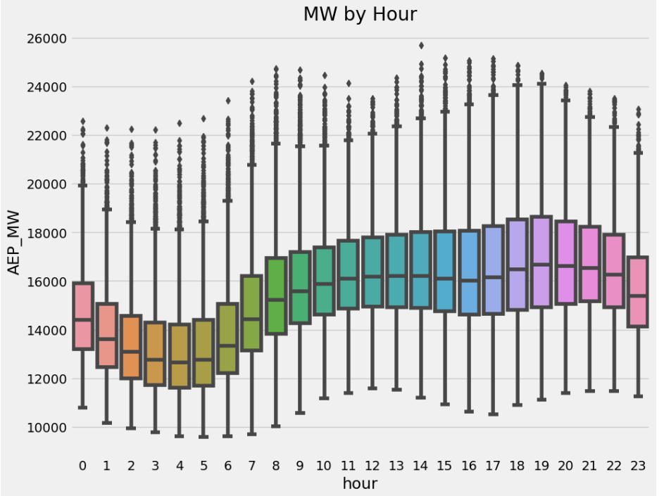
This boxplot visualizes the distribution of hourly electricity consumption (in megawatts) across all 24 hours of the day, aggregated over the entire dataset. Each box represents the spread of energy usage for a specific hour, showing the median, interquartile range (IQR), and outliers. The pattern reveals that electricity consumption is typically lowest during the early morning hours (around 3–6 AM), gradually increases throughout the day, and peaks between 5 PM to 7 PM, when residential and commercial energy usage is at its highest. This chart clearly highlights the daily usage cycle, which is a key seasonal pattern in time series analysis of energy data.
fig, ax = plt.subplots(figsize=(10, 8))
sns.boxplot(data=df, x='month', y='AEP_MW', palette='Blues')
ax.set_title('MW by Month')
plt.show()
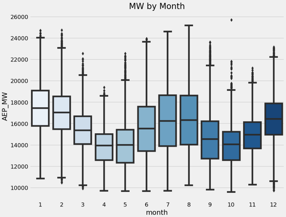
This boxplot illustrates the monthly distribution of hourly electricity consumption (AEP_MW) throughout the year. Each box represents one month (from January to December), showing how energy usage varies seasonally. The plot reveals a clear seasonal pattern: electricity consumption tends to be higher in the winter months (January, February, December) and lower during spring and early summer (April, May, June). This aligns with real-world behavior, where colder months typically see increased heating demands. The wide spread and presence of outliers in some months (especially summer and winter) indicate occasional peaks, likely driven by extreme temperatures and high heating or cooling needs. This monthly seasonality is crucial for building accurate time series forecasts.
Now we create our model
train = create_features(train)
test = create_features(test)
FEATURES=['hour', 'dayofweek', 'quarter', 'month', 'year', 'dayofyear']
TARGET='AEP_MW'

X_train = train[FEATURES]
y_train = train[TARGET]

X_test = test[FEATURES]
y_test = test[TARGET]
reg = xgb.XGBRegressor(n_estimators=1000, early_stopping_rounds=50,
                      learning_rate = 0.01)
reg.fit(X_train, y_train,
       eval_set=[(X_train, y_train),(X_test, y_test)],
       verbose=100)
Feature importance
fi = pd.DataFrame(data=reg.feature_importances_,
             index=reg.feature_names_in_,
             columns=['importance'])
fi.sort_values('importance').plot(kind='barh', title='Feature Importance')
plt.show()
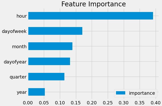
This bar chart shows the feature importance scores generated by the XGBoost model, indicating how much each time-based feature contributed to predicting electricity consumption. The hour feature stands out as the most influential by far, with an importance score close to 0.40, confirming that energy usage is heavily driven by the time of day — likely due to predictable daily routines. Other features like dayofweek, month, and dayofyear also contribute meaningfully, reflecting weekly and seasonal patterns in electricity demand. Meanwhile, quarter and year have the least impact, suggesting that long-term trends or quarterly shifts are less relevant than more granular time features. This insight helps us understand which temporal patterns the model is relying on most for accurate forecasting.
Forecast on test
test['prediction']=reg.predict(X_test)
df = df.drop(columns=['prediction'], errors='ignore')  # avoid error if it doesn't exist
merged = df.merge(test[['prediction']], how='left', left_index=True, right_index=True)
df = merged
ax = df[['AEP_MW']].plot(figsize=(15, 5))
df['prediction'].plot(ax=ax, style='.')
plt.legend(['Truth Data', 'Predictions'])
ax.set_title('Raw Dat and Prediction')
plt.show()
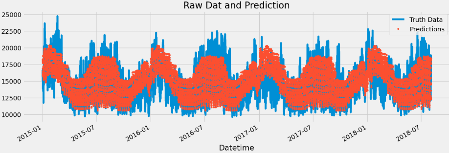
This plot compares the actual electricity consumption values (blue line) with the predictions generated by the XGBoost model (red dots) over a multi-year period from early 2015 to mid-2018. The blue curve represents the ground truth (AEP_MW) data, while the red scatter points show the model's hourly predictions. The overall shape and seasonality are captured reasonably well — the predictions align with the cyclical rise and fall of energy demand across seasons. However, we can observe that the predictions appear slightly smoother and less spiky than the true data, indicating that the model captures broader trends well but may underestimate sudden peaks or drops in consumption. This highlights the strength of the model in understanding regular patterns, though there may still be room for improvement in modeling short-term fluctuations.
ax = df.loc[(df.index > '04-01-2018') & (df.index < '04-08-2018')]['AEP_MW'] \
    .plot(figsize=(15, 5), title='Week Of Data')
df.loc[(df.index > '04-01-2018') & (df.index < '04-08-2018')]['prediction'] \
    .plot(style='.')
plt.legend(['Truth Data','Prediction'])
plt.show()
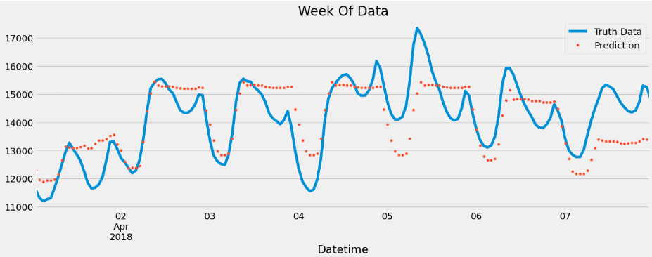
This plot zooms into a single week of energy consumption data — from April 1st to April 8th, 2018 — showing the actual values (blue line) and the XGBoost model predictions (red dots) on an hourly basis. The blue line highlights the natural daily rhythm of electricity usage, with clear peaks during daytime and dips at night. The red dots representing the predictions follow the overall trend but appear slightly delayed and smoothed, often missing some of the sharper peaks and valleys. This suggests that while the model effectively captures the broader time-of-day and day-of-week patterns, it struggles with short-term volatility, possibly due to the absence of lag or rolling window features that could have helped it react to recent changes more accurately. Overall, this weekly view helps assess the model’s strengths in seasonality and areas where fine-tuning is needed.
score = np.sqrt(mean_squared_error(test['AEP_MW'], test['prediction']))
print(f'RMSE Score on Test set: {score:0.2f}')
RMSE Score on Test set: 1645.77
test['error'] = np.abs(test[TARGET] - test['prediction'])
test['date'] = test.index.date
test.groupby(['date'])['error'].mean().sort_values(ascending=False).head(10)
Next Step
More robust cross validation
Add more features (weather forecast, holidays)
This blog has been referred from here - link
Subscribe to my newsletter
Read articles from Rohit Ahire directly inside your inbox. Subscribe to the newsletter, and don't miss out.
Written by
