How to Calculate Productivity in Jira: A Comprehensive Guide
 Viktoriia Golovtseva
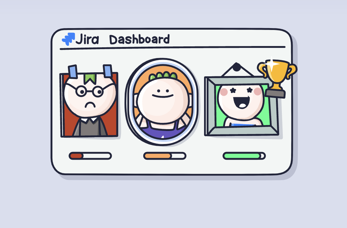
Struggling to measure your team’s performance in Jira? Discover how to turn raw data into actionable productivity insights!
Tracking team productivity poses a constant challenge for managers and team leaders, especially in fast-paced, collaborative environments. Questions like, “Is my team performing above or below average?” and “Is one engineer underperforming?” often linger without clear answers. For engineering and cross-functional teams, it’s essential to not only understand what your team is doing but how effectively they’re doing it.
Jira offers built-in tools like sprint reports and velocity charts to help measure progress. However, these tools have limitations when it comes to comparing individual performance or aggregating data across projects.
The Smart Productivity & Team Performance Dashboard for Jira goes beyond just basic reporting. It connects data from Jira, Confluence, and GitHub to deliver clear, customizable insights. From tracking metrics to spotting bottlenecks, it’s a game-changer for teams aiming to boost productivity, maintain effective project management, and achieve high performance.
Understanding Productivity Metrics in Jira
What Does Productivity Mean in Jira?
Productivity in Jira focuses on key metrics that help teams understand their efficiency and output. It highlights how effectively tasks are completed and progress is managed.
Completed Issues: Shows the total tasks finished in a given time, helping teams track their delivery capacity and adherence to goals.
Sprint Velocity: Measures the amount of work completed during sprints, offering insights into team capacity and future workload planning.
Cycle Time: Calculates the time it takes to complete a task from its creation. It helps identify process inefficiencies and ensures timelines are met.
These metrics form the foundation for evaluating team performance and improving project management workflows.
How to Track and Analyze Your Team’s Work with Jira Reports
Jira’s built-in reports provide actionable insights into team productivity, helping identify bottlenecks and improve processes. Here’s a breakdown of each report, including its purpose, advantages, and limitations.
Sprint Reports
Purpose: Offer a detailed view of completed and incomplete tasks during a sprint, highlighting team performance against goals.
Advantages: Easy to access, provides a clear summary of sprint outcomes and helps with retrospective analysis.
Disadvantages: Does not offer insights into task dependencies or root causes for incomplete work.
How to Use:
Open your project and navigate to Reports.
Select Sprint Report and choose a completed sprint.
Review completed tasks and backlog items to adjust future plans and address roadblocks.
For more details, check documentation: View and understand the sprint report
Burndown Charts
Purpose: Visualize the remaining work in a sprint, helping track progress towards completion.
Advantages: Real-time updates make it easy to monitor sprint health and identify delays.
Disadvantages: Does not provide context for why delays occur or offer detailed insights into individual contributions.
How to Use:
Open Reports and select Burndown Chart.
Examine the chart’s slope to assess task progress. Steeper declines indicate rapid progress, while flat lines suggest delays.
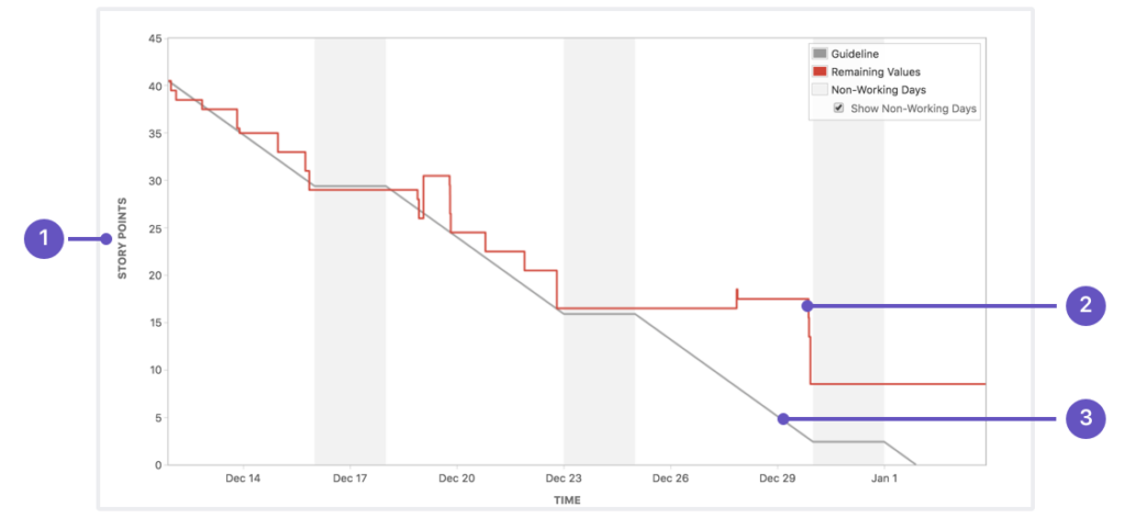
For more details, check documentation: View and understand the burndown chart
Velocity Charts
Purpose: Show the amount of work completed vs work planned across multiple sprints, helping with capacity planning.
Advantages: Supports data-driven sprint planning and goal setting.
Disadvantages: Limited in explaining variations in velocity, such as unexpected team absences.
How to Use:
Navigate to Reports and select Velocity Chart.
Analyze trends in story points completed vs planned across sprints.
Consistent velocities and ratios reflect stable workloads, while fluctuating trends may require adjustments.
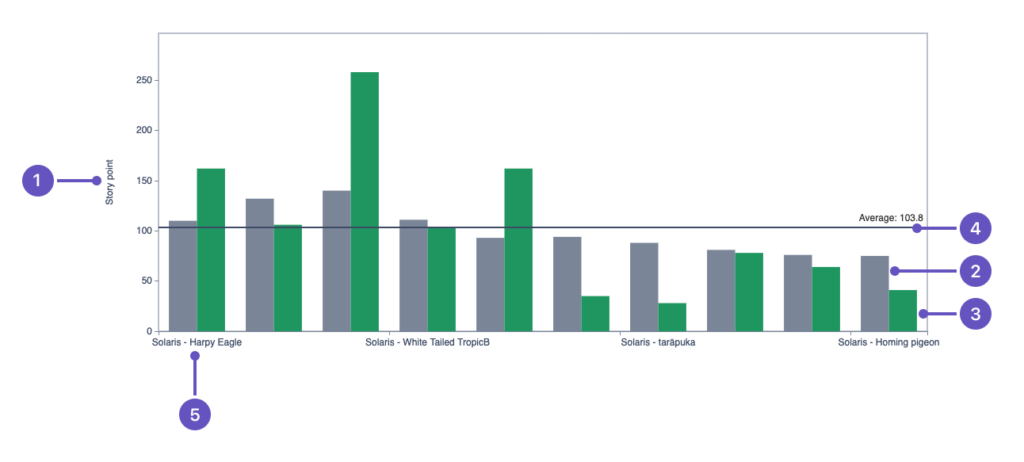
For more details, check documentation View and understand the velocity chart
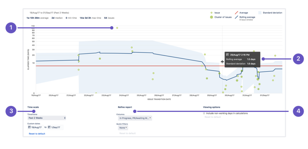
Control Charts
Purpose: Track cycle time and lead time to assess workflow efficiency and predict future performance.
Advantages: Helps identify bottlenecks, measure team performance trends, and assess the impact of process changes.
Disadvantages: Does not account for task dependencies, team workload, or qualitative factors impacting productivity.
How to Use:
Open Reports in your Jira project and select the Control Chart.
Configure the chart by selecting relevant statuses to track cycle time or lead time.
Examine the rolling average (blue line) to identify trends in team performance.
Use the standard deviation (shaded blue area) to assess variability in task completion times.
Investigate outliers (green dots) to understand unexpected delays and refine processes.
Key Insights:
Cycle time measures the duration from when work starts on an issue until it is completed.
Lead time tracks the total time from issue creation to completion.
Narrower standard deviation suggests more predictable workflow performance.
Increasing cycle times indicate possible inefficiencies requiring process adjustments.
For more details, visit the Atlassian Control Chart documentation.
Cumulative Flow Diagrams
Purpose: Visualize the distribution of work across different statuses over time to monitor workflow efficiency.
Advantages: Provides a clear, high-level view of how tasks progress, helping teams identify bottlenecks and workflow imbalances.
Disadvantages: Requires accurate and timely status updates to effectively reflect real-time project conditions.
How to Use:
Open Reports in Jira and select the Cumulative Flow Diagram.
Adjust filters using Refine Report to analyze specific teams, projects, or workflows.
Use the date range selector to focus on different time periods.
Examine the width of status areas:
A steady flow indicates a balanced workload.
A widening area signals a bottleneck in that status.
Track workflow trends to optimize backlog management and task allocation.
Key Insights:
The x-axis represents time, and the y-axis represents the number of issues.
Different colors indicate different workflow statuses (e.g., To Do, In Progress, Done).
A smooth, even flow indicates a stable process, whereas bulging areas reveal workflow congestion.
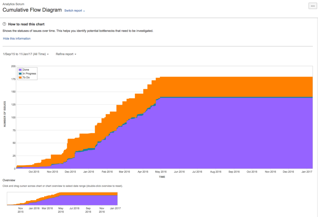
For more details, visit the Atlassian Cumulative Flow Diagram documentation.
Third-Party Tools: Advanced Productivity Insights
Third-party tools like LinearB and Jellyfish cater to development teams that require more advanced metrics and detailed productivity tracking than Jira’s native reports provide.
LinearB: Popular among engineering teams, this tool focuses on metrics like cycle time, deployment frequency, and collaboration patterns. It helps identify bottlenecks and optimize workflows, making it ideal for teams aiming to improve development efficiency.
Jellyfish: Widely used by leadership teams, Jellyfish connects engineering efforts to business goals. It provides insights into time allocation, ensuring projects align with organizational priorities.
Why Choose Third-Party Tools Over Jira Reports?
Advantages:
These tools offer advanced analysis, allowing teams to dive deeper into developer performance and workflow trends.
They connect engineering work to broader business objectives, bridging the gap between technical teams and management.
They provide customizable dashboards tailored to specific needs.
You can choose data from additional sources, such as repositories
Drawbacks:
As SaaS tools outside of Jira, they require separate accounts and setup, adding complexity to your tech stack and flow.
They come with additional subscription costs and demand ongoing configuration and maintenance.
Teams need time to learn and integrate these tools effectively.

While LinearB and Jellyfish are excellent for detailed insights, their added complexity and costs might not suit every team. For simpler needs, Jira’s native tools may be more practical.
Third-party tools like LinearB and Jellyfish excel at offering deeper insights, measuring productivity and connecting productivity metrics to business goals. However, their setup and integration into your tech stack can add overhead. For most teams, balancing Jira’s native tools with external solutions depends on their specific requirements and resources.
Now, let’s explore the challenges of Jira’s native tools and how they might limit productivity tracking.
Challenges with Jira’s Native Tools
Jira’s built-in tools are excellent for tracking tasks and projects; however, they have notable limitations when it comes to comprehensive productivity analysis. Here are the key challenges:
Aggregating Data from Multiple Sources
Teams often use multiple tools like Confluence, GitHub, and Jira to manage workflows. While Jira provides detailed insights into issues and sprints, it lacks the ability to seamlessly combine data from these platforms to measure productivity. For example:
Code reviews in GitHub and documentation updates in Confluence remain disconnected from Jira’s productivity metrics.
Managers must manually gather and consolidate data, which is time-consuming and prone to errors.
Comparing Team and Individual Performance
Jira’s native reports focus on team-level metrics like velocity or burndown charts. However, they do not offer detailed comparisons between individual team members or across teams. This leads to:
Difficulty in identifying underperforming or overperforming individuals.
Challenges in benchmarking team performance when managing multiple cross-functional teams.
Without these comparisons, managers lack clarity on how different teams contribute to overall progress.
Absence of Benchmarks for Productivity
Jira does not provide industry or team-specific benchmarks to help define what “good” productivity looks like. Teams often face questions like:
Is our sprint velocity meeting industry standards?
Are our team’s lead times above or below average?
The absence of benchmarks makes it challenging for managers to assess whether productivity levels are satisfactory or require improvement.
While Jira’s native tools are powerful for day-to-day task management, they fall short in providing a complete picture of productivity. Aggregating data, benchmarking, and comparing performance require extra effort or external tools.
In the next section, we explore how the Smart Productivity & Team Performance Dashboard for Jira from TitanApps overcomes these limitations, offering deeper insights and detailed analysis of team and individual productivity.
Smart Productivity & Team Performance Dashboard: A Game-Changer for Productivity in Jira
Managing team productivity in Jira can be a challenge when relying solely on native tools. The Smart Productivity & Team Performance Dashboard for Jira addresses these gaps with features designed to offer deeper insights, streamlined comparisons, and actionable metrics on team productivity across your tools.

Key Features of the Smart Productivity Dashboard:
Connect Multiple Data Sources – this dashboard integrates data from Jira, Confluence, and GitHub, creating a unified view of team productivity. For instance, managers can observe how Jira issues align with Confluence documentation and GitHub commits, all in a single place.
Team-Based Comparisons – organize and compare performance across teams or individuals. Metrics like Jira Activity, Confluence Edits, and GitHub Commits allow you to identify top contributors and pinpoint underperformance quickly.
Visualized Productivity Metrics – the dashboard offers detailed visualizations. Scorecards show individual and team performance compared to benchmarks. Charts highlight Confluence activity and GitHub contributions, making it easy to spot trends or outliers.
Customizable Insights – Filter data by project, sprint, epic, or timeline. This flexibility enables managers to focus on specific areas of concern or opportunities for improvement.
Why Choose the Smart Productivity Dashboard?
The Smart Productivity Dashboard offers unmatched clarity by consolidating data from Jira, Confluence, and GitHub. Its benchmark comparisons and advanced metrics help uncover workflow inefficiencies and track team and individual progress in detail. This tool empowers managers to make data-driven decisions and improve team performance without adding unnecessary complexity.Jira’s built-in tools provide a foundation for tracking productivity, but the Smart Productivity Dashboard takes team performance analysis to the next level. It simplifies productivity management for teams of all sizes, integrating multiple data sources and offering actionable insights.
I hope you found the article on productivity in Jira insightful and valuable. It was originally published on the TitanApps blog, where we share in-depth insights and expertise on this topic.
Subscribe to my newsletter
Read articles from Viktoriia Golovtseva directly inside your inbox. Subscribe to the newsletter, and don't miss out.
Written by
Viktoriia Golovtseva
Viktoriia Golovtseva
Experienced Content Writer & Marketer, passionate about crafting strategic content that drives results and exploring the intersections of content and product marketing to create impactful campaigns. Dedicated to helping companies achieve their marketing goals through engaging storytelling and data-driven optimization.