Using CSS animations to create microinteractions
 Felix Verduin
I didn’t know about micro interactions until I started delving into the realm of CSS animations. Apparently, micro interactions are the small, subtle animations or responses in a user interface that provide feedback, enhance usability, and make digital experiences feel more intuitive. They help users understand what’s happening and make interactions more engaging.
I have to give credit to Leonardo Russo for giving me the idea when he posted about his 3D carousel in Power Apps and also to Charles Sexton for an amazing video explaining how to use CSS animations in SVG images. Without them I wouldn’t have fallen into this rabbit hole to discover what I could do with these techniques myself.
Some examples of micro interactions can be a progress bar that fills up, a red border when an input is incorrect or a red text stating your password isn’t strong enough when you haven’t used a special character. When creating a Canvas application on the Power Platform we are familiar with all these micro interactions. But with SVG images and CSS we can implement animations in our icons which can convey feedback.
Imagine a user clicking on something without the right permissions filled in all the required fields. Normally you would add more components that light up red or disable the buttons, but what if we could make the icon shake? Let’s find out what we can do with CSS animations to make this happen.
Why use inline CSS animations for micro interactions?
One big reason we use inline CSS aminations is that there isn’t much else we can utilize. Since we are working with PowerFx we cannot add JavaScript to utilize functions. We will have to integrate our CSS animations directly in the SVG images we are using. Luckily, this is still possible!
Furthermore, inline CSS animations are lightweight and performance friendly because they run directly in the browser and they are flexible and easily customizable. Just a few lines of CSS and you can tweak animations. It takes some practice but once you have the hang of it you can do it! If you want to read more about CSS animations I can recommend the W3 schools website.
Using inline CSS animations in your SVG images
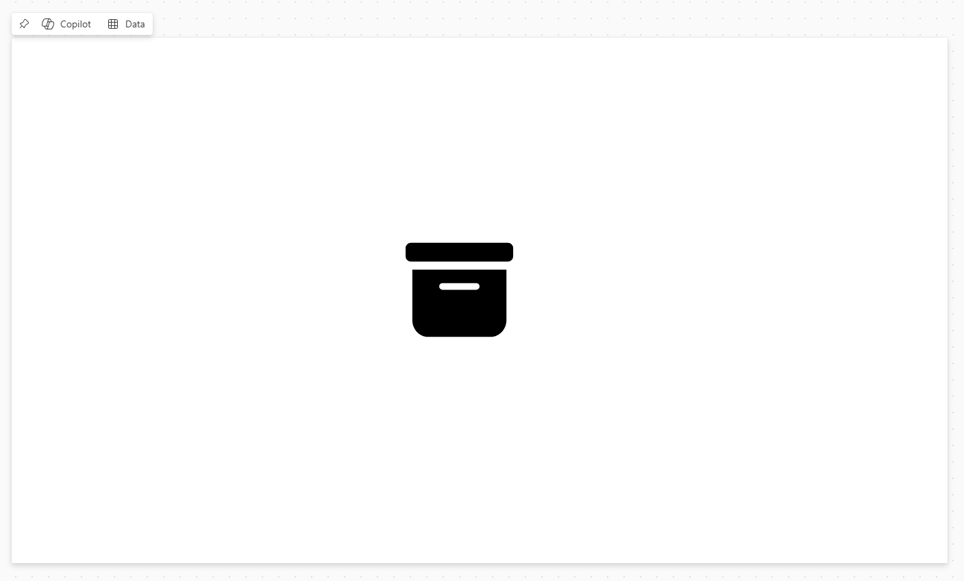
To start using inline CSS animations in your SVG images we have to begin with an SVG image. Let’s use the SVG image we used in the previous blog post. This was the following code.
"data:image/svg+xml;utf8,  " & EncodeUrl("
<svg xmlns='http://www.w3.org/2000/svg' width='16' height='16' fill='currentColor' class='bi bi-archive-fill' viewBox='0 0 16 16'>
  <path d='M12.643 15C13.979 15 15 13.845 15 12.5V5H1v7.5C1 13.845 2.021 15 3.357 15zM5.5 7h5a.5.5 0 0 1 0 1h-5a.5.5 0 0 1 0-1M.8 1a.8.8 0 0 0-.8.8V3a.8.8 0 0 0 .8.8h14.4A.8.8 0 0 0 16 3V1.8a.8.8 0 0 0-.8-.8z'/>
</svg>"
)
Which created the following image in an image control in a Canvas app.
To add animations to our SVG image we need to add a style tag. We can do this by adding the opening and closing tags: <style> and </style> right under the first line of the SVG code. Such as follows.
"data:image/svg+xml;utf8, " & EncodeUrl(" <svg xmlns='http://www.w3.org/2000/svg' width='16' height='16' fill='currentColor' class='bi bi-archive-fill' viewBox='0 0 16 16'>
<style>
</style>
<path d='M12.643 15C13.979 15 15 13.845 15 12.5V5H1v7.5C1 13.845 2.021 15 3.357 15zM5.5 7h5a.5.5 0 0 1 0 1h-5a.5.5 0 0 1 0-1M.8 1a.8.8 0 0 0-.8.8V3a.8.8 0 0 0 .8.8h14.4A.8.8 0 0 0 16 3V1.8a.8.8 0 0 0-.8-.8z'/>
</svg>" )
Here we add a so called class we can couple to our SVG path. We define a class by inserting a dot and then the name of the class. Then we add curly brackets to add different properties to the class. See the below example where the class is called animate.
"data:image/svg+xml;utf8, " & EncodeUrl(" <svg xmlns='http://www.w3.org/2000/svg' width='16' height='16' fill='currentColor' class='bi bi-archive-fill' viewBox='0 0 16 16'>
<style>
.animate {

}
</style>
<path d='M12.643 15C13.979 15 15 13.845 15 12.5V5H1v7.5C1 13.845 2.021 15 3.357 15zM5.5 7h5a.5.5 0 0 1 0 1h-5a.5.5 0 0 1 0-1M.8 1a.8.8 0 0 0-.8.8V3a.8.8 0 0 0 .8.8h14.4A.8.8 0 0 0 16 3V1.8a.8.8 0 0 0-.8-.8z'/>
</svg>" )
For a simple shake animation we need at least three properties: name, duration and fill mode. We’ll add these to the class using the following property names: animation-name, animation-duration and animation-fill-mode.
"data:image/svg+xml;utf8, " & EncodeUrl(" <svg xmlns='http://www.w3.org/2000/svg' width='16' height='16' fill='currentColor' class='bi bi-archive-fill' viewBox='0 0 16 16'>
<style>
.animate {
animation-name: shake;
animation-duration: 1.5s;
animation-fill-mode: both;
}
</style>
<path d='M12.643 15C13.979 15 15 13.845 15 12.5V5H1v7.5C1 13.845 2.021 15 3.357 15zM5.5 7h5a.5.5 0 0 1 0 1h-5a.5.5 0 0 1 0-1M.8 1a.8.8 0 0 0-.8.8V3a.8.8 0 0 0 .8.8h14.4A.8.8 0 0 0 16 3V1.8a.8.8 0 0 0-.8-.8z'/>
</svg>" )
Now that we have the properties we can add so called keyframes. We add those by adding the @keyframes rule. We bind the keyframe by using the same name as we gave our class in the step before this. Then, we add percentages to implement animations at different intervals. For every percentage we add curly brackets. See below for the added @keyframe rule.
"data:image/svg+xml;utf8, " & EncodeUrl(" <svg xmlns='http://www.w3.org/2000/svg' width='16' height='16' fill='currentColor' class='bi bi-archive-fill' viewBox='0 0 16 16'>
<style>
.animate {
animation-name: shake;
animation-duration: 1.5s;
animation-fill-mode: both;
}
@keyframes shake {
0, 100% { }
25% { }
50% { }
75 { }
}
</style>
<path d='M12.643 15C13.979 15 15 13.845 15 12.5V5H1v7.5C1 13.845 2.021 15 3.357 15zM5.5 7h5a.5.5 0 0 1 0 1h-5a.5.5 0 0 1 0-1M.8 1a.8.8 0 0 0-.8.8V3a.8.8 0 0 0 .8.8h14.4A.8.8 0 0 0 16 3V1.8a.8.8 0 0 0-.8-.8z'/>
</svg>" )
Now that we have our percentages sectioning up the animation we can add our transformation. Using the transform property with the translate3d function we can make our icon shake from left to right indicating, for instance, an error. To use this transform property we add the following code: transform: translate3d(0 ,0 ,0) where the numbers in translate3d correspond with (x,y,z).
"data:image/svg+xml;utf8, " & EncodeUrl(" <svg xmlns='http://www.w3.org/2000/svg' width='16' height='16' fill='currentColor' class='bi bi-archive-fill' viewBox='0 0 16 16'>
<style>
.animate {
animation-name: shake;
animation-duration: 1.5s;
animation-fill-mode: both;
}
@keyframes shake {
0, 100% { transform: translate3d(0, 0, 0); }
25% { transform: translate3d(-5px, 0, 0); }
50% { transform: translate3d(5px, 0, 0); }
75 { transform: translate3d(-5px, 0, 0); }
}
</style>
<path d='M12.643 15C13.979 15 15 13.845 15 12.5V5H1v7.5C1 13.845 2.021 15 3.357 15zM5.5 7h5a.5.5 0 0 1 0 1h-5a.5.5 0 0 1 0-1M.8 1a.8.8 0 0 0-.8.8V3a.8.8 0 0 0 .8.8h14.4A.8.8 0 0 0 16 3V1.8a.8.8 0 0 0-.8-.8z'/>
</svg>" )
See how I added -5px and 5px alternatively to make the animation shake from left to right. You can play around with different values to to make your icon do different things. Except, our icon is not actually doing anything yet. We still have to add the class to the path. this we do by adding class = and then the name of our class between apostrophes after the SVG path. See below.
"data:image/svg+xml;utf8, " & EncodeUrl(" <svg xmlns='http://www.w3.org/2000/svg' width='16' height='16' fill='currentColor' class='bi bi-archive-fill' viewBox='0 0 16 16'>
<style>
.animate {
animation-name: shake;
animation-duration: 1.5s;
animation-fill-mode: both;
}
@keyframes shake {
0, 100% { transform: translate3d(0, 0, 0); }
25% { transform: translate3d(-5px, 0, 0); }
50% { transform: translate3d(5px, 0, 0); }
75 { transform: translate3d(-5px, 0, 0); }
}
</style>
<path class = 'animate' d='M12.643 15C13.979 15 15 13.845 15 12.5V5H1v7.5C1 13.845 2.021 15 3.357 15zM5.5 7h5a.5.5 0 0 1 0 1h-5a.5.5 0 0 1 0-1M.8 1a.8.8 0 0 0-.8.8V3a.8.8 0 0 0 .8.8h14.4A.8.8 0 0 0 16 3V1.8a.8.8 0 0 0-.8-.8z'/>
</svg>" )
Now did you see it? You might have missed it but the icon just moved from left to right. Unfortunately it stopped immediately after the first time and will not repeat itself. To make this animation start on a trigger we use a trick from Charles Sexton where we add a timestamp to our class name. Using Set(varTimeStamp, Text(Now(), "" )) and adding this variable to our class name we make sure every time we set this variable we trigger the animation. So add this variable to your class and add the the code to the OnSelect property. I use the ampersands to cut off the code and implement the variable. I don’t use the $ sign notation for this because it gets messy using this in conjunction with the curly brackets you use in the SVG image. But if you want to use it you would just have to double your curly brackets everywhere in the code.
"data:image/svg+xml;utf8, " & EncodeUrl(" <svg xmlns='http://www.w3.org/2000/svg' width='16' height='16' fill='currentColor' class='bi bi-archive-fill' viewBox='0 0 16 16'>
<style>
.animate"&varTimeStamp&" {
animation-name: shake;
animation-duration: 1.5s;
animation-fill-mode: both;
}
@keyframes shake {
0, 100% { transform: translate3d(0, 0, 0); }
25% { transform: translate3d(-5px, 0, 0); }
50% { transform: translate3d(5px, 0, 0); }
75 { transform: translate3d(-5px, 0, 0); }
}
</style>
<path class = 'animate"&varTimeStamp&"' d='M12.643 15C13.979 15 15 13.845 15 12.5V5H1v7.5C1 13.845 2.021 15 3.357 15zM5.5 7h5a.5.5 0 0 1 0 1h-5a.5.5 0 0 1 0-1M.8 1a.8.8 0 0 0-.8.8V3a.8.8 0 0 0 .8.8h14.4A.8.8 0 0 0 16 3V1.8a.8.8 0 0 0-.8-.8z'/>
</svg>" )
Now, everytime we click on the icon we initiate the animation!

Adding more animations
Now we could simply add animations or effects by adding something after the curly brackets. In our case we are going to add a simple fill effect to indicate the user is not allowed to do this action. Therefore we would just need to add fill: and the color that we want. In our case, we do want red, so we fill in red. Be sure to only fill this in on the 50% mark so the icon won’t be red the whole animation through.
"data:image/svg+xml;utf8, " & EncodeUrl(" <svg xmlns='http://www.w3.org/2000/svg' width='16' height='16' fill='currentColor' class='bi bi-archive-fill' viewBox='0 0 16 16'>
<style>
.animate"&varTimeStamp&" {
animation-name: shake;
animation-duration: 1.5s;
animation-fill-mode: both;
}
@keyframes shake {
0, 100% { transform: translate3d(0, 0, 0); }
25% { transform: translate3d(-5px, 0, 0); }
50% { transform: translate3d(5px, 0, 0); fill: red }
75 { transform: translate3d(-5px, 0, 0); }
}
</style>
<path class = 'animate"&varTimeStamp&"' d='M12.643 15C13.979 15 15 13.845 15 12.5V5H1v7.5C1 13.845 2.021 15 3.357 15zM5.5 7h5a.5.5 0 0 1 0 1h-5a.5.5 0 0 1 0-1M.8 1a.8.8 0 0 0-.8.8V3a.8.8 0 0 0 .8.8h14.4A.8.8 0 0 0 16 3V1.8a.8.8 0 0 0-.8-.8z'/>
</svg>" )

Adjusting the viewbox
Lastly, we have to adjust the viewBox. As you can see now, the image is moving out of the frame. That isn’t really nice and we would like to have the SVG image stay in frame. We can achieve this by adjusting the viewBox. If we adjust the viewBox to have the following values '-6.5 -6 28 28' the image stays in frame. Of course, the image is a little smaller now but you can adjust the pixel width and height to be a little bigger. In the next blog post we are going to build a button around this SVG image with animation so it’ll be nicely covered. Sometimes you have to play with the viewBox values to make adjust for your animation. It can be tricky but you’ll get the hang of it after fiddling around a bit. See below for the final result!

Wrapping it up
As you can see we can be quite creative if we really want to. Now that you’ve discovered the art of adding CSS animations to your SVG images you can start experimenting. Use ChatGPT to help you come up with different other animations that you can incorporate. In the next series installment I’ll cover HTML styling for your buttons. That way, you can really get that button experience with these CSS animations!
Subscribe to my newsletter
Read articles from Felix Verduin directly inside your inbox. Subscribe to the newsletter, and don't miss out.
Written by
Felix Verduin
Felix Verduin
Hi! Welcome to my blog. I believe that technology is the great enabler of the 21st century. While technology is making rapid changes and is evolving quickly people aren't always keeping up. I want to help human beings understand what ICT solutions can bring them for benefits. I am convinced low code and no code platforms will play an integral part in the technology industry in the future. I create Powerapps, Power Automate flows and PowerBI reports to increase business value for different departments. Leveraging Dataverse as the data backbone to create scalable and secure environments I build custom enterprise solutions. My ambition is to enable companies to leverage the Power Platform by implementing the Power Platform in a professional and sustainable way using ALM practices, data management and security best practices. My current home base is Amsterdam (the Netherlands) but in the past I have had the privilege to call Adelaide (South-Australia), Langkawi (Malaysia) and New York City (United States of America) my home for a while. After receiving my bachelor of business administration in hospitality my love for food and beverages has not fizzled out. I still enjoy gastronomy and mixology as a hobby and will always carry this passion with me. Should you have any questions with regard to enquiries or my profile, please do not hesitate to contact me! Kind regards, Felix Verduin