Heikin-Ashi vs. Candlestick Charts: Which Is Better for Market Trend Analysis in WPF?
 syncfusion
TL;DR: Let’s see how to create a Heikin-Ashi Chart using WPF Charts control and compare it with the traditional Candlestick Chart. We’ll use Microsoft’s 2024 stock data to visualize market trends and spot differences in price representation. Implement Heikin-Ashi calculations by extending the CandleSeries with custom formulas. Render both charts side by side for clearer trend analysis and improved decision-making.
Welcome to this week’s edition of the Chart of the Week blog series!
Charting techniques play a crucial role in identifying market trends and making informed decisions in financial market analysis. Among the widely used chart types, Candlestick and Heikin-Ashi Charts are popular for visualizing stock price movements. While the traditional Candlestick Chart provides precise open, high, low, and close values for each period, the Heikin-Ashi Chart smooths price fluctuations to highlight trends more clearly.
In this blog, we’ll explore how to create a Heikin-Ashi Chart to visualize Microsoft’s 2024 stock data using the Syncfusion WPF Charts control and compare it with the traditional Candlestick Chart. This comparison will highlight their structural differences and help you understand how each chart presents market data uniquely.
Refer to the following image.

Why Heikin-Ashi Chart?
The Heikin-Ashi Chart smoothens price fluctuations and highlights trends more clearly. Unlike traditional candlestick charts that show precise open and close prices, Heikin-Ashi uses a modified calculation to reduce market noise. This makes it easier to identify continuous uptrends and downtrends. Traders often use Heikin-Ashi to get a clearer picture of market direction while combining it with other chart types for a complete analysis.
Understanding the difference
A Candlestick Chart displays real market prices, making it ideal for analyzing precise price movements and patterns. However, due to frequent fluctuations, it can sometimes appear noisy.
In contrast, Heikin-Ashi Chart smooths out price movements by averaging values, helping to highlight trends more clearly. While it makes trends easier to identify, it does not show actual market prices, as the values are calculated rather than directly taken from trading data.
When to use each chart type?
Candlestick charts
Candlestick charts are ideal for day trading and short-term analysis because they display exact price movements and provide precise entry and exit points.
Heikin-Ashi charts
Heikin-Ashi charts are best suited for trend-following strategies. They offer a smoother representation of market trends by filtering out minor fluctuations and reducing false signals.
Now, let’s create a Heikin-Ashi Chart using our Syncfusion WPF Charts control and compare it with the traditional Candlestick Chart.
Step 1: Building a Heikin-Ashi series by extending Syncfusion WPF CandleSeries
To integrate Heikin-Ashi logic directly within the chart, we extend the Syncfusion WPF CandleSeries and introduce a dedicated HeikinAshiItemsSource property. This ensures that whenever the data updates, the series recalculates Heikin-Ashi values automatically.
public class HeikinAshiSeries : CandleSeries
{
    private ObservableCollection<StockData> _previousCollection;

    public HeikinAshiSeries()
    {
        _previousCollection = [];
    }

    public static readonly DependencyProperty HeikinAshiItemsSourceProperty =
        DependencyProperty.Register(
            nameof(HeikinAshiItemsSource),
            typeof(ObservableCollection<StockData>),
            typeof(HeikinAshiSeries),
            new PropertyMetadata(null, OnHeikinAshiItemsSourceChanged));

    public ObservableCollection<StockData> HeikinAshiItemsSource
    {
        get { return (ObservableCollection<StockData>)GetValue(HeikinAshiItemsSourceProperty); }
        set { SetValue(HeikinAshiItemsSourceProperty, value); }
    }

    private static void OnHeikinAshiItemsSourceChanged(DependencyObject d, DependencyPropertyChangedEventArgs e)
    {
        if (d is HeikinAshiSeries series)
        {
            if (e.OldValue is ObservableCollection<StockData> oldCollection)
            {
                series.UnbindNotifications(oldCollection);
            }

            if (e.NewValue is ObservableCollection<StockData> newCollection)
            {
                series.CalculateHeikinAshi(newCollection);
                series.BindNotifications(newCollection);
            }
        }
    }

    private void BindNotifications(ObservableCollection<StockData> collection)
    {
        _previousCollection = collection;
        collection.CollectionChanged += HeikinAshiItemsSource_CollectionChanged;
    }

    private void HeikinAshiItemsSource_CollectionChanged(object? sender, NotifyCollectionChangedEventArgs e)
    {
        if (sender is ObservableCollection<StockData> newCollection)
        {
            CalculateHeikinAshi(newCollection);
        }
    }

    private void UnbindNotifications(ObservableCollection<StockData> collection)
    {
        collection.CollectionChanged -= HeikinAshiItemsSource_CollectionChanged;

        if (_previousCollection == collection)
        {
            _previousCollection = null;
        }
    }
}
This class defines a custom HeikinAshiItemsSource property to hold stock price data. When the data source is updated, the series automatically calculates Heikin-Ashi values and updates the chart. The event handlers ensure that whenever the data collection changes, the Heikin-Ashi values are recalculated accordingly.
Step 2: Deriving Heikin-Ashi values from traditional OHLC data
Heikin-Ashi (HA) calculations transform traditional candlestick data into a smoothed representation, making analyzing trends easier. Instead of directly plotting raw Open, High, Low, and Close values from stock data, Heikin-Ashi modifies them using the following formulas:
HA Close = (Open + High + Low + Close) / 4
HA Open = (Previous HA Open + Previous HA Close) / 2
HA High = Max(High, HA Open, HA Close)
HA Low = Min(Low, HA Open, HA Close)
These formulas smooth price fluctuations, reducing noise and highlighting trends more clearly than traditional candlestick charts.
Now, let’s apply this calculation inside the CalculateHeikinAshi method of our HeikinAshiSeries class.
private void CalculateHeikinAshi(ObservableCollection<StockData> collection)
{
    var heikinAshiData = new ObservableCollection<StockData>();

    if (collection.Count == 0)
    {
        ItemsSource = heikinAshiData;
        return;
    }

    var firstCandle = collection[0];
    double prevClose = (firstCandle.Open + firstCandle.Close) / 2;
    double prevOpen = prevClose;

    foreach (var currentCandle in collection)
    {
        double open = (prevOpen + prevClose) / 2;
        double close = (currentCandle.Open + currentCandle.High + currentCandle.Low + currentCandle.Close) / 4;
        double high = Math.Max(currentCandle.High, Math.Max(open, close));
        double low = Math.Min(currentCandle.Low, Math.Min(open, close));

        heikinAshiData.Add(new StockData
        {
            Date = currentCandle.Date,
            Open = open,
            High = high,
            Low = low,
            Close = close
        });

        prevClose = close;
        prevOpen = open;
    }

    ItemsSource = heikinAshiData;
}
By following this approach, the Heikin-Ashi chart filters out market noise and provides a clearer view of price trends than a traditional candlestick chart.
Step 3: Gathering the data
To start, we need reliable stock price data. For this chart, we’ll use Microsoft’s 2024 stock price data, which includes open, high, low, and close values. This dataset will help us calculate the Heikin-Ashi values accurately.
Step 4: Preparing the data for the chart
Once we have the data, the next step is to structure it for the chart. This involves creating a Model class to represent each stock data point (open, high, low, and close prices) and a ViewModel class to manage the collection of these data points.
Create a StockData class with the Date, Open, High, Low, and Close properties to represent each stock price entry. This structured data will be used to calculate Heikin-Ashi values and bind them to the chart.
public class StockData
{
    public DateTime Date { get; set; }
    public double Open { get; set; }
    public double High { get; set; }
    public double Low { get; set; }
    public double Close { get; set; }

    public StockData(DateTime date, double open, double high, double low, double close)
    {
        Date = date;
        Open = open;
        High = high;
        Low = low;
        Close = close;
    }
}

public class ViewModel
{
    public ObservableCollection<StockData> MsftData { get; set; }

    public ViewModel()
    {
        MsftData = [];
        ReadCSV("HeikinAshiChart.Resources.stockmsft.csv");
    }

    private void ReadCSV(string resourceStream)
    {
        Assembly executingAssembly = typeof(App).GetTypeInfo().Assembly;
        Stream? inputStream = executingAssembly.GetManifestResourceStream(resourceStream);

        string? line;
        List<string> lines = [];

        if (inputStream != null)
        {
            using StreamReader reader = new(inputStream);

            while ((line = reader.ReadLine()) != null)
            {
                lines.Add(line);
            }

            lines.RemoveAt(0);
            lines.Reverse();

            foreach (var dataPoint in lines)
            {
                string[] data = dataPoint.Split(',');

                // To get the date data
                DateTime date = DateTime.ParseExact(data[0], "MM/dd/yyyy", CultureInfo.InvariantCulture);
                var open = Convert.ToDouble(data[1].Trim('"'));
                var high = Convert.ToDouble(data[2].Trim('"'));
                var low = Convert.ToDouble(data[3].Trim('"'));
                var close = Convert.ToDouble(data[4].Trim('"'));

                MsftData.Add(new StockData(date, open, high, low, close));
            }
        }
    }
}
Step 5: Configuring the WPF Charts control
The next step is to configure the Syncfusion WPF Charts to display the Heikin-Ashi values.
Adding the Heikin-Ashi series to the chart
We’ll use the SfChart control and add our custom Heikin-Ashi series to bind the stock market data.
<chart:SfChart x:Name="heikinAshiChart">

 <chart:SfChart.PrimaryAxis>
  <chart:DateTimeCategoryAxis>
  </chart:DateTimeCategoryAxis>
 </chart:SfChart.PrimaryAxis>

 <chart:SfChart.SecondaryAxis>
  <chart:NumericalAxis>
   <chart:NumericalAxis.Header>
    <TextBlock Text="HeikinAshiSeries"/>
   </chart:NumericalAxis.Header>
  </chart:NumericalAxis>
 </chart:SfChart.SecondaryAxis>

 <local:HeikinAshiSeries
     HeikinAshiItemsSource="{Binding MsftData}"
     XBindingPath="Date"
     Open="Open"
     High="High"
     Low="Low"
     Close="Close">
 </local:HeikinAshiSeries>
</chart:SfChart>
Refer to the following image.

Configuring WPF Charts control to display Heikin-Ashi values
Step 6: Comparing the Heikin-Ashi series with the Candlestick series
Now that we’ve successfully added the Heikin-Ashi series! Let’s compare it with a traditional Candlestick Chart to observe the differences in trend representation.
Adding both Heikin-Ashi and Candlestick series to the chart
To visualize both chart types together, we’ll add a CandleSeries chart alongside our custom HeikinAshiSeries chart in the Grid.
<Grid>

 <Grid.RowDefinitions>
  <RowDefinition/>
  <RowDefinition/>
 </Grid.RowDefinitions>

 <chart:SfChart Grid.Row="0" x:Name="heikinAshiChart">
     . . .
  <!-- Heikin-Ashi Chart Configuration -->
  . . .
 </chart:SfChart>

  <chart:SfChart Grid.Row="1" x:Name="candleChart">

   <chart:SfChart.PrimaryAxis>
    <chart:DateTimeCategoryAxis>
    </chart:DateTimeCategoryAxis>
   </chart:SfChart.PrimaryAxis>

   <chart:SfChart.SecondaryAxis>
    <chart:NumericalAxis>
     <chart:NumericalAxis.Header>
      <TextBlock Text="CandleSeries"/>
     </chart:NumericalAxis.Header>
    </chart:NumericalAxis>
   </chart:SfChart.SecondaryAxis>

   <chart:CandleSeries
       ItemsSource="{Binding MsftData}"
       XBindingPath="Date"
       Open="Open"
       High="High"
       Low="Low"
       Close="Close"/>

  </chart:SfChart>

</Grid>
Refer to the following image.
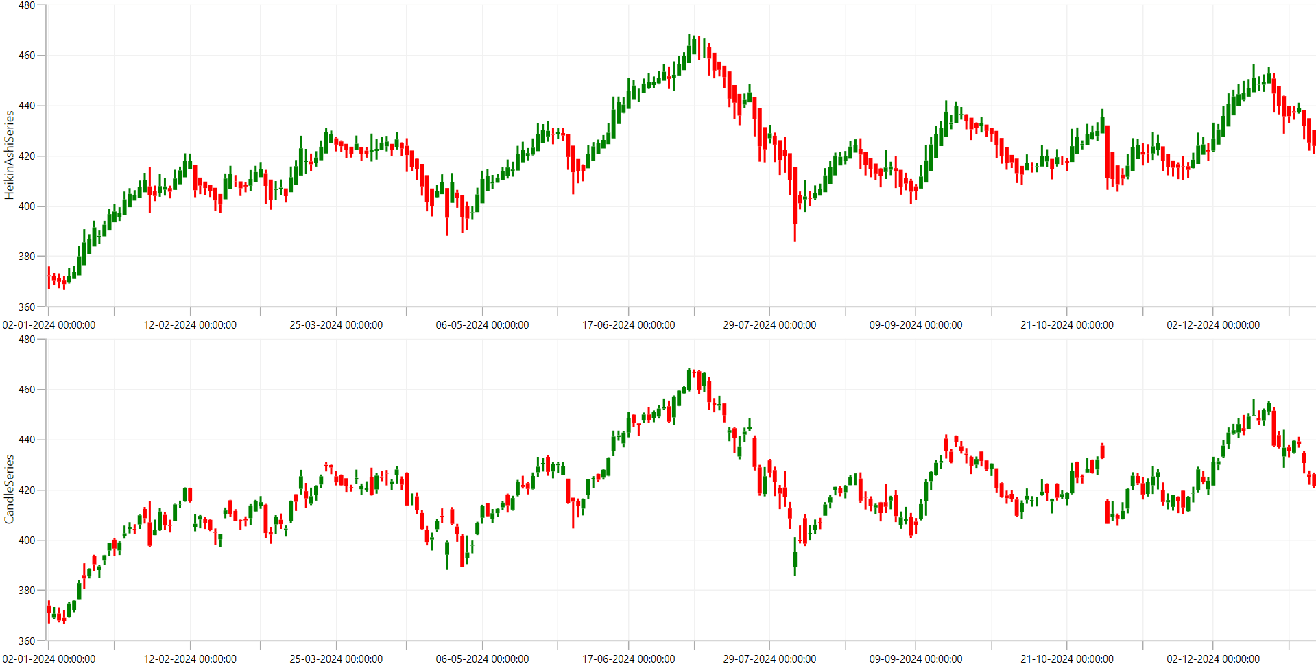
Visualizing stock data using the Heikin-Ashi series and Candlestick series
By comparing both charts, you can see that Heikin-Ashi is useful for trend analysis, while Candlestick charts provide exact price action details.
Step 7: Adding the trackball for interactive data analysis
To enhance the visualization of stock price data, we’ll add and customize the Trackball labels using a TrackballLabelTemplate. This allows for a more structured and visually appealing display of Open, High, Low, and Close values when hovering over the chart.
Defining the custom label template
On the XAML page, we define a DataTemplate to format the trackball labels, as shown in the following code example.
<Grid>
 <Grid.Resources>
  <local:ValueFormatConverter x:Key="valueConverter"/>

  <DataTemplate x:Key="trackballLabelTemplate">
   <Border Background="White" Padding="10" BorderThickness="5"
                    CornerRadius="5" BorderBrush="Gray">
    <Grid>
     <Grid.RowDefinitions>
      <RowDefinition/>
      <RowDefinition/>
      <RowDefinition/>
      <RowDefinition/>
     </Grid.RowDefinitions>

     <Grid.ColumnDefinitions>
      <ColumnDefinition Width="4.5*"/>
      <ColumnDefinition Width="1*"/>
      <ColumnDefinition Width="4.5*"/>
     </Grid.ColumnDefinitions>

     <TextBlock Text="Open" Grid.Row="0" Grid.Column="0"
                FontSize="12" FontWeight="Bold" Foreground="DarkGray"/>
     <TextBlock Text=" : " Grid.Row="0" Grid.Column="1"
                FontSize="12" FontWeight="Bold" Foreground="DarkGray"/>
     <TextBlock Text="{Binding Open, Converter={StaticResource valueConverter}}"
                Grid.Row="0" Grid.Column="2" FontSize="12"
                FontWeight="Bold" Foreground="Black"/>

     <TextBlock Text="Close" Grid.Row="1" Grid.Column="0"
                FontSize="12" FontWeight="Bold" Foreground="DarkGray"/>
     <TextBlock Text=" : " Grid.Row="1" Grid.Column="1"
                FontSize="12" FontWeight="Bold" Foreground="DarkGray"/>
     <TextBlock Text="{Binding Close, Converter={StaticResource valueConverter}}"
                Grid.Row="1" Grid.Column="2" FontSize="12"
                FontWeight="Bold" Foreground="Black"/>

     <TextBlock Text="High" Grid.Row="2" Grid.Column="0"
                FontSize="12" FontWeight="Bold" Foreground="DarkGray"/>
     <TextBlock Text=" : " Grid.Row="2" Grid.Column="1"
                FontSize="12" FontWeight="Bold" Foreground="DarkGray"/>
     <TextBlock Text="{Binding High, Converter={StaticResource valueConverter}}"
                Grid.Row="2" Grid.Column="2" FontSize="12"
                FontWeight="Bold" Foreground="#13FFAA"/>

     <TextBlock Text="Low" Grid.Row="3" Grid.Column="0"
                FontSize="12" FontWeight="Bold" Foreground="DarkGray"/>
     <TextBlock Text=" : " Grid.Row="3" Grid.Column="1"
                FontSize="12" FontWeight="Bold" Foreground="DarkGray"/>
     <TextBlock Text="{Binding Low, Converter={StaticResource valueConverter}}"
                Grid.Row="3" Grid.Column="2" FontSize="12"
                FontWeight="Bold" Foreground="#6F5DE5"/>
    </Grid>
   </Border>
  </DataTemplate>

  <DataTemplate x:Key="axisTrackballTemplate">
   <StackPanel Orientation="Horizontal">
    <TextBlock Text="{Binding ValueX}" Background="White"
               Padding="5" FontWeight="Bold" Foreground="#6F5DE5"/>
   </StackPanel>
  </DataTemplate>

 </Grid.Resources>
</Grid>
Enabling the trackball and applying the custom label template
Now, we’ll configure the ChartTrackballBehavior and set the LabelTemplate to our custom template.
<Grid>

    <chart:SfChart Grid.Row="0" x:Name="heikinAshiChart"
                   MouseMove="heikinAshiChart_MouseMove">

        . . .

        <chart:SfChart.Behaviors>
            <local:TrackballExt/>
        </chart:SfChart.Behaviors>

        <local:HeikinAshiSeries ShowTrackballInfo="True"
                                 TrackBallLabelTemplate="{StaticResource trackballLabelTemplate}"/>

    </chart:SfChart>

    <chart:SfChart Grid.Row="1" x:Name="candleChart"
                   MouseMove="candleChart_MouseMove">

        <chart:SfChart.PrimaryAxis>
            <chart:DateTimeCategoryAxis ShowTrackBallInfo="True"
                                         TrackBallLabelTemplate="{StaticResource axisTrackballTemplate}"/>
        </chart:SfChart.PrimaryAxis>

        . . .

        <chart:SfChart.Behaviors>
            <local:TrackballExt/>
        </chart:SfChart.Behaviors>

        <chart:CandleSeries ShowTrackballInfo="True"
                             TrackBallLabelTemplate="{StaticResource trackballLabelTemplate}"/>

    </chart:SfChart>

</Grid>
Refer to the following image.
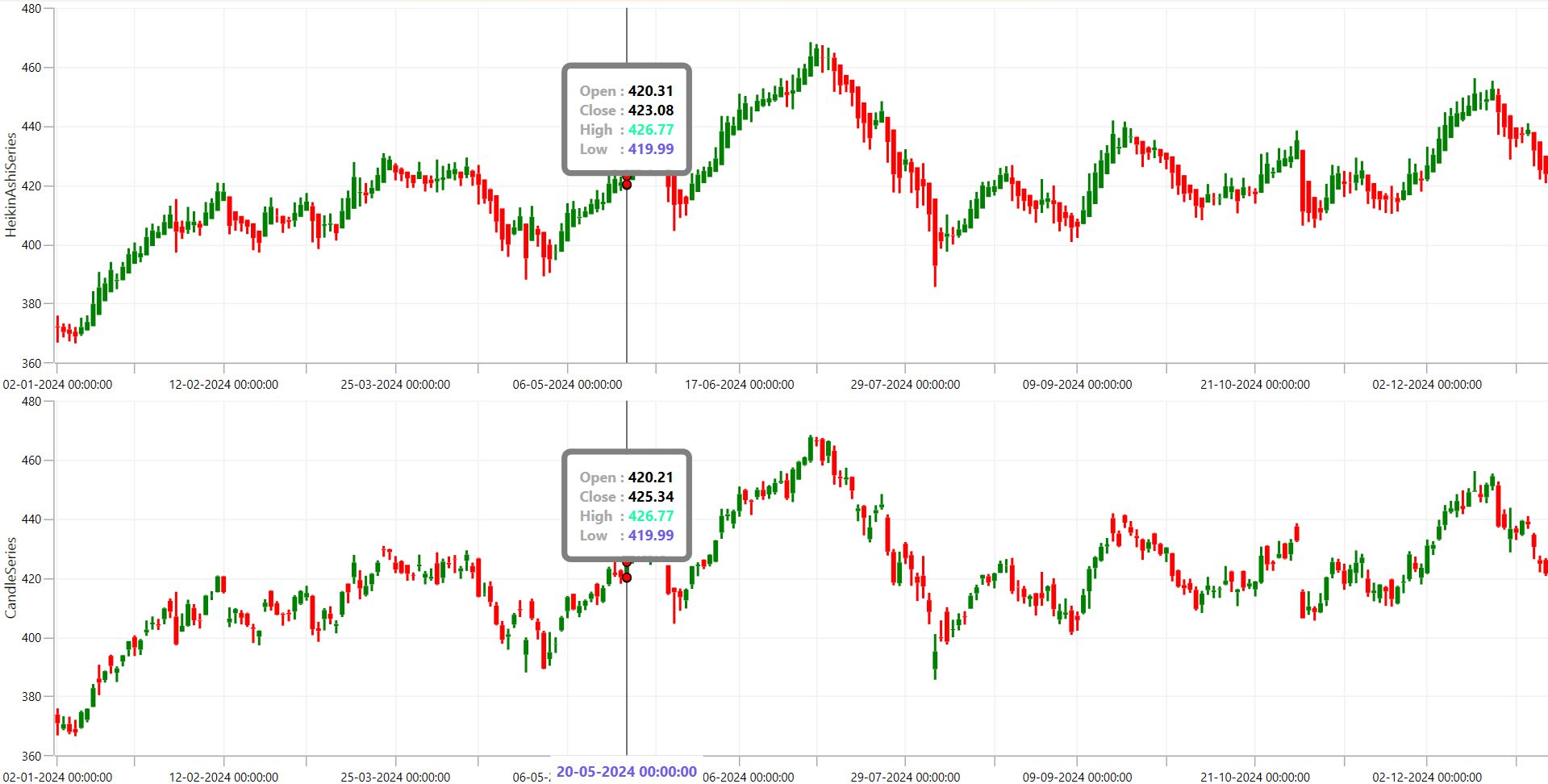
Enabling the trackball and applying the custom label template
With the trackball enabled, you can hover over the chart to see precise price values. This will also help us compare the data representation of the Heikin-Ashi and Candlestick charts.
Step 8: Customizing the chart elements
To further improve our charts’ visual appeal and readability, we’ll customize various chart elements, such as Header, AxisLabelStyle, AxisHeaderStyle, AxisGridLines, and TrackballLineStyle. These enhancements ensure a modern, easy-to-read, and insightful stock analysis visualization.
Enhancing the chart header
We’ve added a title and description to help users understand the purpose of the chart. The title includes a subtle drop shadow effect for better visibility.
<chart:SfChart.Header>
 <Grid>
     . . .

  <Path Margin="0,5,5,0" Stretch="Uniform" RenderTransformOrigin="0.5,0.5"
        Grid.RowSpan="2" Grid.Row="0" Grid.Column="0" VerticalAlignment="Center"
        HorizontalAlignment="Center" Fill="#FFFFFF" Height="35" Width="35"
        Data="M0.58399963,23.402008L7.0410004,23.402008 7.0410004,32 0.58399963,32z
              M8.7159996,19.751007L15.173,19.751007 15.173,32 8.7159996,32z
              M16.848,17.427002L23.304996,17.427002 23.304996,32 16.848,32z
              M24.98,11.451996L31.437,11.451996 31.437,32 24.98,32z
              M22.312,0L30.609997,0 30.609997,8.2969971 27.521999,5.2099915
              18.470997,14.26001 16.849998,15.881989 10.875999,9.9079895
              2.2890015,18.492004 0,16.204987 10.860001,5.3469849
              10.874001,5.3599854 10.888,5.3450012 16.849998,11.306
              25.234997,2.92099z"/>

  <TextBlock Grid.Row="0" Grid.Column="1" FontSize="16" Margin="0,5"
                  Text="Microsoft 2024 Stock Analysis: Heikin-Ashi vs. Traditional Candlestick Chart"
                   Foreground="White">
   <TextBlock.Effect>
    <DropShadowEffect Color="White" Opacity="0.4"/>
   </TextBlock.Effect>
  </TextBlock>

 <TextBlock Grid.Row="1" Grid.Column="1"
                   Text="This chart highlights trend clarity in Heikin-Ashi vs. precise price movements in candlesticks, helping traders analyze Microsoft's 2024 stock trends."
                   Foreground="Gray" FontSize="12"/>

 </Grid>
</chart:SfChart.Header>
Customizing axis styles
We have dark-themed axis labels for better contrast against the chart background.
Primary Axis (DateTimeCategoryAxis): Displays date labels in a user-friendly format (dd-MMM) using the LabelFormat property.
Secondary Axis (NumericalAxis): Adjusted to highlight stock price movements with OpposedPosition, placing it on the right.
<chart:SfChart.PrimaryAxis>
 <chart:DateTimeCategoryAxis LabelFormat="dd-MMM" ShowGridLines="False"
                              EdgeLabelsDrawingMode="Shift">
  <chart:DateTimeCategoryAxis.LabelStyle>
   <chart:LabelStyle Foreground="White" FontSize="12"/>
  </chart:DateTimeCategoryAxis.LabelStyle>
 </chart:DateTimeCategoryAxis>
</chart:SfChart.PrimaryAxis>

<chart:SfChart.SecondaryAxis>
 <chart:NumericalAxis ShowTrackBallInfo="True" OpposedPosition="True"
                       ShowGridLines="False">
  <chart:NumericalAxis.Header>
   <TextBlock Text="HeikinAshiSeries" FontSize="14" Foreground="white"/>
  </chart:NumericalAxis.Header>
  <chart:NumericalAxis.LabelStyle>
   <chart:LabelStyle Foreground="White" FontSize="12" />
  </chart:NumericalAxis.LabelStyle>
 </chart:NumericalAxis>
</chart:SfChart.SecondaryAxis>
Styling the Heikin-Ashi and Candlestick series
Each chart type is customized with distinct colors and improved readability.
HeikinAshiSeries: Uses custom bullish (#13FFAA) and bearish (#6F5DE5) colours with the BullFillColor and BearFillColor properties, respectively.
CandleSeries : Follows the same color scheme for consistency.
<Grid>

 <chart:SfChart Grid.Row="0" x:Name="heikinAshiChart">
     . . .
  <local:HeikinAshiSeries HeikinAshiItemsSource="{Binding MsftData}" XBindingPath="Date"
                           Open="Open" High="High" Low="Low" Close="Close"
                           BullFillColor="#13FFAA" BearFillColor="#6F5DE5" >
  </local:HeikinAshiSeries>
 </chart:SfChart>

 <chart:SfChart Grid.Row="1" x:Name="candleChart">
     . . .
  <chart:CandleSeries ItemsSource="{Binding MsftData}" XBindingPath="Date"
                       Open="Open" High="High" Low="Low" Close="Close"
                       BullFillColor="#13FFAA" BearFillColor="#6F5DE5"/>
  </chart:SfChart>

</Grid>
With these implementations, we will get the output that resembles the following image.
Visualizing stock market trends using WPF Heikin-Ashi and Candlestick charts
GitHub reference
For more details, refer to the project on Visualize stock market Trends with WPF Heikin-Ashi and Candlestick Charts GitHub demo.
Conclusion
Thanks for reading! In this blog, we have seen how to create a HeikinAshi Chart to visualize Microsoft’s 2024 Stock Price using the Syncfusion WPF Charts. We also compared it with the traditional candlestick chart to understand the differences in trend visualization and market analysis. We strongly encourage you to follow the steps discussed in this blog and share your thoughts in the comments below.
If you require any assistance, you can contact us through our support forums, support portal or feedback portal. We are always happy to assist you!
See you in our next blog!
Related Blogs
Subscribe to my newsletter
Read articles from syncfusion directly inside your inbox. Subscribe to the newsletter, and don't miss out.
Written by
syncfusion
syncfusion
Syncfusion provides third-party UI components for React, Vue, Angular, JavaScript, Blazor, .NET MAUI, ASP.NET MVC, Core, WinForms, WPF, UWP and Xamarin.