Blazor Upgrade: Syncfusion’s New SpeechToText Component
 syncfusion
TL;DR: Let’s explore the new Blazor SpeechToText component from the 2025 Volume 1 release. It converts spoken words into text using the Web Speech Recognition API with support for real-time transcription, multi-language input, and UI customization. Key features include interim result handling, tooltip guidance, and listening state indicators. Ideal for voice assistants, language learning apps, and transcription tools.
We’re happy to share that we have launched the new Syncfusion Blazor SpeechToText component in our 2025 Volume 1 release. This component leverages the Web Speech Recognition API to transform spoken words into text in real time, offering seamless integration for developers aiming to build voice-activated apps.
With features like multi-language support, pre-defined styles, tooltips, and customizable UI, the Blazor SpeechToText component is a versatile tool for enhancing user experience. Whether you’re developing an accessibility tool, a voice-driven app, or an interactive user interface, it is versatile enough to suit various use cases.
Refer to the following image.
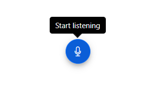
Blazor SpeechToText component
Use cases
The Blazor SpeechToText component is ideal for numerous apps:
Language learning apps: Help users practice pronunciation and improve language skills by providing real-time feedback on spoken words and phrases.
Voice-activated assistants: Enable voice commands in apps, facilitating hands-free interaction and operation.
Real-time transcription services: Implement live transcription for events, lectures, or note-taking apps, catering to diverse audiences.
Interactive customer service: Enhance customer interaction platforms by transcribing audio inquiries into text for accurate service delivery.
Key features
The key features of the Blazor SpeechToText component are as follows:
Real-time text conversion
With this feature, you can instantly transcribe spoken language into text in real-time, supporting both interim and final results for seamless transcription.
Look at the following example. It captures spoken words and displays the transcribed text in a text area using the Transcript property.
@using Syncfusion.Blazor.Inputs

<div class="speechtext-container">
 <SfSpeechToText @bind-Transcript="@transcript"></SfSpeechToText>
 <SfTextArea RowCount="5" ColumnCount="50" @bind-Value="@transcript" ResizeMode="Resize.None" Placeholder="Transcribed text will be shown here..."></SfTextArea>
</div>

<style>
 .speechtext-container {
     margin: 50px auto;
     gap: 20px;
     display: flex;
     flex-direction: column;
     align-items: center;
 }
</style>

@code {
    string transcript = "";
}
Refer to the following output image.
Real-time text conversion feature in Blazor SpeechToText component
Speech recognition with interim results
Interim results offer live feedback when the user speaks, displaying temporary transcriptions before the final text is confirmed. You can display either the temporary or final transcription using the AllowInterimResults property.
In the following code example, we used the AllowInterimResults property to display only the final transcription after completing the speech.
@using Syncfusion.Blazor.Inputs

<div class="speechtext-container">
 <SfSpeechToText @bind-Transcript="@transcript" AllowInterimResults="false"></SfSpeechToText>
 <SfTextArea RowCount="5" ColumnCount="50" @bind-Value="@transcript" ResizeMode="Resize.None" Placeholder="Transcribed text will be shown here..."></SfTextArea>
</div>
<style>

    .speechtext-container {
        margin: 50px auto;
        gap: 20px;
        display: flex;
        flex-direction: column;
        align-items: center;
    }
</style>
@code {
    string transcript = "";
}
Refer to the following output image.
Speech recognition with interim results feature in Blazor SpeechToText component
Listening state management
The Blazor SpeechToText component manages different listening states: Inactive, Listening, and Stopped, providing users with visual cues about the current state of speech recognition.
Inactive: Idle state with no active speech recognition.
Listening: Captures and transcribes speech, indicated by a stop icon and blinking animation.
Stopped: Recognition ends, displaying the final transcript.
Refer to the following code example.
@using Syncfusion.Blazor.Inputs
@using Syncfusion.Blazor.Inputs

<div class="listening-states-container">
 <SfSpeechToText @bind-Transcript="@transcript"
                 SpeechRecognitionStarted="OnSpeechRecognitionStarted"
                 SpeechRecognitionStopped="OnSpeechRecognitionStopped">
 </SfSpeechToText>
 <div class="state-indicator @GetStatusClass()">
  <span>Status: <strong>@listeningState</strong></span>
 </div>
</div>
<style>
    .listening-states-container {
        width: 80%;
        margin: 0 auto;
        text-align: center;
        display: flex;
        flex-direction: column;
        align-items: center;
    }

    .state-indicator {
        margin-bottom: 20px;
        padding: 10px;
        border-radius: 5px;
        font-weight: bold;
    }

    .state-indicator.inactive {
        background-color: #f8f9fa;
        color: #6c757d;
    }

    .state-indicator.listening {
        background-color: #d1e7dd;
        color: #0f5132;
    }

    .state-indicator.stopped {
        background-color: #f8d7da;
        color: #842029;
    }
</style>
@code {
    private string transcript = "";
    private SpeechToTextState listeningState = SpeechToTextState.Inactive;
    private void OnSpeechRecognitionStarted(SpeechRecognitionStartedEventArgs args)
    {
        listeningState = args.State;
    }
    private void OnSpeechRecognitionStopped(SpeechRecognitionStoppedEventArgs args)
    {
        listeningState = args.State;
    }
    private void UpdateListeningState(SpeechToTextState state)
    {
        listeningState = state;
    }

    private string GetStatusClass()
    {
        return listeningState switch
        {
            SpeechToTextState.Listening => "listening",
            SpeechToTextState.Stopped => "stopped",
            _ => "inactive"
        };
    }
}
Refer to the following output image.
Listening state management feature in Blazor SpeechToText component
Multi-language support
This component supports multiple languages, allowing users to transcribe speech in their preferred language, enhancing app versatility across different regions and cultures.
The following example demonstrates setting the language to French for speech-to-text conversion using the Language property.
@using Syncfusion.Blazor.Inputs
<div class="speechtext-container">
 <SfSpeechToText Language="fr-FR" @bind-Transcript="@transcript">
 </SfSpeechToText>
 <SfTextArea RowCount="5" ColumnCount="50" @bind-Value="@transcript" ResizeMode="Resize.None" Placeholder="Transcribed text will be shown here..."></SfTextArea>
</div>

<style>
    .speechtext-container {
        margin: 50px auto;
        gap: 20px;
        display: flex;
        flex-direction: column;
        align-items: center;
    }
</style>

@code {
    string transcript = "";
}
Refer to the following output image.
Multi-language support feature in Blazor SpeechToText component
<a name="Tooltips>Tooltips for improved guidance
The tooltips help us display information when hovering over the speech-to-text button. Users can configure tooltips to display custom messages for the start and stop listening states.
The following example demonstrates how to customize the tooltip using the TooltipSettings property.
@using Syncfusion.Blazor.Inputs

<div class="speechtext-container">
 <SfSpeechToText TooltipSettings="@tooltipSettings" @bind-Transcript="@transcript"></SfSpeechToText>
</div>
@code {
    string transcript = "";
    SpeechToTextTooltipSettings tooltipSettings = new SpeechToTextTooltipSettings()
    {
        Position = TooltipPosition.BottomCenter,
        Text = "Click the button to start speech recognition",
        StopStateText = "Click the button to stop speech recognition"
    };
}
<style>
    .speechtext-container {
        margin: 50px auto;
        gap: 20px;
        display: flex;
        flex-direction: column;
        align-items: center;
    }
</style>
Refer to the following output image.

Tooltips feature in Blazor SpeechToText component
Flexible button customization
The component supports icon-only buttons as well as buttons with text and icons, which can be positioned to the left, right, bottom, or center of the text.
The following example demonstrates how to customize the button using the ButtonSettings property.
@using Syncfusion.Blazor.Inputs
@using Syncfusion.Blazor.Buttons
<div class="button-customization-container">
 <SfSpeechToText ButtonSettings="@buttonSettings" @bind-Transcript="@transcript"></SfSpeechToText>
 <SfTextArea RowCount="5" ColumnCount="50"
                @bind-Value="@transcript"
                ResizeMode="Resize.None"
                Placeholder="Transcribed text will appear here...">
 </SfTextArea>
</div>
<style>
    .button-customization-container {
        width: 70%;
        margin: auto;
        display: flex;
        flex-direction: column;
        align-items: center;
        gap: 20px;
    }
</style>
@code {
    string transcript = "";
    SpeechToTextButtonSettings buttonSettings = new SpeechToTextButtonSettings()
        {
            Text = "Start Listening",
            StopStateText = "Stop Listening",
            IconCss = "e-icons e-play",
            StopIconCss = "e-icons e-pause",
            IconPosition = IconPosition.Right,
            IsPrimary = true
        };
}
Refer to the following output image.
Customizing buttons in Blazor SpeechToText component
Pre-defined button styles
The component offers pre-defined button styles, including Primary, Secondary, Outline, Flat, etc. These styles can be applied to match different app themes and use cases.
The following example demonstrates how to customize the button style using the CssClass property.
@using Syncfusion.Blazor.Inputs
<div class="predefined-styles-container">
 <div class="button-style-group">
  <div class="button-with-label">
   <label>Primary</label>
   <SfSpeechToText CssClass="e-primary"></SfSpeechToText>
  </div>
  <div class="button-with-label">
   <label>Secondary</label>
   <SfSpeechToText CssClass="e-secondary"></SfSpeechToText>
  </div>
  <div class="button-with-label">
   <label>Outline</label>
   <SfSpeechToText CssClass="e-outline"></SfSpeechToText>
  </div>
  <div class="button-with-label">
   <label>Flat</label>
   <SfSpeechToText CssClass="e-flat"></SfSpeechToText>
  </div>
 </div>
</div>
<style>
    .predefined-styles-container {
        width: 80%;
        margin: auto;
        text-align: center;
        display: flex;
        flex-direction: column;
        align-items: center;
        gap: 25px;
    }
    .button-style-group {
        display: grid;
        grid-template-columns: repeat(2, auto);
        gap: 25px;
        justify-content: center;
    }
    .button-with-label {
        display: flex;
        flex-direction: column;
        align-items: center;
        gap: 8px;
    }
    .button-with-label label {
        font-weight: 600;
        font-size: 1rem;
        color: #333;
    }
</style>
Refer to the following output image.
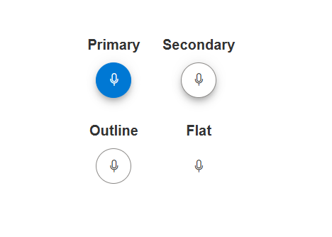
Pre-defined button styles in Blazor SpeechToText component
References
For more details, refer to the Blazor SpeechToText component demos and documentation.
Supported platforms
The SpeechToText component is also available on the following platforms.
Conclusion
Thank you for reading! In this blog, we’ve covered the key features of the new Syncfusion Blazor SpeechToText component, designed to enhance voice-enabled apps. With features like real-time transcription, multi-language support, and customizable UI options, this component is designed to improve user interaction and accessibility across diverse apps.
For more details, check out the Release Notes and What’s New pages for our 2025 Volume 1 release. We encourage you to try the Blazor SpeechToText component and share your feedback in the comments.
If you need assistance, feel free to reach out via our support forum, support portal, or feedback portal. Our team is always happy to help you!
Related Blogs
Subscribe to my newsletter
Read articles from syncfusion directly inside your inbox. Subscribe to the newsletter, and don't miss out.
Written by
syncfusion
syncfusion
Syncfusion provides third-party UI components for React, Vue, Angular, JavaScript, Blazor, .NET MAUI, ASP.NET MVC, Core, WinForms, WPF, UWP and Xamarin.