2025 Volume 1: Must-Know Updates in the Syncfusion Diagram Component
 syncfusion
TL;DR: The latest Syncfusion Diagram update enhances JavaScript, Blazor, and WPF with better usability and flexibility. Highlights include improved connector routing, container support, UML sequence diagrams via Mermaid syntax, and smoother performance. Try it now!
As we all know, the Syncfusion Essential Studio 2025 Volume 1 has been released with many new features and controls across all platforms!
In this release, the Diagram Library introduces several powerful enhancements and new features across JavaScript, Blazor, and WPF platforms. These updates are designed to improve usability, flexibility, and the overall diagramming experience.
Let’s explore them in detail!
JavaScript
The new features introduced in the JavaScript Diagram Library are as follows:
Enhanced connector routing algorithm
This feature ensures that connectors adjust dynamically to avoid overlapping with neighboring connectors, maintaining a clear and organized diagram. Automatically updating the connector geometry eliminates visual clutter and enhances the readability of connection paths, resulting in a more structured and comprehensible diagram.
To enable this feature, inject both the LineRouting and AvoidLineOverlapping modules and add LineRouting and AvoidLineOverlapping constraints to the diagram constraints.
The following example demonstrates how to enable the AvoidLineOverlapping feature in the diagram.
/**
 * Injecting the line routing and avoid line overlapping module.
 */
ej.diagrams.Diagram.Inject(ej.diagrams.LineRouting, ej.diagrams.AvoidLineOverlapping);

/**
 * Initialize the Diagram
 */
   var diagram = new ej.diagrams.Diagram({
         //Add line routing and avoid line overlapping constraints in the diagram.
        constraints: ej.diagrams.DiagramConstraints.Default |
                    ej.diagrams.DiagramConstraints.LineRouting |
                    ej.diagrams.DiagramConstraints.AvoidLineOverlapping
    });
    diagram.appendTo('#diagram');
Refer to the following image.
Enabling the AvoidLineOverlapping feature in the JavaScript Diagram Library
Layout updated event
The layoutUpdated event is triggered when the layout rendering process in the diagram starts or is complete. This event allows users to track its state.
The following code example explains the layout updated event in the diagram.
var diagram = new ej.diagrams.Diagram({
    width: '100%',
    height: '550px',
    layout: {
        type: 'HierarchicalTree',
    },
    dataSourceSettings: {
        id: 'Name',
        parentId: 'ReportingPerson',
        dataManager: items,
    },
    layoutUpdated: function (args) {
        if (args.state === 'Started') {
            console.log('Layout started rendering');
        }
    }
});
diagram.appendTo('#element');
Selection change event enhancement
The selectionChange event is triggered when an annotation of a node or connector is selected in the diagram.
You can prevent selection by setting the cancel property of SelectionChangeEventArgs to true, as shown in the following code example.
selectionChange: function (args) {
    if (args.state === 'Changing') {
        // Prevents selection
        args.cancel = true;
    }
}
Blazor
The Blazor Diagram Library delivers the following new features:
Container support
This feature allows users to group multiple nodes and connectors, providing a structured layout to manage complex diagrams. Containers support dragging, resizing, and customization, including headers and text styling. They help maintain an organized layout without permanently merging elements, making them ideal for workflows, BPMN diagrams, and system designs. Effortlessly manage grouped elements while ensuring clarity and flexibility in your diagrams.
A container can be created and added to the diagram, either programmatically or interactively. To create a container, you have to define the container object and add it to the Nodes collection of the diagram.
The following code example illustrates how to create a container node.
@using Syncfusion.Blazor.Diagram

<SfDiagramComponent @ref="@diagram" Height="600px" Nodes="@nodes">
</SfDiagramComponent>

@code {
    public SfDiagramComponent diagram;

    // Initialize the node collection
    DiagramObjectCollection<Node> nodes = new DiagramObjectCollection<Node>();

    protected override void OnInitialized() {
        // Create container
        Container container = new Container() {
            ID = "container",
            Height = 300,
            Width = 500,
            OffsetX = 500,
            OffsetY = 300
        };
        nodes.Add(container);
    }
}
Adding children to a container
To add child elements to a container, define the child nodes and assign their IDs to the container’s Children property. When child nodes are added to a container, they become part of its structure while remaining individually editable.
The following code example illustrates how to create a container with children.
@using Syncfusion.Blazor.Diagram

<SfDiagramComponent @ref="@diagram" Height="600px" Nodes="@nodes">
</SfDiagramComponent>

@code {
    public SfDiagramComponent diagram;

    // Initialize the node collection
    DiagramObjectCollection<Node> nodes = new DiagramObjectCollection<Node>();

    protected override void OnInitialized() {
        Node node1 = new Node() {
            ID = "node1",
            Height = 60,
            Width = 100,
            OffsetX = 400,
            OffsetY = 300,
            Annotations = new DiagramObjectCollection<ShapeAnnotation>() {
                new ShapeAnnotation() { Content = "Process" }
            }
        };

        Node node2 = new Node() {
            ID = "node2",
            Height = 60,
            Width = 100,
            OffsetX = 600,
            OffsetY = 300,
            Annotations = new DiagramObjectCollection<ShapeAnnotation>() {
                new ShapeAnnotation() { Content = "Process" }
            }
        };

        Container container = new Container() {
            ID = "container",
            Height = 300,
            Width = 500,
            OffsetX = 500,
            OffsetY = 300,
            Children = new string[] { "node1", "node2" }
        };

        nodes.Add(node1);
        nodes.Add(node2);
        nodes.Add(container);
    }
}
Container header
Through the Header property, we can add descriptive text to a container to identify its purpose or contents. This feature enhances diagram readability by providing clear labels for grouped elements. The header’s visual presentation is fully customizable using the Style property.
The following code example explains how to define a container header and its customization.
@using Syncfusion.Blazor.Diagram
<SfDiagramComponent @ref="@diagram" Height="600px" Nodes="@nodes">
</SfDiagramComponent>
@code
{
    public SfDiagramComponent diagram;
    // Initialize the node collection
    DiagramObjectCollection<Node> nodes = new DiagramObjectCollection<Node>();

    protected override void OnInitialized()
    {
        Node node1 = new Node()
        {
            ID = "node1",
            Height = 60,
            Width = 100,
            OffsetX = 400,
            OffsetY = 300,
            Style = new ShapeStyle()
            {
                Fill = "CornflowerBlue",
            }
        };

        Node node2 = new Node()
        {
            ID = "node2",
            Height = 60,
            Width = 100,
            OffsetX = 600,
            OffsetY = 300,
            Style = new ShapeStyle()
            {
                Fill = "CornflowerBlue",
            }
        };

        Container container = new Container()
        {
            ID = "container",
            Header = new ContainerHeader()
            {
                ID = "containerHeader",
                Height = 40,
                Annotation = new ShapeAnnotation()
                {
                    Content = "Container Title",
                    Style = new TextStyle()
                    {
                        FontSize = 18,
                        Bold = true,
                        Color = "#343434"
                    }
                },
                Style = new TextStyle()
                {
                    Fill = "CornflowerBlue"
                }
            },
            Height = 300,
            Width = 500,
            OffsetX = 500,
            OffsetY = 300,
            Children = new string[] { "node1", "node2" }
        };

        nodes.Add(node1);
        nodes.Add(node2);
        nodes.Add(container);
    }
}
Refer to the following image.
Defining and customizing container header in Blazor Diagram Library
Highlight multiple selection
This feature improves the visibility of selected diagram elements by rendering a highlighted border around them during multiple selections. The first selected element stands out with a border that is twice as thick as the others, making it easier to identify and manage selections effectively.
During Rubber band selection, the first added diagram element will be highlighted with a 2px stroke width, while other selected elements will have a 1px stroke width. In Ctrl+Click action, the first selected element will have a 2px stroke width, while other selected elements will have a 1px stroke width.
Refer to the following image.
Highlighting multiple selection feature in Blazor Diagram Library
Toggle selection for diagram elements
By clicking on diagram elements, including nodes, connectors, groups, and swimlanes, at runtime, we can toggle their selection state. If an element is already selected, clicking it again will unselect it, enhancing interaction flexibility.
The canToggleSelection property in DiagramSelectionSettings determines whether the selection state of a diagram element should be toggled with a mouse click at runtime. By default, this property is set to false.
Refer to the following code example.
@using Syncfusion.Blazor.Diagram

<SfDiagramComponent Height="600px" Nodes="@nodes" SelectionSettings="@selectionSettings" />

@code
{
    DiagramObjectCollection<Node> nodes;
    DiagramSelectionSettings selectionSettings = new DiagramSelectionSettings()
    {
        CanToggleSelection = true
    };

    protected override void OnInitialized()
    {
        nodes = new DiagramObjectCollection<Node>();
        Node node = new Node()
        {
            ID = "node1",
            OffsetX = 250,
            OffsetY = 250,
            Width = 100,
            Height = 100,
            Style = new ShapeStyle()
            {
                Fill = "#6495ED",
                StrokeColor = "white"
            }
        };
        nodes.Add(node);
    }
}
Control annotation rotation
By default, annotations rotate along with the node when the rotator thumb is used. This feature introduces an option to keep annotations fixed to the page or rotate them along with the node, providing greater flexibility in diagram customization. The RotationReference property of an annotation allows you to control whether the text should rotate relative to its parent node or the Page.
The following code examples illustrate how to configure RotationReference for an annotation.
@using Syncfusion.Blazor.Diagram
<SfDiagramComponent Height="600px" Nodes="@nodes" />
@code
{
    // Defines diagram's node collection.
    DiagramObjectCollection<Node> nodes;
    protected override void OnInitialized()
    {
        nodes = new DiagramObjectCollection<Node>();

        Node node1 = new Node()
        {
            ID = "node1",
            Width = 100,
            Height = 100,
            OffsetX = 100,
            OffsetY = 100,
            Annotations = new DiagramObjectCollection<ShapeAnnotation>()
            {
                new ShapeAnnotation
                {
                    Content = "Node1",
                    RotationReference = AnnotationRotationReference.Parent,
                }
            },
        };

        Node node2 = new Node()
        {
            ID = "node2",
            Width = 100,
            Height = 100,
            OffsetX = 100,
            OffsetY = 100,
            Annotations = new DiagramObjectCollection<ShapeAnnotation>()
            {
                new ShapeAnnotation
                {
                    Content = "Node2",
                    RotationReference = AnnotationRotationReference.Page,
                }
            },
        };

        nodes.Add(node1);
        nodes.Add(node2);
    }
}
The following table illustrates the output for each rotation reference value:
| Value | Description | Output |
| Page | When this option is set, the annotation remains fixed in its original orientation, even if its parent node is rotated. | |
| Parent | In this case, the annotation rotates along with its parent node. |
Performance improvement
The Blazor Diagram component now renders significantly faster while initially loading with nodes containing annotations and connectors. The following benchmarks show the performance improvement percentages for various quantities of nodes, connectors, and annotations.
| Environment | Scenario | Performance improvement |
| Server | 1,000 nodes, 1,000 connectors, 1,000 annotations | 60% faster |
| 5,000 nodes, 5,000 connectors, 5,000 annotations | 75% faster | |
| 10,000 nodes, 10,000 connectors, 10,000 annotations | 86.6% faster | |
| WebAssembly (WASM) | 1,000 nodes, 1,000 connectors, 1,000 annotations | 31.2% faster |
| 5,000 nodes, 5,000 connectors, 5,000 annotations | 85.3% faster | |
| 10,000 nodes, 10,000 connectors, 10,000 annotations | 74.1% faster |
## WPF
The WPF Diagram Library is rolled out with the following user-friendly features:
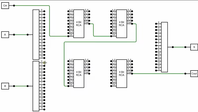
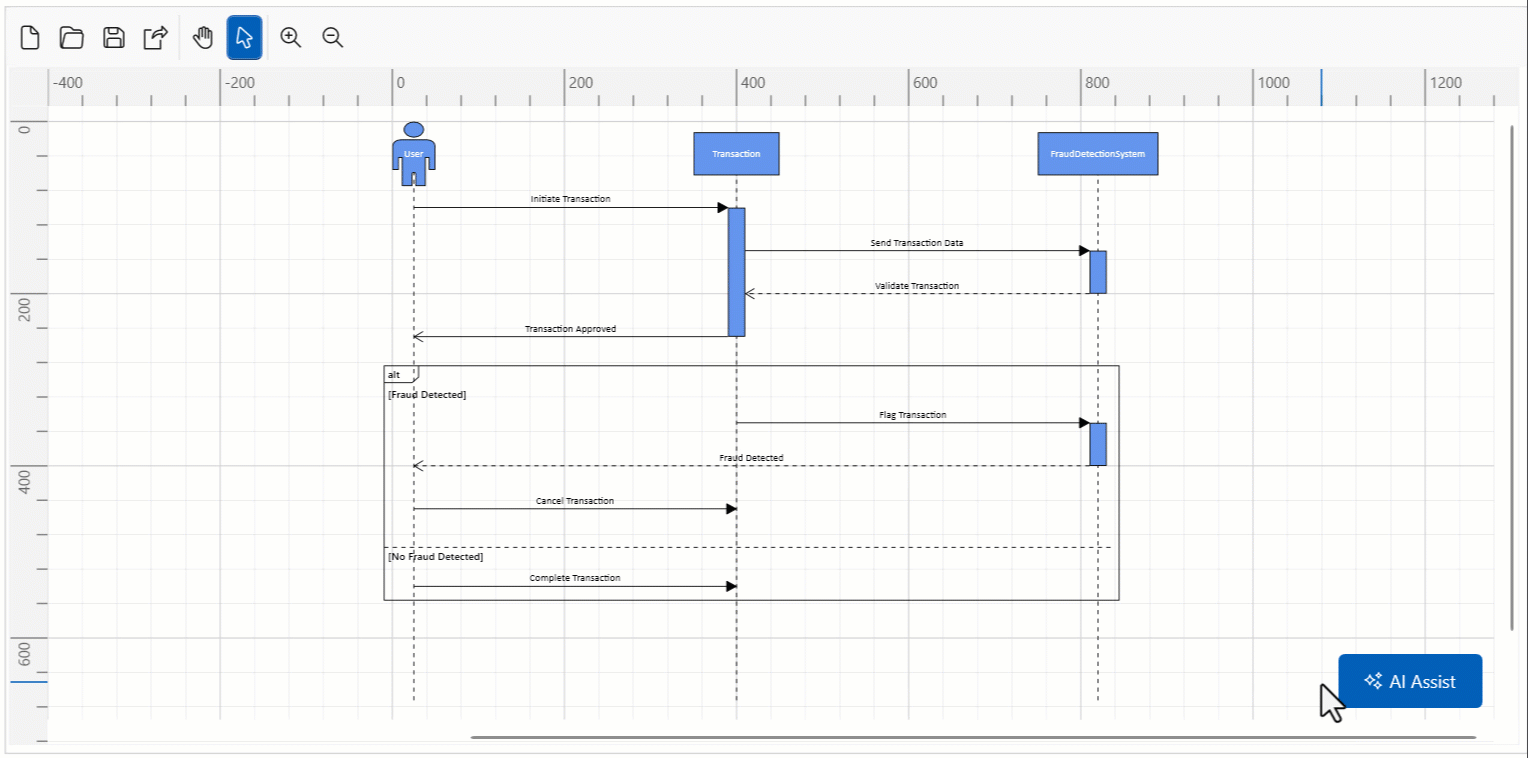
Automatic generation of UML sequence diagrams from model data
The UML sequence diagram visually represents how a set of objects interact in a process over time. This feature easily generates these diagrams automatically from model data, streamlining the visualization of interactions between objects in a system. It dynamically creates an actor/object with lifelines, messages, and activation boxes based on the provided data, reducing manual effort and ensuring accuracy.
The following code example illustrates how to create a simple UML sequence diagram using model data.
// Initialize the SfDiagram
SfDiagram Diagram = new SfDiagram();

// Initialize the model for a sequence diagram
Diagram.Model = new UMLSequenceDiagramModel()
{
    SpaceBetweenParticipants = 120,
    Participants = new ParticipantCollection
    {
        new UMLSequenceParticipant
        {
            ID = "User",
            Content = "User",
            IsActor = true
        },
        new UMLSequenceParticipant
        {
            ID = "System",
            Content = "System",
            IsActor = false
        }
    },
    Messages = new MessageCollection
    {
        new UMLSequenceMessage
        {
            ID = "MSG1",
            Content = "Login Request",
            FromParticipantID = "User",
            ToParticipantID = "System",
            Type = UMLSequenceMessageType.Synchronous
        },
        new UMLSequenceMessage
        {
            ID = "MSG2",
            Content = "Login Response",
            FromParticipantID = "System",
            ToParticipantID = "User",
            Type = UMLSequenceMessageType.Reply
        }
    }
};
Refer to the following image.
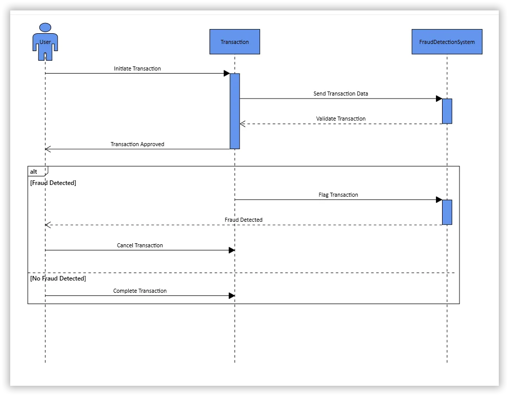
Creating UML sequence diagram using model data in WPF Diagram Library
Import and export UML sequence diagrams in Mermaid-syntax
The Mermaid’s syntax is a markdown-inspired text-based language designed to define diagrams through simple, readable commands. This feature allows users to create UML sequence diagrams from Mermaid syntax and export them back.
Key features
Create UML sequence diagrams from Mermaid syntax: Easily visualize complex ideas and workflows directly from the text, eliminating the need to draw each element manually.
Export diagrams to Mermaid syntax: You can share, edit, and reuse your diagrams across various platforms by exporting them to Mermaid format.
How do you use Mermaid syntax in the WPF Diagram?
You can access this functionality through the following methods in the WPF Diagram:
1. SaveDiagramAsMermaid
The SaveDiagramAsMermaid() method converts the current diagram into Mermaid’s text format for easy sharing. Refer to the following code example.
// Initialize the SfDiagram
SfDiagram Diagram = new SfDiagram();

// Initialize the model for a sequence diagram
Diagram.Model = new UMLSequenceDiagramModel()
{
    SpaceBetweenParticipants = 120,
    Participants = new ParticipantCollection
    {
        new UMLSequenceParticipant
        {
            ID = "User",
            Content = "User",
            IsActor = true
        },
        new UMLSequenceParticipant
        {
            ID = "System",
            Content = "System",
            IsActor = false
        }
    },
    Messages = new MessageCollection
    {
        new UMLSequenceMessage
        {
            ID = "MSG1",
            Content = "Login Request",
            FromParticipantID = "User",
            ToParticipantID = "System",
            Type = UMLSequenceMessageType.Synchronous
        },
        new UMLSequenceMessage
        {
            ID = "MSG2",
            Content = "Login Response",
            FromParticipantID = "System",
            ToParticipantID = "User",
            Type = UMLSequenceMessageType.Reply
        }
    }
};

// Save diagram as Mermaid syntax
String mermaidText = Diagram.SaveDiagramAsMermaid();
2. LoadDiagramFromMermaid
The LoadDiagramFromMermaid method generates a diagram from Mermaid’s text data, automatically creating the necessary nodes and connectors.
The following code example demonstrates how to load a diagram using Mermaid’s text data.
// Initialize the SfDiagram
SfDiagram Diagram = new SfDiagram();

// Initialize the model for a sequence diagram
Diagram.Model = new UMLSequenceDiagramModel()
{
    SpaceBetweenParticipants = 300,
};

// Load the diagram using the Mermaid text
Diagram.LoadDiagramFromMermaid(mermaidData);
Users can also use AI assistants to generate Mermaid syntax for these diagrams and directly import it into the WPF Diagram component.
Loading a diagram using Mermaid’s text data with AI assistant in WPF Diagram
This functionality not only streamlines diagram creation but also enhances collaboration by using a widely recognized syntax format.
Stencil serialization enhancement
In Stencil, the DataContractSerializer serializes symbols and their properties into an XML file. The following stencil properties are included in the serialization process, ensuring that the stencil settings can be restored regardless of its current visibility:
Constraints
SymbolGroupDisplayMode
ExpandMode
DisplayMode
SymbolsDisplayMode
ShowSearchTextBox
GroupMappingName
Title
BorderBrush
BorderThickness
ShowDisplayModeToggleButton
SymbolSelectionMode
By default, when deserializing a stencil, symbols and their properties are loaded from the saved stream. To restore the previously saved stencil settings, pass true as the second argument of the Load method. This ensures that the stencil settings are deserialized and applied, regardless of their current visibility.
The following code example demonstrates how to load a stencil with its saved settings.
// Load from saved XAML file
OpenFileDialog dialog = new OpenFileDialog();
if (dialog.ShowDialog() == true)
{
    using (Stream myStream = dialog.OpenFile())
    {
        stencil.Load(myStream, true);
    }
}

// Load from saved memory stream
myStream.Position = 0;
stencil.Load(myStream, true);
Conclusion
Thank you for reading! In this blog, we’ve explored the latest updates to the Syncfusion Diagram component in the 2025 Volume 1 release. With these features, users can create more efficient and structured diagrams. For a complete overview of all the new features in this release, check out our Release Notes and What’s New pages. Try these features, and don’t forget to share your thoughts in the comments!
If you’re an existing Syncfusion user, you can download the latest version of Essential Studio® from the License and Downloads page. For those new to Syncfusion, we offer a 30-day free trial so you can experience these exciting features firsthand.
Need help? Feel free to reach out via our support forum, support portal, or feedback portal. We’re always here to assist you!
Related Blogs
Subscribe to my newsletter
Read articles from syncfusion directly inside your inbox. Subscribe to the newsletter, and don't miss out.
Written by
syncfusion
syncfusion
Syncfusion provides third-party UI components for React, Vue, Angular, JavaScript, Blazor, .NET MAUI, ASP.NET MVC, Core, WinForms, WPF, UWP and Xamarin.