🍔 The Psychology Behind McDonald’s $2 Billion Self-Serve Kiosks
 Gauri Sharma
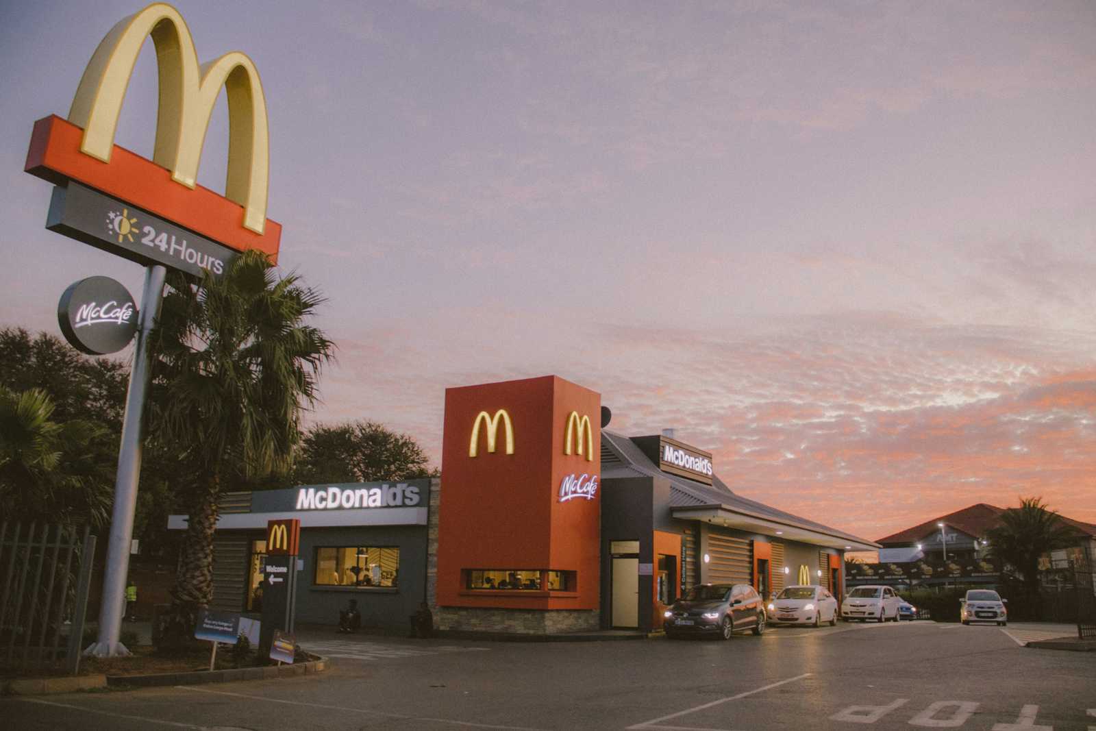
A Deep Dive into UI/UX, Consumer Behavior & Fast-Food Psychology
In 2020, McDonald’s invested over $2 billion into self-service kiosks across thousands of locations. What might seem like a tech upgrade is, in fact, a brilliant masterclass in psychological manipulation and user-centered design. Behind the touchscreen glows a powerful blend of behavioral science, UI/UX strategy, and subtle persuasion techniques.
Let’s break down what’s really happening when you order that extra side of fries.
🔑 Key Takeaways
McDonald's self-service kiosks are designed to nudge you into spending more.
The UI/UX emphasizes visual hierarchy, ease, and impulse design.
Anchoring, upselling, and choice architecture are used masterfully.
It’s less about convenience and more about maximizing AOV (Average Order Value).
These kiosks play on cognitive biases, reducing social pressure and increasing indulgence.
1. 🧠 The Power of Psychological Nudges
Humans are irrational decision-makers. McDonald's kiosks use behavioral economics to their advantage:
Default choices (like medium-sized meals) encourage higher spending.
Limited-time deals at the top of the screen create FOMO and urgency.
Personalization based on past orders subtly encourages brand loyalty.
“When there’s no cashier watching, people are more likely to order indulgent items.”
— Behavioral Economist Insight
2. 🎨 UI/UX Design: Built to Convert
The UX isn’t just intuitive—it’s optimized for micro-decisions and habit-forming behavior.
🟢 What They Do Right:
Large product images trigger dopamine and appetite.
Step-by-step flow makes upselling seamless (e.g., "Want to make it a meal?").
Eye-level positioning of high-margin items.
Contrast buttons draw attention to profitable choices (e.g., desserts, larger sizes).
Haptic feedback and sound cues confirm and reward actions.
🔴 What They Intentionally Omit:
A clear “No Thanks” button for upsells.
Calorie details until the last moment.
Prominence for lower-cost items.
3. 🛒 Increasing AOV with UX Tricks
Average Order Value (AOV) is where kiosks really shine.
Techniques:
Anchoring effect: Showing higher-priced meals first makes the rest seem cheaper.
Decoy pricing: A $9.99 burger makes the $7.99 option feel like a bargain.
Cross-selling prompts: “People who ordered this also got…”
Limited-time visuals: Seasonal items appear in warm colors to draw attention.
Fun fact: Kiosk orders at McDonald’s result in up to 30% higher AOV compared to cashier-based orders.
4. 🧩 Reducing Friction, Increasing Indulgence
With no social judgment from cashiers, kiosks allow users to:
Spend more time browsing.
Customize orders without anxiety.
Feel in control—even though the UI controls them.
The interface is frictionless, removing barriers to decision-making while subtly guiding choices.
5. 🔍 Lessons for Designers & Product Managers
If you’re building interfaces, especially in e-commerce or food tech, McDonald’s kiosks offer valuable lessons:
Use progressive disclosure—don’t overwhelm users, reveal options gradually.
Guide the user journey with visual hierarchy and behavioral flow.
Leverage social proof, urgency, and customization for better engagement.
Think in terms of AOV, not just conversions.
🧠 Final Thought
McDonald’s kiosks aren't just about convenience—they’re carefully constructed systems of influence. Behind each screen tap is a story of psychology, UX mastery, and a deep understanding of human behavior.
Next time you’re at a kiosk, ask yourself:
Did I choose that meal… or was it chosen for me? 🍟
Subscribe to my newsletter
Read articles from Gauri Sharma directly inside your inbox. Subscribe to the newsletter, and don't miss out.
Written by