Choosing Between Linear and Log Scales in Charts — What Every Developer Should Know
 syncfusion
TL;DR: Learn when to use linear vs. logarithmic scales in charts. Linear scales are ideal for uniform data changes like revenue, while logarithmic scales are perfect for visualizing exponential trends like stock prices or COVID-19 cases.
Welcome to our “Weekly Data Visualization” blog series!
Charts are essential data visualization tools, and choosing the right axis scale is crucial for accurate representation and interpretation. By default, most charting libraries use a linear scale for numerical data, where values are evenly spaced. This approach works well for datasets with a consistent range.
However, when data spans multiple orders of magnitude, a logarithmic scale becomes more effective. It compresses larger values and expands smaller ones, making variations in the data more visible.
In this blog, we will explore the differences between linear and logarithmic scales, their default behavior, and how to implement them in charts, with practical examples using our Syncfusion® Blazor Charts.
Understanding linear and logarithmic scales
1. Linear scale
A linear scale represents data in equal intervals, where each step on the axis corresponds to a fixed unit increase. In a chart with a linear scale, the distance between 10 and 20 is the same as between 90 and 100. This scale is best suited for datasets with a uniform data distribution.
When to use a linear scale?
Data values are relatively close in range (e.g., 10 to 100).
Changes in data are uniform or additive (e.g., revenue growth of $100 per year).
Negative and zero values need to be displayed, as log scales do not support them.
Example: If you’re plotting monthly sales revenue that grows consistently by $500, a linear scale effectively represents the trend.
Let’s explore the use of a linear axis by visualizing the average monthly temperatures in New York City, United States, with our Blazor Line Chart. This example illustrates the highest and lowest temperatures for each month.
To get started with the linear scale, refer to the numeric axis documentation.
In our Blazor Charts, the Y-axis defaults to a linear scale unless a different scale type is specified. To configure a linear scale, set the ValueType=”Double” in the ChartPrimaryYAxis.
Refer to the following code example.
@using Syncfusion.Blazor.Charts

<SfChart Title="Average Monthly Temperatures for New York City, United States">
    <ChartPrimaryXAxis Title="Months" ValueType="Syncfusion.Blazor.Charts.ValueType.Category" />
    <ChartPrimaryYAxis ValueType="Syncfusion.Blazor.Charts.ValueType.Double"
                       Title="Temperature (°C)"
                       LabelFormat="{value}°C" />

    <ChartSeriesCollection>
        <ChartSeries DataSource="TemperatureData"
                     XName="Month"
                     YName="Temperature"
                     Fill="DodgerBlue"
                     Width="2"
                     Type="Syncfusion.Blazor.Charts.ChartSeriesType.Line">
            <ChartMarker Visible="true">
                <ChartDataLabel Visible="true"></ChartDataLabel>
            </ChartMarker>
        </ChartSeries>
    </ChartSeriesCollection>
</SfChart>

@code {
    public class TemperatureRecord
    {
        public string Month {get; set;}
        public double Temperature {get; set;}
    }

    public List<TemperatureRecord> TemperatureData {get; set;} = new List<TemperatureRecord>
    {
        new TemperatureRecord {Month = "Jan", Temperature = 13.8},
        new TemperatureRecord {Month = "Feb", Temperature = 16.5},
        new TemperatureRecord {Month = "Mar", Temperature = 22.1},
        new TemperatureRecord {Month = "Apr", Temperature = 28.7},
        new TemperatureRecord {Month = "May", Temperature = 32.8},
        new TemperatureRecord {Month = "Jun", Temperature = 34.0},
        new TemperatureRecord {Month = "Jul", Temperature = 30.9},
        new TemperatureRecord {Month = "Aug", Temperature = 29.7},
        new TemperatureRecord {Month = "Sep", Temperature = 29.0},
        new TemperatureRecord {Month = "Oct", Temperature = 26.1},
        new TemperatureRecord {Month = "Nov", Temperature = 20.5},
        new TemperatureRecord {Month = "Dec", Temperature = 15.3}
    };
}
Refer to the following image.
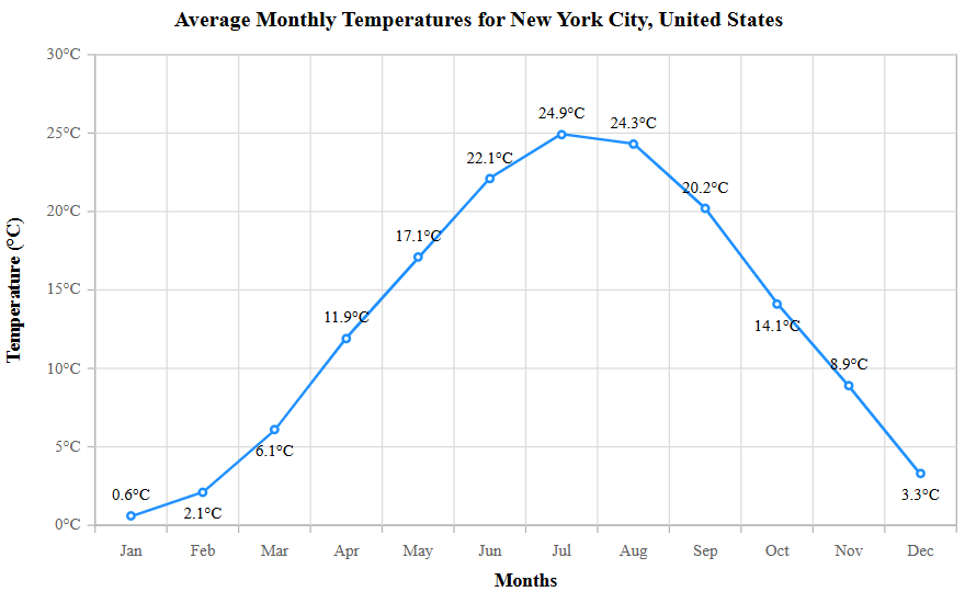
Visualizing data using a linear scale in Blazor Charts
Note: You can get the reference data here or view the live demo for the Linear scale in the Blazor Charts.
2. Logarithmic scale
A logarithmic scale is used when data varies exponentially, meaning each step increases by a factor (e.g., 10, 100, 1000). This scale is useful for visualizing data with large variations or exponential growth. For example, a base-10 log scale might display values like 1, 10, 100, 1,000 instead of 1, 2, 3, 4.
When to use a logarithmic scale?
The data spans multiple orders of magnitude (e.g., 1 to 1,000,000).
Relative change is more important than absolute change.
There is exponential growth or decay (e.g., stock prices, population growth, earthquake magnitudes).
You need to compare percentage changes rather than absolute differences.
Example: If you’re plotting the market capitalization of companies, where some are worth millions and others trillions, a log scale helps maintain visibility across all data points.
Let’s explore the use of a logarithmic axis by visualizing the exponential growth of COVID-19 cases during the early stages of the pandemic. This approach provides a clearer representation of data that spans multiple orders of magnitude.
To get started with the logarithmic scale in Blazor Charts, refer to its documentation.
To enable a logarithmic axis in our Blazor Charts, set the ValueType=”Logarithmic” in the ChartPrimaryYAxis. By default, the logarithmic base (LogBase) is set to 10.
Refer to the following code example.
@using Syncfusion.Blazor.Charts

<SfChart Title="Cumulative COVID-19 Cases Worldwide">
    <ChartPrimaryXAxis ValueType="Syncfusion.Blazor.Charts.ValueType.Category"
                        Title="Months" />

    <ChartPrimaryYAxis ValueType="Syncfusion.Blazor.Charts.ValueType.Logarithmic"
                        Title="Cases" />

    <ChartSeriesCollection>
        <ChartSeries DataSource="CovidCases"
                     XName="Date"
                     YName="Cases"
                     Fill="DodgerBlue"
                     Width="2"
                     Type="Syncfusion.Blazor.Charts.ChartSeriesType.Line">

            <ChartMarker Visible="true">
                <ChartDataLabel Visible="true"></ChartDataLabel>
            </ChartMarker>

        </ChartSeries>
    </ChartSeriesCollection>
</SfChart>

@code {
    public class CovidData
    {
        public string Date {get; set;}
        public double Cases {get; set;}
    }

    public List<CovidData> CovidCases {get; set;} = new List<CovidData>
    {
        new CovidData {Date = "Jan 1, 2020", Cases = 27},
        new CovidData {Date = "Feb 1, 2020", Cases = 11_953},
        new CovidData {Date = "Mar 1, 2020", Cases = 87_137},
        new CovidData {Date = "Apr 1, 2020", Cases = 862_234},
        new CovidData {Date = "May 1, 2020", Cases = 3_272_202}
    };
}
Refer to the following image.
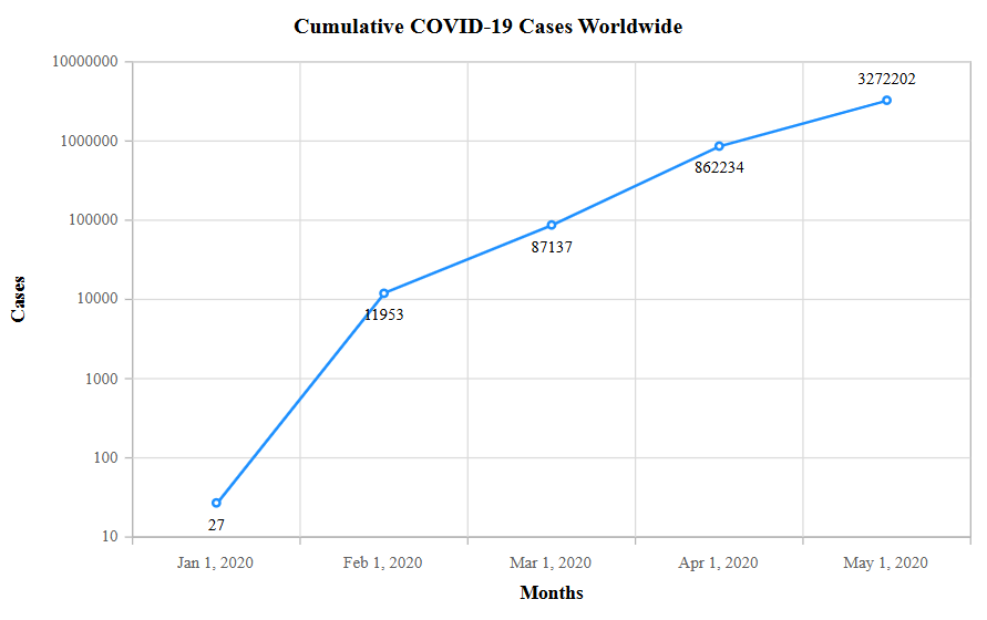
Visualizing data using a logarithmic scale in Blazor Charts
Note: You can get the reference data here or view the live demo for the logarithmic scale in Blazor Charts.
Key differences between linear and logarithmic scales
| Features | Linear scale | Logarithmic scale |
| Value spacing | Equal increments | Exponential increments |
| Best for | Uniform changes | Exponential changes |
| Supports zero/negative values | Yes | No |
| Example usage | Temperature trends, sales growth | Stock prices, scientific data |
Choosing the right scale
If your data exhibits steady, predictable changes, a linear scale is typically the best choice. However, if your data varies significantly in magnitude or follows an exponential pattern, a logarithmic scale can reveal trends that would otherwise be difficult to see.
When designing charts, consider:
The size of the value range.
Whether absolute or relative differences matter more.
If exponential growth or decay is present.
Conclusion
Thanks for reading! In this blog, we have seen key differences and how to use the linear and logarithmic scales for data visualization using our Syncfusion® Blazor Charts. You can also explore our linear and logarithmic axes in the Blazor Charts demos. Try them out and leave your feedback in the comments section below!
The latest version of the Blazor Charts component is available for existing customers from the License and Downloads page. If you are not yet a customer, try our 30-day free trial to check it out.
You can also contact us through our support forum, support portal, orfeedback portal. We are always happy to assist you!
Related Blogs
Subscribe to my newsletter
Read articles from syncfusion directly inside your inbox. Subscribe to the newsletter, and don't miss out.
Written by
syncfusion
syncfusion
Syncfusion provides third-party UI components for React, Vue, Angular, JavaScript, Blazor, .NET MAUI, ASP.NET MVC, Core, WinForms, WPF, UWP and Xamarin.