How to Read Keepa Charts | FREE Amazon FBA Course | Module 7
 Veronika Grishkova
Hi everyone! Welcome back to our Seller Assistant Academy.
In this module, we will together learn how to research product sales history using Keepa charts and how that helps with product sourcing.
Let’s go!
What are Keepa charts?
Keepa is an Amazon price tracking tool that shows detailed product data in the form of charts. These charts help with detailed product research and allow you to see how a product sells over time.

Keepa charts
Keepa charts let you track such important things about a product as price changes, how well a product sells, new seller offers, how old is the listing, review count and star rating, and much more. Reading Keepa charts is part of extended product research and helps verify that it is good for sourcing.
You can find the links to Module 6
Types of Keepa charts
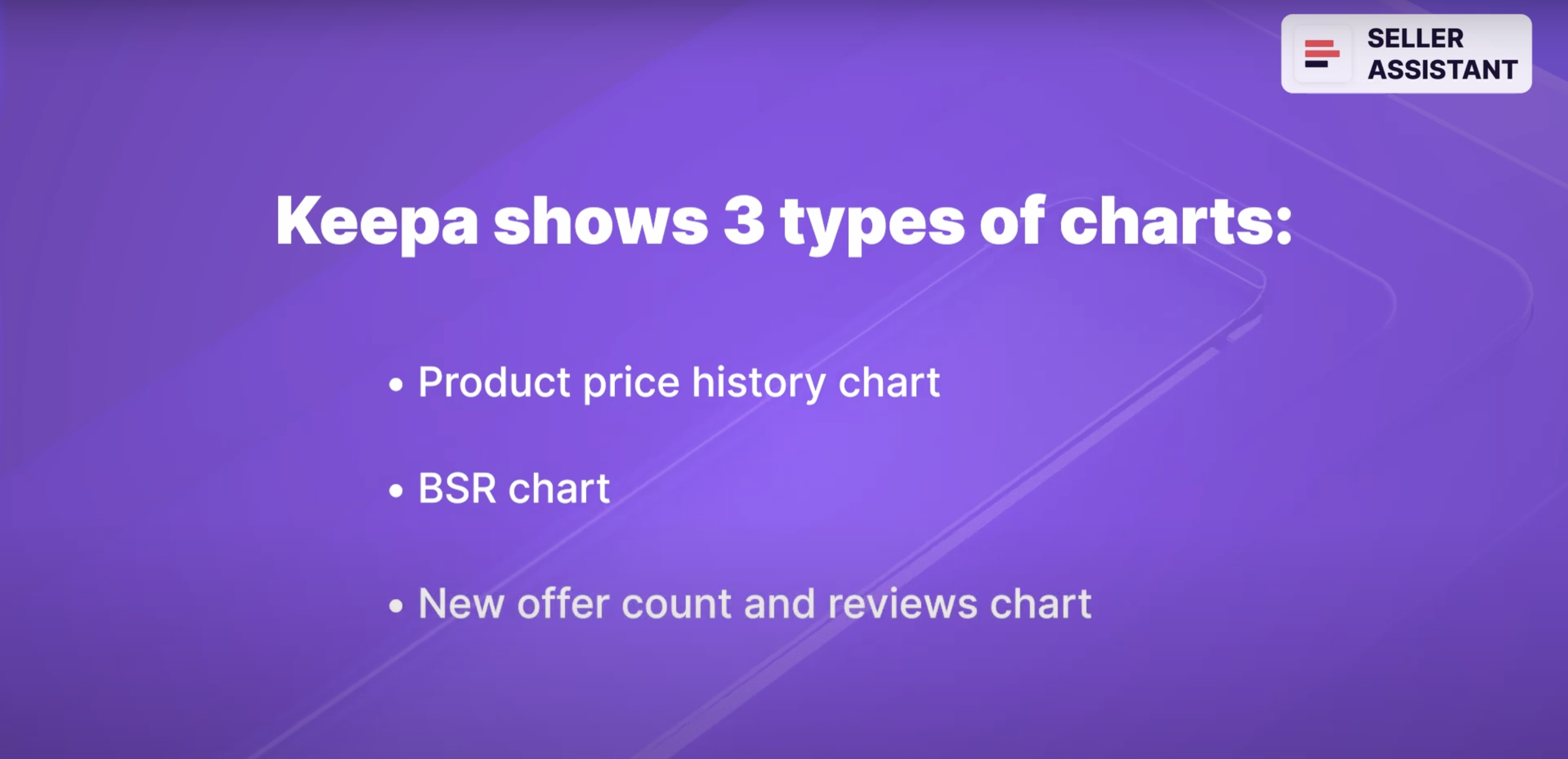
Keepa shows 3 types of charts:
Product price history chart;
BSR chart;
New offer count and reviews chart.
Types of Keepa charts
Now let’s discuss how these Keepa charts help very if a product is good or not good for sourcing. You can find more information about reading Keepa charts in the link on the video description.
Product price history chart
Keepa chart shows product price history. The left-hand side of the graph shows the offer prices. At the bottom, you can see the dates.

Product price history chart
To the right of the chart is the menu that lets you customize your view. You can select to display only the Amazon chart, New or Used products, Sales Rank, or Buy Box. You can also set a period to view the data — day, week, month, 3 months, year, or all.
Keepa uses specific colors to show each product metric.
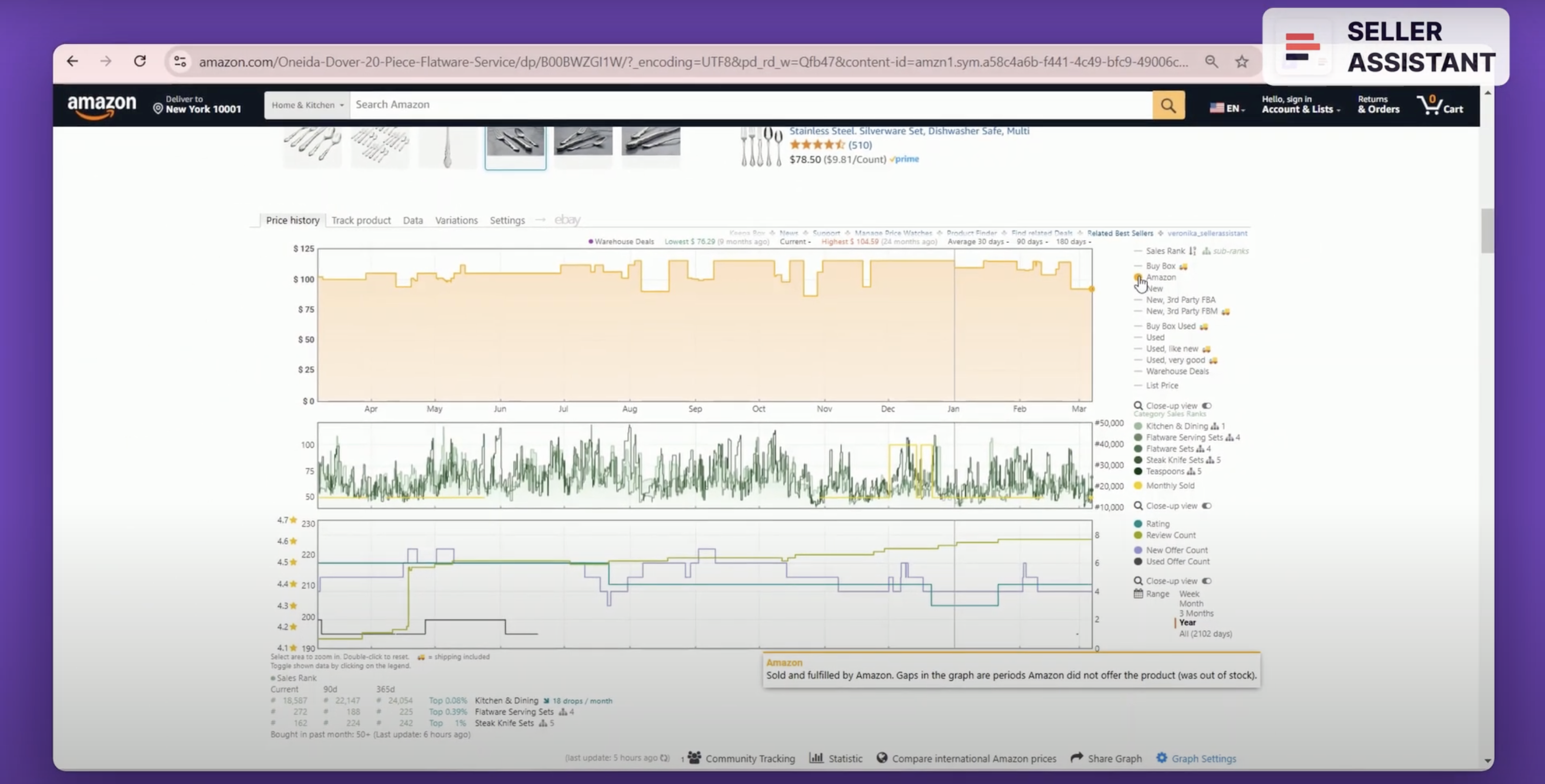
Keepa uses specific colors to show each product metric.
Orange shaded area shows Amazon;
Purple is the lowest product offer in the New condition;
Black is the lowest product offer in the Used condition (we can skip this as we sell only New products);
Green is Sales Rank (BSR);
The pink line is the Buy Box;
The orange triangle is the lowest FBA offer;
The blue square is the lowest FBM offer;
The yellow gold line is product unit sales/month.
When you analyze a price history chart, you must pay attention to a number of things.
Amazon as a seller
If Amazon sells a product and dominates a Buy Box, or stopped selling on the listing less than 2 months ago, the product is not suitable for selling because it is almost impossible to compete with them (we discussed that in a module about extended product research).

Amazon as a seller
If the chart shows a shaded orange area, that means Amazon offers the product. If there is a white area between orange slots, that means Amazon was out of stock during that time.
New offer price
The new offer price (that is a purple line on a chart) shows the lowest product offer in the New condition from a 3rd-party seller at any given time (the figure indicates the offer price, not the product’s sale price).

New offer price
It gives the picture of the minimum current price level and helps set a price. The orange triangles show you the lowest FBA offers, while the blue squares are the lowest FBM offers.
How old is the listing?
The product listing must be old enough so that you can see how the product behaved over time. The «good» listing age is half a year or more.
How old is the listing?
If the product history starts less than half a year ago, there will not be enough data to estimate the BSR, Buy Box and price changes, because they can go up and down. To understand if product sales consistently increase or decrease, you must look at the average trend over at least half a year.
Buy Box
It’s crucial to win the Buy Box because the majority of sales happen in the Buy Box. We must see who the Buy Box sellers are and if different sellers can get the Buy Box.

Buy Box
Keepa displays a pink line to show the Buy Box price and Buy Box sellers. To see details, hover your mouse over it. If different sellers are in the Buy Box at different times, that is a «good» listing because it’s possible to compete on it.
You can find more information about Buy Box in the link in the video description.
High competition and dumping
A large number of sellers (more than 15) fighting for the Buy Box and the Buy Box price drops show the high level of competition. If the Buy Box price goes up and down too much, that means the sellers engage in a price war. That can lead to price dumping and low margins.

High competition and dumping
You can find more information about price wars and how to avoid them in the link in the video description.
BSR chart and seasonal products
BSR
The sales rank (BSR) chart shows how well the product sells compared to other products in its main category and other subcategories.

BSR
The lower the BSR, the better the product sells. Because BSR changes, you must analyze its average number and the trend — upwards or downwards — to see if product sales increase or decrease. The right-hand side of the chart displays the BSR figures, and the green lines show rank history in different categories and subcategories.
Seasonal products
Seasonal products only sell within a particular season, not throughout the year (for example, summer or winter shoes). If you see on the chart that during specific periods a product's BSR goes down to zero, that may indicate a seasonal product.

Seasonal products
An additional indicator of a seasonal product is if its BSR goes down to zero in the high season and after seasonal sales start to increase.
You can find more information about BSR in the link in the video description.
New offer count and reviews chart
This chart shows the new offer count and the review quality. New offer count helps identify private label products you can’t sell. Reviews show if a product has good demand and quality.

New offer count and reviews chart
Private label seller listing
If you are not a brand owner, you can’t sell private label products. From a Keepa graph, you can understand if a product is a private label. If the item is sold by one seller during a long period (for example, 195 days), that is likely a private label product and it’s not good for selling.

Private label seller listing
Reviews and rating
Reviews are buyer feedback about a product in the form of a star rating or a text. The rating ranges from 1 to 5 stars. A «good» product must have reviews. If it doesn’t, it has too recent sales history or doesn’t sell.

Reviews and rating
The average rating must be 4-5 stars, and it must not have many negative reviews. If it has bad reviews, it will generate many returns.
You can see reviews on the New offer count and reviews chart. Review count and rating figures are on the right-hand side and indicate the number of product reviews and the average number of stars it earned over time.
Variations
Amazon variations are different attributes of the same products such as size, color, style, etc. grouped on one listing. Not all variations sell equally well, which means you must select the ones that sell the best.

Variations
Keepa has a «Variations» section where you can see current offers and price history of all product variations available in stock.
You can find more information about Amazon variations in the link on the video description.
Where does Seller Assistant show Keepa charts?
When you do product research, it is essential to have all data in one place to do it fast. Seller Assistant shows Keepa charts together with all key product information on the Amazon product pages.

Where does Seller Assistant show Keepa charts?
These charts let you see key product trends and decide if you need to research it further in more detail. Built-in Keepa charts in Seller Assistant allow you to conveniently review all necessary data without switching between the tabs and saves you a lot of time.
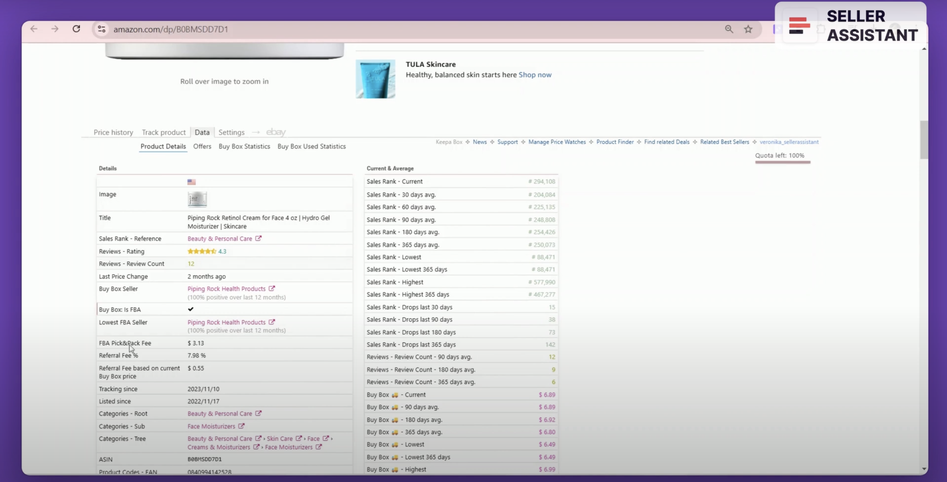
In addition to charts, Keepa has a number of sections you can access in the top menu. In the «Data» section, you can find additional tools and features that can help your research.
In the «Deals» section, you can filter out Lightning deals and Prime-eligible items.
That’s it for now.
In the next module, I will show you how to research Amazon variations.
Originally published at https://www.sellerassistant.app/blog/how-to-read-keepa-charts-free-amazon-fba-course-module-7
Subscribe to my newsletter
Read articles from Veronika Grishkova directly inside your inbox. Subscribe to the newsletter, and don't miss out.
Written by