✨ Creating a 3D Hover Tilt Effect in React with GSAP and Tailwind CSS 4.1
 Daniel Don
Table of contents
- 🧱 What You’ll Learn
- ✅ Prerequisites
- Set Up the React Project
- Configure Tailwind CSS 4.1 (The New Plugin Method)
- Introducing GSAP (GreenSock Animation Platform)
- Build the Tilt Component
- How the GSAP Animation Works
- What Is perspective and Why It Matters
- Add Tailwind Support for perspective
- Use the Component
- Styling Recap
- Conclusion

Modern UI design is all about the little things — the subtle movements, the tactile interactions, the way an element seems to respond to your presence.
In this guide, you’ll learn how to create an elegant 3D hover tilt effect on an image using React, GSAP (GreenSock Animation Platform), and Tailwind CSS 4.1. We’ll walk through everything from setting up the project to breaking down how the animation works — even if you’ve never used GSAP or Tailwind before.
🧱 What You’ll Learn
How to scaffold a React project using Vite
How to install and configure Tailwind CSS 4.1 with the official plugin
How to animate an image in response to mouse movement using GSAP
What the CSS
perspectiveproperty does and why it mattersHow to structure, style, and control animation behavior cleanly
✅ Prerequisites
You’ll need:
Node.js (v16+)
npm
Basic understanding of React and JSX
Set Up the React Project
Let’s start by creating a new React project using Vite:
npm create vite@latest gsap-tilt-demo -- --template react
cd gsap-tilt-demo
npm install
Then install the required dependencies:
npm install gsap tailwindcss @tailwindcss/vite
This installs:
GSAP: our animation engine
TailwindCSS: our utility-first CSS framework
@tailwindcss/vite: the official Tailwind plugin for Vite
Configure Tailwind CSS 4.1 (The New Plugin Method)
Tailwind v4.1 streamlines the integration process via a Vite plugin.
2.1 Configure the Vite Plugin
Open or create vite.config.js and add:
import { defineConfig } from 'vite'
import react from '@vitejs/plugin-react'
import tailwindcss from '@tailwindcss/vite'

export default defineConfig({
  plugins: [
    react(),
    tailwindcss(),
  ],
})
Import Tailwind in Your CSS
Create or open src/index.css and add:
@import "tailwindcss";
Then import it in main.jsx:
import './index.css';
You now have Tailwind CSS 4.1 working out of the box with zero boilerplate.
Introducing GSAP (GreenSock Animation Platform)
GSAP is a powerful JavaScript animation library that makes it easy to animate elements with precision and control.
While CSS handles simple animations (like fade-ins or hover transitions), GSAP offers much more flexibility — especially for real-time interactions like this one.
In this project, we’ll use a single function from GSAP:gsap.to()
This lets us animate an element to a new state — such as rotating the image based on mouse position. It handles:
Transition timing (
duration)Rotation values (
rotateX,rotateY)Smoothing (
ease)Depth simulation (
transformPerspective)
GSAP abstracts away the manual math, CSS updates, and animation timing — leaving you with readable, declarative code.
Build the Tilt Component
Let’s build a component that applies 3D rotation based on the mouse’s position relative to an image.
Create a new file:src/TiltImage.jsx
import { useRef } from "react";
import { gsap } from "gsap";
export default function TiltImage() {
const frameRef = useRef(null);
const handleMouseMove = (e) => {
const el = frameRef.current;
const rect = el.getBoundingClientRect();
const x = e.clientX - rect.left;
const y = e.clientY - rect.top;
const centerX = rect.width / 2;
const centerY = rect.height / 2;
const rotateX = ((y - centerY) / centerY) * -10;
const rotateY = ((x - centerX) / centerY) * 10;
gsap.to(el, {
duration: 0.3,
rotateX,
rotateY,
transformPerspective: 500,
ease: "power1.out",
});
};
const resetTilt = () => {
gsap.to(frameRef.current, {
duration: 0.3,
rotateX: 0,
rotateY: 0,
ease: "power1.inOut",
});
};
return (
<div className="h-screen bg-neutral-950 flex items-center justify-center">
<div className="relative w-[320px] h-[420px] perspective-1000">
<img
ref={frameRef}
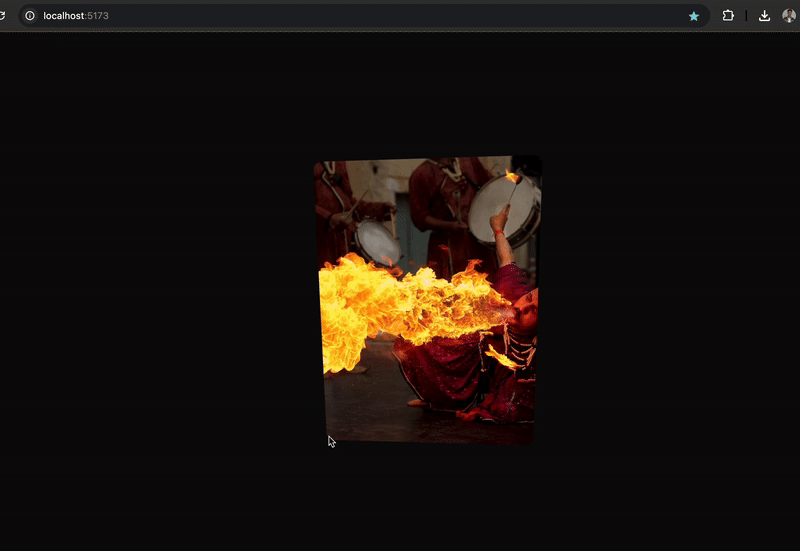
src="/img/entrance.webp"
alt="Tilted Image"
className="w-full h-full object-cover rounded-xl shadow-lg will-change-transform transition-transform"
onMouseMove={handleMouseMove}
onMouseLeave={resetTilt}
/>
</div>
</div>
);
}
How the GSAP Animation Works
Here’s what the two animation calls do:
Animate on Mouse Move:
gsap.to(el, {
  duration: 0.3,
  rotateX,
  rotateY,
  transformPerspective: 500,
  ease: "power1.out",
});
rotateX/rotateY: Calculated from cursor position to create the tilttransformPerspective: 500: Adds visual depth so the rotation appears 3Dduration: 0.3: Animates over 300msease: "power1.out": Smooth acceleration, then gentle deceleration
Reset on Mouse Leave:
gsap.to(frameRef.current, {
  duration: 0.3,
  rotateX: 0,
  rotateY: 0,
  ease: "power1.inOut",
});
This smoothly resets the image to its original state when the cursor leaves.
What Is perspective and Why It Matters
To make the rotation look truly 3D, we need to define a viewer perspective.
In CSS, the perspective property simulates the distance between the viewer and the object:
.perspective-1000 {
  perspective: 1000px;
}
A lower value (like
400px) creates a stronger, more dramatic depth.A higher value (like
1000px) creates a more natural, subtle effect.
In our component, we apply perspective-1000 to the image container.
Add Tailwind Support for perspective
Tailwind doesn’t include perspective by default, so you can either:
A. Use inline styles (recommended for simplicity)
<div style={{ perspective: "1000px" }}>
B. Or extend Tailwind by creating a config file:
npx tailwindcss init
Then in tailwind.config.js:
export default {
  content: ["./index.html", "./src/**/*.{js,jsx}"],
  theme: {
    extend: {
      perspective: {
        1000: "1000px",
      },
    },
  },
};
This lets you use perspective-1000 as a utility class.
Use the Component
In App.jsx:
import TiltImage from "./TiltImage";

export default function App() {
  return <TiltImage />;
}
Place your image at /public/img/entrance.webp, or update the path.
Start your development server:
npm run dev
Now hover your mouse over the image — and watch it subtly tilt based on your movement.
Styling Recap
Here’s a summary of the key Tailwind classes used:
| Class | Purpose |
h-screen | Full viewport height |
bg-neutral-950 | Dark background |
flex items-center justify-center | Centers content |
w-[320px] h-[420px] | Fixed image size |
rounded-xl | Smooth border radius |
shadow-lg | Adds depth |
will-change-transform | Optimizes GPU rendering |
transition-transform | Makes motion smoother |
Conclusion
We created a 3D hover tilt effect using
React for structure
GSAP for animation
Tailwind CSS 4.1 for styling
This kind of interaction adds a premium feel to portfolios, hero sections, or any visual element meant to catch attention — all without adding unnecessary complexity.
Subscribe to my newsletter
Read articles from Daniel Don directly inside your inbox. Subscribe to the newsletter, and don't miss out.
Written by
Daniel Don
Daniel Don
I am a software developer, passionate about technology and community building! with high interest in expertly prepared noodles by myself