Explore Interactive Drill-Down Charts in Blazor for Deeper Data Insights
 syncfusion
TL;DR: This blog demonstrates how to build interactive drill-down charts in Blazor apps using the Syncfusion Blazor Charts component. It covers structuring global population data, configuring the chart, and implementing key event handlers like OnPointClick and OnAxisLabelClick to navigate between data levels. It also explains the NavigateToDefault method for returning to the main view, helping you create dynamic charts for deeper data exploration.
Welcome to our Weekly Data Visualization blog series!
Drill-down charts are a powerful tool for interactive data exploration in Blazor applications. They enable users to click on a data point and navigate to more detailed information, making it easier to analyze hierarchical or categorized data.
The Syncfusion Blazor Charts component provides seamless drill-down functionality, allowing users to explore data with a user-friendly interface. It supports a range of features, including data binding, legends, animations, tooltips, and event handling, ensuring a smooth and engaging user experience.
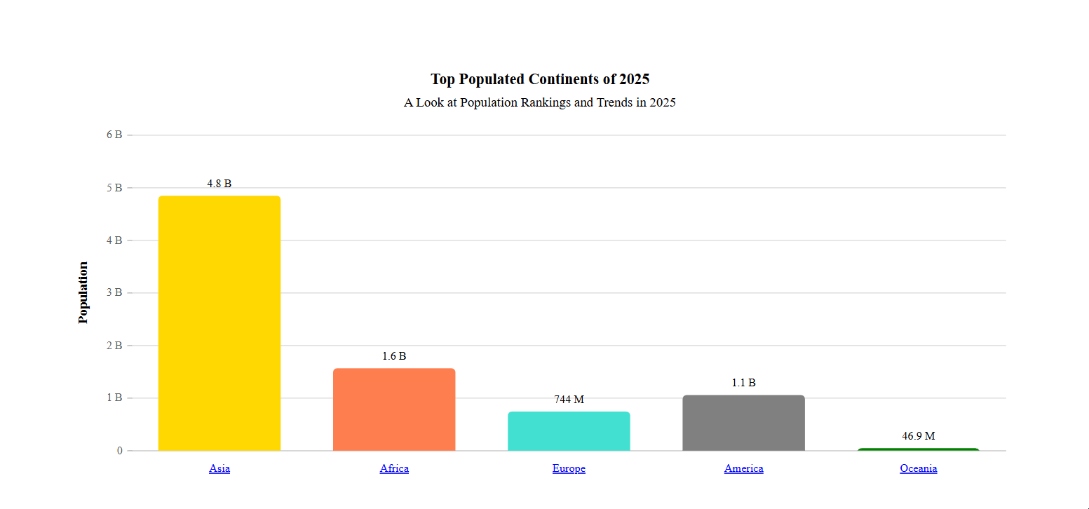
In the drill-down charts, we will initially display a column chart showing the population data for each continent. When a user clicks on a continent data point, the chart will drill down to show a column chart of the countries within that continent. An additional functionality will allow users to drill back to the original continent-level chart.
We’ll discuss three key functionalities that enable drill-down behavior in Blazor Charts:
OnPointClick: Enables users to trigger a drill-down action by clicking on points.
AxisLabelClick: Enables users to trigger a drill-down action by clicking on axis labels.
NavigateToDefault: Resets the chart view to its default state when needed.
By the end of this tutorial, you’ll be able to create dynamic and interactive drill-down charts that enhance data exploration in your Blazor applications.
Let’s get started!
Implementing the Drill-Down in the Chart
Follow these steps to implement the drill-down in a chart using Syncfusion Blazor Charts.
Step 1: Gathering the data
Before visualizing data in a drill-down chart, it’s essential to gather accurate and up-to-date population statistics. In this case, data is sourced from the World Population by Country page on Worldometer, a trusted platform for global statistics. The dataset includes the 2025 estimated population for major regions such as Asia, Africa, Europe, America, and Oceania.
Step 2: Define and populate the data in the Chart
After gathering the data, the next step is to define a class to structure the data and populate it for the chart. In this case, we define a PopulationData class with two properties:
Location – the name of the region (e.g., Asia, Africa)
Population – the estimated population value for 2025.
The data is then populated into a list of PopulationData objects, which serves as the chart’s data source.
Refer to the following code example.
public List<PopulationData> DataSource { get; set; } = new List<PopulationData>
{
    new PopulationData { Location = "Asia", Population = 4849336830 },
    new PopulationData { Location = "Africa", Population = 1567367367 },
    new PopulationData { Location = "Europe", Population = 744010306 },
    new PopulationData { Location = "America", Population = 1058663026 },
    new PopulationData { Location = "Oceania", Population = 46867762 }
};

public class PopulationData
{
    public double Population { get; set; }
    public string Location { get; set; }
}
This structured data needs to be assigned to the Syncfusion Blazor Charts component. To get started with Syncfusion Blazor Charts, refer to our Getting Started documentation. Once the Blazor Charts are initialized, bind the data to the ChartSeries component using the DataSource property.
Step 3: Configure the Chart component
Now that the data is ready, let’s configure the chart component to display it. We’ll use the SfChart component from Syncfusion, which offers a flexible and interactive way to visualize data.
In this example, we use a column chart to compare the population across different regions. The chart includes one series that binds directly to our population data. The XName is set to Location, representing each continent, and the YName is set to Population to show the corresponding values.
For better data visibility, data labels are enabled and positioned outside the bars. Event handlers such as OnPointClick, OnAxisLabelClick, OnPointRender, and OnDataLabelRender are wired up using the ChartEvents tag. These allow us to add interactivity to the chart, enabling users to drill down into details or customize the appearance of individual points dynamically.
Refer to the following code example.
<SfChart @ref="ChartObj" Title="@ChartTitle" SubTitle="@ChartSubTitle">

    ...
    <ChartEvents
        OnPointRender="PointRender"
        OnPointClick="OnPointClick"
        OnAxisLabelClick="AxisLabelClick"
        OnDataLabelRender="DataLabelRender">
    </ChartEvents>
    ...

    <ChartSeriesCollection>
        <ChartSeries
            Fill="@Fill"
            DataSource="@DataSource"
            Name="Population"
            XName="Location"
            YName="Y"
            Type="ChartSeriesType.Column">
            ...
        </ChartSeries>
    </ChartSeriesCollection>

    ...
</SfChart>
Step 4: Handling clicks on data points
In a drill-down chart, clicking on a data point dynamically updates the chart to display more detailed information. The OnPointClick event plays a crucial role in handling these interactions. This event method is triggered when a user clicks on a data point. Within it, each case in the switch statement corresponds to a continent. Based on the clicked point index, the chart title, breadcrumb region name, and data source are updated to display the population details of the selected region.
For example, clicking on the first data point updates the chart to show the most populated countries in Asia for 2025, while clicking on another index reveals similar data for Africa, Europe, North America, or Oceania.
Suppose the user clicks again after a drill-down, ChartObj.PreventRender() prevents unnecessary re-rendering, ensuring smooth performance. This approach enables users to explore hierarchical population data efficiently in an intuitive and interactive way.
Refer to the following code example.
public void OnPointClick(PointEventArgs args)
{
    if (args.Point.Index != 6)
    {
        if (!clicked)
        {
            TextDecoration = "none";
            Interval = Double.NaN;
            Fill = Colors[args.Point.Index % 10];
            IsDivVisible = true;

            UpdateDataSource(args.Point.Index);
        }
        else
        {
            ChartObj.PreventRender();
        }
    }
}
Step 5: Handling the clicks on the axis label
Handling axis label clicks allows users to interact with the chart by selecting different categories, making data exploration more intuitive. In Syncfusion Blazor Charts, the OnAxisLabelClick event detects clicks on axis labels, dynamically updating the chart to display relevant data based on the selected category.
The OnAxisLabelClick event updates the chart in the same way as the OnPointClick event, using the index of the selected label provided in the event argument. After making the necessary changes, StateHasChanged is called to refresh the UI, ensuring that the chart is immediately updated with the new data.
By implementing this functionality, users can seamlessly navigate through hierarchical data by clicking on axis labels, improving data analysis without requiring complex interactions or navigation.
Refer to the following code example.
public void AxisLabelClick(AxisLabelClickEventArgs args)
{
    if (args.Index != 6)
    {
        if (!clicked)
        {
            TextDecoration = "none";
            Fill = Colors[args.Index % 10];
            IsDivVisible = true;
            Interval = Double.NaN;

            UpdateDataSource(args.Index);
            StateHasChanged();
        }
    }
}
These OnPointClick and OnAxisLabelClick events enhance data exploration by allowing users to seamlessly navigate between different levels of detail. They provide a clean and efficient way to analyze complex datasets without cluttering the main chart view.
Step 6: Reset to default view
The drill-down chart allows users to navigate deeper into specific data categories, but it is equally important to provide an option to reset the chart to its original state. The NavigateToDefault method restores the default view, displaying the overall population distribution across continents.
A clickable label, styled as a breadcrumb (e.g., Population >> Region), becomes visible when a drill-down occurs. Clicking this label triggers the NavigateToDefault method, which resets key properties such as ChartTitle, RegionName, and DataSource. The clicked flag is set to false, ensuring users can interact with the chart again from the top level. Additionally, the TextDecoration property, used to style the axis labels, and the Color property, used to provide fill color for the chart series, are updated to visually indicate that the chart has returned to its default state.
To enhance performance, ChartObj.PreventRender(false) ensures a smooth transition back to the original view without unnecessary re-rendering. This implementation provides a seamless way for users to explore data at different levels while maintaining easy navigation back to the summary view.
Refer to the following code example.
<div style="padding-top: 20px; visibility: @(IsDivVisible ? "visible" : "hidden");">
    <span @onclick="NavigateToDefault" id="category"
          style="visibility: @(IsDivVisible ? "visible" : "hidden");
                 color: #337ab7; display:inline-block">
        Population
    </span>
    <p style="visibility: @(IsDivVisible ? "visible" : "hidden");
              display:inline-block" id="symbol">
        >>
    </p>
    <p style="visibility: @(IsDivVisible ? "visible" : "hidden");
              display:inline-block;">
        @RegionName
    </p>
</div>
Implementing Drill-Down Charts across major populated regions
GitHub reference
You can find the complete code examples on GitHub.
Conclusion
Thanks for reading! In this blog, we’ve explored implementing Drill-Down Charts in Blazor for detailed Data Exploration. Try them out and share your feedback in the comments section below!
Explore our Blazor Chart Examples to learn more about the supported chart types and how easy it is to configure them for stunning visual effects.
If you’re an existing Syncfusion® user, you can download the latest version of Essential Studio® from the License and Downloads page. For those new to Syncfusion®, we offer a 30-day free trial so you can experience these exciting features firsthand.
Need help? Feel free to reach out via our support forum, support portal, or feedback portal. We’re always here to assist you!
Related Blogs
Subscribe to my newsletter
Read articles from syncfusion directly inside your inbox. Subscribe to the newsletter, and don't miss out.
Written by
syncfusion
syncfusion
Syncfusion provides third-party UI components for React, Vue, Angular, JavaScript, Blazor, .NET MAUI, ASP.NET MVC, Core, WinForms, WPF, UWP and Xamarin.