Crafting a Seamless User Onboarding Experience with .NET MAUI Popup Control
 syncfusion
TL;DR: Enhance your app’s user experience with a seamless onboarding process. Avoid clunky tutorials and use a more intuitive approach to guide users through key features like editing and resizing. In .NET MAUI, creating a smooth, interactive flow will not only improve user retention but also make your app more enjoyable from the start!
Seeking to enhance new user navigation in your app?
First impressions matter. Users don’t ‘get’ your app in the first few minutes and might never return. Traditional onboarding methods often feel clunky, disruptive, or just plain boring.
Want a smoother way to guide users through key features like editing, resizing, or swiping in your .NET MAUI app?
Here’s the good news: with Syncfusion’s® .NET MAUI Popup control, you can craft an elegant, interactive onboarding experience that’s helpful and visually engaging. This blog walks you through building a powerful in-app guidance system using popups, animations, and the flexible SfDataGrid control.
From showcasing column resizing to walking users through drag-and-drop, you’ll learn how to combine feature-rich controls with animated onboarding help, right inside your app!
Let’s dive in and see how Syncfusion® makes onboarding intuitive and delightful.
Step 1: Add a DataGrid control
Create a data model with the required properties and a model repository (view model) with the collection property initialized with the required data objects.
Install the Syncfusion.Maui.DataGrid package and include the namespace of the DataGrid control. Finally, initialize the DataGrid and bind the ViewModel’s TeamsData collection in the MainPage.xaml file.
Note: For more details, refer to the .NET MAUI DataGrid documentation.
xmlns:grid ="clr namespace:Syncfusion.Maui.DataGrid;assembly=Syncfusion.Maui.DataGrid"
<Grid x:Name="rootGrid">
    <grid:SfDataGrid x:Name="dataGrid"
                     ItemsSource="{Binding TeamsData}”
                     AutoGenerateColumnsMode="None"
                     RowHeight="48"
                     AllowSwiping="True"
                     AllowDraggingRow="True"
                     AllowEditing="True"
                     EditTapAction="OnDoubleTap"
                     AllowResizingColumns="True"
                     SelectionMode="Single"
                     NavigationMode="Cell">
     <grid:SfDataGrid.Columns>
      . . .
     </grid:SfDataGrid.Columns>
    </grid:SfDataGrid>
</Grid>
Refer to the following image.
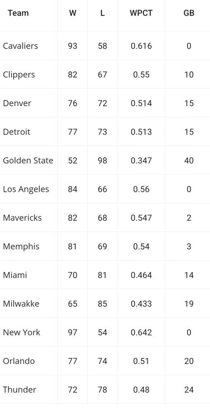
.NET MAUI DataGrid control
Step 2: Add a Popup control
Install the Syncfusion.Maui.Popup package and include the namespace of the Popup control. Then initialize the Popup control in MainPage.xaml as below.
Note: For more details, refer to the .NET MAUI Popup documentation.
xmlns:popup="clr-namespace:Syncfusion.Maui.Popup;assembly=Syncfusion.Maui.Popup"
. . .
<Grid x:Name="rootGrid">
    <grid:SfDataGrid x:Name="dataGrid"
                     ItemsSource="{Binding TeamsData}”>
     . . .
    </grid:SfDataGrid>
    <popup:SfPopup x:Name="popup"/>
</Grid>
Step 3: Define resizing, editing, swiping, and drag-and-drop views
Create custom content view using framework components such as StackLayout, Image, & Label based on your UI requirements, as below.
ResizingView.xaml
<ContentView xmlns="http://schemas.microsoft.com/dotnet/2021/maui"
             xmlns:x="http://schemas.microsoft.com/winfx/2009/xaml"
             xmlns:local="clr-namespace:OnBoardHelpDemo"
             x:Class="OnBoardHelpDemo.ResizingView">
    <ContentView.Content>
     <StackLayout Margin="0,10,0,0">
      <StackLayout.Behaviors>
       <local:ResizingBehavior/>
      </StackLayout.Behaviors>
      <Image Source="{Binding ResizingIllustrationImage}"
             HeightRequest="50"
             WidthRequest="50"/>
      <Label Text="Press and drag to resize"
             TextColor="White"
             HorizontalOptions="Center"
             FontFamily="Satisfy-Regular"/>
     </StackLayout>
    </ContentView.Content>
</ContentView>
Refer to the following image.
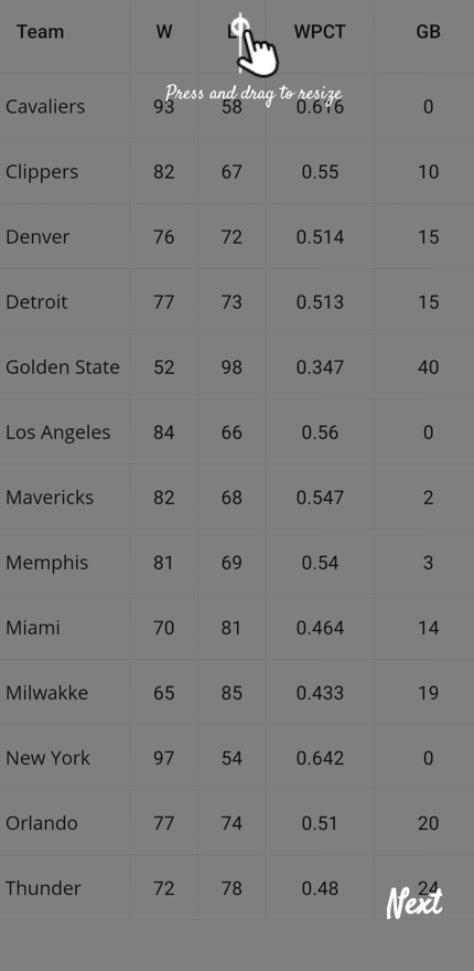
Resizing feature of the .NET MAUI Popup control
EditingView.xaml
<ContentView xmlns="http://schemas.microsoft.com/dotnet/2021/maui"
             xmlns:x="http://schemas.microsoft.com/winfx/2009/xaml"
             xmlns:local="clr-namespace:OnBoardHelpDemo"
             x:Class="OnBoardHelpDemo.EditingView">
    <ContentView.Content>
        <StackLayout HorizontalOptions="Center" VerticalOptions="Center">
         <StackLayout.Behaviors>
          <local:EditingBehavior/>
         </StackLayout.Behaviors>
         <Image Source="{Binding EditingIllustrationImage}" HeightRequest="50" WidthRequest="50"/>
         <Label Text="doubletap to edit" TextColor="White" HorizontalOptions="Center" FontFamily="Satisfy-Regular"/>
        </StackLayout>
    </ContentView.Content>
</ContentView>
Refer to the following image.
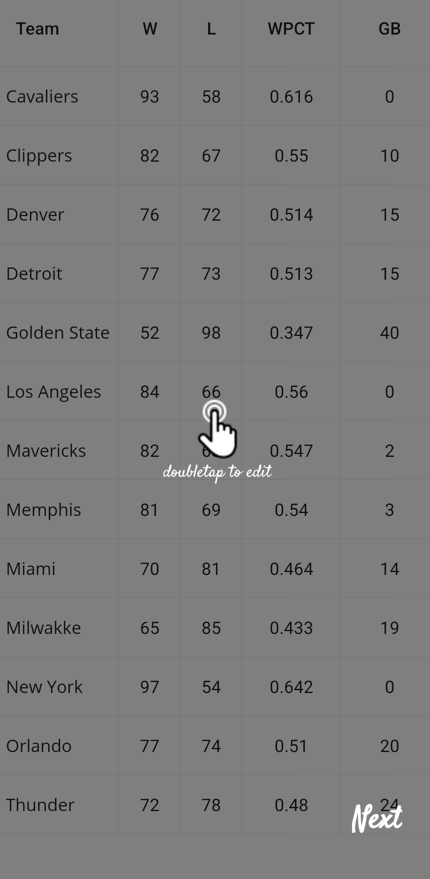
Editing feature of the .NET MAUI Popup control
SwipingView.xaml
<ContentView xmlns="http://schemas.microsoft.com/dotnet/2021/maui"
             xmlns:x="http://schemas.microsoft.com/winfx/2009/xaml"
             xmlns:local="clr-namespace:OnBoardHelpDemo"
             x:Class="OnBoardHelpDemo.SwipingView">
    <ContentView.Content>
        <StackLayout Margin="10,0,0,0"
                     VerticalOptions="Center"
                     HorizontalOptions="Start">
            <StackLayout.Behaviors>
             <local:SwipingBehavior/>
            </StackLayout.Behaviors>
            <Label Text="slide to open SwipeView"
                   TextColor="White"
                   HorizontalOptions="Center"
                   FontFamily="Satisfy-Regular"/>
            <Image Source="{Binding SwipingIllustrationImage}" HeightRequest="50" WidthRequest="50"/>
           </StackLayout>
          </ContentView.Content>
</ContentView>
Refer to the following image.
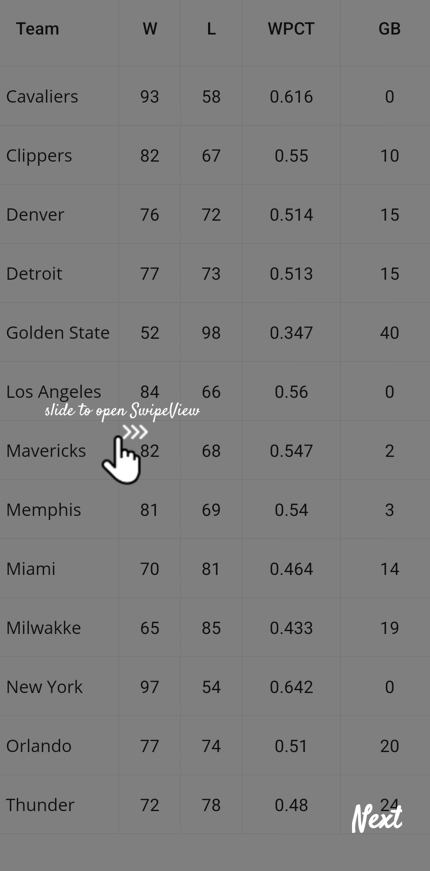
Swiping feature of the .NET MAUI Popup control
DraggingView.xaml
<ContentView xmlns="http://schemas.microsoft.com/dotnet/2021/maui"
             xmlns:x="http://schemas.microsoft.com/winfx/2009/xaml"
             xmlns:local="clr-namespace:OnBoardHelpDemo"
             x:Class="OnBoardHelpDemo.DraggingView">
    <ContentView.Content>
     <StackLayout Margin="10,0,0,0"
                  VerticalOptions="Center"
                  HorizontalOptions="Start">
      <StackLayout.Behaviors>
       <local:DragAndDropBehavior/>
      </StackLayout.Behaviors>
      <Image Source="{Binding DragAndDropLayoutImage}"
             HeightRequest="50"
             WidthRequest="50"/>
      <Label Text="Drag and Drop"
             TextColor="White"
             HorizontalOptions="Center"
             FontFamily="Satisfy-Regular"/>
     </StackLayout>
    </ContentView.Content>
</ContentView>
Refer to the following image.
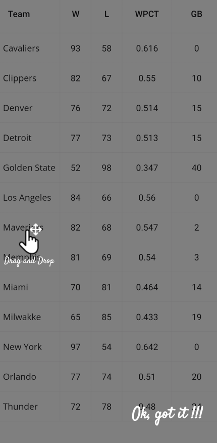
Dragging feature of the .NET MAUI Popup control
Step 4: Add required properties in the ViewModel
Create the properties MainContent, ResizingContentView, EditContentView, SwipingContentView, and DragDropContentView in ContentView type in the ViewModel class.
public ContentView MainContent
{
    get
    {
        return _mainContent;
    }
    set
    {
        _mainContent = value;
        RaisePropertyChanged("MainContent");
    }
}
public ContentView ResizingContentView
{
    get
    {
        if(this._resizingView == null)
        {
            this._resizingView = new ResizingView();
        }
        return _resizingView;
    }
}

public ContentView EditContentView
{
    get
    {
        if (this._editView == null)
        {
            this._editView = new EditingView();
        }
        return _editView;
    }
}

public ContentView SwipingContentView
{
    get
    {
        if (this._swipeView == null)
        {
            this._swipeView = new SwipingView();
        }
        return _swipeView;
    }
}

public ContentView DragDropContentView
{
    get
    {
        if (this._dragView == null)
        {
            this._dragView = new DraggingView();
        }
        return _dragView;
    }
}
Step 5: Implement resizing, double-tap, swiping, & drag-drop animations
We have used TranslateTo and FadeTo methods to include the animation effect for an enhanced user interface.
Create custom Behavior for the StackLayout used in the above custom views and include the animation logic.
For resizing, swiping, & drag-and-drop functionalities, we used TranslateTo animation.
public class ResizingBehavior : Behavior<StackLayout>
{
    private StackLayout? stackLayout;
    protected override void OnAttachedTo(StackLayout bindable)
    {
        base.OnAttachedTo(bindable);
        this.stackLayout = bindable as StackLayout;
        this.AnimateResizingContentView();
    }
   . . .
   . . .
    private async void AnimateResizingContentView()
    {
        await this.stackLayout!.TranslateTo(100, 0, 1000);
        await this.stackLayout!.TranslateTo(0, 0, 0);
        this.AnimateResizingContentView();
    }
}

public class SwipingBehavior : Behavior<StackLayout>
{
    private StackLayout? stackLayout;

    protected override void OnAttachedTo(StackLayout view)
    {
        base.OnAttachedTo(view);
        this.stackLayout = view;
        this.stackLayout.Loaded += OnStackLayoutLoaded;
    }

    private async void OnStackLayoutLoaded(object? sender, EventArgs e)
    {
         AnimateSwipingContentView ();
    }

    private async void AnimateSwipingContentView()
    {
        await this.stackLayout.TranslateTo(90, 0, 1800);
        await this.stackLayout.TranslateTo(0, 0, 0);
        this.AnimateSwipeIllustration();
    }
}
For editing functionality, we used the FadeTo animation to achieve a double-tap UI effect.
private async void OnStackLayoutLoaded(object? sender, EventArgs e)
{
    this.AnimateEditContentView();
}

private async void AnimateEditContentView()
{
    this.stackLayout!.Opacity = 0;
    await this.stackLayout.FadeTo(1, 250);
    this.stackLayout.Opacity = 0;
    await this.stackLayout.FadeTo(1, 250);
    await Task.Delay(1000);
    this.AnimateEditContentView();
}
Create another property in Command type in ViewModel and write logic to update the ViewModel’s MainContent property when clicking on the Popup overlay container.
public Command ChangeContentView
{
     get; set;
}

public TeamViewModel()
{
    this.ChangeContentView = new Command(this.GoToNextContent);
    this.MainContent = this.ResizingContentView;
}

private void GoToNextContent()
{
    if(!(MainContent is DraggingView))
    {
        switch (MainContent)
        {
            case ResizingView:
                MainContent = EditContentView;
                break;
            case EditingView:
                MainContent = SwipingContentView;
                break;
            case SwipingView:
                MainContent = DragDropContentView;
                HelpText = "Ok, got it !!!";
                break;
            default:
                MainContent = ResizingContentView;
                break;
        }
    }
    else
    {
        // close the popup after displaying all content views.
        this.PopupIsOpen = false;
    }
}
Step 6: Define ContentTemplate property for Popup
Finally, define your custom content template to display the resizing, editing, swiping, and drag-and-drop content views inside the Popup. And bind the ViewModel’s MainContent to the ContentTemplate property of the Popup and the ChangeContentView command property to the Command property of the TapGestureRecognizer.
<popup:SfPopup x:Name="popup" IsOpen="{Binding PopupIsOpen,Mode=TwoWay}">
    <popup:SfPopup.ContentTemplate>
        <DataTemplate>
         <Grid>

          /// Add a gesture recognizer to change or switch the content view by clicking.
          <Grid.GestureRecognizers>
           <TapGestureRecognizer Command="{Binding ChangeContentView}"/>
          </Grid.GestureRecognizers>

          /// Bind the ViewModel’s MainContent property.
          <ContentView Content="{Binding MainContent}"/>
          . . .
          . . .
          . . .
         </Grid>
        </DataTemplate>
    </popup:SfPopup.ContentTemplate>
</popup:SfPopup>
Here is the final output.

Crafting a seamless user onboarding experience with .NET MAUI Popup control
GitHub Reference
For more details, refer to the GitHub demo.
Conclusion
Thank you for reading! By simplifying how new users interact with your app, you can boost their confidence and ensure they keep coming back. A great first experience leads to loyal users, make sure your onboarding reflects that! Following this guide, you can create a seamless onboarding experience in your .NET MAUI application using the dynamic capabilities of the Syncfusion® SfPopup control.
For existing Syncfusion® customers, the newest version of Essential Studio® is available from the license and downloads page. If you are not a customer, try our 30-day free trial to check out these new features.
If you need a new widget for the Flutter framework or new features in our existing widgets, you can contact us through our support forums, support portal, or feedback portal. As always, we are happy to assist you!
Related Blogs
Subscribe to my newsletter
Read articles from syncfusion directly inside your inbox. Subscribe to the newsletter, and don't miss out.
Written by
syncfusion
syncfusion
Syncfusion provides third-party UI components for React, Vue, Angular, JavaScript, Blazor, .NET MAUI, ASP.NET MVC, Core, WinForms, WPF, UWP and Xamarin.