Easily Build an SIP Calculator Using the Syncfusion .NET MAUI Toolkit Charts
 syncfusion
TL;DR: This guide walks you through building a cross-platform investment calculator using the Syncfusion® .NET MAUI Toolkit. It covers environment setup, defining data and view models, integrating segmented controls to select investment types, and visualizing financial growth using interactive circular and Cartesian charts. The calculator responds to user input in real time, making it easy to compare SIP and Lump Sum strategies through clear, dynamic insights.
Welcome to the Chart of the Week blog series!
Introduction
Choosing the right strategy is essential to achieving financial goals when investing. Two common approaches are Systematic Investment Plans (SIPs) and Lump Sum investments, each offering distinct advantages, risks, and suitability depending on the investor’s financial situation and market outlook.
Systematic investment plan (SIP)
A systematic investment plan is a structured approach in which an investor contributes a fixed amount at regular intervals to a mutual fund. It helps mitigate market volatility by averaging the purchase cost over time. SIPs are ideal for long-term wealth building, leveraging the benefits of compounding and disciplined investing.
Lump Sum investment
A Lump Sum investment involves investing a large amount of money in a financial instrument such as mutual funds or stocks. This method suits investors with substantial capital who prefer a one-time investment. While it offers potential for higher returns, it also exposes the investor to market risks in the short term.
Key reasons to use an SIP calculator
Accurate future wealth estimation: A SIP calculator helps investors estimate the future value of their investments based on the investment amount, duration, and expected return rate. This aids in more precise financial planning and goal setting.
Comparison and informed decision-making: By adjusting variables such as tenure, monthly contribution, and expected returns, investors can compare multiple scenarios and select an investment plan that best aligns with their financial objectives.
Key reasons to use a Lump Sum calculator
Predicts future investment value: A lump sum calculator estimates the potential returns on a one-time investment based on the principal amount, investment duration, and expected rate of return, aiding in goal-oriented financial planning.
Helps in timing investment decisions: By analyzing different return scenarios, investors can assess market conditions and decide when and how much to invest in a mutual fund for optimal growth.
Benefits of visualizing SIP growth using charts
Using charts to visualize systematic investment plan growth helps investors understand trends, projections, and performance. Below are five key use cases:
Tracking investment growth over time: Line charts allow investors to visualize how their SIP contributions grow over months or years, highlighting the impact of compounding.
Comparing investment scenarios: Bar or stacked charts can compare SIP returns with different durations, contribution amounts, or interest rates.
Understanding market volatility impact: Candlestick or trendline charts help investors see how market fluctuations affect SIP performance over time.
Asset allocation insights: Pie charts can illustrate how SIP investments are distributed across different asset classes, aiding in portfolio diversification decisions.
Goal-based investment tracking: Progress charts or heatmaps can track how SIP investments align with financial goals like retirement, education, or wealth accumulation.
In this blog, we will explore how to build an investment calculator using the Syncfusion® .NET MAUI Toolkit Charts and MAUI Controls to effectively visualize investment growth. This calculator helps users analyze their Systematic Investment Plan (SIP) and Lump Sum returns, track investment progress, and make informed financial decisions through interactive and insightful data visualizations.
What is Syncfusion .NET MAUI Toolkit?
The Syncfusion® .NET MAUI Toolkit offers powerful tools for building feature-rich applications with interactive data visualization capabilities. It includes a wide range of controls, such as various types of charts, Segmented Control, and more. Additionally, it offers free licensed controls with open-source contributions for enhanced customization and community support.
Why use Syncfusion .NET MAUI Toolkit?
Using .NET MAUI Toolkit for the investment calculator provides pre-built, high-performance controls that enhance user experience with intuitive interfaces and data visualizations. It streamlines development by offering ready-to-use components, reducing the time spent on coding while ensuring consistent UI elements. This toolkit also supports scalability, flexibility, and cross-platform compatibility, enabling the creation of smooth and responsive applications.
Step 1: Configure the .NET MAUI Toolkit
Before creating the investment calculator, install the Syncfusion® .NET MAUI Toolkit by following the official documentation and setting up the necessary dependencies.
Step 2: Define the data model
Define the data model to represent investment-related information. Below is a breakdown of its properties:
Year: Represents the investment year
TotalInvested: The total amount of money invested up to the specific year.
EstimatedReturns: The estimated returns generated from the investment for that year.
AmountName: A label or category for the Amount field, indicating whether it represents TotalInvested, EstimatedReturns, or Gains.
Amount: A numerical value representing the investment, returns, or total accumulated value, depending on the AmountName.
Refer to the following C# code example.
public class Model
{
    public string? Year { get; set; }

    public double TotalInvested { get; set; }

    public double EstimatedReturns{ get; set; }

    public string? AmountName { get; set; }

    public double Amount { get; set; }
}
Step 3: Define the ViewModel
The ViewModel class implements the INotifyPropertyChanged interface, allowing automatic UI updates when property values change. This class manages and calculates investment data, including investment period, expected returns, annual step-up amount, and the impact of inflation.
Refer to the following code C# example.
public class ViewModel : INotifyPropertyChanged
{
    private ObservableCollection<Model>? investmentData;
    public ObservableCollection<Model>? InvestmentData
    {
        get => investmentData;
        set
        {
            if (investmentData != value)
            {
                investmentData = value;
                OnPropertyChanged(nameof(InvestmentData));
            }
        }
    }

    private ObservableCollection<Model>? overallInvestmentData;
    public ObservableCollection<Model>? OverallInvestmentData
    {
        get => overallInvestmentData;
        set
        {
            if (overallInvestmentData != value)
            {
                overallInvestmentData = value;
                OnPropertyChanged(nameof(OverallInvestmentData));
            }
        }
    }

    private ObservableCollection<Model>? inflationImpactedData;
    public ObservableCollection<Model>? InflationImpactedData
    {
        get => inflationImpactedData;
        set
        {
            if (inflationImpactedData != value)
            {
                inflationImpactedData = value;
                OnPropertyChanged(nameof(InflationImpactedData));
            }
        }
    }

    private double intialAmount;
    public double IntialAmount
    {
        get => intialAmount;
        set
        {
            if (intialAmount != value)
            {
                intialAmount = value;
                OnPropertyChanged(nameof(IntialAmount));
            }
        }
    }

    private int investPeriod;
    public int InvestPeriod
    {
        get => investPeriod;
        set
        {
            if (investPeriod != value)
            {
                investPeriod = value;
                OnPropertyChanged(nameof(InvestPeriod));
            }
        }
    }

    private double expectedReturns;
    public double ExpectedReturns
    {
        get => expectedReturns;
        set
        {
            if (expectedReturns != value)
            {
                expectedReturns = value;
                OnPropertyChanged(nameof(ExpectedReturns));
            }
        }
    }

    private double annualStepUp;
    public double AnnualStepUp
    {
        get => annualStepUp;
        set
        {
            if (annualStepUp != value)
            {
                annualStepUp = value;
                OnPropertyChanged(nameof(AnnualStepUp));
            }
        }
    }

    public List<Brush> CustomBrushes { get; set; }
    public List<Brush> CustomBrushes1 { get; set; }

    public ViewModel()
    {
        IntialAmount = 5000;
        InvestPeriod = 5;
        ExpectedReturns = 12;

        InvestmentData = Get_Investment_DataCollection();

        CustomBrushes = new List<Brush>()
        {
            new SolidColorBrush(Color.FromArgb("#34495E")),
            new SolidColorBrush(Color.FromArgb("#16A085")),
            new SolidColorBrush(Color.FromArgb("#20B2AA"))
        };

        CustomBrushes1 = new List<Brush>()
        {
            new SolidColorBrush(Color.FromArgb("#6B5B95")),
            new SolidColorBrush(Color.FromArgb("#D3A6D3")),
            new SolidColorBrush(Color.FromArgb("#F4A261")),
        };

        OverallInvestmentData = GetOverall_Investment_DataCollection();
    }

    public event PropertyChangedEventHandler? PropertyChanged;

    protected void OnPropertyChanged(string name)
    {
        PropertyChanged?.Invoke(this, new PropertyChangedEventArgs(name));
    }

    public ObservableCollection<Model> Get_Investment_DataCollection()
    {
        // Estimated Returns = P * ({[1 + r] ^ n – 1} / r) * (1 + r)
        // Where:
        // P - Principal contributions each month
        // r - expected rate of return (per month)
        // n - Number of contributions towards the principal

        // Total Invest = P * n
        // Where:
        // P - Principal contributions each month
        // n - Number of contributions towards the principal

        // Estimated Returns = FV - Total Invest

        var data = new ObservableCollection<Model>();

        double expectedReturnsValue = ExpectedReturns / 100;
        double powerValue = 1.0 / 12;
        double rateofInterest = Math.Pow((1 + expectedReturnsValue), powerValue) - 1;

        for (int period = 1; period <= InvestPeriod; period++)
        {
            double monthlyPeriod = period * 12;
            double totalInvest = IntialAmount * monthlyPeriod;
            double value = Math.Pow((1 + rateofInterest), monthlyPeriod) - 1;
            double estimatedReturns = (IntialAmount * (value / rateofInterest) * (1 + rateofInterest)) - totalInvest;

            data.Add(new Model()
            {
                Year = period.ToString() + "Yrs",
                TotalInvested = totalInvest,
                EstimatedReturns = Math.Round(estimatedReturns, 0)
            });
        }

        return data;
    }

    public ObservableCollection<Model> GetOverall_Investment_DataCollection()
    {
        var data = new ObservableCollection<Model>();
        int count = InvestmentData!.Count - 1;

        data.Add(new Model()
        {
            AmountName = "TotalInvested",
            Amount = InvestmentData[count].TotalInvested
        });

        data.Add(new Model()
        {
            AmountName = "EstimatedReturns",
            Amount = InvestmentData[count].EstimatedReturns
        });

        return data;
    }
}
Step 4: Add a dashboard title
Create a title section using a horizontal stack layout, which includes an image and descriptive labels. This visually highlights the app’s name and key features.
Refer to the following XAML code example.
<HorizontalStackLayout Grid.Row="0" Spacing="{OnPlatform Android=2, Default=5, iOS=2}">

    <Image
        Source="insight.png"
        WidthRequest="{OnPlatform Android=50, Default=60, iOS=40}"
        HeightRequest="{OnPlatform Android=50, Default=60, iOS=40}"/>

    <VerticalStackLayout
        Spacing="{OnPlatform Android=2, Default=5, iOS=2}"
        Margin="10,5,5,5">

        <Label
            Text="Growth Insights Investment Calculator"
            FontSize="{OnPlatform Android=15, Default=25, iOS=15}"
            HorizontalOptions="Start"/>

        <Label
            Text="Easily visualize and monitor your financial growth and investment progress."
            FontSize="{OnPlatform Android=12, Default=15, iOS=12}"/>

    </VerticalStackLayout>

</HorizontalStackLayout>
Refer to the following image.

Step 5: Configure the Syncfusion .NET MAUI Toolkit Segmented control
Let’s configure the Syncfusion® .NET MAUI Toolkit Segmented control using the official documentation.
Initialize the SfSegmentedControl to allow users to switch between SIP, LumpSum, and Mutual Fund. Customize the SelectionIndicatorSettings and handle selection changes with the SelectionChanged event.
Refer to the following code XAML example.
<!--Choose Type of Investments-->
<segmentedControl:SfSegmentedControl
    Grid.Row="1"
    SelectionChanged="SfSegmentedControl_SelectionChanged">

    <segmentedControl:SfSegmentedControl.SelectionIndicatorSettings>
        <segmentedControl:SelectionIndicatorSettings
            SelectionIndicatorPlacement="Fill"
            Background="#5FAEE3"/>
    </segmentedControl:SfSegmentedControl.SelectionIndicatorSettings>

    <segmentedControl:SfSegmentedControl.ItemsSource>
        <x:Array Type="{x:Type x:String}">
            <x:String>SIP</x:String>
            <x:String>LumpSum</x:String>
            <x:String>Mutual Fund</x:String>
        </x:Array>
    </segmentedControl:SfSegmentedControl.ItemsSource>

</segmentedControl:SfSegmentedControl>
Refer to the following image.

Step 6: Select investment mode using the radio button
Provide three radio buttons to let users select an investment mode, each triggering the CheckedChanged event. The available options include investment amount, goal amount, and StepUp, each adjusting calculations accordingly.
Refer to the following code XAML example.
<HorizontalStackLayout Grid.Row="2">

    <!--Select Investment Modes-->
    <RadioButton
        x:Name="radioButton1"
        Content="Investment Amount"
        HorizontalOptions="Start"
        FontSize="{OnPlatform Android=12, iOS=12, Default=15}"
        CheckedChanged="radioButton1_CheckedChanged"
        IsChecked="True"/>

    <RadioButton
        x:Name="radioButton2"
        Content="Goal Amount"
        HorizontalOptions="Start"
        FontSize="{OnPlatform Android=12, iOS=12, Default=15}"
        CheckedChanged="radioButton2_CheckedChanged"/>

    <RadioButton
        x:Name="radioButton3"
        Content="StepUp"
        HorizontalOptions="Start"
        FontSize="{OnPlatform Android=12, iOS=12, Default=15}"
        CheckedChanged="radioButton3_CheckedChanged"/>

</HorizontalStackLayout>
Refer to the following image.

Step 7: Enter investment details
Users can enter investment details using labels, entries, and sliders, all bound to ViewModel for real-time updates. The TextChanged event dynamically updates properties, ensuring seamless adjustments.
Refer to the following code XAML example.
<HorizontalStackLayout Grid.Row="3">

    <!--User Interaction Layouts-->

    <VerticalStackLayout Spacing="{OnPlatform Default=5, Android=2, iOS=2}">
        <HorizontalStackLayout Spacing="{OnPlatform Default=30, Android=10, iOS=10}">
            <Label
                x:Name="initialamountLabel"
                Text="Montly Investment"
                FontSize="{OnPlatform Default=17, Android=12, iOS=12}"
                VerticalOptions="Center" />

            <Entry
                x:Name="initialamountEntry"
                Keyboard="Numeric"
                WidthRequest="{OnPlatform Default=150, Android=70, iOS=90}"
                FontSize="{OnPlatform Default=17, Android=12, iOS=12}"
                Text="{Binding IntialAmount, StringFormat='₹ {0:N0}'}"
                HeightRequest="30"
                TextChanged="Entry_TextChanged" />
        </HorizontalStackLayout>

        <Slider
            x:Name="slider"
            Minimum="1"
            Value="{Binding IntialAmount}"
            Maximum="10000000" />
    </VerticalStackLayout>

    <VerticalStackLayout Spacing="{OnPlatform Default=5, Android=2, iOS=2}">
        <HorizontalStackLayout Spacing="{OnPlatform Default=30, Android=10, iOS=10}">
            <Label
                Text="Investment Period"
                FontSize="{OnPlatform Default=17, Android=12, iOS=12}"
                VerticalOptions="Center" />

            <Entry
                Keyboard="Numeric"
                WidthRequest="{OnPlatform Default=150, Android=70, iOS=70}"
                FontSize="{OnPlatform Default=17, Android=12, iOS=12}"
                Text="{Binding InvestPeriod, StringFormat='{0:N0} Yrs'}"
                HeightRequest="30"
                TextChanged="Entry_TextChanged_1" />
        </HorizontalStackLayout>

        <Slider
            Minimum="1"
            Value="{Binding InvestPeriod}"
            Maximum="50" />
    </VerticalStackLayout>

    <VerticalStackLayout Spacing="{OnPlatform Default=5, Android=2, iOS=2}">
        <HorizontalStackLayout Spacing="{OnPlatform Default=30, Android=10, iOS=10}">
            <Label
                Text="Expected Returns"
                FontSize="{OnPlatform Default=17, Android=12, iOS=12}"
                VerticalOptions="Center" />

            <Entry
                Keyboard="Numeric"
                WidthRequest="{OnPlatform Default=150, Android=70, iOS=70}"
                FontSize="{OnPlatform Default=17, Android=12, iOS=12}"
                Text="{Binding ExpectedReturns, StringFormat='{0:N1} %'}"
                HeightRequest="30"
                TextChanged="Entry_TextChanged_2" />
        </HorizontalStackLayout>

        <Slider
            Minimum="1"
            Value="{Binding ExpectedReturns}"
            Maximum="50" />
    </VerticalStackLayout>

    <VerticalStackLayout
        x:Name="annualSetUpBox"
        Spacing="{OnPlatform Default=5, Android=2, iOS=2}"
        IsVisible="False">

        <HorizontalStackLayout Spacing="{OnPlatform Default=30, Android=10, iOS=10}">
            <Label
                Text="Annual StepUp"
                FontSize="{OnPlatform Default=17, Android=12, iOS=12}"
                VerticalOptions="Center" />

            <Entry
                Keyboard="Numeric"
                WidthRequest="{OnPlatform Default=150, Android=70, iOS=70}"
                FontSize="{OnPlatform Default=17, Android=12, iOS=12}"
                Text="{Binding AnnualStepUp, StringFormat='{0:N1} %'}"
                HeightRequest="30"
                TextChanged="Entry_TextChanged_3" />
        </HorizontalStackLayout>

        <Slider
            Minimum="1"
            Value="{Binding AnnualStepUp}"
            Maximum="50" />
    </VerticalStackLayout>

</HorizontalStackLayout>
Refer to the following image.

Step 8: Configure the Syncfusion .NET MAUI Toolkit Cartesian Charts
Let’s configure the Syncfusion® .NET MAUI Toolkit Cartesian Charts using the official documentation.
Use two SfCartesianChart components, each placed inside a separate SfCardView container, to visualize investment performance.
1.Investment growth chart: A stacked column chart illustrates investment growth over time.
X-Axis: Use CategoryAxis to represent years, with labels rotated for improved readability.
Y-Axis: Use NumericalAxis to display financial values with formatted labels.
Series: Add two StackingColumnSeries in this chart to visualize total invested over time and estimated returns, indicating projected growth.
Tooltip: Use TooltipBehavior to show detailed values for each data point.
2.Inflation impact chart: A column chart (initially hidden) that illustrates the impact of inflation on investments.
Title: Displays “inflation-impacted investment amounts” for clarity.
X-Axis: Use CategoryAxis to represent different investment categories.
Y-Axis: Use NumericalAxis to display financial values with formatted labels.
Series: Add ColumnSeries to visualize Future Value, Total Invested, and Interest Earned using distinct segment colors and animations for clarity.
Refer to the following code XAML example.
<cards:SfCardView x:Name="cartesianChart1" Grid.Column="0">

    <!--StackedColumn Chart represents Investment Growth-->
    <chart:SfCartesianChart PaletteBrushes="{Binding CustomBrushes}">

        <chart:SfCartesianChart.XAxes>
            <chart:CategoryAxis />
        </chart:SfCartesianChart.XAxes>

        <chart:SfCartesianChart.YAxes>
            <chart:NumericalAxis LabelCreated="NumericalAxis_LabelCreated" />
        </chart:SfCartesianChart.YAxes>

        <chart:SfCartesianChart.Legend>
            <chart:ChartLegend />
        </chart:SfCartesianChart.Legend>

        <chart:StackingColumnSeries
            x:Name="stackSeries1"
            ItemsSource="{Binding InvestmentData}"
            XBindingPath="Year"
            YBindingPath="TotalInvested"
            EnableTooltip="True"
            Label="TotalInvested"
            LegendIcon="SeriesType"
            EnableAnimation="True" />

        <chart:StackingColumnSeries
            x:Name="stackSeries2"
            ItemsSource="{Binding InvestmentData}"
            XBindingPath="Year"
            YBindingPath="EstimatedReturns"
            EnableTooltip="True"
            Label="EstimatedReturns"
            LegendIcon="SeriesType"
            EnableAnimation="True" />

    </chart:SfCartesianChart>

</cards:SfCardView>

<cards:SfCardView x:Name="cartesianChart2" IsVisible="False" Grid.Column="0">

    <!--Column Chart represents the inflation impact on Investment-->
    <chart:SfCartesianChart Grid.Column="0">

        <chart:SfCartesianChart.Title>
            <Label
                Text="Inflation Impacted Investment Amounts"
                HorizontalOptions="Center"
                Margin="{OnPlatform WinUI='0,0,0,15', MacCatalyst='0,0,0,15'}"
                FontSize="{OnPlatform Default=17, Android=15, iOS=15}" />
        </chart:SfCartesianChart.Title>

        <chart:SfCartesianChart.XAxes>
            <chart:CategoryAxis ShowMajorGridLines="False" />
        </chart:SfCartesianChart.XAxes>

        <chart:SfCartesianChart.YAxes>
            <chart:NumericalAxis LabelCreated="NumericalAxis_LabelCreated" />
        </chart:SfCartesianChart.YAxes>

        <chart:ColumnSeries
            ItemsSource="{Binding InflationImpactedData}"
            XBindingPath="AmountName"
            YBindingPath="Amount"
            ShowDataLabels="True"
            PaletteBrushes="{Binding CustomBrushes}"
            EnableAnimation="True"
            Width="0.5" />

    </chart:SfCartesianChart>

</cards:SfCardView>
Refer to the following images.


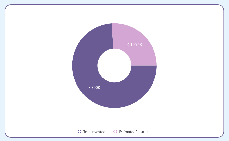
Step 9: Configure the Syncfusion .NET MAUI Toolkit Circular Chart
Let’s configure the Syncfusion® .NET MAUI Toolkit Circular Chart using the official documentation.
The third SfCardView includes an SfCircularChart, specifically a Doughnut chart, to visually represent the breakdown of investment allocation.
Legend: Use ChartLegend at the bottom to display investment categories.
Series: Add DoughnutSeries, bound to investment data, with custom colors and animated data labels for better visualization.
Tooltip: Use TooltipBehavior to display detailed values for each data point.
Refer to the following code XAML example.
<cards:SfCardView Grid.Column="1">

    <!--Doughnut Chart represents overall Investment-->
    <chart:SfCircularChart>

        <chart:SfCircularChart.Legend>
            <chart:ChartLegend Placement="Bottom" />
        </chart:SfCircularChart.Legend>

        <chart:DoughnutSeries
            ItemsSource="{Binding OverallInvestmentData}"
            XBindingPath="AmountName"
            YBindingPath="Amount"
            EnableAnimation="True"
            PaletteBrushes="{Binding CustomBrushes1}"
            LegendIcon="SeriesType"
            ShowDataLabels="{OnPlatform Android=False, iOS=False, Default=True}"
            EnableTooltip="{OnPlatform Android=True, iOS=True, Default=False}"
            Radius="0.7" />

    </chart:SfCircularChart>

</cards:SfCardView>
Refer to the following image.
Step 10: Dynamic data updates
The following data collections update dynamically based on user interactions such as text entry, slider adjustments, radio button selections, and segmented control changes:
Investment data collection
Investment goal amount data collection
Overall investment data collection
6% inflation-impacted data collection
Step 11: Organize controls in the overall layout
Finally, arrange all controls within the main layout to provide a seamless, intuitive, and visually balanced user experience.
Refer to the following XAML code example.
<Border>
    <ScrollView>

        <Grid>

            <Grid.RowDefinitions>
                <RowDefinition Height="0.5*" />
                <RowDefinition Height="0.7*" />
                <RowDefinition Height="*" />
                <RowDefinition Height="1.3*" />
                <RowDefinition Height="6.5*" />
            </Grid.RowDefinitions>

            <!--Title-->
            <HorizontalStackLayout Grid.Row="0">
                ……
            </HorizontalStackLayout>

            <!--Choose Type of Investments-->
            <segmentedControl:SfSegmentedControl Grid.Row="1">
                ……
            </segmentedControl:SfSegmentedControl>

            <!--Select Investment Modes-->
            <HorizontalStackLayout Grid.Row="2">
                ……
            </HorizontalStackLayout>

            <!--User Interaction Layouts-->
            <HorizontalStackLayout Grid.Row="3">
                …….
            </HorizontalStackLayout>

            <Grid Grid.Row="4">

                <Grid.ColumnDefinitions>
                    <ColumnDefinition Width="*" />
                    <ColumnDefinition Width="*" />
                </Grid.ColumnDefinitions>

                <cards:SfCardView Grid.Column="0">
                    <!--StackedColumn Chart represents Investment Growth-->
                    …..
                </cards:SfCardView>

                <cards:SfCardView Grid.Column="0">
                    <!--Column Chart represents the inflation impact on Investment-->
                    …….
                </cards:SfCardView>

                <cards:SfCardView Grid.Column="1">
                    <!--Doughnut Chart represents overall Investment-->
                    ……..
                </cards:SfCardView>

            </Grid>
        </Grid>
    </ScrollView>
</Border>
After executing these code examples, we will get the output that resembles the following image.
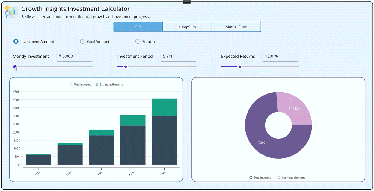
Build an SIP Calculator using .NET MAUI Toolkit Charts
GitHub repository
For more details, refer to the GitHub repository.
Conclusion
Thanks for reading! In this blog, we’ve explored how to build an investment calculator using .NET MAUI Toolkit. We encourage you to follow the steps outlined in this guide and share your feedback in the comments section below.
The existing customers can download the new version of Essential Studio® on the license and downloads page. If you are not a Syncfusion® customer, try our 30-day free trial to check out our incredible features.
If you require assistance, please don’t hesitate to contact us via our support forum, support portal, or feedback portal. We are always eager to help you!
Stay tuned for next week’s featured Chart of the Week.
Related Blogs
Subscribe to my newsletter
Read articles from syncfusion directly inside your inbox. Subscribe to the newsletter, and don't miss out.
Written by
syncfusion
syncfusion
Syncfusion provides third-party UI components for React, Vue, Angular, JavaScript, Blazor, .NET MAUI, ASP.NET MVC, Core, WinForms, WPF, UWP and Xamarin.