Fix Messy JavaScript Charts with Optimized Margins and Padding
 syncfusion
TL;DR: Margins and padding are essential for achieving a clear, clutter-free chart design. Margins prevent external overlap, while padding provides internal spacing around labels and legends. This blog demonstrates how Syncfusion® JavaScript Charts utilize these features to enhance clarity and layout, using real-world coffee data examples.
Welcome to our Weekly Data Visualization blog series.
When creating charts, we often focus on the data, colors, labels, and chart types. However, one often-overlooked element is spacing —specifically, margins and padding. These subtle design elements are crucial in improving a chart’s readability, structure, and visual appeal.
In this post, we’ll explore how margins and padding enhance chart clarity and guide you through an example using Syncfusion® JavaScript Charts and a real-world coffee production dataset.
What is Margin?
A margin is the space outside the chart area. It acts as a buffer to prevent the chart from overlapping with other page elements, such as adjacent charts, text, or page boundaries. By giving the chart ample breathing room, margins help maintain clarity and keep it visually distinct from surrounding content.
What is Padding?
Padding is the space inside the chart container, surrounding internal elements like labels, titles, and legends. It prevents these components from crowding or overlapping the data, resulting in a tidy, organized layout that enhances readability.
The Importance of margins and padding in chart design
Margins and padding define a chart’s spatial dynamics, ensuring its plot area, labels, and axes remain clear, organized, and interpretable.
Why they matter.
Clarity: Proper margins and padding provide consistent spacing for labels, axes, and data points, preventing overlap and enhancing readability.
Aesthetics: They balance the layout to create a visually engaging chart that draws viewers.
Focus: Well-managed space guides attention to key data points, highlighting the most important information.
Flexibility: Defined margins and padding let charts adapt seamlessly to various container sizes and devices without sacrificing clarity.
Ultimately, margins and padding transcend mere spacing; they are pivotal for crafting charts that communicate data effectively and elegantly.
Applying margin and padding in Syncfusion® charts
Syncfusion® offers a versatile suite of UI components, including a comprehensive chart library that enables developers to create rich visualizations with ease. The Syncfusion® Charts are renowned for their flexibility and support for a wide variety of chart types across multiple platforms. To get started, explore the official documentation for more details.
In this guide, we’ll examine how to use the margin and padding settings in Syncfusion JavaScript Charts to improve readability and balance. Using a coffee production dataset as an example, we’ll walk through the steps to create a clear and visually appealing Stacked Column Chart, focusing on readability and aesthetics.
Let’s dive into the steps!
Step 1: Collect data
Begin by sourcing reliable data for your chart. For this guide, we use statistics from the U.S. Department of Agriculture (USDA), which provides detailed insights into coffee production volumes across countries. Accurate, trustworthy data is essential because the clarity and credibility of your visualization depend on the quality of the underlying data.
Step 2: Structuring the data
Once you have your datasets, prepare them for visualization by mapping each property to the appropriate chart dimension:
The year property is used for the x-axis of the chart.
The production property is plotted on the y-axis, representing annual coffee production volumes in million 60 kg bags.
Separate datasets for each country, Brazil, Vietnam, and Colombia, are shown as individual series in a stacked column chart.
let brazilData: Object[] = [
    { year: 2019, production: 60.5 },
    { year: 2020, production: 69.9 },
    { year: 2021, production: 58.1 },
    { year: 2022, production: 62.6 },
    { year: 2023, production: 66.3 },
    { year: 2024, production: 66.4 }
];

let vietnamData: Object[] = [
    { year: 2019, production: 31.3 },
    { year: 2020, production: 29.0 },
    { year: 2021, production: 31.6 },
    { year: 2022, production: 28.3 },
    { year: 2023, production: 27.5 },
    { year: 2024, production: 30.1 }
];

let colombiaData: Object[] = [
    { year: 2019, production: 14.1 },
    { year: 2020, production: 13.4 },
    { year: 2021, production: 11.8 },
    { year: 2022, production: 10.7 },
    { year: 2023, production: 12.8 },
    { year: 2024, production: 12.9 }
];
Step 3: Creating and enhancing a Stacked Column Chart for the data
To visualize your coffee-production data, configure the EJ2 Chart control with a Stacked Column chart. This chart type is perfect for comparing volumes across countries, such as Brazil, Vietnam, and Colombia, while stacking each country’s values for easy comparison.
In your chart configuration, bind your dataset via the dataSource property, then map fields with xName (category axis) and yName (value axis). Finally, render the chart by calling appendTo on your chart instance.
let chart: Chart = new Chart({
    series: [
        {
            type: 'StackingColumn',
            dataSource: brazilData,
            xName: 'year',
            yName: 'production',
            name: 'Brazil'
        },
        {
            type: 'StackingColumn',
            dataSource: vietnamData,
            xName: 'year',
            yName: 'production',
            name: 'Vietnam'
        },
        {
            type: 'StackingColumn',
            dataSource: colombiaData,
            xName: 'year',
            yName: 'production',
            name: 'Colombia'
        }
    ],

});

chart.appendTo('#container');
Step 4: Enhancing visual presentation
Refine your chart’s visual appeal and readability by fine-tuning aesthetic properties, such as margin and padding.
Chart margin
The chart margin lets you customize the space around the entire chart, left, right, top, and bottom. These margins control the gap between the chart’s outer edge and plotting area, ensuring balanced layout and preventing chart elements from abutting the container boundaries.
let chart: Chart = new Chart({
    margin: { left: 25, top: 25, right: 25, bottom: 25 }

});
chart.appendTo('#container');
ChartArea margin
ChartArea margin defines the space between the chart container and the chart area. You can customize the left, right, top, and bottom margins to control how much buffer surrounds your chart. Adjusting these values helps maintain a clean layout by preventing chart content from appearing too close to the edges of the container.
let chart: Chart = new Chart({
    chartArea: {
        border: {
            width: 0
        },
        margin: { left: 5, top: 5, right: 5, bottom: 5 }
    }
});

chart.appendTo('#container');
Legend margin
The legend margin allows you to control the space around the chart legend by adjusting the left, right, top, and bottom margins. This helps ensure adequate spacing between the legend and other chart elements, preventing overlap and improving readability. Proper margin settings can enhance the visual structure, especially when the legend is placed near the chart content.
let chart: Chart = new Chart({
    legendSettings: {
        margin: { left: 5, right: 5, bottom: 5, top: 5 }
    }

});
chart.appendTo('#container');
Data label margin
The data label margin allows you to define spacing around individual data labels. Adjusting the top, bottom, left, and right margins helps improve label clarity and ensures they are properly positioned within the chart layout.
let chart: Chart = new Chart({
    series: [
        {
            type: 'StackingColumn',
            dataSource: brazilData,
            xName: 'year',
            yName: 'production',
            name: 'Brazil',
            marker: {
                dataLabel: {
                    visible: true,
                    margin: { left: 5, bottom: 1, top: 5, right: 5 },
                    border: { width: 1, color: '#5C4033' }
                }
            }
        },
        {
            type: 'StackingColumn',
            dataSource: vietnamData,
            xName: 'year',
            yName: 'production',
            name: 'Vietnam',
            marker: {
                dataLabel: {
                    visible: true,
                    margin: { left: 5, bottom: 1, top: 5, right: 5 },
                    border: { width: 1, color: '#5C4033' }
                }
            }
        },
        {
            type: 'StackingColumn',
            dataSource: colombiaData,
            xName: 'year',
            yName: 'production',
            name: 'Colombia',
            marker: {
                dataLabel: {
                    visible: true,
                    margin: { left: 5, bottom: 1, top: 5, right: 5 },
                    border: { width: 1, color: '#5C4033' }
                }
            }
        }
    ],

});
chart.appendTo('#container');
Stack label margin
The stack labels margin allows you to control the space around labels displayed on stacked columns or bars. By adjusting the left, right, top, and bottom margins, you can fine-tune the position of stack labels to prevent overlapping and improve their visibility within the chart.
let chart: Chart = new Chart({
    stackLabels: {
        visible: true,
        format: '{value}M',
        margin: { left: 5, bottom: 1, top: 5, right: 5 },
        border: { width: 1, color: '#5C4033' }
    }

});
chart.appendTo('#container');
Chart Padding
Label padding
The labelPadding property controls the spacing between axis labels and the axis line. Increasing this value helps create a clear visual gap, improving the readability of axis labels and preventing them from appearing too close to the axis.
let chart: Chart = new Chart({
    primaryXAxis: {
        valueType: 'Double',
        labelPadding: 8
    },
    primaryYAxis: {
        title: 'Coffee Production',
        labelPadding: 8
    }

});
chart.appendTo('#container');
Title padding
The titlePadding property sets the space between the axis title and the axis labels. Adjusting this padding helps avoid visual clutter and ensures the axis title is separated from the labels, enhancing the overall readability of the chart.
let chart: Chart = new Chart({
    primaryYAxis: {
        title: 'Coffee Production',
        titlePadding: 10
    }

});
chart.appendTo('#container');
Legend padding
The padding property customizes the spacing around the legend. Adjusting this value helps separate it from other chart elements, making the legend easier to read and better aligned within the chart layout.
let chart: Chart = new Chart({
    legendSettings: {
        padding: 10
    }

});
chart.appendTo('#container');
Legend container padding
The containerPadding property defines the space between the edges of the legend container and its content. By customizing the left, right, top, and bottom padding, you can improve the alignment and spacing of the legend within the chart area.
let chart: Chart = new Chart({
    legendSettings: {
        containerPadding: { left: 10, right: 10, bottom: 10, top: 10 }
    }

});
chart.appendTo('#container');
Legend item padding
The itemPadding property controls the space between individual legend items. Adjusting this padding helps to evenly distribute the items, improving readability and preventing them from appearing too close to each other.
let chart: Chart = new Chart({
    legendSettings: {
        itemPadding: 25
    }

});
chart.appendTo('#container');
Legend shape padding
The shapePadding property controls the space between the legend shape (such as a rectangle or circle) and its associated text. Adjusting this padding helps maintain a clear and balanced layout, preventing the shape and label from appearing too close together.
let chart: Chart = new Chart({
    legendSettings: {
        shapePadding: 10
    }

});

chart.appendTo('#container');
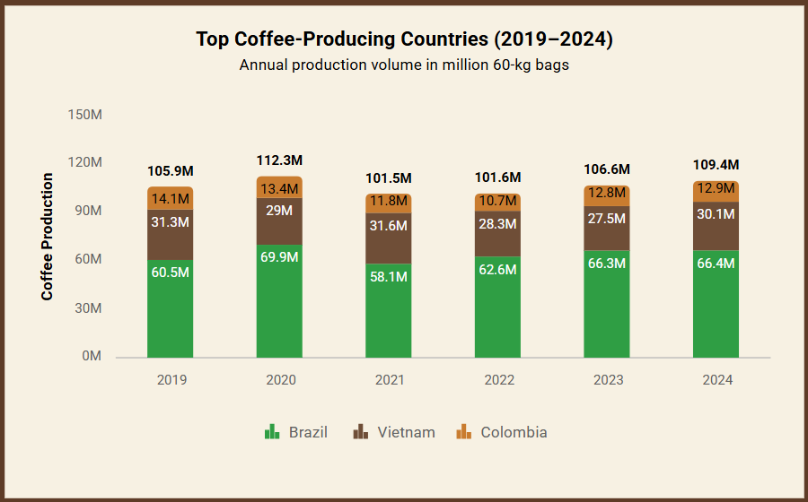
Before and after: The impact of Margin and Padding on readability
Before adjusting Margin and Padding
Initially, the chart appeared cluttered, with overlapping elements and cramped spacing between the legend, y-axis title, axis labels, and chart title. This lack of visual separation made the chart harder to read and less effective in communicating data.
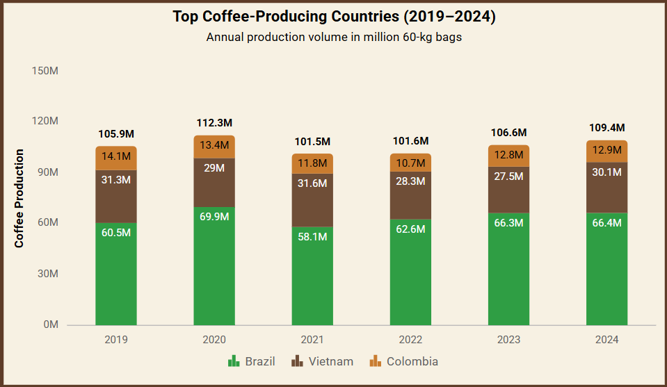
After adjusting Margins and Padding
By tweaking the margins and padding, the legend, y-axis title, axis labels, and chart title gain proper spacing, significantly enhancing the overall visualization.
This creates a well-balanced and aesthetically pleasing layout.
Reference
For more details, refer to the JavaScript Chart Margin and Padding Readability StackBlitz demo.
Conclusion
Thanks for reading! Chart margins and padding play a crucial role in enhancing the readability and visual balance of data visualizations. Proper spacing ensures that labels, legends, titles, and data points are not cramped, making the chart easier to interpret and more visually appealing. By fine-tuning these layout elements in Syncfusion JavaScript Charts, we can significantly improve user experience and data clarity.
The new version of Essential Studio® is available for current customers from the License and Downloads page. If you are not a Syncfusion® customer, try our 30-day free trial to check out our newest features.
If you have questions, contact us through our support forums, support portal, or feedback portal. We are always happy to assist you. Happy coding!
Related Blogs
[2025 Volume 1: Must-Know Updates in the Syncfusion Diagram Component](2025 Volume 1: Must-Know Updates in the Syncfusion Diagram Component)
Subscribe to my newsletter
Read articles from syncfusion directly inside your inbox. Subscribe to the newsletter, and don't miss out.
Written by
syncfusion
syncfusion
Syncfusion provides third-party UI components for React, Vue, Angular, JavaScript, Blazor, .NET MAUI, ASP.NET MVC, Core, WinForms, WPF, UWP and Xamarin.