Data Visualization Tools Explained: Features, Pros & Cons
 Hemant SEO
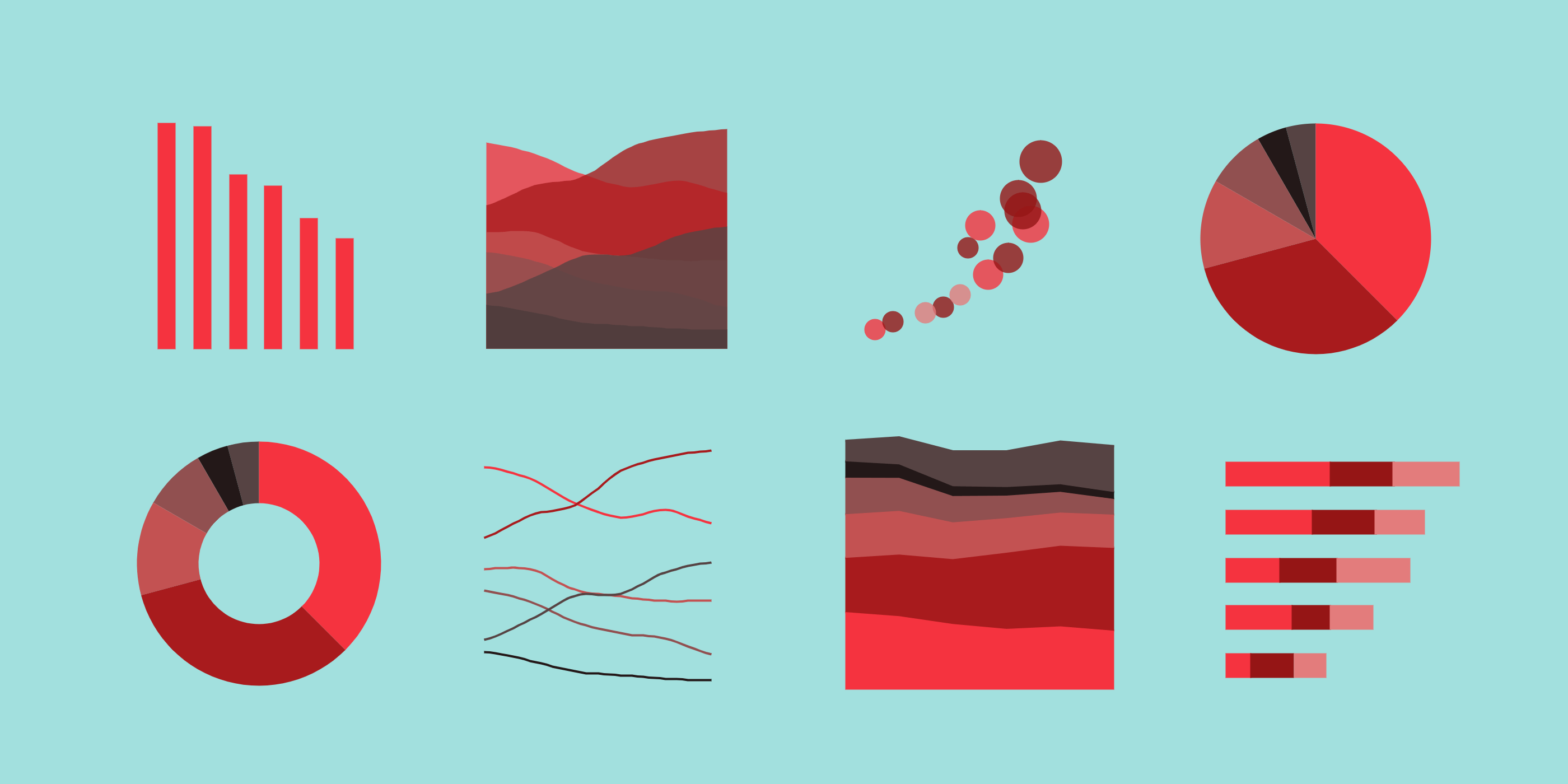
Data is everywhere. From social media trends to company sales reports, we are surrounded by data. But raw data can be confusing and hard to understand. This is where data visualization comes in. Data visualization means showing data in the form of charts, graphs, and maps so that it becomes easy to read and analyze.
In this guide, we will explain what to look for in a data visualization tool and review some of the most popular tools available. We’ll also share the features, pros, and cons of each tool to help you choose the best one for your needs.
What to Look for in a Data Visualization Tool

Before choosing a data visualization tool, it is important to know what features matter most. Here are some key things to consider:
User Interface and Ease of Use
The tool should be simple and user-friendly, especially if you are not a tech expert. A drag-and-drop interface is a plus.
Data Source Integration
The tool should connect easily with your data sources like Excel, Google Sheets, databases, or cloud platforms.
Types of Charts and Visualizations
Look for tools that support different types of charts like bar charts, pie charts, line graphs, scatter plots, maps, etc.
Customization and Interactivity
A good tool allows you to change colors, labels, and design styles. It should also let users interact with the visuals by clicking or hovering.
Collaboration Features
If you work in a team, your tool should allow easy sharing, editing, and commenting on visual reports.
Pricing and Scalability
Choose a tool that fits your budget. Also, make sure it can grow with your needs if your data size increases.
Popular Data Visualization Tools: Features, Pros & Cons
Microsoft Power BI

Key Features
Connects to Excel, SQL Server, and cloud services
Real-time data updates
Uses AI to analyze data
Works well with other Microsoft tools
Pros
Affordable for small businesses
Familiar interface for Excel users
Strong data modeling abilities
Cons
Some advanced features are hard to learn
Limited visual customization unless you use coding
Tableau

Key Features
Easy drag-and-drop dashboard creation
Connects to many data sources
Offers a lot of visualization types
Has strong community support
Pros
Makes beautiful and interactive dashboards
Great for telling data stories
Good for large datasets
Cons
Expensive pricing, especially for large teams
Requires time to learn for beginners
Google Data Studio (Looker Studio)
Key Features
Free and web-based
Connects with Google products like Analytics and BigQuery
Real-time collaboration
Pros
Completely free
Great for digital marketers
Simple to use for basic dashboards
Cons
Limited design options
Not ideal for complex data work
Qlik Sense

Key Features
Uses associative data model for deeper insights
Offers smart search and AI suggestions
Supports cloud and on-premise use
Pros
Powerful analytics engine
Handles large and complex data well
Good for self-service BI (Business Intelligence)
Cons
Steeper learning curve
UI can feel complicated
Pricing and plans can be confusing
D3.js
Key Features
Open-source JavaScript library
Fully customizable visuals
Great for interactive web-based charts
Pros
Gives full control over chart design
Ideal for web developers
Can create advanced visual stories
Cons
Requires coding skills (JavaScript)
Takes time to create visuals from scratch
Not suitable for non-technical users
Chart.js
Key Features
Simple JavaScript charting library
Lightweight and easy to use
Supports basic chart types (bar, pie, line, etc.)
Pros
Quick to set up and use
Great for small websites or apps
Free and open-source
Cons
Fewer features than larger tools
Limited interactivity
Not suitable for large datasets or business dashboards
Infogram
Key Features
Templates for reports, infographics, and dashboards
Easy drag-and-drop editor
Embeddable visual content
Pros
Good for marketing and design teams
No need for coding
Shareable visuals with links
Cons
Limited functionality for deep data analysis
Some features locked in premium plans
Comparison Table: Quick Overview
Tool | Ease of Use | Best For | Free Version | Customization | Requires Coding |
Power BI | Medium | Small businesses | Yes | Medium | No |
Tableau | Medium | Analysts & teams | Yes (Public) | High | No |
Google Data Studio | Easy | Marketers | Yes | Low | No |
Qlik Sense | Medium | Enterprises | Limited | High | No |
D3.js | Hard | Developers | Yes | Very High | Yes |
Chart.js | Easy | Simple web apps | Yes | Low | Yes |
Infogram | Easy | Designers, marketers | Yes (Limited) | Medium | No |
How to Choose the Right Tool for Your Needs
Choosing the right tool depends on what you need. Here are some tips:
For Beginners and Small Teams
Choose tools like Google Data Studio or Infogram.
They are free and easy to use.
Great for simple charts and quick dashboards.
For Analysts and Business Users
Use Power BI or Tableau.
These tools offer deeper analysis and beautiful dashboards.
Good for companies that work with lots of data.
For Developers and Tech Experts
Try D3.js or Chart.js.
These tools give full control and flexibility.
Best for building custom web-based visualizations.
For Enterprises
Qlik Sense is a strong choice.
It works well with large data and multiple users.
Good for big organizations with data teams.
Conclusion
Data visualization helps people understand information clearly and quickly. There are many tools available, and each has its own features, strengths, and weaknesses. Whether you’re a beginner, a business user, or a developer, there’s a tool out there for you.
Remember to choose a tool based on your goals, team size, budget, and technical skills. Try free versions before making a purchase.
Subscribe to my newsletter
Read articles from Hemant SEO directly inside your inbox. Subscribe to the newsletter, and don't miss out.
Written by
