Build a Stunning and Interactive Real-Time Weather Dashboard with .NET MAUI Toolkit
 syncfusion
TL;DR: Build a dynamic weather monitoring dashboard with the Syncfusion® .NET MAUI Toolkit. Discover how to set up your project, model weather data, and create interactive visualizations using temperature charts, radial gauges for wind and UV indices, and Segmented Controls for seamless view switching. This guide demonstrates how to deliver real-time, mobile-friendly dashboards using Syncfusion’s powerful UI components.
Welcome to the Chart of the Week blog series!
In this blog post, we’ll show you how to build a weather dashboard using the Syncfusion®.NET MAUI Toolkit. You’ll learn how to visualize real-time weather data and extract meaningful insights using rich charting controls. We’ll also explore how these tools help us better understand weather patterns and trends through interactive, smooth, and responsive visualizations.
Syncfusion®.NET MAUI Toolkit
The Syncfusion®.NET MAUI Toolkit offers a comprehensive suite of tools for building feature-rich applications with interactive data visualizations. It includes a wide variety of UI components, such as charts, segmented control, and other customizable elements. The toolkit also features open-source contributions, providing developers greater flexibility and fostering strong community support.
Benefits of weather tracking
Weather significantly influences our daily activities, from planning outdoor events to ensuring safety during severe conditions. Visualizing weather data effectively empowers users to make informed decisions with confidence. For instance, temperature changes throughout the day can be visualized using the SplineSeries and SplineAreaSeries available in the MAUI Toolkit’s SfCartesianChart.
The SplineSeries presents data as smooth curves, while the SplineAreaSeries fills the area beneath the curve, ensuring clarity in the data representation.
The final weather monitoring dashboard below illustrates dynamic, real-time weather tracking using these charts.

Now, let’s explore the steps to build this dashboard!
Step 1: Configure the .NET MAUI Toolkit
Before creating the weather monitoring dashboard, install the Syncfusion® .NET MAUI Toolkit by following the documentation.
Step 2: Prepare the WeatherDataModel
To organize the weather data, define a WeatherDataModel class. This model includes properties to track key weather metrics as follows:
Temperature: Captures temperature variations throughout the day.
Wind speed and direction: Helps assess outdoor activities and travel conditions.
Feels like temperature: Reflects the perceived temperature based on humidity and wind.
Humidity and dew point: Indicates the moisture content in the air.
UV Index: Highlights sun exposure risks for better skin protection.
Using this data model, you can visualize weather metrics with chart types like SplineSeries , SplineAreaSeries , and ColumnCharts , provided in the .NET MAUI Toolkit .
Refer to the following code example.
public class WeatherDataModel
{
    private float temperature;

    public float Temperature
    {
        get => temperature;
        set
        {
            temperature = Celsius = value;
            Fahrenheit = MathF.Round((value * 9 / 5) + 32, 1);
        }
    }

    public DateTime Time { get; set; }

    public float Celsius { get; set; }

    public float Fahrenheit { get; set; }

    public float FeelsLike { get; set; }

    public float FeelsLikeF => MathF.Round(Fahrenheit + random.Next(5, 11) + random.NextSingle(), 1);

    public float WindSpeed { get; set; }

    public float WindDirection { get; set; }

    public float Feelslike { get; set; }

    public float Humidity { get; set; }

    public float UVIndex { get; set; }

    public float MaxTemperature { get; set; }

    public float MinTemperature { get; set; }

    public float Dew { get; set; }

    public string? WeatherDescription { get; set; }

    public string? Category { get; set; }

    public double ChancePercentage { get; set; }

    public Enums.TempScale Scale { get; set; }
}
Step 3: Initialize weather data in the WeatherViewModel
The WeatherViewModel defines an ObservableCollection to store and manage dynamic weather data. This collection supports real-time UI updates through data binding.
Sample weather data is generated and assigned to this collection, demonstrating how to populate charts and gauges with dynamic, interactive weather information.
Refer to the following code example.
public WeatherViewModel()
{
    GenerateWeatherData();
}

void GenerateWeatherData()
{
    City = "Los Santos";
    DateTime time = DateTime.Today;
    Date = time.ToString("MMMM dd, yyyy");

    WeatherData = new ObservableCollection<WeatherDataModel>();
    Random random = new();

    for (int i = 1; i <= 24; i++)
    {
        float temp = MathF.Round(random.Next(24, 28) + random.NextSingle(), 1);

        WeatherData.Add(new WeatherDataModel
        {
            Time = time,
            Temperature = temp,
            WindSpeed = MathF.Round(random.Next(1, 15) + random.NextSingle(), 1),
            WindDirection = random.Next(0, 360),
            Humidity = random.Next(40, 90),
            UVIndex = MathF.Round(random.Next(0, 12) + random.NextSingle(), 1),
            Dew = MathF.Round(random.Next(5, 20) + random.NextSingle(), 1),
            FeelsLike = MathF.Round(temp + random.Next(5, 11) + random.NextSingle(), 1)
        });

        time = time.AddHours(1);
    }

    MinTemperature = WeatherData.Min(min => min.Temperature);
    MaxTemperature = WeatherData.Max(max => max.Temperature);
}
Step 4: Visualize temperature trends with charts
In this step, we’ll use the SfCartesianChart to visualize temperature trends throughout the day. The actual temperature is plotted using a SplineAreaSeries , while the feels-like temperature is displayed using a SplineSeries. These smooth and responsive chart types provide a clear, intuitive representation of temperature fluctuations.
The chart configurations are:
X-Axis: Displays time intervals.
Y-Axis: Displays temperature values.
Spline Area Chart: Represents actual temperature using smooth, shaded curves.
Refer to the following code example.
<chart:SfCartesianChart>

    <chart:SfCartesianChart.XAxes>
        <chart:DateTimeAxis Interval="2" ShowMajorGridLines="False">
            <chart:DateTimeAxis.LabelStyle>
                <chart:ChartAxisLabelStyle
                    TextColor="SlateGray"
                    FontFamily="Sen"
                    LabelFormat="h tt" />
            </chart:DateTimeAxis.LabelStyle>
        </chart:DateTimeAxis>
    </chart:SfCartesianChart.XAxes>

    <chart:SfCartesianChart.YAxes>
        <chart:NumericalAxis Interval="{Binding Interval}" Maximum="{Binding YAxisMax}">
            <chart:NumericalAxis.LabelStyle>
                <chart:ChartAxisLabelStyle
                    LabelFormat="0°"
                    TextColor="SlateGray"
                    FontFamily="Sen" />
            </chart:NumericalAxis.LabelStyle>
        </chart:NumericalAxis>
    </chart:SfCartesianChart.YAxes>

    <chart:SfCartesianChart.Legend>
        <chart:ChartLegend Placement="Bottom">
            <chart:ChartLegend.LabelStyle>
                <chart:ChartLegendLabelStyle
                    FontFamily="Sen"
                    TextColor="DarkSlateGrey" />
            </chart:ChartLegend.LabelStyle>
        </chart:ChartLegend>
    </chart:SfCartesianChart.Legend>

    <chart:SfCartesianChart.TrackballBehavior>
        <chart:ChartTrackballBehavior DisplayMode="NearestPoint">
            <chart:ChartTrackballBehavior.LineStyle>
                <chart:ChartLineStyle
                    Stroke="#4facfe"
                    StrokeWidth="2" />
            </chart:ChartTrackballBehavior.LineStyle>
            <chart:ChartTrackballBehavior.LabelStyle>
                <chart:ChartLabelStyle
                    TextColor="White"
                    LabelFormat="{}0.00°"
                    Background="SlateGray"
                    FontAttributes="Bold"
                    FontSize="14" />
            </chart:ChartTrackballBehavior.LabelStyle>
            <chart:ChartTrackballBehavior.MarkerSettings>
                <chart:ChartMarkerSettings
                    Height="10"
                    Width="10"
                    Stroke="#4facfe"
                    StrokeWidth="2"
                    Fill="white" />
            </chart:ChartTrackballBehavior.MarkerSettings>
        </chart:ChartTrackballBehavior>
    </chart:SfCartesianChart.TrackballBehavior>

    <chart:SfCartesianChart.Series>

        <chart:SplineAreaSeries
            ItemsSource="{Binding WeatherData}"
            XBindingPath="Time"
            YBindingPath="{Binding TemperatureYPath}"
            Opacity=".6"
            Label="Temperature"
            EnableAnimation="True"
            Fill="{StaticResource gradientFill}" />

        <chart:SplineSeries
            ItemsSource="{Binding WeatherData}"
            XBindingPath="Time"
            YBindingPath="{Binding FeelsYPath}"
            IsVisible="{Binding SeriesIsVisible}"
            StrokeWidth="1.5"
            Label="Feels like"
            Fill="#FF6F00"
            LegendIcon="SeriesType"
            StrokeDashArray="{StaticResource strokeDash}">
        </chart:SplineSeries>

    </chart:SfCartesianChart.Series>

</chart:SfCartesianChart>
Refer to the following image.

Step 5: Implement the wind direction compass
Wind direction is visualized using the SfRadialGauge control, which offers an interactive, compass-like display of wind movement. This type of visualization is especially useful in weather dashboards, aviation apps, and outdoor planning tools.
The following code example demonstrates how to customize the SfRadialGauge to resemble a compass, complete with cardinal direction labels and a two-headed needle for indicating wind directions accurately.
<gauge:SfRadialGauge Background="Transparent" Grid.Column="1">

    <gauge:RadialAxis Minimum="0"
                      Maximum="360"
                      Interval="45"
                      ShowTicks="False"
                      LabelPosition="Inside"
                      StartAngle="270"
                      EndAngle="270"
                      LabelCreated="RadialAxis_LabelCreated">

        <gauge:RadialAxis.AxisLabelStyle>
            <gauge:GaugeLabelStyle
                TextColor="#8fd3ff"
                FontSize="10"
                FontFamily="Sen" />
        </gauge:RadialAxis.AxisLabelStyle>

        <gauge:RadialAxis.AxisLineStyle>
            <gauge:RadialLineStyle
                Fill="#8fd3ff" />
        </gauge:RadialAxis.AxisLineStyle>

        <gauge:RadialAxis.Pointers>
            <gauge:NeedlePointer
                Value="300"
                NeedleFill="#4facfe"
                KnobFill="White"
                NeedleLengthUnit="Factor"
                NeedleLength=".6"
                KnobRadius="0.1"
                NeedleEndWidth="13" />

            <gauge:NeedlePointer
                Value="120"
                EnableAnimation="True"
                NeedleFill="#8fd3ff"
                KnobFill="White"
                NeedleLengthUnit="Factor"
                NeedleEndWidth="13"
                NeedleLength=".6" />
        </gauge:RadialAxis.Pointers>

    </gauge:RadialAxis>

</gauge:SfRadialGauge>
Refer to the following image.

Step 6: Visualize climate factors with RadialBarSeries
We use the RadialBarSeries in the .NET MAUI Toolkit SfCircularChart to present key weather metrics such as rain percentage, humidity level, and dew point probability in a clean, modern circular format.
Refer to the following code example.
<chart:SfCircularChart Margin="0,0,20,0">

    <chart:SfCircularChart.Legend>
        <chart:ChartLegend Placement="Right">
            <chart:ChartLegend.LabelStyle>
                <chart:ChartLegendLabelStyle
                    TextColor="SlateGray"
                    FontFamily="Sen"
                    FontSize="13" />
            </chart:ChartLegend.LabelStyle>
        </chart:ChartLegend>
    </chart:SfCircularChart.Legend>

    <chart:RadialBarSeries
        ItemsSource="{Binding WeatherMetrics}"
        XBindingPath="Category"
        YBindingPath="ChancePercentage"
        GapRatio=".4"
        MaximumValue="100"
        CapStyle="BothCurve"
        EnableAnimation="True"
        PaletteBrushes="{StaticResource RadialBarGradients}" />

</chart:SfCircularChart>
Refer to the following image.

Step 7: Add a Segmented Control to switch between charts
To enhance the user experience, we use the MAUI Toolkit SfSegmentedControl to toggle between the temperature and the overview charts within the same display area. This control provides a smooth and intuitive way to switch between visualizations, enhancing the dashboard’s interactivity.
The Segmented Control supports modern styling and includes labeled options such as temperature and overview.
To configure the SfSegmentedControl, refer to the following code example.
<segments:SfSegmentedControl ItemsSource="{Binding SegmentItems}"
                              SelectedIndex="0"
                              Stroke="#778899"
                              StrokeThickness="1.5"
                              SegmentHeight="30"
                              SegmentWidth="100"
                              WidthRequest="210"
                              CornerRadius="5"
                              SelectionChanged="SfSegmentedControl_SelectionChanged">

    <segments:SfSegmentedControl.TextStyle>
        <segments:SegmentTextStyle
            TextColor="#778899"
            FontAttributes="Bold"
            FontFamily="Sen"
            FontSize="14" />
    </segments:SfSegmentedControl.TextStyle>

    <segments:SfSegmentedControl.SelectionIndicatorSettings>
        <segments:SelectionIndicatorSettings
            Background="#85D3FD"
            TextColor="White" />
    </segments:SfSegmentedControl.SelectionIndicatorSettings>

</segments:SfSegmentedControl>
Refer to the following image.

Step 8: Create an overview chart
Now, visualize the day’s overall weather summary using multiple ColumnSeries within the .NET MAUI Toolkit ColumnCharts. This approach enables users to interpret weather insights such as temperature, humidity, wind speed, and more by comparing their daily variations in a single SfCartesianChart.
Refer to the following code example.
<chart:SfCartesianChart>

    <chart:SfCartesianChart.XAxes>
        <chart:DateTimeAxis Interval="2" ShowMajorGridLines="False">
            <chart:DateTimeAxis.LabelStyle>
                <chart:ChartAxisLabelStyle TextColor="SlateGray" FontFamily="Sen" LabelFormat="h tt" />
            </chart:DateTimeAxis.LabelStyle>
        </chart:DateTimeAxis>
    </chart:SfCartesianChart.XAxes>

    <chart:SfCartesianChart.YAxes>
        <chart:NumericalAxis IsVisible="False" />
    </chart:SfCartesianChart.YAxes>

    <chart:SfCartesianChart.Legend>
        <chart:ChartLegend Placement="Bottom" ToggleSeriesVisibility="True">
            <chart:ChartLegend.LabelStyle>
                <chart:ChartLegendLabelStyle FontFamily="Sen" TextColor="DarkSlateGrey" />
            </chart:ChartLegend.LabelStyle>
        </chart:ChartLegend>
    </chart:SfCartesianChart.Legend>

    <chart:SfCartesianChart.Series>

        <chart:ColumnSeries ItemsSource="{Binding WeatherData}"
                            XBindingPath="Time"
                            YBindingPath="Temperature"
                            Fill="#F7DC6F"
                            Width=".4"
                            CornerRadius="2"
                            EnableAnimation="True"
                            Label="Temperature" />

        <chart:ColumnSeries ItemsSource="{Binding WeatherData}"
                            XBindingPath="Time"
                            YBindingPath="FeelsLike"
                            Fill="#FFA560"
                            Width=".4"
                            CornerRadius="2"
                            EnableAnimation="True"
                            Label="Feels Like" />

        <chart:ColumnSeries ItemsSource="{Binding WeatherData}"
                            XBindingPath="Time"
                            YBindingPath="UVIndex"
                            Fill="#AF7AC5"
                            Width=".4"
                            CornerRadius="2"
                            EnableAnimation="True"
                            Label="UV Index" />

        <chart:ColumnSeries ItemsSource="{Binding WeatherData}"
                            XBindingPath="Time"
                            YBindingPath="WindSpeed"
                            Fill="#85D3FD"
                            Width=".4"
                            CornerRadius="2"
                            EnableAnimation="True"
                            Label="Wind Speed" />

    </chart:SfCartesianChart.Series>

</chart:SfCartesianChart>
Refer to the following image.

Integrating the temperature chart, overview chart, and wind direction compass creates a comprehensive dashboard for analyzing weather patterns. These visualizations provide users with valuable and intuitive insights into daily weather conditions.
Step 9: Create an overview panel
Create an overview panel as the central display for key weather metrics. It offers a structured and visually appealing view of real-time weather data.
The UVIndex is visualized using the .NET MAUI SfRadialGauge Control, offering an intuitive and dynamic way to represent varying UV exposure levels. This example illustrates how such visualizations apply to real-world scenarios, helping users to understand daily sun intensity.
Refer to the following image.

Refer to the following code example to learn how to customize the SfRadialGauge to represent the UV index. This implementation includes a gradient color scale to indicate varying UV intensity levels and an animated pointer to display the current UV index value.
<gauge:SfRadialGauge Grid.Column="3" BackgroundColor="Transparent" Margin="0,20">

    <gauge:SfRadialGauge.Axes>
        <gauge:RadialAxis Minimum="0"
                          Maximum="12"
                          ShowTicks="False"
                          ShowLabels="False">

            <gauge:RadialAxis.AxisLineStyle>
                <gauge:RadialLineStyle ThicknessUnit="Factor"
                                       Thickness="0.1">
                    <gauge:RadialLineStyle.GradientStops>
                        <gauge:GaugeGradientStop Value="2"
                                                 Color="#88D8B0" />
                        <gauge:GaugeGradientStop Value="5"
                                                 Color="#FFD700" />
                        <gauge:GaugeGradientStop Value="7"
                                                 Color="#FFA500" />
                        <gauge:GaugeGradientStop Value="9"
                                                 Color="OrangeRed" />
                        <gauge:GaugeGradientStop Value="12"
                                                 Color="#8A2BE2" />
                    </gauge:RadialLineStyle.GradientStops>
                </gauge:RadialLineStyle>
            </gauge:RadialAxis.AxisLineStyle>

            <gauge:RadialAxis.Pointers>
                <gauge:ShapePointer Value="{Binding WeatherData[0].UVIndex}"
                                    x:DataType="local:WeatherViewModel"
                                    Offset="-11"
                                    EnableAnimation="True"
                                    Fill="SlateGray" />
            </gauge:RadialAxis.Pointers>

            <gauge:RadialAxis.Annotations>
                <gauge:GaugeAnnotation>
                    <gauge:GaugeAnnotation.Content>
                        <Label VerticalTextAlignment="Center"
                               HorizontalTextAlignment="Center"
                               x:DataType="local:WeatherViewModel">
                            <Label.FormattedText>
                                <FormattedString>
                                    <Span Text="{Binding WeatherData[0].UVIndex}"
                                          FontSize="20"
                                          FontFamily="Sen"
                                          TextColor="SlateGray" />
                                    <Span Text="10"/>
                                    <Span Text="UV Index"
                                          FontFamily="Sen"
                                          FontSize="14"
                                          TextColor="LightSlateGray" />
                                </FormattedString>
                            </Label.FormattedText>
                        </Label>
                    </gauge:GaugeAnnotation.Content>
                </gauge:GaugeAnnotation>
            </gauge:RadialAxis.Annotations>

        </gauge:RadialAxis>
    </gauge:SfRadialGauge.Axes>

</gauge:SfRadialGauge>
This sample highlights how Syncfusion’s .NET MAUI Toolkit can help developers build feature-rich, interactive applications with user-friendly designs.
After executing these code examples, we will get the output that resembles the following image.
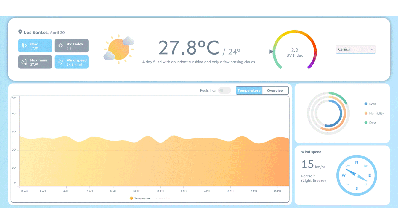
.NET MAUI Weather Dashboard with temperature, wind, UV index, and climate metrics
GitHub reference
For more details, refer to the GitHub demo.
Conclusion
Thanks for reading! In this blog, we’ve explored how to build a weather monitoring dashboard using Syncfusion® .NET MAUI Toolkit. We encourage you to follow the steps outlined in this guide and share your feedback in the comments section below.
Existing customers can download the new version of Essential Studio® on the license and downloads page. If you are not a Syncfusion® customer, try our 30-day free trial to check our incredible features.
If you require assistance, please don’t hesitate to contact us via our support forum, support portal, or feedback portal. We are always eager to help you!
Stay tuned for next week’s featured Chart of the Week.
Related Blogs
Subscribe to my newsletter
Read articles from syncfusion directly inside your inbox. Subscribe to the newsletter, and don't miss out.
Written by
syncfusion
syncfusion
Syncfusion provides third-party UI components for React, Vue, Angular, JavaScript, Blazor, .NET MAUI, ASP.NET MVC, Core, WinForms, WPF, UWP and Xamarin.