Understanding CSS Positioning and Pseudo Elements (With a Little Help From AI)
 David Ocean
If you’ve ever built a web page and thought, “Why isn’t this element sitting where I want it to?” — you’ve already come across one of the trickiest parts of CSS: positioning.
And if you’ve ever wondered how websites add fancy effects like custom underlining, styled first letters, or tooltips — then you’ve bumped into the world of pseudo-elements.
Luckily, you don’t have to figure out positioning or pseudo-elements by trial and error.
AI tools can help you visualize, fix, and even generate the right CSS for you making the learning curve much less steep.
In this post, we’ll cover:
The basics of CSS positioning: relative, absolute, fixed, and sticky
How to use pseudo-elements like ::before and ::after
Easy AI prompt examples to get hands-on practice
Let’s jump in.
CSS positioning: How elements move and behave
If you’ve ever struggled to center a box, place a button in a corner, or create an overlay — you’ve tangled with CSS positioning.
Let’s make it simple.
Position: Relative vs Absolute
The two most common types you’ll use are relative and absolute positioning.
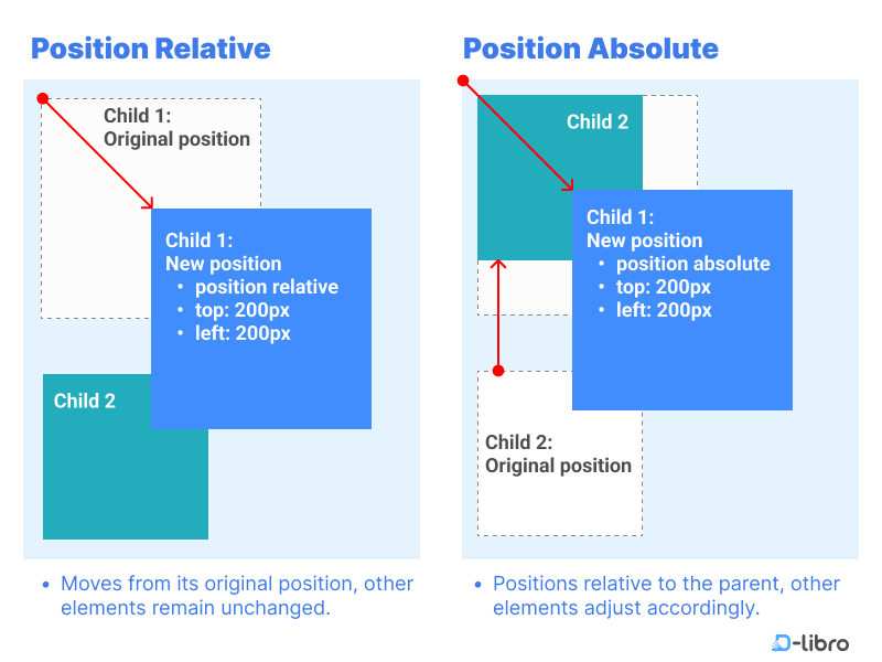
Relative moves the element relative to its original place.
Absolute positions the element relative to the nearest positioned ancestor — or, if none exists, the entire page.
Example of relative positioning:
.child {
  position: relative;
  top: 20px;
  left: 30px;
}
Example of absolute positioning:
.child {
  position: absolute;
  top: 20px;
  left: 30px;
}
Absolute elements are removed from the normal flow, so they can overlap other elements easily.
Prompt idea:
“Generate CSS that places a button absolutely at the bottom right of a container.”
One prompt, and you’ll have ready-to-use positioning code.
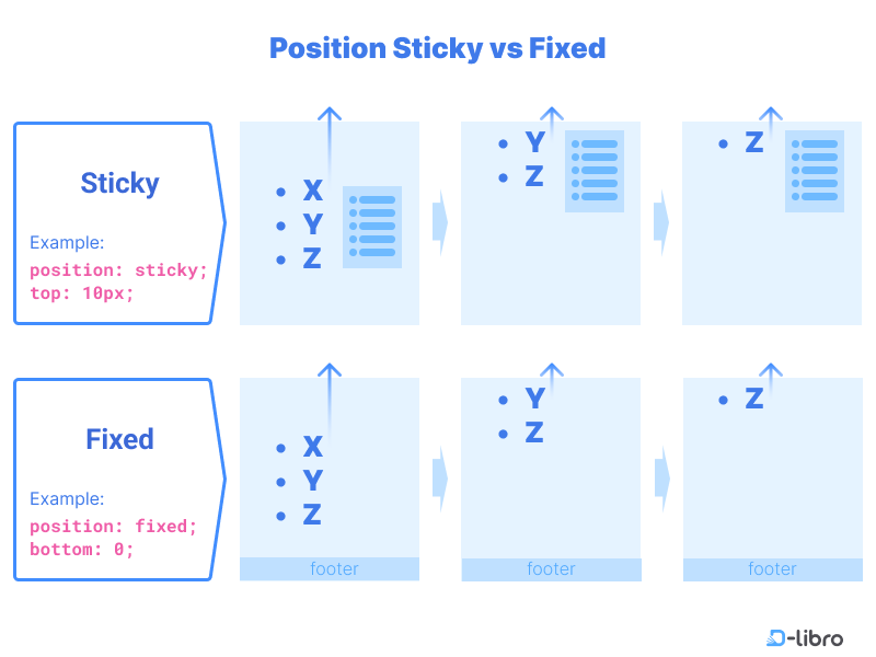
Sticky vs Fixed positioning
Another important duo to understand: sticky and fixed.
Sticky elements scroll with the page until they hit a set position — then they stick. Fixed elements stay pinned to a spot on the screen no matter how much you scroll.
Example of sticky positioning:
header {
  position: sticky;
  top: 0;
  background: white;
}
Example of fixed positioning:
footer {
  position: fixed;
  bottom: 0;
  width: 100%;
}
Pseudo-Elements: A simple way to add tiny details without extra code
If you’ve ever wanted to make just the first letter of a paragraph bigger — or sneak in a little icon before a heading — you might’ve wondered, “Do I have to wrap everything in a span tag?” Actually, you don’t.
That’s exactly what pseudo-elements are for. They let you style pieces of an element, without having to touch your HTML at all. No extra tags. No extra mess.
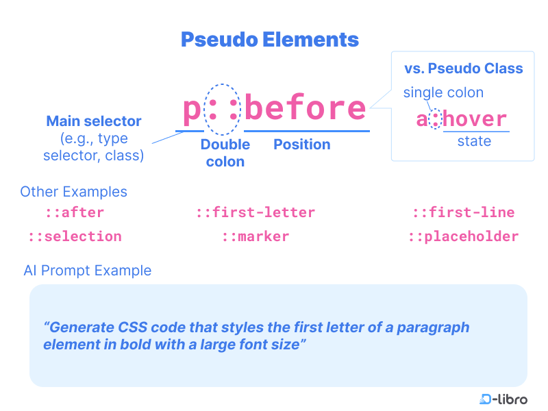
A few pseudo-elements you’ll probably bump into:
::before — Add something before the content (like a custom bullet point).
::after — Add something after the content (like an arrow after a link).
::first-letter — Style just the first letter (great for magazine-style intros).
::first-line — Tweak only the first line of a paragraph.
::placeholder — Style the light grey text inside input boxes.
You get the idea: tiny customizations without cluttering your HTML.
A Real-World Example (Not Just Theory)
Say you’re writing a blog post and you want that first letter to pop — sort of like those big, fancy drop caps you see in print magazines.
You don’t need to wrap the letter manually. You just add this:
p::first-letter {
  font-size: 2.5rem;
  font-weight: bold;
  color: #333;
}
Your paragraph still looks clean in the code, but the first letter is styled automatically.
What if you don’t like how it looks? No problem: just tweak the CSS. No messy edits in your HTML.
Where you’ll actually use this (and why it matters)
Once you start playing around with positioning and pseudo-elements, you’ll notice them all over the web — whether you realize it or not.
You know that sticky header that follows you down a page?
Or that little arrow that appears after a “Read More” link?
Or the fancy first letter in a blog post that looks way fancier than the rest of the text?
Yeah, all of that usually comes down to a few smart uses of positioning and pseudo-elements.
Here are some places you’ll start using these tricks yourself:
Making a header stick to the top when someone scrolls (without a crazy amount of JavaScript)
Adding a simple icon or arrow before a link, without needing an extra <img>
Keeping a “Contact Us” button floating in the bottom corner — even while everything else scrolls
Styling the first letter of an article to give it a more polished, editorial feel
Creating little tooltips or label hints without touching the HTML structure
You don’t need 50 techniques either. Just a few basics can already make your projects feel a lot more “pro” without a ton of effort.
If you ever get stuck, don’t waste an hour googling. Drop a quick prompt into ChatGPT or any AI tool and get a ready-to-tweak example.

What’s next in the series
Next up, we’ll dive into CSS Layouts with Flexbox and Grid. You’ll learn how to arrange elements side-by-side, stack them cleanly, and build fully responsive sections without fighting the dreaded “alignment chaos.”
We’ll also show how AI can help you whip up complete layouts in minutes.
Get ready your pages are about to get a lot more polished.
This article is a summary of ‘Master HTML & CSS Coding with AI: Revolutionize Your Learning’ by D-Libro — read the full version at https://d-libro.com/course/html-css-coding-with-ai/.
Subscribe to my newsletter
Read articles from David Ocean directly inside your inbox. Subscribe to the newsletter, and don't miss out.
Written by