Visualize Financial Insights Instantly with Blazor Waterfall Charts
 syncfusion
TL;DR: Discover how to create a Waterfall Chart in Blazor to visualize financial data effectively. This guide explains the chart’s use in analyzing revenue, expenses, and profit, and offers a step-by-step approach covering data gathering, chart configuration, and interactive features for insightful visualizations.
Welcome to our Weekly Data Visualization blog series.
What is a Waterfall Chart?
Waterfall Charts are powerful tools for visualizing step-by-step variations in financial or business data. They are widely used to illustrate how sequential values contribute to a final total in revenue breakdowns, expense tracking, and profit analysis.
In this blog post, we’ll explore how to create a Waterfall Chart using Syncfusion® Blazor Charts to represent financial data effectively. We’ll dive into key features, data binding, and customization options to enhance your visualizations’ clarity and insight.
This guide will provide a structured approach to integrating Waterfall Charts into your Blazor applications, ensuring accurate and insightful financial analysis.
Common use cases for Waterfall Charts include:
Financial statements: Analyzing revenue breakdowns, profit margins, and expense tracking.
Business performance metrics: Visualizing how different factors contribute to overall growth or decline.
Budget variance analysis: Tracking increases and decreases in expenses or revenues over time.
Project cost analysis: Evaluating cost distributions and identifying key expense drivers.
Sales and market analysis: Understanding the impact of promotions, discounts, and returns on net sales.
Waterfall Charts are invaluable for highlighting intermediate values while emphasizing the overall trend, making them ideal for decision-making and reporting.
Implementing Waterfall Charts in Blazor
Waterfall Charts offer a clear and concise way to visualize financial movements such as profits, losses, and net performance. This section will walk you through implementing one in a Blazor application using Syncfusion® components.
Let’s dive in!
Step 1: Gathering the financial data
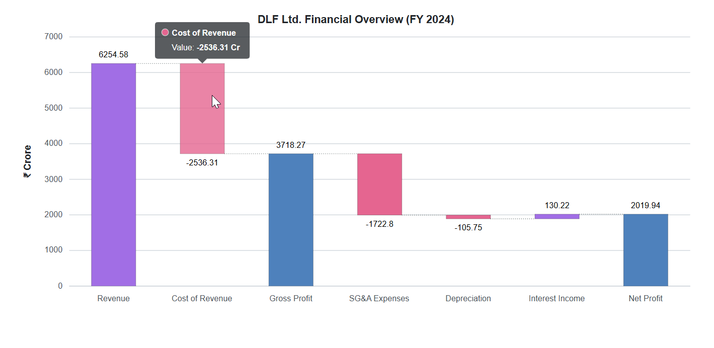
Before you visualize any data, the first step is to gather the data. For this example, we collected annual financial data from the Profit and Loss Report for DLF. This report provides a detailed view of the company’s revenue, costs, profits, and other key financial indicators.
We selected a few critical values to keep our example simple and focused:
Revenue
Cost of Revenue
SG&A Expenses **(**Selling, General, and Administrative Expenses)
Depreciation
Interest Income
These categories illustrate how individual components contribute to the overall net profit. This makes them ideal for a Waterfall Chart, which visually breaks down the contributions to a final value.
Step 2: Define the data model
With the financial data sourced, we will structure it in a format compatible with your Blazor chart.
We’ll define a class called WaterfallChartData with the following properties:
X: The financial category (e.g., “Revenue” or “Depreciation”).
Y: The corresponding value. Positive values represent gains; negative values indicate expenses or losses.
Refer to the following code example.
public class WaterfallChartData
{
    public string X { get; set; }
    public double Y { get; set; }
}
public List<WaterfallChartData> ChartPoints { get; set; } = new List<WaterfallChartData>
{
    new WaterfallChartData { X = "Revenue", Y = 6254.58 },
    new WaterfallChartData { X = "Cost of Revenue", Y = -2536.31 },
    new WaterfallChartData { X = "Gross Profit" }, // Intermediate Sum
    new WaterfallChartData { X = "SG&A Expenses", Y = -1722.80 },
    new WaterfallChartData { X = "Depreciation", Y = -105.75 },
    new WaterfallChartData { X = "Interest Income", Y = 130.22 },
    new WaterfallChartData { X = "Net Profit" } // Final Sum
}
Notice how Gross Profit and Net Profit are defined without a Y value. They represent Sum points, which the chart calculates automatically.
private Double[] IntermediateSumIndexes { get; set; } = new Double[] { 2 };
private Double[] SumIndexes { get; set; } = new Double[] { 6 };
To achieve this, we use index arrays to specify which categories should be treated as calculated sums.
IntermediateSumIndexes: Marks the third item, Gross Profit, as an intermediate sum.
SumIndexes: Marks the seventh item, Net Profit, as the final total.
This approach provides a clear, intuitive way to break down your financial performance step by step, making it significantly easier for users to follow the flow of gains and losses in business data.
Step 3: Configure the Waterfall Charts
With your data model prepared, you can now visualize your data effectively. A Waterfall Chart in Blazor is ideal for showing how values progress across financial categories, from revenue to net profit. It highlights both gains and losses along the way.
If you’re new to Syncfusion® Blazor Charts, follow the official user guide to set up your project. This guide will walk you through installing the required NuGet packages, registering Syncfusion services, and configuring your project to use Blazor Charts components.
After completing the setup, you can define the Waterfall Charts using the SfChart component
Refer to the code example below:
<SfChart>
     <ChartSeries DataSource="@ChartPoints"
             Name="DLF FY2024"
             XName="X"
             YName="Y"
             Type="ChartSeriesType.Waterfall">
</SfChart>
Breakdown of the Chart configuration
The ChartSeries section connects the chart to the data. The DataSource property binds the chart to the ChartPoints list you defined earlier.
The properties XName and YName map the fields in your WaterfallChartData model to the chart’s X and Y axes, respectively.
Step 4: Define the Series with subtotals and totals
This step focuses on binding the financial data and configuring the logic required for the Waterfall Chart.
Refer to the following code snippet for implementation details.
<ChartSeriesCollection>
    <ChartSeries ColumnWidth="0.5"
                 NegativeFillColor="#e56590"
                 DataSource="@ChartPoints"
                 Name="DLF FY2024"
                 XName="X"
                 YName="Y"
                 Width="2"
                 IntermediateSumIndexes="@IntermediateSumIndexes"
                 SumIndexes="@SumIndexes"
                 Type="ChartSeriesType.Waterfall">
        ….

    </ChartSeries>
</ChartSeriesCollection>
The following configurations make the Waterfall chart function as expected:
The NegativeFillColor property highlights losses using a distinct pink shade.
The IntermediateSumIndexes (e.g., for “Gross Profit”) and SumIndexes (e.g., for “Net Profit”) properties indicate where the chart should calculate running and final totals, respectively.
Data is retrieved from the ChartPoints collection, and each point is rendered dynamically based on its configuration.
Step 5: Add styling, tooltips, and markers
To make the chart more interactive and visually appealing, enable animations, labels, and tooltips.
<SfChart ID="waterfall" Title="DLF Ltd. Financial Overview (FY 2024)" Width="@Width" Theme="Theme.Bootstrap4">
    <ChartTitleStyle TextOverflow="TextOverflow.Wrap" />

    <ChartTooltipSettings Enable="true" Header=""
        Format="<b>${point.x}</b><br>Value: <b>${point.y} Cr</b>" />

    <ChartSeries>
        <!-- Series configuration (data source, x/y mapping) should go here -->

        <ChartSeriesAnimation Enable="true" />

        <ChartMarker>
            <ChartDataLabel Visible="true" Position="LabelPosition.Outer">
                <ChartDataLabelFont Size="@Size" />
            </ChartDataLabel>
        </ChartMarker>

        <ChartSeriesConnector Color="#5F6A6A" Width="0.8" DashArray="1,2" />
        <ChartSeriesBorder Width="0.2" Color="black" />
    </ChartSeries>

    <!-- Other chart settings -->
</SfChart>
Use the Title property of the SfChart to set a clear and informative chart title that communicates the financial context of the data.
Set the chart’s width using the Width property of the SfChart to ensure responsiveness across devices.
Configure ChartTooltipSettings to display values dynamically when hovering over each bar, improving user interaction.
Add ChartDataLabel to display values directly on the bars, enhancing readability at a glance.
Use ChartSeriesConnector, which visually connects each bar to the next, to guide the viewer’s eye through the data.
Apply ChartSeriesBorder to define the edges of each bar for a cleaner look, and enable ChartSeriesAnimation to add smooth transitions and visual flair.
Final output
GitHub reference
For more details, refer to the GitHub demo.
Conclusion
Thanks for reading! In this blog post, we’ve explored how to build insightful Blazor Waterfall Charts for Financial and Business Analysis using Syncfusion Charts. Try them out and share your feedback in the comments section below!
You can explore our Blazor Chart Example to learn more about the supported chart types and how easy it is to configure them for stunning visual effects.
The latest version of the Blazor Chart component is available for current customers from the license and downloads page. If you are not a Syncfusion® customer, try our 30-day free trial.
You can also contact us through our support forums, support portal, orfeedback portal. We’re always happy to assist you!
Related Blogs
Subscribe to my newsletter
Read articles from syncfusion directly inside your inbox. Subscribe to the newsletter, and don't miss out.
Written by
syncfusion
syncfusion
Syncfusion provides third-party UI components for React, Vue, Angular, JavaScript, Blazor, .NET MAUI, ASP.NET MVC, Core, WinForms, WPF, UWP and Xamarin.