How Data Visualization is Transforming the World and How MAANG Companies Use It?
 Aakashi Jaiswal
Data visualization has become a central force in shaping how we understand, communicate, and act on information. In a world overflowing with data, the ability to turn numbers and raw facts into clear, meaningful visuals is not just helpful—it is essential for progress in science, business, policy, and daily life. This blog unpacks the impact of data visualization and explains how major technology companies—often referred to as MAANG (Meta, Apple, Amazon, Netflix, Google)—use it to lead their industries.
What is Data Visualization?
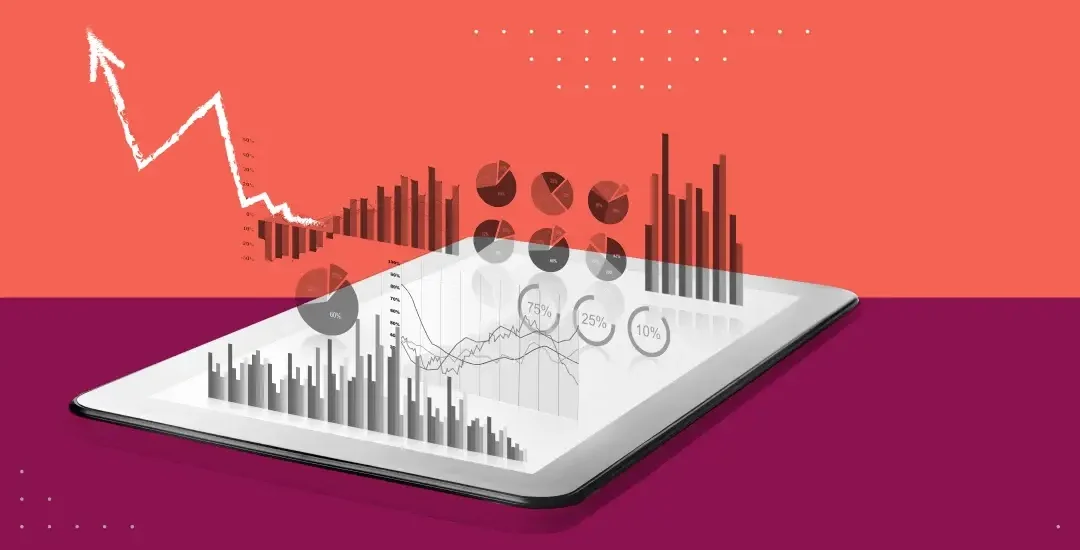
Data visualization is the process of converting complex data into graphical formats—such as charts, graphs, maps, and dashboards—so that patterns, trends, and insights become clear at a glance. It bridges the gap between raw data and human understanding, making information accessible and actionable for everyone, not just experts.
Why Data Visualization Matters Today
1. Making Sense of Complexity
The world generates vast amounts of data every second. From social media activity and online purchases to scientific experiments and financial markets, the volume and variety of data are staggering. Data visualization helps by:
Turning overwhelming spreadsheets into clear visuals.
Highlighting trends, outliers, and relationships that would be hard to spot otherwise.
Allowing users to interact with data, filter it, and focus on what matters most.
2. Improving Decision-Making
Visual data is processed much faster by the human brain than text or numbers. This means:
Leaders and teams can grasp the current situation quickly.
Decisions are made based on facts, not just intuition.
Organizations can respond faster to changes in the market or environment.
Studies show that companies using advanced data visualization tools are 70% more likely to make data-driven decisions, leading to better outcomes and greater agility.
3. Boosting Communication and Engagement
A well-designed chart or dashboard can communicate a message instantly, engaging audiences and helping them remember key points. This is especially important in business meetings, educational settings, and public communications.
4. Driving Business Growth
Companies that adopt modern data visualization tools have seen, on average, a 20% boost in overall business growth. These tools help organizations:
Identify new opportunities.
Optimize operations.
Improve customer experiences.
The Science Behind Visual Understanding
We humans are visual creatures. About 90% of the information processed by the brain is visual, and we interpret images much faster than text. This natural ability makes data visualization a powerful tool for:
Enhancing memory retention.
Reducing cognitive overload.
Supporting faster learning and understanding.
How Data Visualization Impacts Different Sectors
Business
Sales and Marketing: Track customer journeys, campaign performance, and sales funnels.
Finance: Monitor budgets, forecasts, and risks in real time.
Operations: Optimize supply chains, inventory, and resource allocation.
Healthcare
Patient Care: Visualize patient histories, treatment outcomes, and resource usage.
Public Health: Map disease outbreaks, vaccination rates, and health disparities.
Government and Policy
Resource Allocation: Identify areas of need and direct funds or services accordingly.
Transparency: Share data with the public in understandable formats, building trust.
Education
Student Performance: Track progress, identify gaps, and personalize learning.
Research: Share findings in ways that are easy to grasp and act upon.
Social Impact
Data visualization helps identify social and economic disparities, guiding interventions and raising awareness. During the COVID-19 pandemic, for example, visual dashboards and maps were essential for tracking cases and informing the public.
The MAANG Companies: Masters of Data Visualization
The world’s leading technology companies—Meta, Apple, Amazon, Netflix, and Google—rely heavily on data visualization to maintain their edge. Here’s how each uses this powerful tool:
Meta (Facebook)
User Engagement: Meta analyzes billions of interactions daily. Visual dashboards help teams monitor trends in user activity, content performance, and ad effectiveness.
Network Analysis: Visualizing social connections helps improve algorithms for friend suggestions, content ranking, and community management.
Safety and Moderation: Real-time dashboards track harmful content and coordinate rapid responses.
Apple
Product Development: Apple uses data visualization to analyze customer feedback, product usage, and supply chain efficiency.
Health Data: The Health app presents complex health metrics in simple, colorful graphs, empowering users to manage their well-being.
Retail Performance: Store managers use dashboards to monitor sales, inventory, and customer satisfaction.
Amazon
Supply Chain Optimization: Amazon’s vast logistics network is managed using real-time visualizations of inventory, shipping routes, and delivery times.
Personalized Recommendations: Data visualizations help teams understand user preferences and improve product suggestions.
Business Intelligence: Executives use dashboards to track sales, market trends, and operational efficiency.
Netflix
Content Strategy: Netflix visualizes viewing habits to decide which shows to produce or promote.
User Experience: A/B testing results are presented in clear visuals to guide interface changes.
Network Performance: Dashboards monitor streaming quality and identify issues before they affect users.
Search Trends: Google Trends offers public access to visualizations of search data, helping businesses and researchers spot emerging topics.
Advertising: Marketers use Google’s dashboards to track campaign performance and optimize spending.
Internal Operations: Google teams rely on data visualization for everything from server performance to user engagement analytics.
Popular Data Visualization Tools
The MAANG companies and many others use a variety of advanced tools, including:
Tableau: Widely used for interactive dashboards and business intelligence.
Microsoft Power BI: Integrates with other Microsoft products for seamless analytics.
Google Looker Studio: Offers customizable dashboards and reports.
D3.js: A JavaScript library for creating custom, interactive web-based visualizations.
QlikView, Sisense, and others: Provide specialized features for different industries.
These tools support everything from simple bar charts to complex, real-time dashboards.
The Impact: Real-World Benefits of Data Visualization
1. Faster, Better Decisions
Visual data cuts through complexity, allowing leaders to act quickly and confidently. In fast-moving industries, this speed can mean the difference between success and failure.
2. Greater Transparency and Accountability
When data is presented clearly, it becomes easier to share with stakeholders, customers, and the public. This builds trust and encourages collaboration.
3. Increased Efficiency
Automated dashboards reduce the time spent on manual reporting and analysis, freeing up teams to focus on higher-value work.
4. Enhanced Innovation
By revealing hidden patterns and opportunities, data visualization sparks new ideas and drives continuous improvement.
How to Make the Most of Data Visualization
If you want to harness the power of data visualization, consider these steps:
Choose the Right Tools: Select platforms that fit your needs and skill level.
Focus on Your Audience: Tailor visuals to the people who will use them, considering their background and goals.
Keep it Simple: Avoid clutter and focus on the key message.
Update Regularly: Use real-time data when possible to ensure your visuals are always relevant.
Invest in Training: Help your team build the skills needed to create and interpret effective visualizations.
Data visualization is not just a trend—it is a fundamental shift in how we process and use information. By making data accessible, understandable, and actionable, it empowers individuals and organizations to make smarter decisions, communicate more effectively, and drive positive change. The MAANG companies stand as leading examples of how to use data visualization to achieve remarkable results, but the tools and techniques are available to everyone.
As data continues to grow in volume and importance, the ability to visualize it clearly and meaningfully will be a defining skill for success in the years ahead. Whether you are a business leader, scientist, policymaker, or everyday user, embracing data visualization will help you see the world—and your place in it—with greater clarity and confidence.
Subscribe to my newsletter
Read articles from Aakashi Jaiswal directly inside your inbox. Subscribe to the newsletter, and don't miss out.
Written by
Aakashi Jaiswal
Aakashi Jaiswal
Coder | Winter of Blockchain 2024❄️ | Web-Developer | App-Developer | UI/UX | DSA | GSSoc 2024| Freelancer | Building a Startup | Helping People learn Technology | Dancer | MERN stack developer