Users Don’t Read. We Finally Believed It After This A/B Test
 Bluell AB
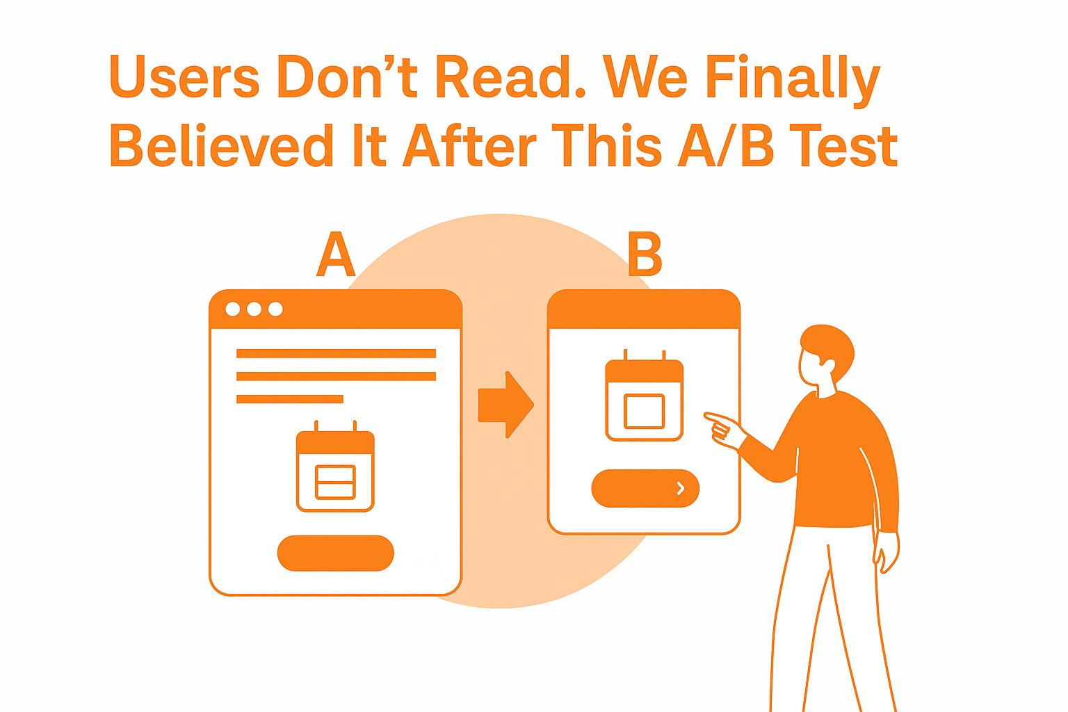
I used to believe that users do read.
Not every word, of course—but surely the important ones.
The ones we put in bold. The buttons. The call-to-actions. The value props are written with just the right mix of marketing magic and product truth.
That belief died on a Tuesday morning.
Let me explain.
The Problem That Didn’t Exist (Until It Did)
We were building a new onboarding flow for a SaaS client.
The UX was clean. The copy was clear. At least, we thought it was.
But users weren’t finishing onboarding. Drop-offs were happening after the second screen, exactly where we explained how the tool worked. We added tooltips. We rewrote the text. We even added an intro video.
Still, nothing changed.
The data didn’t lie. And the comments coming in through support weren’t pretty either.
“I didn’t realize I had to link my calendar before continuing.”
“Why is it asking for permissions? I wasn’t told about this.”
“Stuck on Step 2. What’s next?”
We were telling them everything. They just weren’t reading it.
The A/B Test That Changed Everything
One of our designers had had enough.
He suggested we strip the copy entirely and replace it with an absurdly simplified version. Less than 10 words per screen. More icons. One sentence max.
We were skeptical. But we were also out of ideas. So we ran the test:
Version A (Control): Well-written onboarding steps, detailed copy, microcopy under buttons, and helpful tooltips.
Version B (Test): Brutally short phrases like “Link Your Calendar →” with visual cues (calendar icon, arrows, a pulsing animation).

We ran the test on 50% of new users over 7 days.
Version B outperformed Version A by 61%.
Not in engagement—in completion.
Users were not just getting through the flow faster. They were understanding it better. Support tickets dropped. Confusion dropped. And so did our belief in elegant microcopy.
What We Thought vs. What We Learned
This was the most painful part: we realized we weren’t designing for users. We were designing for ourselves, for what we wished users would do.
Here’s what we learned the hard way:
Users don’t read. They scan.
If it looks like a block of text, it’s dead weight.
Clever copy ≠ clear copy.
Visual hierarchy beats verbal hierarchy every time.
One clear verb beats three smart sentences.
We also learned that usability doesn't equal information density.
You don’t win by saying more. You win by showing less, but saying just enough.
But Here’s the Twist
It wasn’t just that users don’t read.
It’s that users won’t read when they don’t trust you yet.
Onboarding is a trust transaction. If your UI feels slow, bloated, or uncertain, they’ll stop reading before they even start.
Once we optimized the UI to feel fast and focused, people started reading just enough to keep going.
And that’s all we needed.
Final Thoughts
This A/B test wasn’t just about onboarding.
It taught us something bigger: you can’t rely on ideal behavior. You have to design for real behavior. And real behavior is messy, distracted, and fast-moving.
We still write good copy. But now, we test the hell out of it.
Because good intentions don’t convert.
Clarity does.
I've published this article on LinkedIn, and I'm sharing it here for educational and informational purposes only.
Subscribe to my newsletter
Read articles from Bluell AB directly inside your inbox. Subscribe to the newsletter, and don't miss out.
Written by