Google’s new gradient “G”
 Priyanka Sharma
A decade later, a bold step into AI-driven design
Why Google’s icon change is more than just a visual refresh?
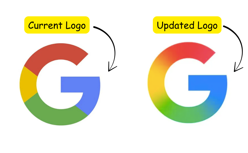
After nearly 10 years with the same iconic “G” logo, Google quietly rolled out its first major update in May 2025. This redesign replaces the flat, solid blocks of red, yellow, green, and blue with a seamless, fluid gradient blending these classic colors. While subtle at first glance, this change marks a significant evolution in Google’s branding strategy, reflecting deeper shifts in technology, design trends, and the company’s AI-centric future.
Why did Google update its ‘G’ icon after 10 years?
Google’s last major logo overhaul was in 2015, when it introduced the sans-serif Product Sans font and the four-color segmented “G.” Since then, the digital landscape has changed dramatically, with new devices, screen sizes, and user expectations demanding more adaptable and accessible branding.
The 2025 update is part of a broader effort to modernize Google’s visual identity, improve consistency across platforms, and enhance accessibility. The gradient design is more screen-friendly and scalable, ensuring clarity and vibrancy on everything from tiny app icons to large displays. This refresh also aligns with Google’s intention to keep its brand feeling fresh and relevant without losing the familiarity users trust.
How does the new gradient design reflect Google’s focus on AI?
The gradient is more than an aesthetic choice; it symbolizes Google’s strategic pivot toward artificial intelligence. Google has been doubling down on generative AI technologies, exemplified by the launch of Gemini, its flagship AI assistant. Gemini’s branding already uses a blue-to-purple gradient, signaling a new visual language rooted in fluidity, depth, and innovation.
By adopting a gradient that smoothly blends its signature colors, Google visually communicates the seamless integration and evolving nature of AI within its ecosystem. The fluid colors suggest adaptability and intelligence that can shift and respond dynamically, mirroring how AI-powered products learn and improve over time. This design move signals that AI is now at the core of Google’s identity and product experience.
Will other Google product logos adopt the gradient style?
As of now, only the standalone “G” icon has been updated. The full Google word mark and other product logos like Chrome, Maps, Gmail, and Drive remain unchanged. However, given the clear direction toward gradient and AI-inspired visuals, it is widely expected that Google may extend this design language across its product suite in the near future.
The gradient style fits naturally with Google’s evolving brand narrative and technological focus, making it a strong candidate for future logo updates. This would unify Google’s visual identity under a cohesive, modern aesthetic that reflects its AI-first strategy.
What this means for Google and its users?
Subtle but Strategic: The update is a small visual tweak with big implications, signaling Google’s transition into an AI-driven era.
Cross-Platform Consistency: The gradient enhances visibility and harmony across devices, from smartphones to desktops.
Brand Evolution: Google balances modernization with brand recognition, maintaining the iconic “G” shape while refreshing its look.
Future-Ready: The new design prepares Google’s identity for a world where AI and digital experiences are increasingly intertwined.
Google’s 2025 “G” logo redesign is a masterclass in subtle evolution. By introducing a vibrant gradient, Google not only modernizes its visual identity but also reflects its strategic focus on AI and innovation. While the change might seem minor, it carries significant weight as a symbol of Google’s future direction — fluid, intelligent, and seamlessly integrated across all platforms. The tech world will be watching closely to see if this gradient aesthetic becomes the new standard for Google’s entire product ecosystem.
Subscribe to my newsletter
Read articles from Priyanka Sharma directly inside your inbox. Subscribe to the newsletter, and don't miss out.
Written by
Priyanka Sharma
Priyanka Sharma
My name is Priyanka Sharma, commonly referred to as lassiecoder within the tech community. With ~5 years of experience as a Software Developer, I specialize in mobile app development and web solutions. My technical expertise includes: – JavaScript, TypeScript, and React ecosystems (React Native, React.js, Next.js) – Backend technologies: Node.js, MongoDB – Cloud and deployment: AWS, Firebase, Fastlane – State management and data fetching: Redux, Rematch, React Query – Real-time communication: Websocket – UI development and testing: Storybook Currently, I'm contributing my skills to The Adecco Group, a leading Swiss company known for innovative solutions.