Flutter Expense Tracker: Building Effective Onboarding Pages for New Users
 syncfusion
TL;DR: The Flutter Expense Tracker app introduces a streamlined onboarding experience that guides users through setup easily and clearly. It begins with a Setup Page that collects essential personal details such as name, birth date, gender, and preferred currency, all presented in layouts optimized separately for desktop and mobile devices to ensure a smooth user experience. Following this, the Import Page offers flexible options—users can begin with sample financial data, upload their .xlsx file, or skip the import process altogether. Emphasizing simplicity and usability, the onboarding flow is a one-time step, with built-in input validation to ensure accuracy and ease from the very beginning.
In this blog, we’ll explore the features and functionalities of the onboarding pages in the Flutter Expense Tracker sample. For more details of the overall Expense Tracker Sample, read the introductory blog.
Overview
In the Expense Tracker sample, we’ll display the following onboarding pages:
Setup page
Import page
One-time setup: The onboarding pages in the Expense Tracker sample guide first-time users through the initial setup process. These pages appear once to collect essential user preferences and cannot be revisited unless the application is reset.
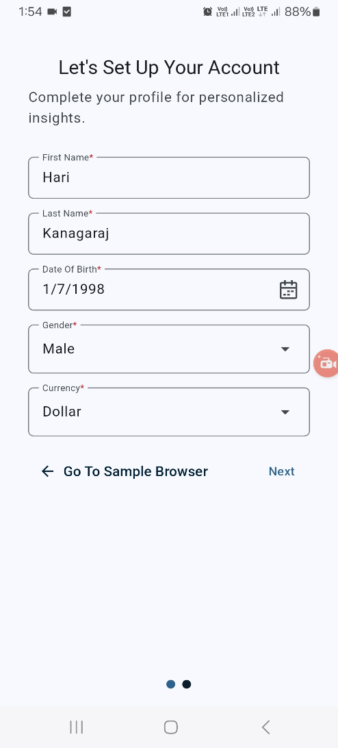
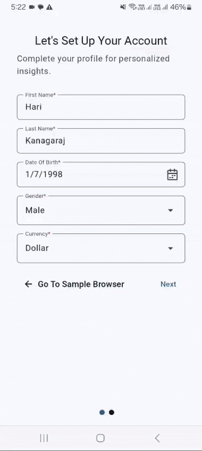
Setup page
The Setup page allows users to create their profile by entering essential details, such as their name, date of birth, gender, and preferred currency. This information is used for their profile within the Expense Tracker sample.
Layout
Desktop layout
For desktop and tablet devices, the Setup page features a clean, user-friendly design with the screen split into two sections.
The left half displays an engaging image, enhancing the visual appeal.
The right half contains vertically arranged input fields for user details.
This layout ensures a visually appealing experience while keeping the form easily accessible.
/// Builds desktop layout for the signup form.
Widget _buildDesktopLayout(BuildContext context) {
  return Row(
    children: <Widget>[
      _buildImage(),
      _buildResponsiveSignUpForm(),
    ],
  );
}
Refer to the following image.

Desktop layout
Mobile layout
On mobile devices, the Setup page is designed for simplicity and ease of use. The entire screen is dedicated to input fields, arranged vertically for a smooth and accessible user experience.
/// Builds mobile layout for the signup form.
Widget _buildMobileLayout(BuildContext context) {
  return SafeArea(
    child: Padding(
      padding: const EdgeInsets.symmetric(horizontal: 32.0, vertical: 40),
      child: SingleChildScrollView(
        child: SizedBox(
          width: 300.0,
          child: _buildSignUpForm(context),
        ),
      ),
    ),
  );
}
Refer to the following image.
Mobile layout
Input fields on the Setup Page
The Setup page contains five fields designed to gather user information.
Name: Records the user’s first and last name, which will be displayed in the profile.
Date of birth: Records the user’s date of birth.
Gender: Records the user’s gender.
Currency format: Sets the preferred currency for the Expense Tracker. This selection is a one-time setup and cannot be changed later unless the application is reset.
Widget _buildSignUpForm(BuildContext context) {
  final List<String> currencies = buildCurrencies();
  final String selectedCurrency = _selectedCurrencyNotifier.value;
  return Column(
    mainAxisAlignment: MainAxisAlignment.center,
    children: <Widget>[
      _buildTitleText(context),
      verticalSpacer8,
      _buildIntroText(context),
      verticalSpacer32,
      _buildNameFields(context),
      verticalSpacer16,
      _buildDOBField(context),
      verticalSpacer16,
      _buildGenderDropdown(context),
      verticalSpacer16,
      _buildCurrencyDropdown(currencies, selectedCurrency),
      verticalSpacer16,
      _buildNavigationButton(),
    ],
  );
}
Validating input fields
The Next button on the Setup page remains disabled until all the required fields are correctly filled in, ensuring accurate user input. Once clicked, users can smoothly navigate to the Import page .
This validation checks all the values of the text editing controllers to confirm that no fields are left empty. The button’s state is managed using the Flutter Provider package, ensuring it only becomes active once all required inputs are filled.
Refer to the following image.

Validating input fields on the setup page
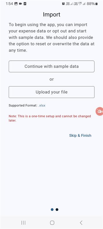
Import page
On the Import page, users can choose to upload their existing financial data or begin with predefined sample data.
Layout
Desktop layout
For larger screens, the Import page follows a structured split-screen design.
The left half features an engaging image, enhancing the visual appeal.
The right half contains options for the users to upload their financial data or start with sample data.
This layout ensures a clean, organized, and user-friendly experience.
/// Constructs the layout for desktop devices.
Widget _buildDesktopLayout(BuildContext context) {
  return Row(
    children: <Widget>[
      _buildImage(),
      _buildResponsiveImportPage(),
    ],
  );
}
Refer to the following image.

Desktop layout
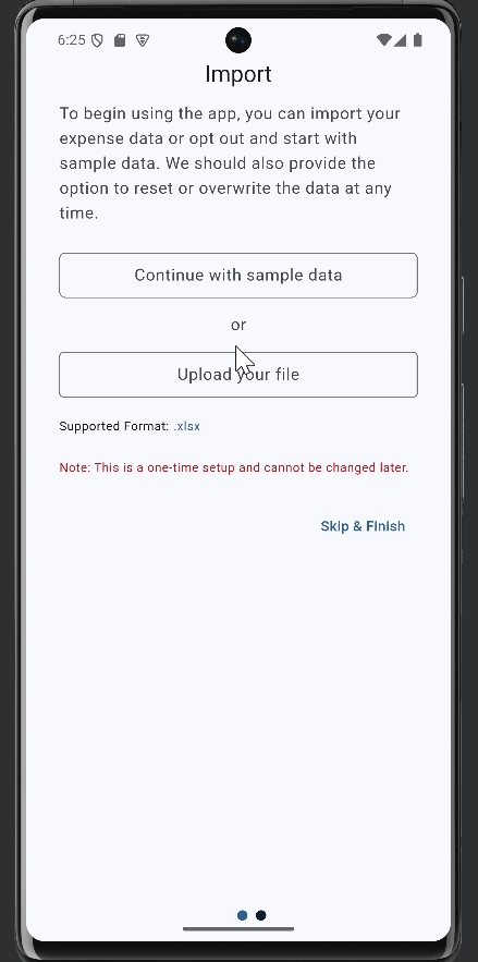
Mobile layout
The Import page on mobile devices is designed for simplicity and ease of navigation. Users can either upload their existing financial data or continue with predefined data by tapping the Continue with sample data button.
/// Constructs the layout for mobile devices.
Widget _buildMobileLayout(BuildContext context) {
  return Padding(
    padding: const EdgeInsets.symmetric(horizontal: 32, vertical: 40),
    child: SingleChildScrollView(
      child: _buildImportPage(context),
    ),
  );
}
Refer to the following image.
Mobile layout
The design utilizes Flutter’s built-in OutlinedButton widget to Continue with sample data and Upload your file options. Other elements use a text widget to display relevant information to users.
/// Builds the main content of the import page.
Widget _buildImportPage(BuildContext context) {
  return Consumer<ImportNotifier>(
    builder: (BuildContext context, ImportNotifier import, Widget? child) {
      return Column(
        mainAxisAlignment: MainAxisAlignment.center,
        children: <Widget>[
          _buildHeader(),
          verticalSpacer12,
          _buildObjective(),
          verticalSpacer24,
          _buildActions(import),
          verticalSpacer12,
          _buildHelperText(),
          verticalSpacer24,
          _buildNotes(),
          verticalSpacer24,
          _buildFinishButton(context, import),
        ],
      );
    },
  );
}
Features
The Import page in the Expense Tracker sample offers three options to enhance the user experience.
Continue with sample data
Upload your file
Skip & Finish
Continue with sample data
This option allows the users to explore the app’s features using preloaded sample data. You can reset the sample data anytime in the settings by tapping the reset button.
Desktop demo

Continue with sample data feature on the desktop
Mobile demo
Continue with sample data feature in mobile
Upload your file
This option allows users to upload their financial data in .xlsx format to view details based on their actual information. It is helpful for users who want to work with and visualize their real data.
Desktop demo

Upload your file feature on the desktop
Mobile demo
Upload your file feature on mobile
Skip & Finish
The Skip & Finish button allows you to bypass the import process and start using the Expense Tracker sample immediately.
Validating imported files
The state of the Skip & Finish button is dynamically managed using the Flutter provider package.
If a file is uploaded, the button label changes to Finish, and the uploaded file details will replace the Upload your file button.
If the file is deleted, the page reverts to its initial state, displaying the Skip & Finish button again.

Validating imported files on the import page
Conclusion
Thank you for taking the time to explore the Expense Tracker onboarding pages with us. This blog explored the Expense Tracker onboarding pages for first-time users. We hope you found the guide insightful and engaging. Start your journey towards better financial management using the Expense Tracker sample today.
Existing customers can download the new version of Essential Studio® on the license and downloads page. If you are not a Syncfusion® customer, try our 30-day free trial to check out our incredible features.
If you have any questions, contact us through our support forums, support portal, or feedback portal. We are always happy to assist you!
Related Blogs
Subscribe to my newsletter
Read articles from syncfusion directly inside your inbox. Subscribe to the newsletter, and don't miss out.
Written by
syncfusion
syncfusion
Syncfusion provides third-party UI components for React, Vue, Angular, JavaScript, Blazor, .NET MAUI, ASP.NET MVC, Core, WinForms, WPF, UWP and Xamarin.