HarmonyOS NEXT ArkUI Pop - up Boxes: Customize & Use
 CoderFeri
Mastering HarmonyOS NEXT ArkUI Pop - up Boxes: A Comprehensive Guide from Customization to Ready - to - Use Solutions, Effortlessly Mastering Interactive Experiences
I. Pop-up Box Tutorial: The "72 Transformations" of Modal Windows
Imagine users are happily navigating your app when suddenly they need a "temporary assistant" to remind them of crucial information—that's the mission of pop-up boxes!
As modal windows, they temporarily "take over" the screen and won't disappear until users complete the interaction. ArkUI thoughtfully offers two main types:
DIY Customization: With complete freedom to shape every aspect, from layout to components, it’s perfect for complex interaction scenarios.
Ready-to-Use Templates: Just insert content like building blocks, ideal for common tasks such as simple prompts, selections, and confirmations—saving time and effort.
📦 Custom Pop-up Boxes: Full Control Over Your Windows
1. "Global Free Agent" Without UI Component Dependencies (openCustomDialog)
This is suitable for scenarios that require dynamic updates of pop-up properties, like content that changes in real-time based on user input. It supports both "modal" (interaction must be completed before proceeding) and "non-modal" (can be ignored temporarily) modes, and comes with lifecycle hooks: onWillAppear → onDidAppear → onWillDisappear → onDidDisappear, allowing you to manage the pop-up's entire lifecycle from creation to dismissal.
2. Step-by-Step Guide to Creating a "Unique Pop-up"
Step 1: Give the Pop-up a "Home" (Encapsulate the Pop-up Class)
import { ComponentContent, promptAction, UIContext } from '@kit.ArkUI';

export class FirstDialog {
  ctx?: UIContext; // Context object, the pop-up's "identity document"
  content?: ComponentContent<Object>; // The "furniture" inside the pop-up
  option?: promptAction.BaseDialogOptions; // The pop-up's "decoration style"

  constructor(ui: UIContext, c: ComponentContent<Object>, o: promptAction.BaseDialogOptions) {
    this.ctx = ui;
    this.content = c;
    this.option = o;
  }

  showDialog() {
    this.ctx?.getPromptAction().openCustomDialog(this.content)
      .then(() => console.log("Pop-up is now live. Check it out!")); // A little success message
  }
}
Step 2: Decorate the Pop-up's "Interior" (Customize the Content)
Use the @Builder decorator to create a unique component. Here, we've added an image, a text input box, and a button, even a red border for emphasis:
@Builder
export function buildDialog(msg: string) {
  Column() {
    Image($r("sys.media.ohos_ic_public_scan")) // Add an icon
      .width(100).height(100)
    Text(msg) // Display the prompt text
    TextInput({ placeholder: "Please enter content" }) // Encourage user interaction
      .onChange(v => msg = v)
    Button("Click Me") // Button click triggers a Toast
      .onClick(() => promptAction.showToast({ message: "Button inside pop-up triggered: " + msg }))
  }
  .width("90%") // Leave some space for width
  .backgroundColor(Color.White) // Clean white background
  .padding(10) // Comfortable internal spacing
  .border({ style: BorderStyle.Solid, width: 2, color: Color.Red }) // Red border for attention!
}
Step 3: "Summon" the Pop-up on the Page
After instantiation, bind it to a button click event. Clicking the button will "summon" this pop-up with an input box, as shown below:
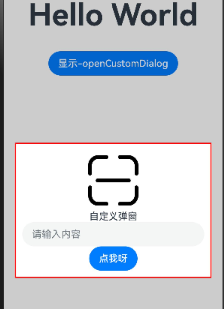
(Imagine the pop-up appearing with its red border, and when the user enters content and clicks the button, the Toast provides real-time feedback—it’s highly interactive!)
🧩 Fixed-Style Pop-up Boxes: A Boon for Lazy Developers, Solving Common Scenarios with One Click
No need to worry about layout—ArkUI has already provided "template rooms." Just insert the content!
1. Savior for Decision-Makers: Action Menu (showActionMenu)
Great for presenting multiple options for users to choose from, like a list of "favorite foods":
Button("Action Menu Pop-up")
  .onClick(() => {
    promptAction.showActionMenu({
      title: "Soul - searching Question: What's Your Favorite Food?", // A dramatic title
      buttons: [
        { text: "Cucumber", primary: true, color: "#007dfe" }, // Main button in blue
        { text: "Tomato", color: "#fd750f" }, // Tomato - red
        { text: "Eggplant", color: "#6a0dad" }, // Mysterious purple
        { text: "Radish", color: "#fd750f" } // Consistent orange - tone
      ]
    }).then(data => {
      const foods = ["Cucumber", "Tomato", "Eggplant", "Radish"];
      promptAction.showToast({ message: `You chose the ${data.index + 1}st option: ${foods[data.index]}` });
    });
  })
When the button is clicked, the option list slides up from the bottom. Clicking any option triggers a Toast—simple and intuitive!
2. Guardian Against Risky Operations: Dialog Box (showDialog)
Essential for "double confirmation" in sensitive operations like deletion or payment, for example:
Button("Delete File")
  .onClick(() => {
    promptAction.showDialog({
      title: "⚠️ Risky Operation", // Title with a warning icon
      message: "Dear, this action cannot be undone. Are you sure you want to proceed?", // More user-friendly tone
      buttons: [
        { text: "I'm Sure", color: "#e53935" }, // Warning red button
        { text: "Let Me Think", color: "#225473" } // Calming blue
      ]
    }).then(data => {
      data.index === 0
        ? promptAction.showToast({ message: "Deletion successful! Fast hands!" })
        : promptAction.showToast({ message: "Cancellation successful. Caution is a virtue~" });
    });
  })
Users must choose either "Confirm" or "Cancel" to continue, preventing accidental operations.
3. Time/Date Manager: Picker Dialogs (PickerDialog)
CalendarPickerDialog: Ideal for selecting year, month, and day, with "Confirm/Cancel" buttons and customizable button styles.
DatePickerDialog: Slide to select dates, with the option to limit the time range (e.g., only select from 2023 - 2025).
TimePickerDialog: Precise down to hours, minutes, and seconds, supporting 24-hour format, perfect for appointment and reminder scenarios.
Example: Triple Date Selection
// Calendar picker
Button("Select an Auspicious Date")
  .onClick(() => {
    CalendarPickerDialog.show({
      selected: new Date(), // Default to today
      acceptButtonStyle: { fontColor: Color.Red, backgroundColor: Color.LightGray }, // Red confirm button
      onAccept: (v) => promptAction.showToast({ message: `You selected: ${v.toLocaleDateString()}` })
    });
  })

// Time picker
Button("Select an Alarm Time")
  .onClick(() => {
    TimePickerDialog.show({
      format: TimePickerFormat.HOUR_MINUTE, // Display only hours and minutes
      useMilitaryTime: true, // 24-hour format
      onAccept: (v) => promptAction.showToast({ message: `Time set to: ${v.hour}:${v.minute}` })
    });
  })
II. Conclusion: Choose Wisely to Elevate Interaction
Custom Pop-up Boxes: Best for complex layouts (like pop-ups with forms or images), offering maximum freedom—akin to "bespoke design."
Fixed-Style Pop-up Boxes: Ideal for common, simple scenarios (confirmation, selection, time/date), ready to use out-of-the-box, saving time and increasing efficiency.
Mastering these pop-up techniques will definitely make your app's interaction experience stand out! Remember, pop-ups are bridges for "conversations" with users. Used properly, they can convey key information without being intrusive.
💡 Tips for Programmer Growth: Technical details require repeated practice. It’s recommended to type out the example code, modify the styles and logic, and fully understand the features of each API. The next time you have a pop-up requirement, simply pick the right solution from your "arsenal"!
Where there is a will, there is a way! See you next time~ 👋
Subscribe to my newsletter
Read articles from CoderFeri directly inside your inbox. Subscribe to the newsletter, and don't miss out.
Written by