HarmonyOS Development: Understanding the Split Line
 AbnerMing
Foreword
this article is based on Api13
there are many scenes of dividing lines, especially in the list. If you open an application casually, you can find the footprint of the dividing line. Although the dividing line is very useful, how to use the dividing line correctly in actual development is the problem we want to talk about.
For example, a simple list, how should the dividing line be drawn?
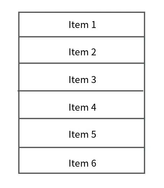

I'm sure many people will think that using the divider attribute divider included in the list can quickly implement a dividing line. The code is as follows:
Column() {
List() {
ForEach(this.dataList, (item: string) => {
ListItem() {
Text(item)
.width("100%")
.height(50)
.textAlign(TextAlign.Center)
}
})
}
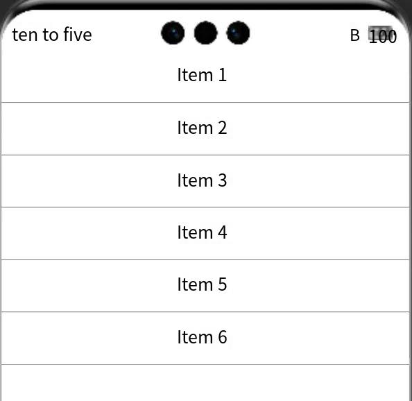
.divider({
color: Color.Gray,
strokeWidth: 1,
})
}
.height('100%')
.width('100%')
effect after running:

what if my dividing line is not a regular line? For example, it is a picture, for example, it is a dotted line, for example, at the end of the entry, I also want to divide the line? Obviously, using the divider attribute that comes with the list cannot be satisfied.
border style border
each component has a common property border, it can be very convenient to use it to achieve a border style, you can set the border thickness, color, rounded corners and other properties.
For example, set a border with a border of 1 and a gray color:
 Column() {

      }.width("100%")
      .height(50)
      .border({ width: 1, color: Color.Gray })
the effect is as follows:
for example, add a fillet degree:
 Column() {

      }.width("100%")
      .height(50)
      .border({ width: 1, color: Color.Gray, radius: 10 })
the effect is as follows:

of course, you can also set other types, such as dotted lines:
 Column() {

      }.width("100%")
      .height(50)
      .border({ width: 1, color: Color.Gray, radius: 10,style:BorderStyle.Dashed})
let's look at the effect:
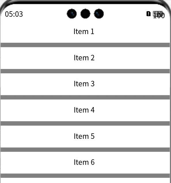
generally, the dividing line is set. At the bottom, we can directly set the dividing line at the bottom for the components of the item:
List() {
        ForEach(this.dataList, (item: string) => {
          ListItem() {
            Text(item)
              .width("100%")
              .height(50)
              .textAlign(TextAlign.Center)
              .border({ width: { bottom: 1 }, color: Color.Gray })
          }
        })
      }
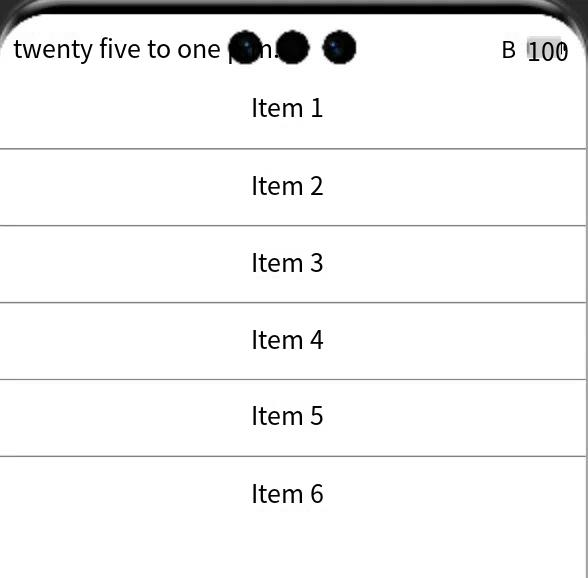
As you can see, the effect is the same as the split line attribute that comes with the component, and the last entry is perfectly filled.
Split Line Assembly Divider
if you don't say, it's still Hongmeng. It also provides a component for a dividing line. This is for fear that developers won't draw it. This component is basically the same as other components, but only one function is to show the dividing line.
Divider()
        .strokeWidth(10)
        .color(Color.Gray)
Property | type | overview |
strokeWidth | number /string | set the width of the split line |
color | ResourceColor | set the color of the split line |
vertical | boolean | sets the direction of the split line, whether to use horizontal or vertical split lines. |
lineCap | LineCapStyle | to set the endpoint style of a split line |
in the above case, we set the dividing line with the Divider component:
List() {
        ForEach(this.dataList, (item: string) => {
          ListItem() {
            Column() {
              Text(item)
                .width("100%")
                .height(50)
                .textAlign(TextAlign.Center)
              Divider()
                .strokeWidth(10)
                .color(Color.Gray)
            }
          }
        })
      }
let's look at the final effect:
related Summary
In actual development, if the self-contained dividing line can meet our needs, it is mainly based on its own dividing line attributes. If not, we can use components to draw.
Generally speaking, the Divider component is rarely used in the list. Generally, a dividing line is required in the fixed UI, which can be used at this time.
Subscribe to my newsletter
Read articles from AbnerMing directly inside your inbox. Subscribe to the newsletter, and don't miss out.
Written by