How to Build a Real-Time Cloud Monitoring Dashboard Using WPF Charts
 syncfusion
TL;DR: Discover how to create a Real-Time Cloud Monitoring Interface with Syncfusion WPF® Charts that visualize live cloud metrics like CPU, memory, and network usage. These charts enable dynamic updates, offering instant insights into system performance. Learn to bind real-time data streams and configure responsive chart types for effective monitoring.
Welcome to the Chart of the Week blog series!
Introduction
Cloud monitoring is the process of continuously observing, tracking, and analyzing the performance, availability, and health of cloud-based infrastructure, applications, and services. It enables organizations to detect real-time issues, optimize resource usage, and ensure seamless user experiences. With the rise of distributed systems and hybrid cloud environments, real-time visibility has become more critical . By leveraging automated tools and dashboards, cloud monitoring provides actionable insights that help maintain system reliability and support proactive decision-making.
Key reasons to use Cloud monitoring
Real-Time visibility: Instantly track the performance and health of cloud resources to detect and resolve issues before they impact users.
Improved reliability: Ensure high availability and uptime by proactively identifying and addressing system anomalies.
Resource optimization: Monitor usage patterns to optimize cloud resource allocation and reduce operational costs.
Security and compliance: Detect unusual activity and maintain compliance with industry standards through continuous monitoring.
Uses of Cloud monitoring
Performance tracking: Monitor CPU, memory, disk I/O, and network usage across cloud services to ensure optimal performance.
Availability monitoring: Ensure the application and service run with minimal downtime.
Alerting and incident response: Automatically trigger alerts for anomalies or failures, enabling quick response and resolution.
Capacity planning: Analyze usage trends to forecast future resource needs and plan for scaling.
In this blog, we’ll explore how to build a Cloud Monitoring dashboard using Syncfusion® WPF controls and the WPF framework to effectively visualize cloud performance metrics. This dashboard will enable users to continuously observe, track, and analyze the performance, availability, and health of cloud-based infrastructure, applications, and services.
Step 1: Configure the Syncfusion® Chart and DataGrid control
Before creating the cloud monitoring dashboard, install Syncfusion.SfChart.WPF and Syncfusion.SfGrid.WPF by following the official WPF Documentation and setting up the necessary dependencies.
Step 2: Define the model
Create data models to represent cloud-related information. Here’s a breakdown of its properties:
CloudMetricsDataModel: This model represents data for the Doughnut chart. It displays metrics like CPU usage, memory consumption, and disk space, with each data point defined by a Name and a Value.
CloudPerformanceDataModel: Designed for real-time spline, bar, and column charts, this model captures Names and their corresponding Values for bar charts and then time-series data, including CPU usage, Network traffic (in/out), and Disk operations (read/write) for spline and column charts. Each entry includes a timestamp and corresponding metric values.
InstanceInfo: This model represents detailed information about cloud instances, displayed in a data grid. It includes properties like InstanceID, Type, State, PublicIP, and Health. Additionally, it provides visual indicators such as HealthIconPath, HealthColor, and HealthBackground to reflect the instance’s health status (e.g., Healthy, Warning, Critical).
C#
public class CloudMetricsDataModel
{
   // Represents the Circular Chart Data Model
}

public class CloudPerformanceDataModel
{
   // Represents the Cartesian Chart Data Model
}

public class InstanceInfo
{
     // Represents the Data grid Model
}
Step 3: Define ViewModel
The ViewModel class implements INotifyPropertyChanged to support dynamic UI updates in a WPF application. It manages observable collections for real-time chart data, circular chart datasets (CPU, memory, disk), disk usage, and instance information. Additionally, it holds formatted text values for CPU, memory, and disk usage, and initializes sample data for visualization and monitoring purposes.
C#
public class ViewModel : INotifyPropertyChanged
{
    private string[] diskusageItems = ["Downloads", "Documents", "RootGB", "MediaGB"];
    private const int MaxPoints = 10;

    private ObservableCollection<CloudPerformanceDataModel> realtimechartData = new();
    public ObservableCollection<CloudPerformanceDataModel> RealTimeChartData
    {
        get { return realtimechartData; }
        set
        {
            if(realtimechartData != value)
            {
                realtimechartData = value;
                OnPropertyChanged(nameof(RealTimeChartData));
            }
        }
    }

    private ObservableCollection<CloudMetricsDataModel> cpuDatasets = new();
    public ObservableCollection<CloudMetricsDataModel> CPUDatasets
    {
        get { return cpuDatasets; }
        set
        {
            if(cpuDatasets != value)
            {
                cpuDatasets = value;
                OnPropertyChanged(nameof(CPUDatasets));
            }
        }
    }

    private ObservableCollection<CloudMetricsDataModel> memoryDatasets = new();
    public ObservableCollection<CloudMetricsDataModel> MemoryDatasets
    {
        get { return memoryDatasets; }
        set
        {
            if(memoryDatasets != value)
            {
                memoryDatasets = value; OnPropertyChanged(nameof(MemoryDatasets));
            }
        }
    }

    private ObservableCollection<CloudMetricsDataModel>diskspaceData = new();
    public ObservableCollection<CloudMetricsDataModel>DiskSpaceData
    {
        get { return diskspaceData; }
        set
        {
            if(diskspaceData != value)
            {
                diskspaceData = value; OnPropertyChanged(nameof(DiskSpaceData));
            }
        }
    }

    private ObservableCollection<CloudPerformanceDataModel> diskUsageDatasets = new();
    public ObservableCollection<CloudPerformanceDataModel> DiskUsageDatasets
    {
        get { return diskUsageDatasets; }
        set
        {
            if( diskUsageDatasets != value)
            {
                diskUsageDatasets = value; OnPropertyChanged(nameof(DiskUsageDatasets));
            }
        }
    }

    private Random _random = new Random();

    private ObservableCollection<InstanceInfo>? _instanceList;
    public ObservableCollection<InstanceInfo>? InstanceList
    {
        get { return _instanceList; }
        set { _instanceList = value; }
    }

    public ViewModel()
    {
        InstanceList = GetInstanceDataCollection();

        RealTimeChartData = new ObservableCollection<CloudPerformanceDataModel>();

        CPUDatasets = new ObservableCollection<CloudMetricsDataModel>
        {
             ...
        };

        MemoryDatasets = new ObservableCollection<CloudMetricsDataModel>
        {
             ...
        };

        DiskSpaceData = new ObservableCollection<CloudMetricsDataModel>
        {
             ...
        };

        DiskUsageDatasets = new ObservableCollection<CloudPerformanceDataModel>()
        {
             ...
        };

        for (int i = 0; i < MaxPoints; i++)
        {
            RealTimeChartData.Add(new CloudPerformanceDataModel
            {
                ...
            });
        }
    }

   private ObservableCollection<InstanceInfo> GetInstanceDataCollection()
   {
         return new ObservableCollection<InstanceInfo>()
         {
                ...
         };
   }
}
Step 4: Define title
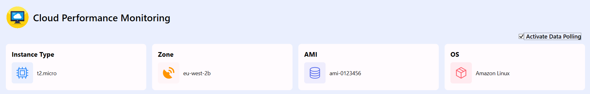
This XAML code creates a horizontal header with a cloud icon and the title “Cloud Performance Monitoring”, styled for clarity and visual appeal. The image and text are aligned side by side for a clean dashboard introduction.
XAML
<StackPanel Orientation="Horizontal">
             <Image Source="/Images/cloudcomputing.png" Width="60" Height="60" Margin="0,0,10,0"/>
             <TextBlock Text="Cloud Performance Monitoring" FontSize="25" FontWeight="Medium" VerticalAlignment="Center"/>
</StackPanel>
Step 5: Define Cloud instances
This XAML snippet creates a control panel with a checkbox to toggle data polling and a horizontally aligned layout displaying instance details like type, zone, AMI, and OS using styled borders, icons, and labels.
Activate data polling (CheckBox): A checkbox labeled “Activate Data Polling” allows users to enable or disable real-time data updates. It triggers specific events (Checked and Unchecked) to control the polling logic dynamically.
Instance type: Displays the type of cloud instance (e.g., t2.micro) with an associated icon inside a styled border, helping users quickly identify the instance configuration.
Zone: Shows the availability zone (e.g., eu-west-2b) where the instance is hosted, providing insight into the geographical distribution of resources.
AMI (Amazon Machine Image): Indicates the AMI ID (e.g., ami-0123456) used to launch the instance, which defines the OS and software configuration.
Operating system (OS): Displays the OS name (e.g., Amazon Linux) with a representative icon, giving users a quick view of the instance’s software environment.
XAML
<CheckBox Content="Activate Data Polling" FontSize="15" FontWeight="Medium" VerticalContentAlignment="Center" VerticalAlignment="Center" Checked="CheckBox_Checked" Unchecked="CheckBox_Unchecked" HorizontalAlignment="Right" Margin="10"/>

<StackPanel Orientation="Horizontal" HorizontalAlignment="Stretch">
    <Border Background="#FFFBFE" Margin="0,0,15,0" Style="{StaticResource instanceinfoborderStyle}">
          <StackPanel Orientation="Vertical">
                 <TextBlock Text="Instance Type" Style="{StaticResource headerlabelStyle}"/>
                 <StackPanel Orientation="Horizontal" Margin="0,10,0,0">
                      <Border Background="#EAEFFE" Style="{StaticResource instanceinfovaluesborderStyle}">
                          <Path Data="M11.000003,10.999997L11.000003,20.999997.….." Stretch="Uniform" Fill="#2485FA" Width="30" Height="30"/>
                       </Border>
                       <TextBlock Text="t2.micro" VerticalAlignment="Center" Margin="10,0,0,0" FontSize="14"/>
                  </StackPanel>
          </StackPanel>
    </Border>
...
</StackPanel>
Cloud performance monitoring
Step 6: Configure the DataGrid
Let’s configure the Syncfusion® WPF DataGrid control using the provided documentation.
This XAML code defines a styled section for displaying a list of cloud instances using the Syncfusion® SfDataGrid inside a bordered container. The grid is bound to the InstanceList from the ViewModel and displays columns for instance ID, type, public IP, state, and health status. The health column uses a GridTemplateColumn to visually represent the health of each instance with a colored icon and background, enhancing readability and quick status recognition.
XAML
<Border Height="345" Background="#FFFBFE" Width="738" HorizontalAlignment="Left" CornerRadius="8" Margin="0,0,7.5,0" VerticalAlignment="Top" Padding="15">

    <StackPanel Orientation="Vertical">

        <TextBlock Text="Instances" Style="{StaticResource headerlabelStyle}" Margin="0,0,0,10"/>

        <dataGrid:SfDataGrid ItemsSource="{Binding InstanceList}"
     AutoGenerateColumns="False" HeaderStyle="{StaticResource headerStyle}"
     ColumnSizer="Star" RowHeight="40" HeaderRowHeight="40">

            <dataGrid:SfDataGrid.Columns>

                <dataGrid:GridTextColumn MappingName="InstanceID" HeaderText="ID" TextAlignment="Center"/>
                <dataGrid:GridTextColumn MappingName="Type" HeaderText="Type" TextAlignment="Center"/>
                <dataGrid:GridTextColumn MappingName="PublicIP" HeaderText="PublicIP" TextAlignment="Center"/>
                <dataGrid:GridTextColumn MappingName="State" HeaderText="State" TextAlignment="Center"/>
                <dataGrid:GridTemplateColumn HeaderText="Health" MappingName="Health">
                    <dataGrid:GridTemplateColumn.CellTemplate>
                        <DataTemplate>
                            <Border Background="{Binding HealthBackground}" CornerRadius="4" Padding="5" Width="30" Height="30">
                                <Path Data="{Binding HealthIconPath}" Fill="{Binding HealthColor}" Stretch="Uniform" Width="17" Height="17" StrokeThickness="2"/>
                            </Border>
                        </DataTemplate>
                    </dataGrid:GridTemplateColumn.CellTemplate>
                </dataGrid:GridTemplateColumn>

            </dataGrid:SfDataGrid.Columns>

        </dataGrid:SfDataGrid>

    </StackPanel>

</Border>
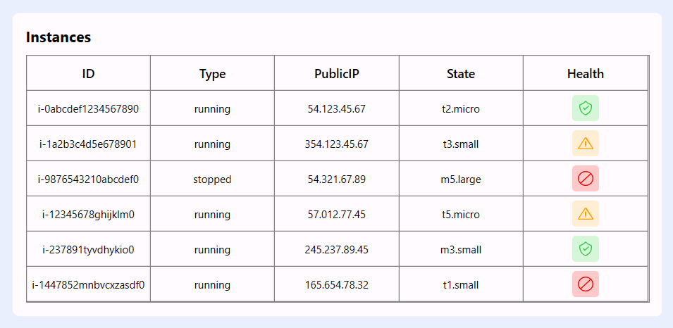
Instance List
Step 7: Configure the Circular Chart and Cloud status
Let’s configure the Syncfusion® WPF Chart control using the provided documentation.
This XAML layout displays four visually styled borders using Syncfusion® Doughnut Charts and icons to represent key cloud performance metrics. Each border is bound to ViewModel properties and provides a clean, animated visualization of system health and resource usage.
CPU usage percentage: A doughnut chart bound to CPUDatasets shows the proportion of used vs. free CPU, with a central label displaying the exact usage percentage (CPUText).
Memory usage: Another doughnut chart bound to MemoryDatasets visualizes memory consumption, with a center label showing the current memory usage in MB (MemoryText).
Cloud health status: A static card with a health icon, labeled “Health”, provides a visual cue for overall system or instance health, enhancing dashboard clarity.
Disk space: A doughnut chart bound to DiskSpaceData illustrates used vs. free disk space, with a central label (DiskText) showing the exact usage in GB.
XAML
<Border Height="165" Width="361" Margin="0,0,7.5,0" CornerRadius="8" Background="#FFFBFE" Padding="5">

    <chart:SfChart>

        <chart:DoughnutSeries ItemsSource="{Binding CPUDatasets}"
              XBindingPath="Name"
              YBindingPath="Value"
              EnableAnimation="True"
              Palette="Custom"
              DoughnutCoefficient="0.5">

            <chart:DoughnutSeries.ColorModel>
                <chart:ChartColorModel>
                    <chart:ChartColorModel.CustomBrushes>
                        <SolidColorBrush Color="#2196F3"/>
                        <SolidColorBrush Color="#F2F2F2"/>
                    </chart:ChartColorModel.CustomBrushes>
                </chart:ChartColorModel>
            </chart:DoughnutSeries.ColorModel>

            <chart:DoughnutSeries.CenterView>
                <ContentControl HorizontalAlignment="Center" VerticalAlignment="Center">
                    <StackPanel Orientation="Vertical">
                        <TextBlock Text="{Binding CPUText}" FontSize="12" HorizontalAlignment="Center" Margin="0,0,0,1" FontWeight="Bold"/>
                        <TextBlock Text="CPU" FontSize="14" FontWeight="Medium" HorizontalAlignment="Center" Foreground="Gray"/>
                    </StackPanel>
                </ContentControl>
            </chart:DoughnutSeries.CenterView>

        </chart:DoughnutSeries>

    </chart:SfChart>

</Border>
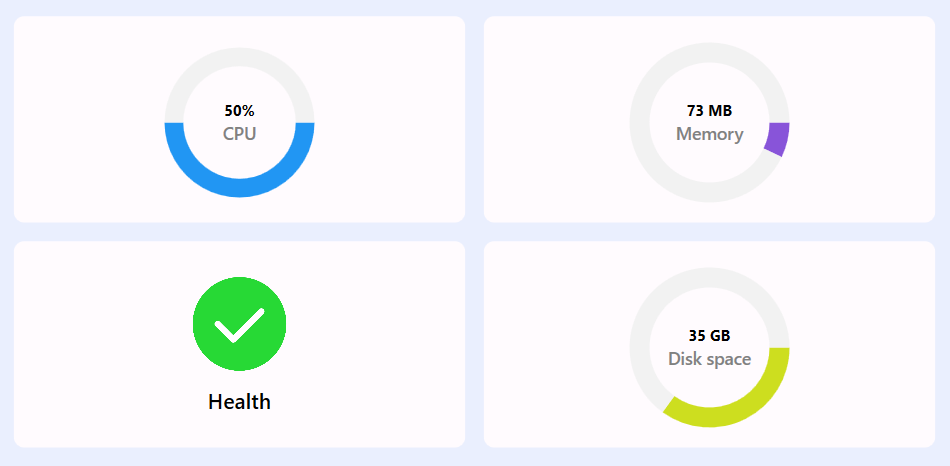
WPF Circular chart
Step 8: Configure the WPF Cartesian Chart
Let’s configure the Syncfusion® WPF Chart control using the provided documentation.
This XAML layout features two visually distinct charts using Syncfusion® WPF controls: a bar chart for visualizing disk usage, a column chart for tracking disk read/write operations, and a spline chart for tracking CPU utilization and monitoring network traffic (in/out) over time. Both charts are enhanced with custom color palettes, axis configurations, and interactive elements like tooltips and data labels for better user insight.
1.Disk usage with a Bar chart
X-axis type: CategoryAxis – displays disk categories like Downloads, Documents, etc.
Y-axis type: NumericalAxis – represents disk usage in GB with a labeled axis.
Series type: BarSeries– visualizes disk usage per category using vertical bars.
Data Label: Enabled via ChartAdornmentInfo to show values above each bar.
2.CPU utilization with Spline chart
X-axis type: DateTimeAxis – shows time progression formatted as hh:mm:ss tt.
Y-axis type: NumericalAxis – displays CPU usage percentage from 0 to 100.
Series type: SplineSeries – smooth line chart representing CPU usage over time.
Tooltip: Custom tooltip shows CPU usage with a colored dot and percentage label.
3.Network data with Spline chart
X-axis type: DateTimeAxis – displays time in hh:mm:ss tt format for real-time tracking.
Y-axis type: NumericalAxis– measures data in bytes ranging from 0 to 100.
Series type: SplineSeries – two smooth lines represent the NetworkIn and NetworkOut traffic.
Tooltip: Custom tooltips show exact byte values with colored indicators for each series.
4.Disk Operations with Column Chart
X-axis type: DateTimeAxis – shows the timeline of disk activity.
Y-axis type: NumericalAxis – represents the number of read/write operations.
Series type: ColumnSeries – two vertical bar series display the Read and Write Operations.
Tooltip: Custom tooltips display operation counts with color-coded markers for each type.
XAML
<Border Height="345" Background="#FFFBFE" Width="737" HorizontalAlignment="Left" Margin="0,0,8,0" Padding="16" CornerRadius="8">

    <StackPanel Orientation="Vertical">

        <TextBlock Text="Disk Usage" Style="{StaticResource headerlabelStyle}" Margin="0,0,0,10"/>

        <chart:SfChart Margin="0,0,10,20">

            <chart:SfChart.PrimaryAxis>
                <chart:CategoryAxis/>
            </chart:SfChart.PrimaryAxis>

            <chart:SfChart.SecondaryAxis>
                <chart:NumericalAxis Header="GB" PlotOffsetEnd="20"/>
            </chart:SfChart.SecondaryAxis>

            <chart:BarSeries ItemsSource="{Binding DiskUsageDatasets}"
                         XBindingPath="Name"
                         YBindingPath="Value"
                         EnableAnimation="True"
                         Palette="Custom" chart:ChartSeriesBase.Spacing="0.5">

                <chart:BarSeries.ColorModel>
                    <chart:ChartColorModel>
                        <chart:ChartColorModel.CustomBrushes>
                            <SolidColorBrush Color="#2196F3"/>
                            <SolidColorBrush Color="#CDDE1F"/>
                            <SolidColorBrush Color="#FF477E"/>
                            <SolidColorBrush Color="#8854D9"/>
                        </chart:ChartColorModel.CustomBrushes>
                    </chart:ChartColorModel>
                </chart:BarSeries.ColorModel>

                <chart:BarSeries.CustomTemplate>
                    <DataTemplate>
                        <Canvas>
                            <Rectangle Fill="{Binding Interior}" Canvas.Left="{Binding RectX}" Canvas.Top="{Binding RectY}" Width="{Binding Width}" Height="{Binding Height}" RadiusY="1.5" RadiusX="1.5"/>
                        </Canvas>
                    </DataTemplate>
                </chart:BarSeries.CustomTemplate>

                <chart:BarSeries.AdornmentsInfo>
                    <chart:ChartAdornmentInfo ShowLabel="True" UseSeriesPalette="False" LabelPosition="Outer"/>
                </chart:BarSeries.AdornmentsInfo>

            </chart:BarSeries>

        </chart:SfChart>

    </StackPanel>

</Border>
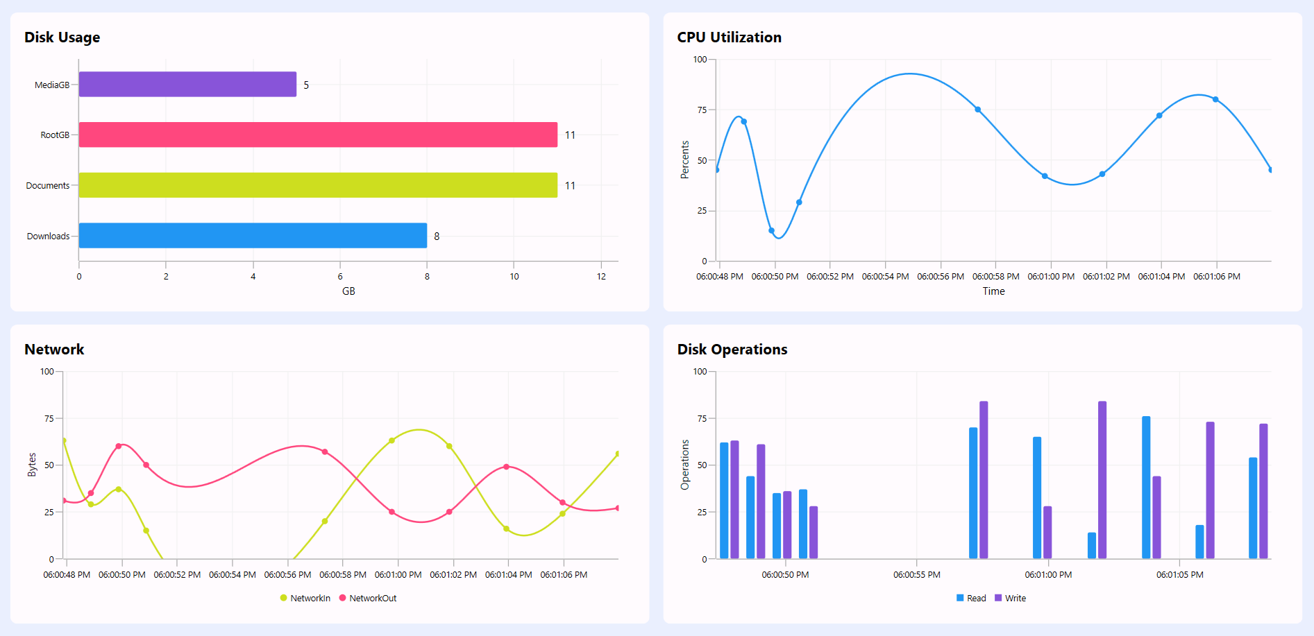
WPF Cartesian Chart
Step 9: Implement dynamic data updates
This code sets up a DispatcherTimer in the ViewModel to simulate real-time cloud monitoring by updating CPU, memory, disk, and network metrics every 2 seconds. It dynamically refreshes chart-bound collections and text values, ensuring the UI reflects the latest system performance data. The UpdateRealTimeData method maintains a rolling window of time-series data for live charting.
C#
public class ViewModel : INotifyPropertyChanged
{
    internal DispatcherTimer dispatcherTimer;
    private Random _random = new Random();

    public ViewModel()
    {
        ...
        dispatcherTimer = new DispatcherTimer
        {
            Interval = TimeSpan.FromSeconds(2)
        };
        dispatcherTimer.Tick += UpdateData;
        dispatcherTimer.Start();

    }

    private void UpdateData(object? sender, EventArgs e)
    {
        double cpuUsed = _random.Next(0, 100);
        double cpuFree = 100 - cpuUsed;

        CPUDatasets.Clear();
        CPUDatasets.Add(new CloudMetricsDataModel() { Name = "Used", Value = cpuUsed });
        CPUDatasets.Add(new CloudMetricsDataModel() { Name = "Free", Value = cpuFree });
        CPUText = cpuUsed.ToString() + "%";

        double memoryUsed = _random.Next(20, 100);
        double memoryFree = 1024 - memoryUsed;

        MemoryDatasets.Clear();
        MemoryDatasets.Add(new CloudMetricsDataModel() { Name = "Used", Value = memoryUsed });
        MemoryDatasets.Add(new CloudMetricsDataModel() { Name = "Free", Value = memoryFree });
        MemoryText = memoryUsed.ToString() + " MB";

        double diskUsed = 0;

        DiskUsageDatasets.Clear();
        foreach (var item in diskusageItems)
        {
            double value = _random.Next(5, 15);
            DiskUsageDatasets.Add(new CloudPerformanceDataModel() { Name = item, Value = value });
            diskUsed += value;
        }

        DiskText = diskUsed.ToString() + " GB";
        double diskFree = 100 - diskUsed;

        DiskSpaceData.Clear();
        DiskSpaceData.Add(new CloudMetricsDataModel() { Name = "Used", Value = diskUsed });
        DiskSpaceData.Add(new CloudMetricsDataModel() { Name = "Free", Value = diskFree });

        UpdateRealTimeData();
    }

    private void UpdateRealTimeData()
    {
        if (RealTimeChartData.Count >= MaxPoints)
            RealTimeChartData.RemoveAt(0);

        RealTimeChartData.Add(new CloudPerformanceDataModel
        {
            Time = DateTime.Now,
            CPUUsage = _random.Next(10, 85),
            NetworkIn = _random.Next(10, 85),
            NetworkOut = _random.Next(20, 70),
            Read = _random.Next(10, 80),
            Write = _random.Next(10, 95)
        });
    }
}
Step 10: Organize controls in the overall layout
Finally, arrange all controls in the main layout for a seamless, intuitive, and visually balanced user experience.
XAML
<ScrollViewer x:Name="scrollViewer" VerticalScrollBarVisibility="Visible">
    <StackPanel Margin="15">

         <!--Title-->
        <StackPanel Orientation="Horizontal">
              ...
        </StackPanel>

        <!--Instance Configuration Details-->
        <StackPanel Orientation="Horizontal">
              ...
        </StackPanel>

        <Grid Margin="0,15,0,0">
            <Grid.ColumnDefinitions>
                <ColumnDefinition Width="5*"/>
                <ColumnDefinition Width="5*"/>
            </Grid.ColumnDefinitions>


            <!--Instance Types listed Details in SfGrid-->
            <Border>
                ...
            </Border>

            <!--Cloud Metrics and Status Details-->
            <StackPanel Orientation="Vertical" Grid.Column="1">

                <StackPanel Orientation="Horizontal">
                     ...
                </StackPanel>

                <StackPanel Orientation="Horizontal">
                     ...
                </StackPanel>

            </StackPanel>
        </Grid>

        <!—Disk and CPU utilization Details in bar and spline charts-->
        <Grid Margin="0,15,0,0">
            <Grid.ColumnDefinitions>
                <ColumnDefinition Width="5*"/>
                <ColumnDefinition Width="5*"/>
            </Grid.ColumnDefinitions>

            <Border>
                 ...
            </Border>

            <Border Grid.Column="1">
                ...
            </Border>
        </Grid>

       <!—Network and disk operation details in spline and column charts -->
        <Grid Margin="0,15,0,0">
            <Grid.ColumnDefinitions>
                <ColumnDefinition Width="5*"/>
                <ColumnDefinition Width="5*"/>
            </Grid.ColumnDefinitions>

            <Border>
                ...
            </Border>

            <Border Grid.Column="1">
                ...
            </Border>
        </Grid>

    </StackPanel>
</ScrollViewer>
When you execute these code examples, the resulting dashboard will resemble the visualization below, featuring a modern and thoughtfully designed layout.
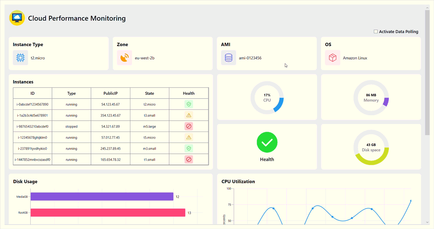
Real-Time Cloud Monitoring Interfaces with WPF Charts
GitHub reference
For more details, refer to the Cloud Performance Monitoring GitHub demo.
FAQs
Q1: What is cloud monitoring?
Cloud monitoring tracks the performance, availability, and health of cloud infrastructure and applications in real time.
Q2: Why use Syncfusion WPF Charts for cloud monitoring?
Syncfusion WPF Charts provide dynamic, customizable visualizations for real-time data like CPU, memory, and disk usage.
Q3: How do I install Syncfusion WPF controls?
Install Syncfusion.SfChart.WPF and Syncfusion.SfGrid.WPF via NuGet, as outlined in the documentation.
Q4: Can I integrate this dashboard with AWS or Azure?
Yes, replace the simulated data in the ViewModel with API calls to AWS CloudWatch or Azure Monitor for real cloud metrics.
Q5: How often does the dashboard update?
The dashboard updates every 2 seconds using a DispatcherTimer for real-time visualization.
Conclusion
Thanks for reading! In this blog, we’ve explored how to build a Cloud Monitoring using Syncfusion® WPF Charts. We encourage you to follow the steps outlined in this blog and share your feedback in the comments section below.
For existing Syncfusion® customers, the latest version of Essential Studio® is available from the license and downloads page. If you are not a customer, try our 30-day free trial to check out these new features.
If you require assistance, please don’t hesitate to contact us via our support forums, support portal, or feedback portal. We are always eager to help you! Stay tuned for next week’s featured Chart of the Week.
##Related Blogs
How to Build a Real-Time ECG Monitoring Dashboard in WPF Using a FastLine Chart
Visualize Global Temperature Anomalies with a Dynamic WPF HeatMap Chart
Heikin-Ashi vs. Candlestick Charts: Which Is Better for Market Trend Analysis in WPF?
This article was originally published at Syncfusion.com.
Subscribe to my newsletter
Read articles from syncfusion directly inside your inbox. Subscribe to the newsletter, and don't miss out.
Written by
syncfusion
syncfusion
Syncfusion provides third-party UI components for React, Vue, Angular, JavaScript, Blazor, .NET MAUI, ASP.NET MVC, Core, WinForms, WPF, UWP and Xamarin.