How Our Brain Sees Data: The Science of Visual Perception
 Muhammad Sajid Bashir
Summary
This article introduces the foundational concepts of how the human brain processes visual information and how those processes directly influence the design and interpretation of data visualizations. You will learn how the eye works, what happens in early and higher-order visual processing areas like V1 and V2, and how cognitive constraints such as working memory shape what viewers notice and remember. From beginners looking to improve their first charts to experienced professionals seeking to design perceptually-optimized dashboards, this article builds the foundation for expert-level visual design. Each section includes terminology, practical examples, and applied design tips. The next article will explore how attention and eye movement further guide perception.
1. Introduction: Why Perception Matters in Visualization
Visualization is not just about displaying data, it's about how the human brain sees and understands it. A well-designed chart helps people draw conclusions quickly and intuitively. A poorly designed one, no matter how accurate, can be confusing, misleading, or ignored altogether. Human perception is the bridge between raw data and insight. That is why understanding how we see is critical for visual communication.
Design Tip: Always ask: "What will the viewer see first? What will they remember?"
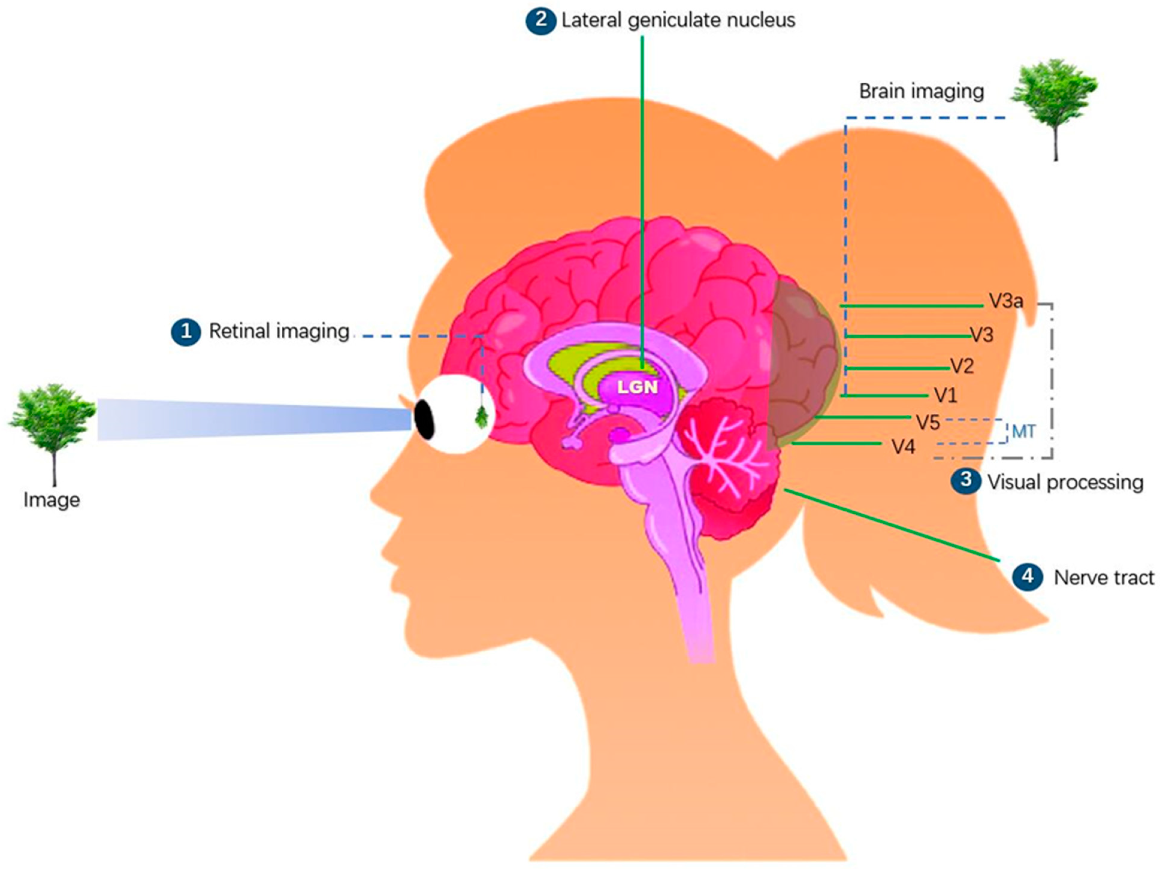
2. The Human Visual System: A Brief Overview
2.1 Anatomy of Vision
Light Reception: Vision starts when light enters the eye and is focused onto the retina.
Photoreceptors:
Rods detect motion and function in dim light. They dominate peripheral vision and cannot detect color.
Cones detect fine detail and color and are concentrated in the fovea, the center of vision.
Blind Spot: The location where the optic nerve leaves the eye has no photoreceptors. The brain fills in this gap using surrounding visual information.
Terminology:
Fovea: Small central pit in the retina with the highest visual acuity
Peripheral vision: Vision outside the central point of focus, low acuity but sensitive to motion

2.2 Implications for Visualization Design
Place the most important visual elements near the center of charts.
Avoid using subtle color differences in peripheral areas—they may not be noticed.
Use motion or strong contrast to draw attention in peripheral zones.
Practical Example:
- On a dashboard, place critical KPIs (e.g., revenue, alerts) centrally. Supporting filters or tool options can be placed peripherally.
Design Tip: Design for the fovea, place key insights where the eye naturally lands.
3. Low-Level Visual Processing: V1 and V2
3.1 What is V1?
The Primary Visual Cortex (V1) is the first stage of cortical processing. It extracts:
Edges (lines, borders)
Orientation (direction of lines)
Motion
Spatial frequency (pattern repetition)
Simple color contrasts
These features are detected without conscious attention. This is known as pre-attentive processing.
Terminology:
- Pre-attentive processing: Visual features that are detected instantly and unconsciously
3.2 What is V2?
V2 builds on V1, combining features into simple patterns:
Grouped textures
Depth edges (figure/ground)
Contour continuation
Practical Example:
- In a heatmap, abrupt color changes form edges. V1 detects them automatically. V2 helps perceive rows or clusters.
Design Tip: To make patterns stand out, use simple feature contrast (e.g., distinct hue, border thickness).
3.3 Visual Popout Effect
If a red square appears among many blue ones, it "pops out." V1 handles this contrast rapidly.
Use Case:
- Anomaly detection dashboards often use red icons to highlight failures among normal blue/green ones.
4. Higher-Level Cognitive Processing
4.1 Object Recognition
Beyond low-level features, the brain combines elements into recognizable shapes, symbols, and charts.
Terminology:
- Schema: A mental model or expectation based on experience
Practical Example:
- Experienced users instantly recognize a line chart or histogram by shape and axis layout.
Design Tip: Use conventional layouts unless there's a strong reason to innovate. Novelty increases cognitive effort.
4.2 Working Memory Constraints
Humans can only hold 4–7 visual items in working memory. This includes marks, labels, or distinct channels (e.g., color + size + shape).
Overload Example:
- A scatterplot using shape, color, size, and texture together quickly exceeds what users can process.
Design Tip: Use no more than 2–3 channels at once. Keep visuals simple and focused.
4.3 Semantic Expectations
Users rely on expectations: red = warning, upward slope = growth, green = success.
Design Tip: Use semantic consistency across dashboards. Avoid switching meanings between charts.
4.4 Practical Use Case: Financial Dashboard
Bad design: Bar height = sales, color = sentiment, icon = region, shape = team
Problem: Too many encodings, conflicting signals
Better design:
Use bar height for sales
Group by region, filter by team
Use color only for sentiment (green/red)
Design Tip: Assign each encoding to one cognitive task only.
5. Summary Design Guidelines Based on Visual Perception
| Principle | Design Tip |
| Foveal Focus | Place high-priority data centrally |
| Pre-attentive Use | Use distinct colors/shapes for outliers |
| Limit Channels | Max 2–3 variables at once |
| Reinforce Schemas | Use familiar formats and symbols |
| Respect Memory | Avoid clutter and visual noise |
6. Suggested Visualizations and Illustrations
Tools: BioRender, VizHub, ObservableHQ
7. References and Further Reading
Ware, C. (2021). Information Visualization: Perception for Design. Morgan Kaufmann.
Cleveland, W. S., & McGill, R. (1984). Graphical perception: Theory, experimentation, and application to the development of graphical methods. JASA.
Perception Resources at Interaction Design Foundation
8. What You Learned and What’s Next
Key Learnings:
How rods, cones, and the fovea influence visual layout
How V1/V2 support fast, unconscious perception of features
Why working memory limits must shape chart complexity
How schemas and semantic cues drive interpretation
Coming Next:
Blog 2: Visual Attention and the Limits of the Eye
Saccades, focus zones, inattentional blindness, visual query models
How to guide attention in dashboards and data stories
This series continues with practical strategies for guiding the user’s eye to what matters most.
Subscribe to my newsletter
Read articles from Muhammad Sajid Bashir directly inside your inbox. Subscribe to the newsletter, and don't miss out.
Written by
Muhammad Sajid Bashir
Muhammad Sajid Bashir
I'm a versatile tech professional working at the intersection of Machine Learning, Data Engineering, and Full Stack Development. With hands-on experience in distributed systems, pipelines, and scalable applications, I translate complex data into real-world impact.