Discover India’s Top Hotel Brands with Stunning .NET MAUI Lollipop Charts
 syncfusion
TL;DR: Visualizing hotel inventory share can be challenging due to the complexity of the data. This guide demonstrates how to use .NET MAUI Lollipop Charts to create clear and interactive visualizations, making it easier to understand and analyze hotel inventory distribution in India. Discover step-by-step instructions, practical examples, and tips to enhance your data visualization skills and make informed business decisions.
Welcome to our Chart of the Week blog Series!
Charts are powerful tools for transforming complex datasets into clear, actionable visuals, especially in industries like business, finance, and economics.
In this blog, you’ll learn how to build a custom Lollipop Chart to visualize the inventory share of leading hotel brands in India using the .NET MAUI Toolkit. We’ll walk through the process of building this chart using custom rendering techniques, enhancing it with interactive features and custom styles. Finally, you’ll understand how to use the Syncfusion® .NET MAUI Toolkit to develop tailored data visualizations that reveal market trends.
Why use the .NET MAUI Toolkit Charts for data visualization?
The .NET MAUI Toolkit is a versatile, open-source library that is freely available to developers. Its open-source nature provides unmatched flexibility and cost-effectiveness, making it an ideal choice for integrating advanced UI components into your applications. By exploring the .NET MAUI Toolkit controls, you can enhance your app development process and offer exceptional user experiences, transforming the way your applications interact with data and engage users.
Understanding Lollipop Charts and their use cases
A Lollipop Chart is a variation of a bar chart in which each data point is represented by a line topped with a circle, resembling a lollipop. This chart type is useful when you want to emphasize individual data points rather than their relative lengths, as in traditional bar charts.
Use cases
Comparing data across categories: Lollipop Charts effectively showcase differences in data across categories, making them suitable for visualizing survey results or product comparisons.
Highlighting specific data points: They are ideal for highlighting key data points within a series, enabling viewers to quickly grasp significant information.
Simplifying complex data: By reducing the visual clutter associated with traditional bar charts, Lollipop Charts provide a cleaner, more focused presentation, beneficial in presentations and reports.
Tracking changes over time: They are useful for displaying changes in data over time, especially when tracking performance metrics or financial trends.
Who can benefit from Lollipop Charts?
Business analysts: They can use lollipop charts to present insights and trends clearly to stakeholders, making decision-making more effective.
Product managers: By visualizing customer feedback or product performance, product managers can easily identify areas for improvement and highlight successful features.
Marketing teams: These charts can be utilized to compare campaign results across different regions or demographics, allowing for targeted marketing strategies.
Financial analysts: They can track financial metrics or highlight key financial data points to provide a clear view of a company’s financial health over time.
Educators and researchers: Simplifying complex datasets into understandable visuals helps in explaining concepts and findings to students or in publications.
Healthcare professionals: Visualizing patient data or treatment outcomes can aid in quickly understanding key trends and making informed clinical decisions.
Let’s visualize the inventory share of leading hotel brands in India using a custom Lollipop Chart with the .NET MAUI Toolkit!

Step 1: Gather the data
Let’s gather data on the inventory share of leading hotel brands in India from the Hotelivate source. This dataset provides detailed insights into the market share of various hotel brands, helping us understand their distribution and presence in the industry.
Step 2: Prepare data for the chart
To create a compelling Lollipop Chart, start by defining a Model class that outlines the data structure for hotel brands. This will include each hotel’s name and its percentage share in the market.
public class Model
{
  public string Hotel { get; set; }
  public double PercentageShare { get; set; }
  public Model(string hotel, double percentageShare)
  {
     Hotel = hotel;
     PercentageShare = percentageShare;
  }
}
Next, construct a ViewModel that contains a collection of Model instances. This collection will act as the foundation for our charting data, allowing us to dynamically present the inventory share of each hotel brand with precision and clarity:
public class ViewModel
{
public ObservableCollection<Model> HotelPercentageShareDetails { get; set; }
public ViewModel()
{
HotelPercentageShareDetails = new ObservableCollection<Model>()
{
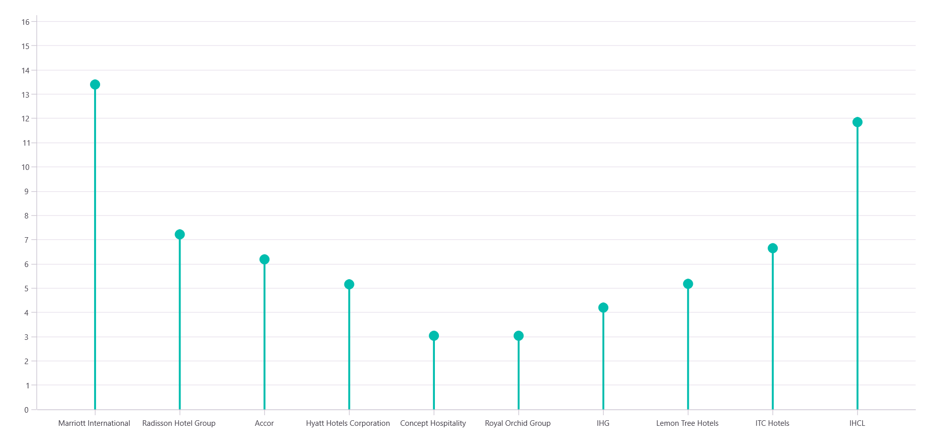
new Model("Marriott International",13.61),
new Model("Radisson Hotel Group",7.43),
new Model("Accor",6.40),
new Model("Hyatt Hotels Corporation",5.37),
new Model("Concept Hospitality",3.25),
new Model("Royal Orchid Group",3.25),
new Model("IHG",4.41),
new Model("Lemon Tree Hotels",5.39),
new Model("ITC Hotels",6.86),
new Model("IHCL",12.06),
};
}
}
Step 3: Configure the Syncfusion® .NET MAUI Toolkit Charts
Proceed to set up the Syncfusion® .NET MAUI Toolkit Charts component, referring to the official documentation. For the chart configuration, assign the XAxis to use a CategoryAxis and the YAxis to utilize a NumericalAxis. This configuration allows the chart to accurately represent the hotel brands and their corresponding percentage shares visually.
<chart:SfCartesianChart>
     <chart:SfCartesianChart.XAxes>
        <chart:CategoryAxis/>
     </chart:SfCartesianChart.XAxes>
     <chart:SfCartesianChart.YAxes>
        <chart:NumericalAxis />
     </chart:SfCartesianChart.YAxes>
</chart:SfCartesianChart>
Step 4: Build a .NET MAUI Toolkit Lollipop Chart
Incorporating the data into the Lollipop Chart involves using advanced customization to enhance the visual impact. By extending the ColumnSeries, the Lollipop Chart can accurately reflect each hotel’s market share.
Define the LollipopSeries Class: Extend the ColumnSeries class to create a custom column series specific for the Lollipop Chart.
public class LollipopSeries : ColumnSeries
{
   protected override ChartSegment CreateSegment()
   {
      return new LollipopSegment();
   }
}
Create the LollipopSegment class: This class will handle the rendering of the columns with a lollipop-style circle at the top.
public class LollipopSegment : ColumnSegment
{
    protected override void Draw(ICanvas canvas)
    {
        float radius = 8;
        float centerX = (Right + Left) / 2;
    float centerY = Top + radius;
        // Create path for vertical stem
    var path = new PathF();
    path.MoveTo(centerX, Bottom);
    path.LineTo(centerX, Top);
    var color = (Fill is SolidColorBrush brush) ? brush.Color : Colors.Transparent;
        // Draw stem
    canvas.StrokeColor = color;
    canvas.StrokeSize = 3;
    canvas.DrawPath(path);
        // Draw candy circle
    canvas.FillColor = color;
    canvas.FillCircle(centerX, century, radius);
    }
}
To design the Lollipop Chart, we’ll use the LollipopSeries instance. Ensure that the ViewModel class is correctly configured to bind its properties to the chart’s BindingContext. This setup is crucial for dynamically reflecting the data within the chart.
The code example below illustrates how to configure the LollipopSeries with the ItemsSource, XBindingPath, and YBindingPath properties. These properties are essential for binding the hotel data to the chart, ensuring that each data point is represented accurately.
<chart:SfCartesianChart>
   <chart:SfCartesianChart.Series>
        <model:LollipopSeries ItemsSource="{Binding HotelPercentageShareDetails}" XBindingPath="Hotel" YBindingPath="PercentageShare">
        </model:LollipopSeries>
   </chart:SfCartesianChart.Series>
</chart:SfCartesianChart>
Refer to the following image.
Building a .NET MAUI Toolkit Lollipop Chart
Step 5: Customize the Lollipop Chart appearance
Let’s enhance the appearance of the .NET MAUI Lollipop Chart by customizing its various elements, such as the title, tooltip, data labels, and more.
Add the chart title
The Title of a chart is crucial for providing context and drawing users’ attention to the subject at hand. In your code, the title “Leading Hotel Brands by Inventory Share in India” is complemented by a subtitle that details the analysis’s scope, “Comprehensive Analysis of Hotel Inventory Distribution as of August 2024.” These titles are formatted to maintain platform-specific readability, ensuring consistency in appearance across devices.
<chart:SfCartesianChart HorizontalOptions="Fill" VerticalOptions="Fill" Margin="{OnPlatform Android=5,Default=15,iOS=5}">
    <chart:SfCartesianChart.Title>
        <Grid Padding="5,0,0,10">
          <Grid.ColumnDefinitions>
             <ColumnDefinition Width="Auto"/>
             <ColumnDefinition Width="*" />
          </Grid.ColumnDefinitions>
          <Path Grid.Column="0" Data="{StaticResource PathData}" Fill="Black" Stroke="Gray" StrokeThickness="1" HeightRequest="40" WidthRequest="40" VerticalOptions="Center"/>
          <StackLayout Grid.Column="1" Orientation="Vertical" HorizontalOptions="Start">
              <Label Text="Leading Hotel Brands by Inventory Share in India" FontAttributes="Bold" FontSize="{OnPlatform Android=12,Default=16,iOS=12}" />
              <Label Text="Comprehensive Analysis of Hotel Inventory Distribution as of August 2024" FontSize="{OnPlatform Android=10,Default=12,iOS=10}" />
          </StackLayout>
        </Grid>
    </chart:SfCartesianChart.Title>
</chart:SfCartesianChart>
Customize tooltips
Tooltips add an interactive layer to the chart by providing immediate, detailed data insights upon user interaction. They are designed to display the percentage share directly related to each data point. This interactive feature enhances user engagement, allowing them to hover over individual elements to understand their specific values.
<chart:SfCartesianChart.Resources>
    <DataTemplate x:Key="tooltipTemplate">
       <Label Text="{Binding Item.PercentageShare, StringFormat='{0}%'}"
              TextColor="Black"
              FontSize="12"
              HorizontalOptions="Center"
              VerticalOptions="Center"/>
     </DataTemplate>
</chart:SfCartesianChart.Resources>

<chart:SfCartesianChart.TooltipBehavior>
    <chart:ChartTooltipBehavior Background="#FFD3B1FF" TextColor="Black"/>
</chart:SfCartesianChart.TooltipBehavior>

<chart:SfCartesianChart.Series>
    <model:LollipopSeries TooltipTemplate="{StaticResource tooltipTemplate}" EnableTooltip="True">
    </model:LollipopSeries>
</chart:SfCartesianChart.Series>
Customize X and Y Axes
Axes are fundamental for framing data within the chart. The X-axis uses a CategoryAxis that improves the readability of labels by rotating them appropriately for better visibility, especially when dealing with extensive text. Meanwhile, the Y-axis employs NumericalAxis settings to convey percentage data effectively. The grid lines are minimized in visibility to direct the user’s focus towards the data without unnecessary distractions.
<chart:SfCartesianChart.XAxes>
    <chart:CategoryAxis LabelRotation="{OnPlatform Android=90,Default=45,iOS=90}"
                        ShowMajorGridLines="False"
                        PlotOffsetStart="25"
                        PlotOffsetEnd="25" />
</chart:SfCartesianChart.XAxes>

<chart:SfCartesianChart.YAxes>
    <chart:NumericalAxis Maximum="16" PlotOffsetEnd="10" EdgeLabelsDrawingMode="Center">
       <chart:NumericalAxis.LabelStyle>
            <chart:ChartAxisLabelStyle LabelFormat="0'%" StrokeWidth="0"/>
       </chart:NumericalAxis.LabelStyle>
       <chart:NumericalAxis.AxisLineStyle>
            <chart:ChartLineStyle Stroke="Transparent"/>
       </chart:NumericalAxis.AxisLineStyle>
       <chart:NumericalAxis.MajorTickStyle>
            <chart:ChartAxisTickStyle Stroke="Transparent"/>
       </chart:NumericalAxis.MajorTickStyle>
       <chart:NumericalAxis.MajorGridLineStyle>
            <chart:ChartLineStyle StrokeDashArray="{StaticResource dashArray}"/>
       </chart:NumericalAxis.MajorGridLineStyle>
    </chart:NumericalAxis>
</chart:SfCartesianChart.YAxes>
Series customization
The LollipopSeries configuration is where the visual distinctiveness comes into play. By selecting a unique color palette for the series, data points are easily distinguishable, making the chart vibrant and engaging.
<chart:SfCartesianChart.Series>
    <model:LollipopSeries ItemsSource="{Binding HotelPercentageShareDetails}" XBindingPath="Hotel" YBindingPath="PercentageShare" Fill="#FFAF72FF">
    </model:LollipopSeries>
</chart:SfCartesianChart.Series>
These customizations collectively transform a basic chart into a powerful visualization tool, capable of highlighting insights effectively while offering engaging user experience. By following these steps, you ensure that your chart not only conveys information efficiently but also captivates your audience with its design and interactive capabilities.
Refer to the following image.

Visualizing the inventory share of leading hotel brands using a Lollipop Chart
GitHub reference
For more details, refer to the GitHub demo
FAQs
Q1: How can I extend the LollipopSeries to support animations or transitions in .NET MAUI?
You can override the CreateSegment and AnimateSeries methods in your custom LollipopSeries class. Syncfusion® charting library supports animation APIs that allow you to animate the rendering of segments, which can enhance the visual appeal and user experience.
Q2: Can I bind dynamic or real-time data to the Lollipop Chart in a .NET MAUI app?
Yes. By using ObservableCollection in your ViewModel and implementing INotifyPropertyChanged, the chart will automatically update when the underlying data changes. This is ideal for dashboards or monitoring tools.
Q3: How do I handle label overlap or truncation on the X-axis for long hotel brand names?
You can rotate labels using the LabelRotationAngle property or enable label wrapping. Additionally, consider using **EdgeLabelsDrawingMode ** to control how labels at the chart edges are rendered.
Q4: Is it possible to export the Lollipop Chart as an image or PDF in .NET MAUI?
A: While .NET MAUI doesn’t natively support chart export, Syncfusion® provides PDF and image export capabilities in its other libraries. You can render the chart to a RenderTargetBitmap and then save it using SkiaSharp or integrate with Syncfusion® PDF library for export.
Conclusion
Thank you for reading! In this blog, we’ve explored how to use the Syncfusion® .NET MAUI Toolkitto create a Lollipop Chart that showcases the inventory share of leading hotel brands in India. We strongly encourage you to follow the steps outlined and share your feedback in the comments section below.
If you’re an existing Syncfusion® user, you can download the latest version of Essential Studio® from the license and downloads page. For those new to Syncfusion®, we offer a 30-day free trial so you can experience these exciting features firsthand.
If you require assistance, please reach out through our support forum, support portal, or feedback portal. We value your input and are always here to help!
Related Blogs
From Chat to Charts: Build an AI-Powered .NET MAUI Chatbot That Converts Text into Charts
Build AI-Powered Smart Sales Dashboards with .NET MAUI Charts
Build a Stunning and Interactive Real-Time Weather Dashboard with .NET MAUI Toolkit
Unlock Insights on Export Trends with a .NET MAUI Toolkit Stacked Area Chart
This article was originally published at Syncfusion.com.
Subscribe to my newsletter
Read articles from syncfusion directly inside your inbox. Subscribe to the newsletter, and don't miss out.
Written by
syncfusion
syncfusion
Syncfusion provides third-party UI components for React, Vue, Angular, JavaScript, Blazor, .NET MAUI, ASP.NET MVC, Core, WinForms, WPF, UWP and Xamarin.