Vertical vs. Horizontal Bar Charts: Optimize Your Data Visualization with Blazor Charts
 syncfusion
TL;DR: Choosing between Vertical and Horizontal Bar Charts can significantly impact how your data is interpreted. This blog explores the strengths and ideal use cases for each chart type, guiding developers on how to implement both using Syncfusion® Blazor Charts. With hands-on code examples and real-time data, you’ll learn to select the best orientation for clearer, more effective visualizations.
Welcome to our latest post in the Weekly Data Visualization blog series!
Data visualization goes beyond displaying numbers; it involves choosing the right format to communicate insights clearly. Bar Charts are among the most common tools in a developer’s arsenal, but deciding between vertical and horizontal layouts can significantly impact how your audience interprets the data.
In this blog, we’ll explore the strengths of both Vertical and Horizontal Bar Charts, when to use each effectively, and how to implement them using the Syncfusion® Blazor Charts component with real-time data. Whether comparing categories or ranking values, the right orientation can make your insights more accessible and impactful.
Let’s dive in.
Why choose Syncfusion® Blazor Charts?
Syncfusion® Blazor Charts deliver 50+ customizable chart types, optimized for performance and responsiveness in Blazor applications. Bar and Column Charts are ideal for comparing categorical data, offering flexibility for diverse use cases.
Note: To get started with the Syncfusion® Blazor Charts, refer to the documentation.
What are Vertical and Horizontal Bar Charts?
Vertical Bar Charts (Column Charts)
Vertical Bar Charts, also known as Column Charts, display data with bars extending upward from the x-axis, where the height represents the value. They’re perfect for time-based trends or small category comparisons.
Note: To start using Syncfusion® Blazor Vertical Bars, refer to the documentation.
Horizontal Bar Charts
Horizontal Bar Charts use bars extending from the y-axis, with the length indicating the value. They are perfect for long labels, large datasets, or rankings.
Note: To start using the Syncfusion® Blazor Horizontal Bars, refer to the documentation.
When to use Vertical Bar Charts?
Time-based trends: Display sequential data , where the x-axis represents a sequence (e.g., months, years). Since time naturally flows from left to right, this format aligns with how people typically read data.
- Example: Monthly revenue growth, yearly temperature trends, or weekly website visits.
Comparisons with a limited number of categories: When dealing with fewer than 10 categories, Vertical Bars provide a clear and visually appealing way to compare values.
- Example: Comparing sales across five product categories.
Highlighting growth or magnitude differences: The height of Vertical Bars emphasizes value differences.
- Example: Comparing the annual growth rate of companies.
Visualize GDP with Vertical Bar Charts
A Vertical Bar Chart effectively illustrates the economic scale of nations, making comparisons easy. To visualize GDP data, collect it from the list of countries by GDP page on Wikipedia.
To display the collected GDP data using a Vertical Bar Chart in Syncfusion® Blazor Charts, use the code example below. This code sets the type property of ChartSeries to Column and customizes the axes using ChartPrimaryXAxis and ChartPrimaryYAxis.
@using Syncfusion.Blazor.Charts
<SfChart Title="Top 10 Countries by GDP (Nominal) in 2024" Theme="Syncfusion.Blazor.Theme.Bootstrap5">
    <ChartPrimaryXAxis ValueType="Syncfusion.Blazor.Charts.ValueType.Category" Title="Country" />
    <ChartPrimaryYAxis Title="GDP (in Trillions USD)" />
    <ChartSeriesCollection>
        <ChartSeries DataSource="GDPData" XName="Country" YName="GDP" Fill="RoyalBlue"
                     Type="Syncfusion.Blazor.Charts.ChartSeriesType.Column">
            <ChartMarker>
                <ChartDataLabel Visible="true"></ChartDataLabel>
            </ChartMarker>
        </ChartSeries>
    </ChartSeriesCollection>
</SfChart>
@code {
    public class GDPRecord
    {
        public string Country {get; set;}
        public double GDP {get; set;}
    }
    public List<GDPRecord> GDPData {get; set;} = new List<GDPRecord>
    {
        new GDPRecord { Country = "United States", GDP = 25.82},
        new GDPRecord { Country = "China", GDP = 19.37 },
        new GDPRecord { Country = "Japan", GDP = 4.94 },
        new GDPRecord { Country = "Germany", GDP = 4.22 },
        new GDPRecord { Country = "India", GDP = 3.73 },
        new GDPRecord { Country = "United Kingdom", GDP = 3.19 },
        new GDPRecord { Country = "France", GDP = 3.06 },
        new GDPRecord { Country = "Italy", GDP = 2.58 },
        new GDPRecord { Country = "Canada", GDP = 2.20 },
        new GDPRecord { Country = "South Korea", GDP = 2.15 }
    };
}
Refer to the following image.
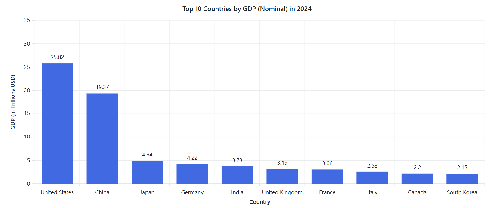
Vertical bar chart showing the top 10 countries by 2024 GDP using Blazor Charts
Note: You can find the complete code example in the BlazorPlayground sample.
When to use Horizontal Bar Charts?
Long category labels: If your category names are long, a Horizontal Bar Chart prevents overlapping or crowded labels, ensuring better readability.
- Example: A survey on favorite book titles, where each title is lengthy.
Large datasets (10+ categories): A Horizontal Bar Chart is easier to read because it prevents bars from being too compressed.
- Example: A ranking of the top 20 countries by GDP.
Ranking data: Effective for ranking items in descending or ascending order, as it naturally aligns with how people read lists
- Example: Top 10 highest-paid athletes or the most popular programming languages.
Visualize top company revenues with a Horizontal Bar Chart
To visualize the top company revenues, use a Horizontal Bar Chart for clear, length-based comparisons. Collect data from the list of the largest companies by revenue page on Wikipedia. This page typically provides comprehensive revenue data for various companies, which you can use to create detailed visualizations in charts or graphs.
To display the collected data using a Horizontal Bar Chart in Syncfusion® Blazor Charts, use the code example below. This code sets the type property of ChartSeries to Bar and customizes the axes using ChartPrimaryXAxis and ChartPrimaryYAxis.
@using Syncfusion.Blazor.Chartshttps://help.syncfusion.com/cr/blazor/Syncfusion.Blazor.Charts.ChartSeries.html

<SfChart Title="Top 10 Largest Companies by Revenue (in Billion USD)">
    <ChartPrimaryXAxis ValueType="Syncfusion.Blazor.Charts.ValueType.Category" Title="Company" />
    <ChartPrimaryYAxis Title="Revenue (in Billion USD)" />
    <ChartSeriesCollection>
        <ChartSeries DataSource="RevenueData"
                     XName="Company"
                     YName="Revenue"
                     Type="Syncfusion.Blazor.Charts.ChartSeriesType.Bar"
                     Fill="RoyalBlue">
            <ChartMarker>
                <ChartDataLabel Visible="true"></ChartDataLabel>
            </ChartMarker>
        </ChartSeries>
    </ChartSeriesCollection>
</SfChart>

@code {
    public class RevenueRecord
    {
        public string Company { get; set; }
        public double Revenue { get; set; }
    }

    public List<RevenueRecord> RevenueData { get; set; } = new List<RevenueRecord>
    {
        new RevenueRecord { Company = "Walmart", Revenue = 523 },
        new RevenueRecord { Company = "Sinopec Group", Revenue = 407 },
        new RevenueRecord { Company = "State Grid", Revenue = 383 },
        new RevenueRecord { Company = "China National Petroleum", Revenue = 379 },
        new RevenueRecord { Company = "Royal Dutch Shell", Revenue = 352 },
        new RevenueRecord { Company = "Saudi Aramco", Revenue = 329 },
        new RevenueRecord { Company = "Volkswagen", Revenue = 282 },
        new RevenueRecord { Company = "BP", Revenue = 278 },
        new RevenueRecord { Company = "Amazon", Revenue = 280 },
        new RevenueRecord { Company = "Toyota Motor", Revenue = 275 }
    };
}
Refer to the following image.
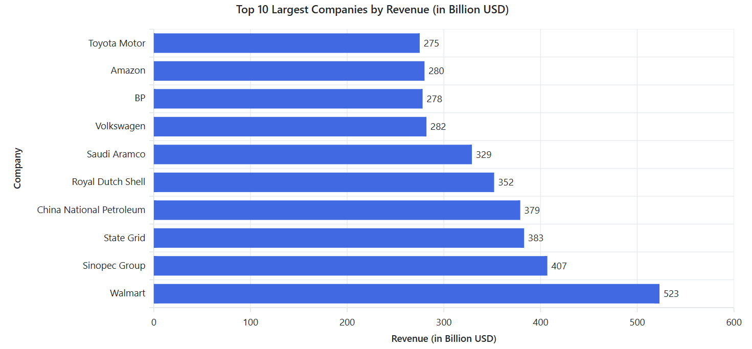
Horizontal Bar Chart displaying the top 10 companies by 2024 revenue using Blazor Charts
Note: You can find the complete code example in the BlazorPlayground sample.
Comparison: Vertical vs. Horizontal Bar Charts
| Feature | Vertical Bar Chart | Horizontal Bar Chart |
| Best for | Time-based trends, small category comparisons | Long labels, large datasets, rankings |
| Category placement | X-axis | Y-axis |
| Scalability | Best for <10 categories | Best for 10+ categories |
| Label readability | May get cluttered with long labels | Easily readable |
| Example use case | Monthly sales, yearly revenue | Top-selling products, survey results |
Final thoughts: Which one should you choose?
Both Vertical and Horizontal Bar Charts have unique advantages. Choosing between a Vertical or Horizontal Bar Chart depends on the dataset and the intended analysis. If your data represents trends over time or has a small number of categories, go with Vertical Bar Charts. If you’re dealing with long category names, rankings, or a large number of items, Horizontal Bar Charts are a better choice.
By selecting the right type of bar chart, you enhance clarity, improve audience understanding, and ensure your data tells a compelling story!
FAQs
Q1. What’s the main difference between Vertical and Horizontal Bar Charts?
Vertical Bar Charts use upward bars from the x-axis for time-based or small datasets, while Horizontal Bar Charts use sideward bars from the y-axis for long labels or rankings.
Q2. When should I use a vertical bar chart?
Use Vertical Bar Charts for time-based trends (e.g., monthly sales), small category comparisons (fewer than 10), or to highlight magnitude differences.
Q3. When are horizontal bar charts better?
Horizontal Bar Charts are ideal for long category names, large datasets (10+ categories), or ranking data like top companies by revenue.
Q4. How do I implement bar charts in Blazor?
Use Syncfusion® Blazor Charts with the ChartSeriesType.Column (vertical) or ChartSeriesType.Bar (horizontal) properties. See the code examples above.
Q5. How can I customize Syncfusion® Blazor Charts?
Add tooltips with , adjust bar width with Width=’0.8′, or customize colors using the fill property.
Conclusion
Vertical and Horizontal Bar Charts are powerful tools for transforming data into compelling stories. By choosing the right chart type for your dataset, whether it’s time-based trends or ranked categories, you can boost clarity and engagement. Ready to create stunning visualizations?
Explore our Blazor Vertical and Horizontal Chart Example to learn more about the supported chart axis types and how easy it is to configure them for stunning visual effects. Try them out and leave your feedback in the comments section below!
The latest version of the Blazor Chart component is available for current customers from the license and downloads page. If you are not a Syncfusion® customer, try our30-day free trial to check it out.
Also, you can contact us through our support forums, support portal, or feedback portal. We are always happy to assist you!
Related Blogs
How to Add Error Bars to Blazor Charts: A Complete Guide with Examples
Visualize Global Water Access Disparities with Blazor Bubble Charts
Visualize Financial Insights Instantly with Blazor Waterfall Charts
[Chart of the Week: Creating a .NET MAUI Horizontal Bar Chart to Compare Grocery Prices Between Two Countries] (https://www.syncfusion.com/blogs/post/dotnet-maui-horizontal-bar-chart-compare-grocery-prices)
This article was originally published at Syncfusion.com.
Subscribe to my newsletter
Read articles from syncfusion directly inside your inbox. Subscribe to the newsletter, and don't miss out.
Written by
syncfusion
syncfusion
Syncfusion provides third-party UI components for React, Vue, Angular, JavaScript, Blazor, .NET MAUI, ASP.NET MVC, Core, WinForms, WPF, UWP and Xamarin.