What Relearning Bootstrap Taught Me
 Benedict - Ampea-Badu
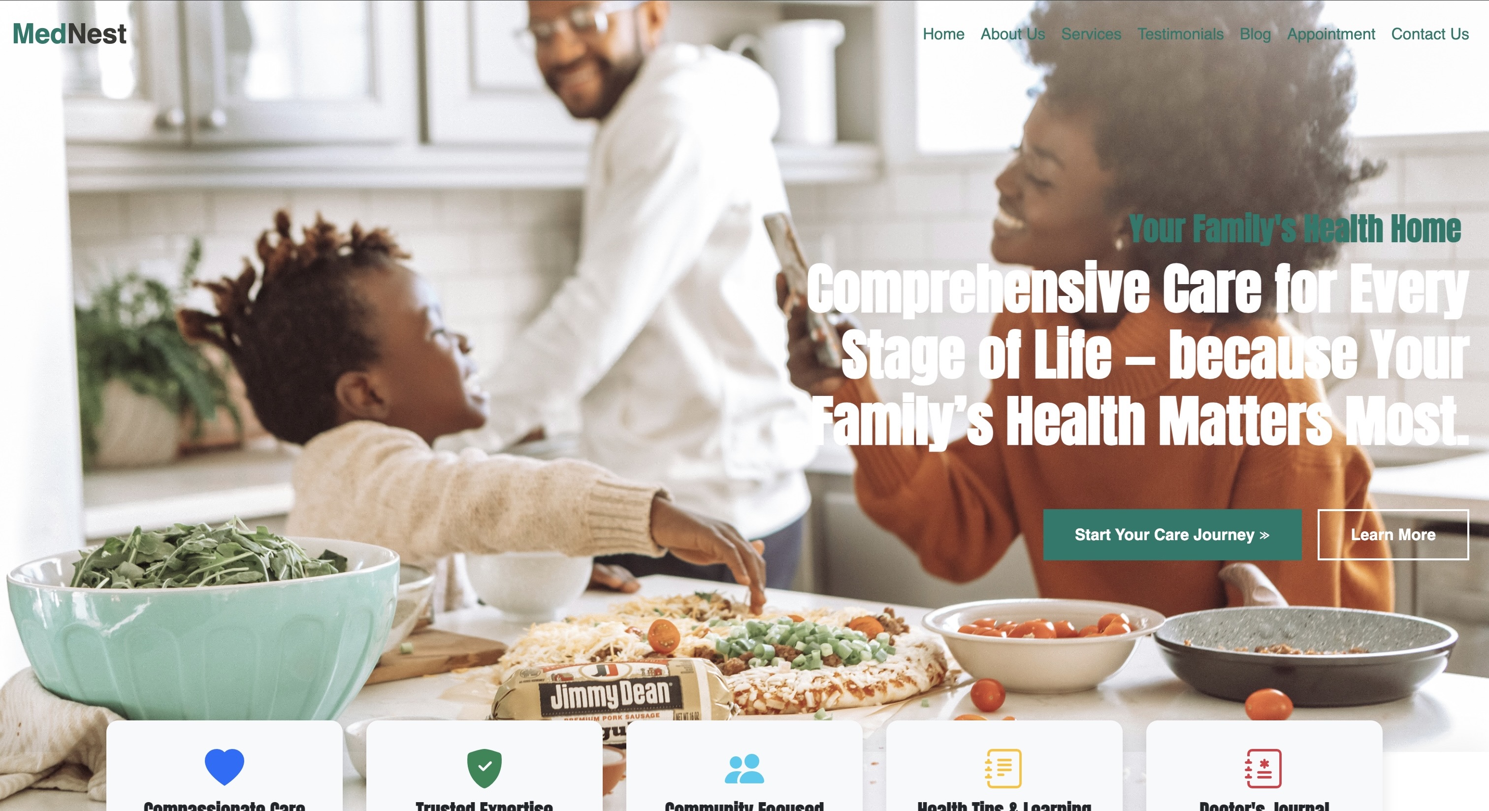
Introduction
They say good times never last — but sometimes, it feels like they barely even begin.
A few weeks ago, I sat behind my newly purchased laptop and opened one of my old GitHub repositories. As I skimmed through the code, a strange feeling washed over me: I couldn’t recognize the person who wrote it. It felt foreign, like I was peering into someone else’s mind.
That’s what happens, I suppose, when life forces you into an unexpected 16-month hiatus from programming. My old laptop had failed me, and in a place where replacing it isn’t as simple as swiping a credit card, that crash wasn’t just technical — it was personal. I watched coding videos on a sluggish, barely functioning machine. Eventually, that too was stolen. For a time, I was reduced to just imagining myself coding again.
February 21st, 2024 — I remember the date well. Life was finally looking up. I had stable income, a budding side hustle in writing, and I was preparing to marry the most amazing woman in the world. I was growing more confident in my code and eager to share the quiet progress I’d been making. That morning, I picked up my laptop with excitement. I had big plans.
But when I pressed the power button, nothing happened. My laptop had crashed — for good.
I tried everything — every repair shop I could find, every online fix, every hopeful prayer. Nothing worked. The verdict was clear: all my unsaved work was lost. That crash didn’t just wipe my hard drive — it erased months of momentum. If you’ve ever been through that kind of loss, you know how hard it is to rebuild.
But slowly, I did. I saved, I scraped, and I eventually got a new machine. And with that fresh start came an unexpected lesson: sometimes, you have to begin again. From the basics.
This time, I decided to relearn everything, starting with Bootstrap. From scratch. To rebuild not just my websites, but my confidence. This blog post — this series — is my first real attempt at creating something with it again. I’ve committed to building at least ten projects before I move on to JavaScript and then React. No shortcuts. No skipping the hard parts. I want to understand things deeply, and I want to bring you along.
If you’re reading this, you might be in a similar place — starting over, starting fresh, or just trying to finally get a grip on Bootstrap. I wrote this with you in mind. We’ll walk through the code together. I’ll explain every line the best way I know how — not just for future-me when I forget it all again, but for you too, especially if you’re just getting started.
Let’s build something.
And yes, through all the mess and madness, I’m still married to the most incredible woman in the world. She pushed me to keep going, and I will. All the way to becoming better than I ever was.
The Mindset Shift — Learning to Learn Again
Before we dive in, I want to share something with you: feeling like a beginner again can be unsettling, but for me, it’s been a quiet joy. There’s a strange kind of freedom in not having all the answers. It gives you the space to be curious, to explore slowly, and to be okay with not knowing — at least for a while. As a junior doctor, one of the best pieces of advice I ever got was this: “Don’t rush out of the beginner phase. Enjoy it. Ask questions. People expect you to not know everything — use that to learn as much as you can.” That lesson has served me just as well in medicine as it has now, returning to code after almost a year and a half away.
I won’t pretend I had mastered Bootstrap before I took that break. I was figuring things out, like most of us. But coming back after 16 months made it feel like I was reading a different language altogether. Bootstrap itself had changed — no more jQuery dependency, a completely reworked grid system in Bootstrap 5, and a more modern JavaScript-first approach. Those changes alone made me feel even further behind. But instead of being discouraged, I chose to lean into it.
So now, I read the documentation more closely. I ask ChatGPT to explain not just what works, but also why it works and what the alternatives are. I google things constantly, dive into Stack Overflow, rewatch old tutorials, watch YouTube videos, and revisit my original Udemy courses. Especially the updated ZTM (Zero to Mastery) lectures — they help me recalibrate and stay on track.
But most importantly, I’m no longer in a rush to prove anything. I’m not coding to show off progress or check boxes. I’m here to understand — to build from a place of knowledge rather than noise; from a place of clarity, and not just completion.
What I’ve learned is this: humility and curiosity are superpowers. They’re what makes the difference between feeling lost and finding your way. They remind you that starting again isn’t a setback — it’s a rare chance to rebuild with better tools and deeper clarity.
So if you’re learning alongside me — whether you’re new to coding or, like me, returning after a break — know this: you are not behind. You’re exactly where you need to be. Ask questions. Take notes. Leave a comment or reach out to me anytime — I may not have all the answers, but I’ll gladly walk with you while we find them together.
Let’s stay curious. Let’s build something beautiful — one line of code at a time.
Final Look of Project

Setting Up the Project
When I sat down to build this site, I knew I didn’t want to just dive in and paste code from old projects. I wanted to really understand every step. So let’s start from the very beginning: the folder structure, file linking, and something called AOS that makes things move.
Folder Structure
This is how I set things up:
my-bootstrap-project/
 │
 ├── index.html
 ├── style.css
 ├── images/
 │ ├── homecover.jpg
 │ ├── appointment.jpg
 │ ├── doctor.jpeg
 │ └── blogdiary.jpg
 └── js/
 └── script.js (if you decide to add custom JavaScript later)
Keeping things organised like this helps you avoid chaos later — especially when your project grows.
Linking Bootstrap
In the head of your HTML file, I added Bootstrap via CDN. CDN means Content Delivery Network, and it’s just a fancy way of loading Bootstrap from the internet instead of downloading it to your local folder. It’s fast and easy:
<link href="https://cdn.jsdelivr.net/npm/bootstrap@5.3.6/dist/css/bootstrap.min.css" rel="stylesheet">
This gives you access to all of Bootstrap’s CSS classes — so you can create layouts, buttons, grids, and more without writing everything from scratch.
At the bottom of the HTML, I also added Bootstrap’s JavaScript Bundle for components like dropdowns and modals:
<script src="https://cdn.jsdelivr.net/npm/bootstrap@5.3.6/dist/js/bootstrap.bundle.min.js"></script>
You need to place this right before the closing tag so it loads after the rest of your content.
Linking Your CSS
Your custom CSS should come after the Bootstrap link, so your styles can override Bootstrap when needed:
<link rel="stylesheet" href="style.css">
This goes in the too.
Adding AOS (Animate On Scroll)
One of the fun things I discovered this time around was AOS — a lightweight library that lets you animate elements as they scroll into view. It’s the reason things subtly fade up or slide in when you load the page. I used it to add polish and life to otherwise static sections. Here’s how to set it up:
1. Include the AOS CSS and JS (in your HTML)
In the :
<link href="https://cdn.jsdelivr.net/npm/aos@2.3.4/dist/aos.css" rel="stylesheet">
<link href="https://cdn.jsdelivr.net/npm/aos@2.3.4/dist/aos.css" rel="stylesheet">
Before the closing </body\> tag:
<script src="https://cdn.jsdelivr.net/npm/aos@2.3.4/dist/aos.js"></script>
<script>
  AOS.init();
</script>
<script src="https://cdn.jsdelivr.net/npm/aos@2.3.4/dist/aos.js"></script>
<script>
  AOS.init();
</script>
That AOS.init() line is what actually activates it. Without it, your animations won’t run.
2. Use AOS Attributes in Your HTML
Once it’s loaded, you can add data-aos to any element you want to animate. For example:
<div data-aos="fade-up" data-aos-duration="1000">
  <!-- your content -->
</div>
Let’s break that down:
data-aos = “fade-up” tells AOS which animation to use. In this case, the content will gently fade in and rise as you scroll.
data-aos-duration= “1000" controls how long the animation lasts — in milliseconds. So here, it’s 1 second (1000ms).
You can swap in other effects like:
fade-down
fade-right
zoom-in
flip-left
slide-up
You can also add:
data-aos-delay = “200” — waits 200ms before starting the animation
data-aos-easing = “ease-in-out” — controls how smooth the animation feels
Why AOS?
I liked AOS because it’s simple. I didn’t need to learn a JavaScript animation library. Just plug and play. It gave my static content some subtle flair — and made the site feel more alive without being distracting.
At this point, it might seem like a bunch of linking and setup, but here’s what we’ve done:
Created a clean folder structure
Loaded Bootstrap and wrote our own CSS
Added AOS for smooth animations that respond to scroll
It’s the foundation. And when you take time to lay it right, everything that follows becomes easier to build and understand.
Building the Navbar
If you’ve ever walked into a hospital or clinic, you know how helpful a clear front desk can be. That’s exactly what your website’s navbar is: a front desk. It tells people where they are, where they can go, and how to get back if they are lost.
In this project, the navbar sits right at the top of the page and includes:
The site’s name (“MedNest”) with brand coloring.
A set of links to other sections.
A responsive design so it works well on both desktops and mobile devices.
The HTML Structure:
<nav class="navbar navbar-expand-lg bg-white shadow-sm sticky-top">
  <div class="container">
    <a class="navbar-brand" href="#">
      <strong>
        <span class="brand-med">Med</span><span class="brand-nest">Nest</span>
      </strong>
    </a>
    <button class="navbar-toggler" type="button" data-bs-toggle="collapse" data-bs-target="#navbarNav">
      <span class="navbar-toggler-icon"></span>
    </button>
    <div class="collapse navbar-collapse justify-content-end" id="navbarNav">
      <ul class="navbar-nav">
        <li class="nav-item">
          <a class="nav-link" href="#">Home</a>
        </li>
        <li class="nav-item">
          <a class="nav-link" href="#services">Services</a>
        </li>
        <li class="nav-item">
          <a class="nav-link" href="#about">About</a>
        </li>
        <li class="nav-item">
          <a class="nav-link" href="#contact">Contact</a>
        </li>
      </ul>
    </div>
  </div>
</nav>
Let’s break it down
<nav class="navbar navbar-expand-lg bg-white shadow-sm sticky-top">
navbar: tells Bootstrap this is a navigation bar.
navbar-expand-lg: makes the navbar responsive. It will collapse on small screens.
bg-white: sets the background to white.
shadow-sm: gives a subtle shadow to help it stand out.
sticky-top: keeps the navbar stuck to the top of the screen when you scroll.
Branding with and custom styles
<a class="navbar-brand" href="#">
  <strong>
    <span class="brand-med">Med</span><span class="brand-nest">Nest</span>
  </strong>
</a>
We split the brand name into two tags so we can color them differently using CSS. brand-med is green, and brand-nest is darker.
This technique helps reinforce the brand identity subtly but consistently.
The Toggle Button (for mobile)
<button class="navbar-toggler" type="button" data-bs-toggle="collapse" data-bs-target="#navbarNav">
  <span class="navbar-toggler-icon"></span>
</button>
This button appears on smaller screens. When clicked, it toggles (shows/hides) the navigation links using Bootstrap’s JavaScript features. The icon (navbar-toggler-icon) is a built-in Bootstrap hamburger icon.
The Collapsible Menu
<div class="collapse navbar-collapse justify-content-end" id="navbarNav">
collapse navbar-collapse: enables the toggling behavior.
justify-content-end: pushes the links to the right.
id=“navbarNav”: links this div to the toggle button via data-bs-target=“#navbarNav”.
Inside this div is where we put an unordered list with the site’s nav links.
Responsive Behavior
When the screen is large (lg and above), the navbar expands and shows all links. On smaller screens, it collapses and shows the hamburger icon.
Bootstrap handles this logic for you. You don’t need JavaScript of your own to make it work — just use the right classes.
Design Tip:
Use consistent branding in your styles. We use .brand-med and .brand-nest in both the navbar and footer. Repetition creates recognition.
Building the Hero Section
“Make your welcome bold, simple, and emotionally clear.”
The hero section is often the very first thing someone sees on your site. It’s your virtual handshake. If it feels rushed or confusing, people may bounce off. But if it’s elegant, calm, and clear — they’ll want to stay.
Here’s how I built the hero section in this Bootstrap project. We’ll break it into:
The HTML structure (and why it’s minimal)
Flexbox layout with Bootstrap removed
The background image styling
Typography decisions
Making it responsive
The HTML Structure
<div class="hero-container">
  <section class="hero-section">
    <h1>Welcome to MedNest</h1>
    <p>Compassionate healthcare with a human touch.</p>
    <a href="#contact" class="btn btn-learn-more">Learn More <span class="triple-arrow">≫</span></a>
  </section>
</div>
Let’s break it down:
<div class=“hero-container”> is the outermost wrapper. I didn’t technically need this, but it gives me flexibility later (for animations, overlays, or layout tweaks).
<section class=“hero-section”> is the main visual box. This is where we apply the background image and position everything with Flexbox.
Inside, we use semantic <h1> and <p> tags for the message, plus an anchor styled like a button.
Nothing fancy. Just clean and purposeful markup.
The CSS Structure:
.hero-section {
  height: 100vh;
  background: url('./homecover.jpg') no-repeat center center/cover;
  padding: 0 20px 50px;
  display: flex;
  flex-direction: column;
  justify-content: center;
  align-items: flex-end;
  color: #ffffff;
  position: relative;
  z-index: 1;
}

.hero-section h1 {
  font-size: 2rem;
  font-weight: 600;
  margin: 0.5rem;
  text-align: right;
  color: #00796b;
}

.hero-section p {
  font-size: 3.5rem;
  font-family: 'Anton', sans-serif;
  font-weight: 900;
  line-height: 1.2;
  text-align: right;
  max-width: 800px;
  margin-bottom: 2rem;
  color: #ffffff;
  align-self: flex-end;
}

@media (max-width: 575.98px) {
  .hero-section h1 {
    font-size: 1.5rem;
  }
  .hero-section p {
    font-size: 2.5rem;
  }
}
Let’s unpack it:
height: 100vh; — Makes the section full screen height (viewport height).
background: url(…) — The hero image.
no-repeat makes sure the image doesn’t tile.
center center centers the image horizontally and vertically.
cover makes the image scale to cover the whole space.
padding: 0 20px 50px; — Creates breathing space.
display: flex — Flexbox lets us align things easily.
flex-direction: column — Stacks elements vertically.
justify-content: center — Vertically centers them within the section.
align-items: flex-end — Pushes content to the right edge.
color: #ffffff — Ensures text is white by default.
This gives the hero a clean, minimal, full-screen look — without any Bootstrap classes.
Typography & Feel
The heading (h1) is calm and green — the brand color.
The paragraph is big, bold, white, and uses Anton for emotional punch.
Both are right-aligned to feel a little different from the typical center-heavy layouts.
Making It Mobile-Friendly
This is how we adjust the font sizes when the screen gets smaller:
@media (max-width: 575.98px) {
  .hero-section h1 {
    font-size: 1.5rem;
  }
  .hero-section p {
    font-size: 2.5rem;
  }
}
On small screens:
We shrink font sizes to prevent overflow or broken layouts.
We adjust the .certified-box too (which overlaps the hero later).
This isn’t complex responsive design, but it’s enough to respect smaller screens and keep things readable.
You might be tempted to throw a bunch of buttons, text, and animations here — but don’t. The best hero sections are often the simplest. You’re not trying to impress with complexity. You’re trying to connect with clarity.
I wanted MedNest to feel:
Compassionate but modern
Warm but professional
Gentle, not chaotic
So I let the typography and color speak instead of cluttering it with noise.
Things You Can Try Differently
Change the layout to center-aligned (align-items: center)
Add a translucent overlay to improve text visibility over bright images
Try a gradient background instead of an image
Animate the text with data-aos or @keyframes
Add scroll indicator or subtle CTA arrow
The Features Section

Designing a Feature Grid
One of the best things about Bootstrap is how it simplifies responsive design — and the feature grid is a great place to experience that firsthand. In this section of the project, we built a responsive layout with five feature boxes that shift beautifully depending on your screen size.
I wanted a row of five neat, evenly spaced feature cards that would:
Sit in a single line on large screens,
Adjust to 2 or 3 cards per row on tablets,
And stack vertically on smaller mobile screens.
This is where Bootstrap’s powerful grid system comes in.
The HTML Structure
<section class="features-section text-center">
  <div class="container">
    <div class="row row-cols-1 row-cols-sm-2 row-cols-md-3 row-cols-lg-5">
      <div class="col" data-aos="fade-up" data-aos-duration="1000">
        <div class="feature-box">
          <i class="bi bi-heartbeat feature-icon"></i>
          <h3>Compassionate Care</h3>
          <p>We treat you like family—with empathy, patience, and genuine concern.</p>
        </div>
      </div>
      <!-- Repeat for other 4 features -->
    </div>
  </div>
</section>
Let’s break it down further.
Bootstrap Grid: row-cols-*
Bootstrap’s grid system is based on 12 columns. Instead of manually setting each column to span a specific width (like col-md-4), we used the newer row-cols-* classes.
row-cols-1 row-cols-sm-2 row-cols-md-3 row-cols-lg-5
This tells Bootstrap:
On extra-small screens (xs), show 1 column
On small screens (sm), show 2 columns
On medium (md), show 3
On large and up (lg), show all 5 side by side
This gives us smooth responsiveness without hardcoding widths.
Card Contents: Icons, Headings & Text
Inside each column (<div class=”col”>), we’ve placed a .feature-box with:
An icon (using Bootstrap Icons)
A heading (<h3>) for the feature name
A short paragraph description
Animation with AOS
Each column also includes:
data-aos=”fade-up” data-aos-duration=”1000"
These attributes trigger a fade-up animation (from the bottom) as the card comes into view. The duration=”1000" means it lasts 1000 milliseconds (1 second).
You can change the effect:
fade-up → try zoom-in, fade-right, flip-left, etc.
Adjust data-aos-delay=”200" to delay each card’s entrance
Hover Effects (CSS)
In our CSS, we styled the .feature-box so that it lifts slightly and changes color on hover:
.feature-box:hover {
  background-color: #00796b;
  color: white;
  box-shadow: 0 0 20px rgba(0, 0, 0, 0.1);
}
This makes the interaction feel more alive — small things like this help users feel that the site is polished and thoughtful.
Icons Grow on Hover
We added a transform to the icons too:
.feature-icon:hover {
  transform: scale(1.2);
}
This makes them gently expand when hovered over, reinforcing the card’s interactivity.
The Service Section

The Services section of the MedNest project was where I hit my first layout frustration. I wanted a neat set of medical service cards lined up side-by-side, scrollable if needed — and I mistakenly thought Bootstrap’s carousel was the way to go.
Turns out, what I wanted wasn’t a slideshow — it was more like a flex-based responsive card group. So I ditched the carousel and built my own layout from scratch using flex, gap, and wrap. Let me show you how and why it works the way it does.
The Structure: A Flex-Based Carousel Substitute
Instead of using the Bootstrap carousel (which is great for image slides), I created a container like this:
<div class="services-carousel">
  <!-- each .service-card here -->
</div>
Here’s what makes this approach work:
display: flex; lays out items in a row.
gap: 2rem; adds consistent space between cards.
flex-wrap: wrap; ensures that if the screen gets narrow (like on mobile), the cards will stack instead of overflowing.
This gives you a beautiful, responsive card layout — no extra JavaScript needed.
Each Card: The .service-card
<div class="service-card">
  <img src="./service-image.jpg" class="service-image" />
  <div class="service-body">
    <h5>Service Title</h5>
    <p>Service Description</p>
    <button class="btn btn-learn">Learn More</button>
  </div>
</div>
Why did I split it this way?
It’s all about control. I wanted the image to stay at the top, and the text to sit in a consistent space below. So I divided the layout into:
A top image with class .service-image
A .service-body section for all the text and button content
Styling the Cards (and Common Problems I Fixed)
The style.css includes this:
.service-card {
  width: 350px;
  height: 520px;
  display: flex;
  flex-direction: column;
  justify-content: space-between;
}
Fixed Height: Keeps the cards from wobbling or shifting height if one paragraph is slightly longer than another.
object-fit: cover on Images: Ensures images fill their box without distortion.
Card Hover Effects:
.service-card:hover .service-body {
  background-color: #00796b;
  color: white;
}
When you hover, the whole body changes color — it feels like the card is coming alive. The button also inverts color on hover for a smooth, interactive feel.
Mobile Fixes: Overriding with Media Queries
On smaller screens, tall cards can be too much. So I added:
@media (max-width: 576px) {
  .service-card {
    height: auto !important;
  }

  .service-body {
    height: auto !important;
  }
}
This lets the cards naturally expand or shrink based on content, which works better for mobile layouts.
Why I Skipped the Real Carousel
At first, I tried Bootstrap’s carousel with .carousel-item, .slide, and .indicators. It worked, but I quickly realized:
It added too much complexity.
It felt unnatural for multiple services.
I didn’t want users clicking back and forth just to read service info.
So I went with a custom solution using flex and grid — Bootstrap gives you the tools, but not every tool is right for every job. And that’s okay.
The Blog Section

Adding Blogs with Overlay Cards
The blog section was my attempt to do something a little more “visual” — not just cards with images and text, but layered textures and mood. I wanted it to feel like you were reading from a journal or bulletin board. Here’s how I pulled it off using basic CSS layering tricks and Bootstrap’s layout power.
The HTML Structure
I used a standard container and row structure, but each blog card is actually just a div with a background image — not an tag.
<div class="row">
  <div class="col-md-6">
    <div class="info-card card-left">
      <h3>Our Health Diary</h3>
      <p>Tips and notes from our medical team</p>
      <div class="arrow-btn"><i class="bi bi-arrow-right"></i></div>
    </div>
  </div>
  <div class="col-md-6">
    <div class="info-card card-right">
      <h3>Meet Our Doctors</h3>
      <p>Profiles and stories from the frontlines</p>
      <div class="arrow-btn"><i class="bi bi-arrow-right"></i></div>
    </div>
  </div>
</div>
Background & Overlay Magic
There’s no inside the cards — instead, the background is applied via CSS:
.card-left {
  background-image: url('./blogdiary.jpg');
}

.card-right {
  background-image: url('./doctor.jpeg');
  background-position: center 10%;
}
Then, to darken the background and make the text readable, I used a ::before pseudo-element:
.info-card::before {
  content: "";
  position: absolute;
  top: 0; left: 0;
  width: 100%; height: 100%;
  background-color: rgba(0,0,0,0.45);
  z-index: 1;
  border-radius: 12px;
}
Text content is given a z-index: 2 so it sits above the overlay.
Hover Effects
To add a sense of interaction:
.info-card:hover {
  transform: translateY(-8px);
  box-shadow: 0 10px 20px rgba(0,0,0,0.3);
}
This makes the card rise gently on hover. Clean and effective.
Interactive Button Overlay
Each card also includes a bottom-left floating button:
<div class="arrow-btn"><i class="bi bi-arrow-right"></i></div>
.arrow-btn {
  width: 35px;
  height: 35px;
  background: #eee;
  border-radius: 50%;
  display: flex;
  align-items: center;
  justify-content: center;
  position: absolute;
  bottom: 1.2rem;
  left: 1.5rem;
  z-index: 2;
  transition: all 0.3s ease;
  cursor: pointer;
}

.arrow-btn:hover {
  background: #00796b;
  transform: scale(1.1);
}

.arrow-btn:hover i {
  color: white;
}
The Contact Form

Contact Form Styling
Designing a good contact form is harder than it looks. It needs to be functional, accessible, and still feel like a natural part of your site’s design. For MedNest, I decided to go with a minimalist approach — something that wouldn’t distract from the rest of the layout, but still felt custom and cared for.
The Form Structure
<form>
  <div class="row">
    <div class="col-md-6 mb-3">
      <input type="text" class="form-input" placeholder="Your Name">
    </div>
    <div class="col-md-6 mb-3">
      <input type="email" class="form-input" placeholder="Email Address">
    </div>
    <div class="col-12 mb-3">
      <textarea class="form-input" placeholder="Your Message"></textarea>
    </div>
    <div class="col-12">
      <button type="submit" class="btn btn-cta">Send Message</button>
    </div>
  </div>
</form>
Why use row and col-* classes? Because Bootstrap’s grid helps us manage form spacing responsively. The col-md-6 inputs sit side-by-side on medium screens and stack on mobile.
.mb-3 adds bottom margin — enough breathing room between each field.
Using form-input as a class allows for global styling — one class to rule all inputs, instead of repeating inline styles.
Styling Choices
.form-input {
  background-color: transparent;
  border: 1px solid white;
  color: white;
  padding: 0.75rem 1rem;
  border-radius: 0;
  font-family: inherit;
  font-size: 1rem;
}

.form-input::placeholder {
  color: #ccc;
  opacity: 0.7;
}

.form-input:focus {
  outline: none;
  border-color: white;
  box-shadow: none;
  background-color: transparent;
  color: white;
}
The transparent background blends nicely with the darker section of the site, and the white borders ensure the fields still stand out.
.form-input::placeholder ensures the placeholder text isn’t too harsh — subtle color keeps the form from feeling noisy.
.form-input:focus styling avoids the default browser blue glow and keeps the design consistent.
Accessibility & UX Considerations
Placeholder vs Label: While placeholders are clean, they’re not enough for accessibility. A future update could include tags that are visually hidden for screen readers.
Contrast: White-on-dark ensures readability, especially for users with visual impairments.
CTA Button: The button uses a custom class .btn-cta consistent with the hero section, giving a unified visual identity.
Tip: Start with a basic form. Once the look and feel is consistent, you can layer on validation, animations, or backend functionality. But never start with complexity.
Sometimes, restraint in design is a strength. You don’t need a fancy form to make users feel heard. Simplicity, structure, and a bit of CSS love go a long way.
The Footer Section
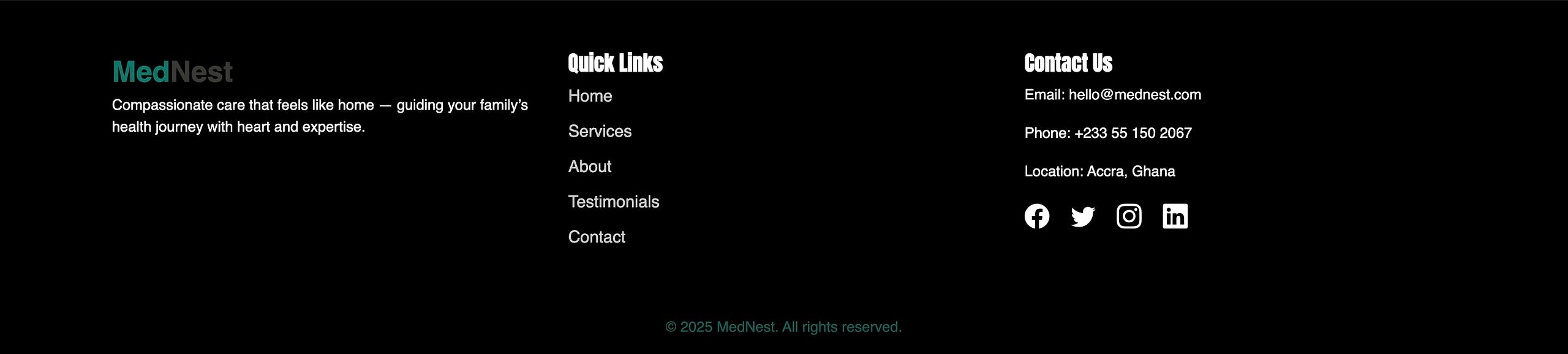
Footer & Polish
By the time I got to the footer, I was tempted to just slap some text on and be done with it. But then I remembered: the footer is the last thing users see. It deserves to be crafted with as much care as the hero section.
The HTML Structure
<footer class="footer-section py-5">
  <div class="container">
    <div class="row">
      <div class="col-md-4">
        <h4>MedNest</h4>
        <p>Compassion. Clarity. Care.</p>
      </div>
      <div class="col-md-4">
        <h5>Quick Links</h5>
        <ul class="footer-links list-unstyled">
          <li><a href="#">Home</a></li>
          <li><a href="#">About</a></li>
          <li><a href="#">Services</a></li>
        </ul>
      </div>
      <div class="col-md-4">
        <h5>Follow Us</h5>
        <div class="social-icons">
          <a href="#"><i class="bi bi-facebook"></i></a>
          <a href="#"><i class="bi bi-twitter"></i></a>
          <a href="#"><i class="bi bi-instagram"></i></a>
        </div>
      </div>
    </div>
    <p class="base-text mt-4">© 2025 MedNest. All rights reserved.</p>
  </div>
</footer>
.footer-section uses Bootstrap’s grid to divide the content into three equal parts:
Left: Branding
Middle: Navigation
Right: Social media
The final paragraph acts as a legal/copyright footer.
CSS Styling:
.footer-section {
  background-color: black;
  color: #f1f1f1;
}

.footer-links a {
  color: #ccc;
  transition: color 0.3s ease;
}

.footer-links a:hover {
  color: white;
}

.social-icons a:hover i.bi-facebook { color: #3b5998; }
.social-icons a:hover i.bi-twitter { color: #1da1f2; }
.social-icons a:hover i.bi-instagram { color: #e1306c; }
Colors and hover effects reinforce the site’s brand palette.
Transition effects ensure smooth animations — no jarring changes.
Bootstrap Icons give us clean SVG-based social icons with easy control over hover state.
Design Decisions
Grid Usage: Ensures consistency with the rest of the page.
Font and Size Matching: Maintains visual rhythm with the rest of the site.
Final Impression: Ends the page with structure, not clutter.
A footer isn’t just an afterthought. It’s the punctuation mark at the end of your website’s sentence. Build it with intention, and users will leave with a sense of completion.
Final Thoughts
This project wasn’t an attempt to prove that JavaScript isn’t needed. It wasn’t to mock its power or suggest we don’t need it for interactivity and dynamic behavior. No — this was something different.
I built this with the mindset of someone still relearning — someone still shaky with JavaScript after a long break. I wanted to see how far I could go with the tools I did understand: HTML, CSS, and Bootstrap. And what I found surprised me — you can do a lot.
I learned to lean harder on layout, spacing, responsiveness, and thoughtful interaction — not through scripts, but through structure and styling. Every effect, every hover, every reveal was crafted using the fundamentals. Not to avoid JavaScript, but to become strong enough to return to it with clarity.
This blog series was never about shortcuts. It’s about rebuilding slowly and honestly, one piece at a time. And in that process, I’ve come to realize:
You don’t need to know everything to make something meaningful.
Styling is a language of its own — and mastering it is worth the effort.
JavaScript is powerful, but Bootstrap and CSS alone can teach you design thinking, accessibility, and layout logic.
And maybe the most important thing I’ve learned?
Code is a forgiving craft: It waits for you. It allows you to begin again. It doesn’t shame you for forgetting or taking time away. When you return, it’s still there — ready to teach, ready to help you grow, ready to let you build again. I felt rusty, unsure, and clumsy when I started this rebuild. But slowly, with each div and class, I felt a little more confident.
Learning by doing is underrated: You can read a hundred docs, watch endless tutorials, and still feel unsure — until you build. This project wasn’t perfect, but every section I completed taught me something: how margin behaves, how responsive rows collapse, how flex and grid feel in a real-world layout.
Small, thoughtful design decisions matter: I didn’t just place elements where they looked good — I asked why they belonged there. I used color and spacing intentionally. I rewrote buttons until they felt right. I hovered, adjusted, hovered again. And in those micro-decisions, I found momentum.
But let me be honest — I can’t confidently say I understand everything I coded here. I don’t remember every rule, every spacing tweak, or every class I used. Not yet.
But I do know this: I have more pages to build. And I intend to keep coding — slowly, intentionally, patiently — until all of this becomes second nature.
Also, this particular rebuild was inspired by and loosely based on the Healthvest template by Colorlib. I used it as a visual reference, but rewrote the code from scratch to learn the structure, challenge myself, and gain full ownership of every element.
I’m not done ignoring JavaScript — far from it. But I’m proud of what I’ve been able to create without it. And I hope this series shows you that you can build real, usable, and even beautiful projects with just the basics.
Let’s not wait until we know everything. Let’s build with what we have, and let the rest catch up.
Because sometimes, clarity comes from limits.
And confidence comes from creating.
Let’s keep going — project by project, line by line.
If you’d like to dive deeper into the actual codebase, you can find the full project on GitHub — https://github.com/BennyBlvck/MedNest. I’ve shared it openly not because it’s perfect, but because it’s real. You’re free to fork it, explore it, break it, rebuild it — whatever helps you learn. Tinker with the styles, rework the layout, or challenge yourself by rebuilding it from scratch. Every line of code is an invitation to understand more deeply, and I hope it serves you the way it’s served me — as a tool to grow, one project at a time.
I’ll end it here for now — but this is just one step on a much longer journey. I’ve got more pages to build, more lessons to uncover, and I’d love for you to walk alongside me as I go. So, whenever you’re ready, meet me in the next project. We’ll keep learning, one thoughtful line of code at a time.
You can also take a look at the functional site here: https://bennyblvck.github.io/MedNest/
By Benedict - Ampea-Badu on July 2, 2025.
Exported from Medium on July 15, 2025.
Subscribe to my newsletter
Read articles from Benedict - Ampea-Badu directly inside your inbox. Subscribe to the newsletter, and don't miss out.
Written by
Benedict - Ampea-Badu
Benedict - Ampea-Badu
👩⚕️ Medical Doctor |💻 Junior Full Stack Software Developer | Aspiring User Engagement Driven Figma UI/UX Designer | Technical Writer | Web Accessibility Enthusiast