Bar vs. Pie Chart: How to Pick the Right One for Your Business Data
 syncfusion
TL;DR: Bar charts and pie charts serve distinct purposes. Bar charts are ideal for comparing values across categories, while pie charts excel at showing proportions. This blog post walks you through how to choose the right chart, with practical Blazor code examples, interactivity tips, and design enhancements using the Syncfusion® Blazor Charts library.
Welcome to our Weekly Data Visualization blog series!
Imagine transforming complex numbers into clear, impactful insights that captivate your audience. The right chart can make all the difference. In this blog, we’ll dive into the fascinating world of bar charts and pie charts, revealing their unique strengths and how to master them using the powerful Syncfusion® Blazor Charts. Discover when to use each chart type, avoid common pitfalls, and follow practical examples to elevate your Blazor applications. Ready to visualize smarter? Let’s get started!
Selecting an effective data visualization between Bar and Pie Charts
Why choose Syncfusion® Blazor Charts?
Syncfusion® Blazor Charts offers a robust suite of tools for data visualization in Blazor. It supports over 50 chart types, including bar, pie, line, and more.
One of its specialized components, the Syncfusion® Blazor Accumulation Chart , is designed to represent data as parts of a whole. It’s ideal for visualizing proportional data and is commonly used to highlight the contribution of individual items to a total.
Both chart types make it easy to integrate visually appealing and interactive charts into your Blazor applications. They are fully compatible with Blazor Server and ** WebAssembly** apps, support real-time data updates, and adapt seamlessly to various screen sizes. Additionally, they can be customized extensively to align with your app’s design and functional requirements. Here’s why developers love it:
Rich chart types
Supports over 50 chart types, including line, bar, pie, area, scatter, financial charts, and more.
Ideal for both simple dashboards and complex data visualizations.
Interactive features
Built-in support for zooming, panning, tooltips, crosshairs, legends, and data labels.
Enhances user experience with real-time updates and animations.
Customization and styling
Fully customizable appearance: colors, fonts, borders, gradients, and themes.
Supports responsive design and adaptive layouts for mobile and desktop.
Comprehensive documentation and support
Extensive documentation, demos, and a strong developer community.
Backed by Syncfusion® enterprise-grade support.
Note: Ready to start building? Check out our Getting Started guide to learn about Syncfusion® Blazor Charts and Syncfusion® Blazor Accumulation Chart.
Let’s get started!
Understanding Bar and Pie Charts
What is a Bar Chart
A bar chart is a graphical representation of data using rectangular bars to show the values of different categories. The length or height of each bar corresponds to the data value it represents. It is commonly used to compare quantities across categories.
When to use a Bar chart
Bar charts are perfect for:
Revenue analysis : Compare performance across different regions or departments.
Trend monitoring : Track changes with grouped or stacked bars.
Data management : Summarize complex datasets with multiple values efficiently.
Value comparison : Display negative and positive values to understand contrasts and trends.
What is a Pie Chart
A pie chart divides a circle into slices, each representing a proportion of the whole. It’s ideal for showing how categories contribute to a total.
When to use a Pie chart?
Pie charts are ideal for:
Breaking down totals: Show how parts make up a whole, e.g, which categories make up total sales in a month.
Clear data segments: Best for small, simple datasets, e.g, 3-6 categories to keep it readable.
Spotlighting share sizes: Emphasize relative contributions of each segment, highlighting key differences.
Bar Chart vs. Pie Chart: Pros and Cons
| Feature | Bar Chart | Pie Chart |
| Purpose | Comparisons | Proportions |
| Data representation | Uses bars | Uses slices |
| Ideal use cases | Multiple categories | Few categories (Maybe 3-6) |
| Axes required | Yes | No |
| Handling negative values | Yes | No |
| Shows trends | Yes | No |
| Handles large datasets | Yes | No |
| Ease of interpretation | Yes | Yes (if segments are limited) |
Implementing Syncfusion® Blazor Bar and Pie Charts
Follow this step-by-step guide to implement Bar Charts and Pie Charts using the Syncfusion® Blazor Charts component, including Charts and Accumulation Charts.
Step 1: Gather the data
In this example, data was gathered from two primary sources to support the visualizations. The bar chart is based on Ranked: The Most Visited Websites in the World, which highlights global digital engagement trends. The pie chart draws from Social Media Users 2025 (Global Data & Statistics) by Priori Data, illustrating the distribution of users across various platforms.
Step 2: Define and populate the data
To visualize website traffic and user engagement, define two classes – BarChartData and PieChartData – each with the following properties:
public class BarChartData
{
    public string Source { get; set; }
    public double MonthlyVisits { get; set; }
    public double UniqueMonthlyVisitors { get; set; }
}
public class PieChartData
{
    public string AgeGroup { get; set; }
    public double Percentage { get; set; }
    public string Fill { get; set; }
}
After defining the classes, create two lists: TrafficStats , which displays traffic sources and user activity, and ActiveUsers , which represents the distribution of age groups. Both are used as data sources for the charts.
public List<BarChartData> TrafficStats = new List<BarChartData>
{
    new BarChartData {Source="Google", MonthlyVisits=136, UniqueMonthlyVisitors = 6.3},
    new BarChartData {Source ="Facebook", MonthlyVisits=12.7, UniqueMonthlyVisitors =2.0},
    new BarChartData {Source = "YouTube", MonthlyVisits = 72.8, UniqueMonthlyVisitors=3.6},
    new BarChartData {Source = "Instagram", MonthlyVisits = 6.8, UniqueMonthlyVisitors=1.5},
    new BarChartData {Source = "Reddit", MonthlyVisits = 6.0, UniqueMonthlyVisitors=1.0 },
};

public List<PieChartData > ActiveUsers = new List<PieChartData >
{
    new PieChartData {AgeGroup="18-29 years", Percentage=45, Fill="#9b5de5"},
    new PieChartData {AgeGroup="30-49 years", Percentage=84, Fill="#00bbf9"},
    new PieChartData {AgeGroup="50-64 years", Percentage=81, Fill="#00f5d4 "},
    new PieChartData {AgeGroup="over 65 years", Percentage=73, Fill="#ee964b"}
};
Step 3: Bind the prepared data to the respective charts
Configure the Syncfusion® Blazor Charts and Accumulation Chart to visualize the information, displaying traffic sources, user activity in a bar chart, and age group distribution in a pie chart.
To display traffic data in the bar chart using Syncfusion® Blazor Charts, set the Type property of the ChartSeries to ChartSeriesType.Bar to visualize the number of visitors and daily active users per platform. Assign the prepared data source, TrafficStats , to the DataSourceproperty, as demonstrated in the code example below.
<SfChart  Title="Social Media Comparison: Monthly Visits vs Unique Monthly Visitors" Theme ="Syncfusion.Blazor. Theme.Bootstrap5">
     <ChartPrimaryXAxis ValueType="Syncfusion.Blazor.Charts.ValueType.Category"
              Title="Social Media">
   <ChartAxisMajorGridLines Width="1" />
  </ChartPrimaryXAxis>
     <ChartSeriesCollection>
         <ChartSeries DataSource="@TrafficStats" XName="Source" YName=" MonthlyVisits" Type="ChartSeriesType.Bar" Name=" Monthly" Fill="#9fc729" >
        <ChartMarker>
           <ChartDataLabel Visible = "true"
                              Position="Syncfusion.Blazor.Charts.LabelPosition.Outer">
                 </ChartDataLabel>
            </ChartMarker>
       </ChartSeries>
  <ChartSeries DataSource="@TrafficStats" XName="Source" YName=" UniqueMonthlyVisitors" Type="ChartSeriesType.Bar" Name=" UniqueMonthly" Fill="#85a8ff" >
       <ChartMarker>
                <ChartDataLabel Visible = "true" Position="Syncfusion.Blazor.Charts.LabelPosition.Outer">
                  </ChartDataLabel>
          </ChartMarker>
  </ChartSeries>
  </ChartSeriesCollection>
</SfChart>
To display the age distribution of users in a pie chart using the Syncfusion® Blazor Accumulation Chart, assign the prepared data source, ActiveUsers , to the DataSource property of the AccumulationChartSeries, as shown in the code example below.
<SfAccumulationChart Title="Visitor Age Distribution Across Social Media Platforms">
      <AccumulationChartSeriesCollection>
    <AccumulationChartSeries DataSource="@ActiveUsers" XName="AgeGroup" YName="Percentage" Name="AgeGroup" PointColorMapping="Fill" Radius="90%">
        </AccumulationChartSeries>
    </AccumulationChartSeriesCollection>
</SfAccumulationChart>
Step 4: Enhance the appearance and effectiveness of the chart.
You can further enhance the bar and pie charts by adding features such as legends, tooltips, and more.
Adding legends to improve clarity
Legend can be enabled in the bar and pie charts by setting the Visible property of ChartLegendSettings and AccumulationChartLegendSettings to “ true ”, as shown in the code example below.
In the Bar chart:
<ChartLegendSettings Visible = "true" Position="LegendPosition.Bottom">
</ChartLegendSettings>
In the Pie Chart:
<AccumulationChartLegendSettings Visible="true">
</AccumulationChartLegendSettings>
Customizing the tooltip for better readability
When space is limited on a chart, tooltips provide a clean and effective way to display detailed information. You can enable them by setting the Enable property in ChartTooltipSettings to true. By default, tooltips display the x and y-axis values. However, you can customize the content using the Format property. For example, using the “ $series.name ” and “ $point.y ” placeholders allows you to display the series name and the y-axis value in the tooltip. Additionally, you can use the Header property with the “ $point.x ” placeholder to show the x-value as the tooltip header.
<ChartTooltipSettings Enable="true" Header="${point.x}" Format="<b>${series.name} : ${point.y} Billion</b>">
</ChartTooltipSettings>
Enhancing the Pie Chart with the Explode feature
Highlight key age groups by pulling out specific slices using the ExplodeIndex property and adjusting their distance from the center with ExplodeOffset to emphasize the most prominent segment, as shown in the code example below.
<AccumulationChartSeriesCollection>
      <AccumulationChartSeries DataSource="@ActiveUsers" XName="AgeGroup" YName="Percentage" Name="AgeGroup" Explode="true" ExplodeIndex="0" ExplodeOffset="5%" PointColorMapping="Fill" Radius="90%">
    </AccumulationChartSeries>
</AccumulationChartSeriesCollection>
Choosing the right chart: A quick guide
If you need to compare values? → Use a Bar Chart
If you need to show proportions? → Use a Pie Chart
If you have many categories? → Avoid Pie Charts to prevent clutter.
Selecting the appropriate chart type ensures your data is easily interpreted and visually effective. Bar charts are ideal for side-by-side comparisons, while pie charts are best for illustrating percentage distributions.
With Syncfusion® Blazor Charts for bar charts and the Accumulation Chart for pie representations, you can effortlessly create clean, interactive visualizations for your application.
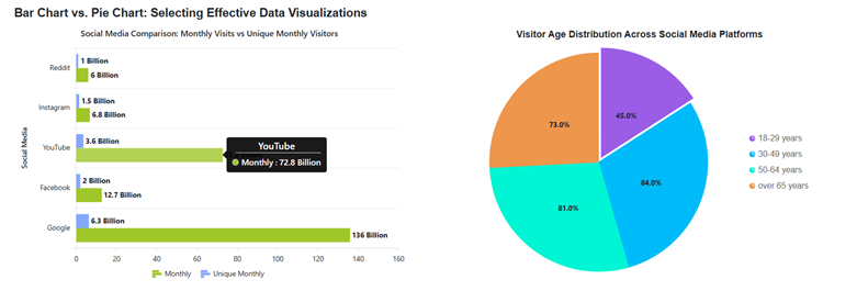
After executing the previously outlined steps, the output will resemble the following image.

Selecting an effective data visualization between Bar and Pie Charts
Reference
For more details, refer to the demo.
FAQs
Q1. What is the primary difference between a bar chart and a pie chart in data visualization?
A bar chart primarily compares values across different categories, using rectangular bars whose lengths represent data values. A pie chart, on the other hand, represents numerical data as proportional slices of a circle, illustrating segments of a whole. It is ideal for showcasing data distributions.
Q2. When should I specifically choose a bar chart over a pie chart for my data?
You should choose a bar chart when comparing values across multiple categories, observing trends over time (using grouped or stacked bars), or visualizing negative and positive values. Bar charts are also more effective for handling larger datasets and complex data with multiple values efficiently.
Q3. Are there situations where a pie chart is a better choice for data representation?
Yes, pie charts are ideal when you want to show parts of a whole, such as dividing total sales into categories, and are best suited for small, simple datasets with a few clear categories, typically 3 to 6. They help emphasize how much each part contributes relative to others.
Q4. How can Syncfusion® Blazor Charts help implement both bar and pie charts?
Syncfusion® Blazor Charts offers a comprehensive suite of interactive and customizable charting tools for Blazor applications. It provides specific components like bar charts and Accumulation Char t, making it easy to bind prepared data. You can also enhance these charts with features like legends, tooltips, and even an “explode” feature for pie charts to highlight key segments.
Conclusion
We hope this guide helped you confidently choose between bar charts and pie charts for your data visualization needs. With Syncfusion® Blazor Charts, you can bring your data to life using clean data models, seamless data binding, interactive legends, customizable tooltips, and dynamic explode effects, all designed to make your charts more engaging and effective.
Want to make your charts even better? Start implementing our shared examples and share your experience in the comments below.
Customers with an active license can download the latest release of Essential Studio® from the license and downloads page. If you’re new, we welcome you to begin a 30-day free trial to explore the latest features and gain access to a rich library of more than 1,900 UI components.
For further assistance, please reach out via our support forum, support portal, or feedback page. We’re here to help you build modern, feature-rich applications with confidence and ease.
Related Blogs
Bar Chart vs. Pie Chart: The Ultimate Guide to Choosing the Right Chart for Your Data
Vertical vs. Horizontal Bar Charts: Optimize Your Data Visualization with Blazor Charts
How to Add Error Bars to Blazor Charts: A Complete Guide with Examples
Choosing Between Linear and Log Scales in Charts — What Every Developer Should Know
Subscribe to my newsletter
Read articles from syncfusion directly inside your inbox. Subscribe to the newsletter, and don't miss out.
Written by
syncfusion
syncfusion
Syncfusion provides third-party UI components for React, Vue, Angular, JavaScript, Blazor, .NET MAUI, ASP.NET MVC, Core, WinForms, WPF, UWP and Xamarin.