How to Visualize Data with Google Data Studio for Maximum Impact?
 Aashika mehra
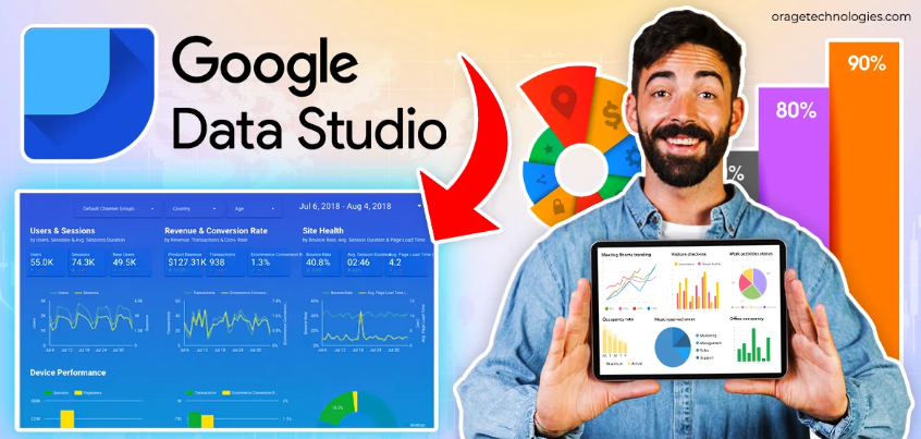
In the data-driven world of digital marketing and analytics, it is critical to provide insights in a clear, engaging manner to facilitate key decision-making. Google Data Studio is a robust and completely free tool that transforms raw data into beautiful, interactive reports and dashboards. With Data Studio's powerful features, businesses can successfully communicate sophisticated forms of data in engaging ways, and ultimately discover trends and other actionable outcomes. This blog post aims to outline the process of using Google Data Studio to develop data visualizations, as well as actionable steps and recommendations to take advantage of this tool. Let's jump into the art of data visualization with Google Data Studio!
What Is Google Data Studio and Why Use It for Data Visualization?
Why is Google Data Studio a valuable asset for visualization? Google Data Studio is a cloud-based platform that allows you to create customizable, interactive reports and dashboards, in seconds, by connecting to different data sources including Google Analytics, Google Ads or spreadsheets. It has a drag-and-drop visual design system that is easy to use for beginners, but still has some advanced features for experienced analysts.
Visualizing data in Google Data Studio removes the burden of looking through raw numbers for trying to figure out what is happening. It allows you to represent your data in a chart, graph or table that tells a story. Rather than reviewing spreadsheets and going through rows and columns of data figuring out website traffic trends or performance of a campaign, you can create a dashboard that layers and shows other insights. Once the data is well visualized through the reports, it is easy to share and make sense of quickly by stakeholders or analysts summarizing insights. This makes Google Data Studio very useful for businesses, marketers and analysts who need to effectively share and communicate insights from data.
How to Create a Dashboard in Google Data Studio?
How can you start putting together some visualizations to better understand your data? Creating a dashboard in Google Data Studio is an easy-to-use platform that allows you create customized visualizations. Follow these steps to get started:
Visit Google Data Studio: Go to datastudio.google.com and sign in with your google account. Click “Create” > “Report” which opens a new project.
Add a Data Source: Click “Add Data” and select your connector; in this case you can use Connectors such as Google Analytics, Google Sheets, BigQuery, etc. You must authenticate the connection and bring in your data.
Name Your Report: You will ultimately want to give your report a name, something descriptive like “Website Performance Dashboard” so that you organize the reports easily.
Add Visualizations: From the toolbar, you can add charts (e.g. bar, line, pie), tables, or scorecards. Drag the charts onto the canvas and resize it if you need.
Configure Data to visualize: For each chart, select the data source and add your metrics (e.g. “Sessions” or “Revenue”) and your dimensions (i.e. “Date” or “Source/Medium”).
Edit Colors and Fonts: Use the “Style” tab to change the colors, fonts, and themes to match your brand, or make it easier to read.
Add Filters and Date Ranges: Add interactive controls, such as date range selectors or filters so users can view a specific subset of the data.
Save and Share: Once you're done, you can save the report by clicking "Save" and share it by link or adding emails under "Share" to invite collaborators.
After the dashboard is set up, all active visualizations in your Google Data Studio dashboard will populate and refresh dynamically as data is ingested into the underlying data source. This helps you visualize and analyze performance.
How To create visualization that make impact in Google data studio?
To create effective visualizations in Google Data Studio you need to balance design and usability. Here are some practices to create dashboards that make impact with your audience:
Select Appropriate Chart Types: Choose charts that align to the story you are trying to tell with the data. Line charts are suitable for showing trends over time, bar charts for comparisons of data, and pie charts for showing proportions.
Limit Visuals: To reduce clutter limit the visuals you use on each page. Think about the key metrics you want your audience to focus on. If you have too much to analyze they will likely not engage with the content in a meaningful way.
Design Consistency: Choose a color scheme and font type and stick with it. There are many built-in theme options in Data Studio that can match your branding and maintain the professional look and feel across your dashboards.
Bring Attention to Key Insights: Use scorecards and prominently display key performance metrics or key metrics like total conversions or revenue as the first part of the dashboard to get viewers attention.
User Interactivity: Incorporate filter controls or date range picker controls on the dashboard that gives the user the ability to drill down to a specific segment of data or timeline. This added engagement is important for your audience to maximize their experience of your visualizations.
Use clear labels: Make sure that they have descriptive titles, axis labels and legends that make it easy for anyone to interpret the data.
By following these practices you can create visualizations with Google Data Studio that have impact and drive long lasting decisions that ultimately lead to action.
How to Combine Multiple Data Sources in Google Data Studio?
There are numerous benefits to integrating multiple data sources within Google Data Studio. Bringing together data from different platforms will allow you to build comprehensive dashboards that tell the entire performance story. For example, you could combine Google Analytics data with Google Ads in order to measure the ROI of a marketing campaign.
To combine multiple data sources:
In the report, select “Add Data” and choose-by-connecting each data source (Google Analytics, Google Sheets or SQL database).
Use Google Data Studio's “Data Blend feature” by clicking on “Resource then Manage Blended Data” to select the data sets that you want to blend together.
Define a join key (date, campaign name, etc.) to align data from the various sources.
Create charts using the blended data source in order to visualize key metrics. For example, sessions from Analytics and ad spend from Google Ads.
By employing a blended data source, your Google Data Studio dashboard can create unified view that leads to uncovering more significant connections and insights between platforms.
How Can You Share and Collaborate on Google Data Studio Dashboards?
With all of that time and effort put into building these dashboards, how do you ensure you get them to the right people? Google Data Studio makes it easy to share and collaborate inside or outside your organization. Here are the ways you can share dashboards:
Share via Link: Click on “Share” and then generate a view-only link or an editable link. You can also adjust the settings so you know who has access to view or edit the report.
Invite Collaborators: In the “Share” menu, you can add your team members' email addresses in order to give them edit or view access. The process is similar to how you would share a Google Docs.
Schedule Reports: You can schedule reports to email your stakeholders with PDF snapshots of your dashboard on a regular basis (weekly, monthly, etc.). Use the “Schedule” feature for this.
Embed Dashboards: If you want to put your Google Data Studio report on a website or on an intranet, go to the “Share” menu, and then copied the embed code.
Export Data: All charts and tables within a Google Data Studio dashboard can be downloaded such as an image or CSV in the event you want to share for a presentation or just to look at the data in a different format.
Sharing your Google Data Studio dashboards has never been easier with a flexible array of options! Doing so with those you need to reach will allow for collaboration and data-driven decision-making.
What Are Effective Methods of Maximizing Your Google Data Studio Dashboards?
Maximizing your Google Data Studio dashboards means that you are maximizing your investment. Please look at these methods:
Keep User's Purpose Top of Mind: Set your dashboards up for your audience's purpose. For example, executives may need the highest level KPIs, whereas a team of marketers may need campaign data that is much more granular (attributed, keyword, etc.).
Automate Updates to the Data: Create live data connections so your dashboards have real-time or near-real-time data, without the need for manual updates every time data is updated. The same keeps them ahead of the curve.
Use Calculated Fields: You can use the formula editor in Google Data Studio to create calculated fields (conversion rates, cost-per-click, etc) in order to give your audience a richer analysis of the data you present to them.
Reduce Performance Times: If you are using a lot of data points (or a lot of charts), your dashboards can load badly. Use filters, or customize data inputs so your dashboards can load quickly, especially if you are loading large data sets or multiple charts.
Test Performative Interactivity: Dashboards can have lots of clickable or dynamic filters and controls, so test it out on different devices, especially mobile devices, and test the performance using your tap points to get that seamless user experience.
By utilizing these methods you can build Google Data Studio dashboards that are both powerful and at the same time user-friendly so that you can create maximum effectiveness.
Frequently Asked Questions About Visualizing Data with Google Data Studio
Can I Use Google Data Studio with Non-Google Data Sources?
Yes, Google Data Studio supports connectors for non-Google sources like MySQL, PostgreSQL, or third-party platforms (e.g., Salesforce) via partners like Supermetrics or native connectors.
How Do I Handle Slow-Loading Dashboards in Google Data Studio?
Reduce data complexity by limiting date ranges, aggregating data before importing, or using extracted data sources to improve performance in Google Data Studio.
Can I Create Interactive Dashboards for Clients in Google Data Studio?
Absolutely! Add filter controls, date range selectors, or drill-down options to make dashboards interactive. Share view-only links with clients for easy access.
How Do I Ensure Data Accuracy in Google Data Studio?
Verify data source connections, check for correct event tracking in tools like Google Analytics, and regularly audit your Google Data Studio reports for discrepancies.
Is Google Data Studio Free to Use?
Yes, Google Data Studio is free for most features, including unlimited reports and data connections. Some third-party connectors, like Supermetrics, may have associated costs.
Conclusion
Visualizing data with Google Data Studio empowers businesses to transform raw data into actionable insights through stunning, interactive dashboards. By setting up data connections, creating effective visualizations, and leveraging sharing features, you can communicate complex information clearly. Follow best practices like simplifying designs and automating updates to maximize impact. Whether you’re tracking marketing campaigns or business KPIs, Google Data Studio is a game-changer for data storytelling. Start building your dashboards today to unlock the full potential of your data!
Subscribe to my newsletter
Read articles from Aashika mehra directly inside your inbox. Subscribe to the newsletter, and don't miss out.
Written by