Creative Background for Product Photos to Boost Sales
 ProdShot Creator
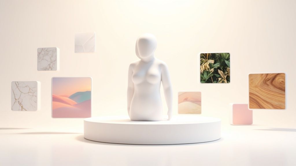
In the crowded digital marketplace, your product photos are your silent salespeople. While a clean white backdrop is a common standard, the right background for product photos can do so much more; it can tell a story, evoke an emotion, and define your brand's entire identity. The difference between a potential customer scrolling past and clicking 'add to cart' often lies in that visual first impression. To truly revolutionize your product's first impression and boost sales, it's crucial to understand how your product photos integrate into your overall e-commerce branding strategy.
This guide moves beyond generic advice to provide seven distinct, actionable background strategies designed to make your products stand out. We will explore everything from the timeless purity of a perfect white setting to the modern appeal of geometric designs, providing the pros, cons, and expert tips you need to choose and execute the perfect visual stage for your items. Whether you're a seasoned e-commerce veteran or just launching your online store, this curated list will equip you with fresh perspectives to transform your product imagery from standard to stunning, helping you captivate your target audience effectively.
1. Pure White Background
The pure white background is the undisputed workhorse of e-commerce. It’s a clean, seamless, and distraction-free option that places the entire focus on your product. This method is considered the gold standard for marketplaces like Amazon and is heavily favored by major brands such as Apple and IKEA for its ability to create a professional, uniform, and trustworthy aesthetic across an entire product line.
A pure white backdrop is not just about placing a product in front of a white wall. True professional results come from using a "cyclorama" or "infinity cove," often created with a large sweep of paper or vinyl. This curved surface eliminates the horizon line where the wall meets the floor, creating a smooth, edgeless void that makes the product appear to float. This technique is the cornerstone of creating a high-quality background for product photos that converts.
When to Use a Pure White Background
This approach is non-negotiable for sellers on platforms with strict image guidelines, like Amazon. It’s also the best choice for:
- Catalog Images: Creating a consistent look for your entire inventory, from apparel on sites like ASOS to complex medical devices.
- Main Product Listings: Ensuring your primary "hero" image is clear, professional, and provides maximum contrast to make the product pop.
- Versatile Assets: A product isolated on white is incredibly easy to repurpose for marketing materials, social media graphics, and advertisements without complex editing.
Key Insight: The goal of a pure white background isn't just to be "white," but to be so neutral and free of distractions that the customer's eye has nowhere else to go but to your product's details.
Implementation and Pro Tips
Achieving a flawless white background requires careful lighting control to eliminate unwanted shadows and ensure the background is truly white, not gray.
- Lighting is Crucial: Use at least two light sources on the background itself, separate from the lights on your product. This helps "blow out" the background to pure white without overexposing your subject.
- Exposure Strategy: Shoot your image slightly underexposed to retain all the product details. You can then selectively brighten the background to pure white (#FFFFFF) in post-production software like Adobe Lightroom or Photoshop.
- Maintain Consistency: Keep your camera settings and lighting setup identical for every product in a series. Pay close attention to the color temperature of your lights to avoid a mix of warm and cool tones, which can make the "white" look inconsistent.
For a quick reference, the following summary box breaks down the core features, pros, and cons of using a pure white background.
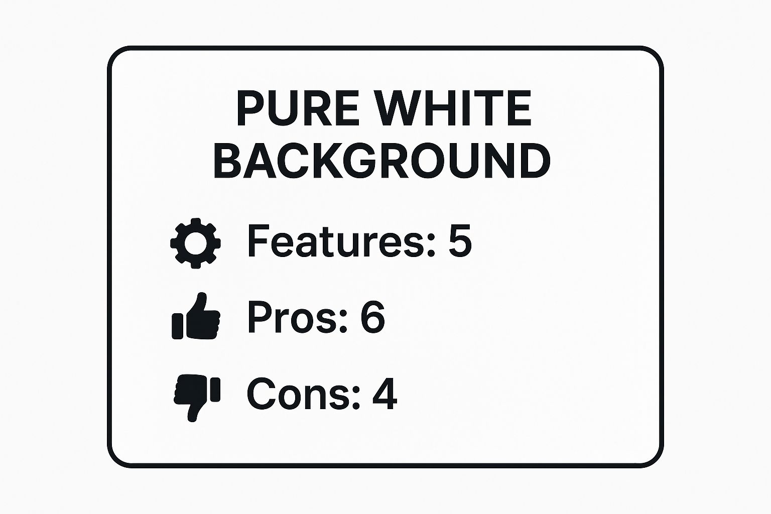
As the data shows, while this background is rich in features and benefits for professional e-commerce, it's not without its technical challenges and may not suit brands aiming for a more lifestyle-oriented feel.
2. Gradient Background
The gradient background is a sophisticated step up from a solid color, adding a sense of depth, luxury, and visual intrigue. It involves a smooth transition from one color to another, or from a darker to a lighter shade of the same hue. This technique is a favorite in the tech, automotive, and beauty industries, seen in campaigns for brands like Samsung and luxury watchmakers. It expertly guides the viewer's eye while creating a dynamic yet uncluttered environment for the product.
Unlike a flat, single-color backdrop, a gradient adds dimension and a premium feel. It can make a product look more grounded and substantial, or give it an ethereal, floating quality depending on the direction and colors used. This subtle complexity makes it a powerful background for product photos aimed at conveying quality and modern design.
When to Use a Gradient Background
This approach is ideal for brands that want to move beyond the standard white background without introducing distracting elements. It excels for:
- Tech and Electronics: Highlighting the sleek, modern lines of gadgets, smartphones, and audio equipment.
- Luxury Goods: Complementing the refined finish of watches, jewelry, and high-end accessories.
- Cosmetics and Beauty Products: Creating a soft, alluring mood that enhances the product's color and texture.
- Hero Images and Ad Campaigns: Making a powerful first impression on a homepage, landing page, or in a social media advertisement.
Key Insight: A well-executed gradient feels intentional and artistic. It tells the customer that every detail of the product's presentation has been considered, subtly elevating the perceived value of the item itself.
Implementation and Pro Tips
Creating a professional gradient effect can be done either practically with lighting or digitally in post-production. For many e-commerce sellers, digital creation is the most efficient path.
- Subtlety is Key: Avoid harsh or overly vibrant color transitions. A gentle shift from light gray to dark gray, or from one analogous color to another, is often more effective than a full rainbow spectrum.
- Direction Matters: A vertical gradient (dark bottom to light top) can ground a product, while a radial gradient (lightest in the center, fading outward) can create a spotlight effect, drawing the eye inward.
- Color Harmony: Choose gradient colors that complement your product's color palette. A blue product might look stunning against a gradient of light to dark cyan, but clash with a red-to-yellow transition.
- Post-Production Polish: Isolate your product on a transparent background first. Then, create the gradient on a separate layer in a tool like Photoshop or Canva. This gives you maximum control to adjust the colors and angle without re-shooting. Many modern tools can also help you explore this style; for instance, you can create a gradient background with an AI product photo generator.
For a quick reference, the following summary box breaks down the core features, pros, and cons of using a gradient background.
As the data illustrates, a gradient background offers a significant boost in aesthetic appeal but requires a good eye for color theory and potentially more post-production work than simpler options.
3. Natural/Lifestyle Context Background
A natural or lifestyle context background moves beyond the studio to place your product in its intended real-world environment. This narrative-driven approach shows the product in action, helping customers visualize how it would fit into their own lives. Brands like Patagonia showcasing gear on a mountainside or Williams Sonoma placing kitchenware in a beautifully styled kitchen use this method to build an emotional connection and demonstrate practical value in a setting that feels both aspirational and authentic.
This technique is all about storytelling. By creating a scene, you’re not just selling an item; you’re selling an experience, a feeling, or a solution to a problem. Whether it’s camping gear in the great outdoors or home decor in a cozy living room, using a natural environment as a background for product photos makes the product more relatable and desirable. It answers the customer's subconscious question: "How will this look and feel in my world?"
When to Use a Natural/Lifestyle Context Background
This background is perfect for brands that want to build a strong identity and connect with customers on an emotional level. It is especially effective for:
- Social Media Content: Creating engaging, shareable images for platforms like Instagram and Pinterest where storytelling reigns supreme.
- Brand Storytelling: Showing the values and lifestyle associated with your brand, such as adventure for REI or sophisticated comfort for Anthropologie.
- Website Banners and Ads: Capturing attention with compelling, high-impact visuals that demonstrate the product’s purpose immediately.
Key Insight: A successful lifestyle shot makes the background an essential part of the story without letting it overpower the product. The environment should enhance the product’s appeal, not compete with it for attention.
Implementation and Pro Tips
Executing a great lifestyle shoot requires careful planning to ensure the product remains the star of the show while the environment provides meaningful context.
- Location Scouting: Choose a location that genuinely reflects your target audience's aspirations and lifestyle. Scout it beforehand to check for lighting conditions, potential distractions, and the best angles.
- Subtle Styling: Use props that complement the product, but avoid clutter. The goal is to create a scene that looks natural and unstaged. For more ideas on styling, particularly for household items, you can find inspiration for home decor product photos.
- Use a Shallow Depth of Field: Keep your product in sharp focus while allowing the background to be slightly blurred. This technique, known as bokeh, helps the product stand out while still providing the contextual clues of the environment.
The following video provides a helpful walkthrough on achieving professional results with lifestyle product photography.
4. Colored Solid Background
A colored solid background moves beyond pure white to inject personality, emotion, and brand identity directly into your product shots. This method uses a single, uniform color to create a bold, modern, and memorable visual experience. It maintains a clean, distraction-free environment similar to white but uses color theory to complement the product, evoke a specific mood, or reinforce brand recognition, as famously done by Tiffany & Co. with their iconic blue.
This technique is powerful because color has a direct psychological impact on consumers. A vibrant red can signal energy and excitement, a soft pastel can feel gentle and calming, and a deep, rich hue can convey luxury and sophistication. Choosing the right colored solid background for product photos can dramatically influence how a customer perceives both the product and the brand behind it, making it a strategic creative decision.
When to Use a Colored Solid Background
This approach is perfect for brands that want to stand out from the sea of white backgrounds and build a strong, visually consistent identity. It’s an excellent choice for:
- Brand-Centric Campaigns: Establishing a cohesive look across a website, social media feed, and advertising, like Target’s use of bold red.
- Highlighting Product Features: Using a contrasting color to make the product's color or texture pop, or a complementary color to create a harmonious, aesthetically pleasing image.
- Targeted Emotional Appeal: Selecting colors that align with the desired feeling of the product, such as a calming green for a wellness item or a playful yellow for a children's toy.
Key Insight: A solid color background is more than just a backdrop; it's an active part of your brand's storytelling. The right hue can communicate your brand's values and personality before the customer even reads a word of your product description.
Implementation and Pro Tips
Success with colored backgrounds hinges on deliberate color selection and consistent execution. The goal is a vibrant, even color field, not a blotchy or uneven surface.
- Master Color Theory: Use a color wheel to find complementary colors (opposites on the wheel) for high contrast or analogous colors (next to each other) for a more serene, unified look.
- Use Quality Backdrops: Seamless paper rolls are the industry standard and come in a vast array of colors. They provide a smooth, matte finish that minimizes reflections and is easy to light evenly.
- Test and Iterate: A color that looks great on a screen may not translate perfectly in your lighting setup. Always test your product against the chosen background color before committing to a full photoshoot.
- Maintain Color Consistency: Ensure your lighting's color temperature is consistent across all shoots. A slight shift from warm to cool light can completely change how the background color appears, breaking brand consistency.
5. Textured Surface Background
A textured surface background moves beyond flat colors to introduce tactile visual interest and a sense of environment. Surfaces like rustic wood, sleek marble, raw concrete, or soft linen add depth, context, and sophistication to an image. This approach helps tell a story about the product, suggesting its quality, origin, or intended use without overwhelming it.

Unlike a simple solid color, a textured background for product photos engages the viewer’s sense of touch, making the product feel more tangible and real. From a high-end watch resting on polished marble to a fresh loaf of bread on a weathered wooden board, the texture provides an immediate contextual clue that elevates the product's perceived value and creates a strong brand mood.
When to Use a Textured Surface Background
This background is ideal for brands that want to evoke a specific lifestyle or feeling. It works exceptionally well for:
- Food and Beverage: Rustic wood, slate, or linen backgrounds can make food look artisanal, fresh, and wholesome.
- Luxury Goods: Marble, silk, or dark stone textures complement jewelry, watches, and high-end cosmetics, reinforcing their premium quality.
- Handmade and Artisanal Products: Natural textures like craft paper, concrete, or burlap highlight the product's unique, handcrafted nature.
- Social Media Content: Textured backgrounds are highly engaging on platforms like Instagram and Pinterest, where aesthetic and mood are paramount.
Key Insight: A well-chosen texture should act as a supporting character, not the star of the show. Its purpose is to enhance the product's story and complement its features, not compete with them for attention.
Implementation and Pro Tips
Successfully using textures requires a delicate balance between visual interest and clarity. The goal is to add depth without creating distraction.
- Complement, Don't Compete: Choose a texture that aligns with your product’s material and brand identity. A rugged, industrial product looks at home on concrete, while delicate skincare might pair better with smooth stone or soft fabric.
- Master Your Lighting: Use directional lighting from the side or back to accentuate the texture's highs and lows. This creates subtle shadows that reveal the surface's depth.
- Use a Shallow Depth of Field: Shoot with a wider aperture (e.g., f/2.8 or f/4) to slightly blur the background texture. This technique keeps the product sharply in focus while softening the background, adding depth without being distracting.
- Find Inspiration: When considering a textured surface background, you might find inspiration from various design resources, including those that explore advanced video design tricks for textures.
6. Transparent/Cut-out Background
The transparent or cut-out background is the chameleon of product photography, designed for ultimate versatility. This method involves completely removing the original background in post-processing to create a product image with a transparent layer, typically saved as a PNG file. This allows the isolated product to be placed seamlessly onto any color, pattern, or design imaginable, making it a cornerstone of modern digital marketing and web design.
This technique is not a type of physical backdrop but rather a post-production outcome. The initial photo is often taken against a solid, contrasting color (like pure white or green) to make the selection and removal process easier. The end result is a highly flexible digital asset, a key reason why it's a standard requirement for Google Shopping feeds and a best practice for creating a cohesive background for product photos across diverse platforms.
When to Use a Transparent/Cut-out Background
This approach is essential for any brand that needs to use product images across multiple marketing channels and contexts. It is the go-to choice for:
- Maximum Marketing Flexibility: Placing products in social media ads, email newsletters, or website banners with custom designs without any awkward white boxes.
- Composite Imagery: Combining multiple products into a single promotional graphic or creating lifestyle scenes digitally.
- Dynamic Website Design: Allowing product images to float over different colored sections or video elements on a webpage for a modern, integrated look.
- Platform Compliance: Meeting the strict requirements of advertising platforms like Google Shopping, which often mandate transparent backgrounds for a uniform user experience.
Key Insight: A transparent background transforms your product photo from a static image into a dynamic, reusable design element. It decouples the product from its environment, giving you complete creative control.
Implementation and Pro Tips
The quality of a cut-out depends heavily on the precision of the editing process. A poor cut-out with jagged edges can look unprofessional and undermine customer trust.
- Shoot for the Edit: Photograph your product on a smooth, solid-color background that contrasts sharply with the product itself. This makes the editor's job much easier and yields a cleaner result.
- Master the Pen Tool: For the most accurate selections in software like Adobe Photoshop, use the Pen Tool to manually trace the product's outline. Automated tools like the Magic Wand can work for simple shapes but often fail with complex edges.
- Handle Shadows Carefully: Decide if you want to retain the natural shadow. Often, it's best to save two versions: one completely without a shadow, and one with a soft, natural drop shadow on a separate layer for added realism.
- Address Complex Edges: Products with hair, fur, or fine details require advanced masking techniques. Use tools like Photoshop's "Select and Mask" workspace to refine edges and capture intricate details. For complex jobs, it's often more efficient to use professional product photo editing services to ensure a flawless final image.
7. Minimalist Geometric Background
The minimalist geometric background uses clean lines, simple shapes, and structured patterns to create a modern, sophisticated, and visually engaging setting. This approach, heavily influenced by Scandinavian and Bauhaus design principles, adds visual interest and depth without distracting from the main subject. It frames the product, guides the viewer's eye, and communicates a sense of order, precision, and contemporary style.
This method moves beyond a simple flat surface by introducing elements like arches, pedestals, or colored blocks. These components create shadows and highlights that give the scene dimension. This makes it an excellent background for product photos for brands that want to convey innovation and design-forward thinking, as seen in campaigns by tech startups and modern furniture brands. It’s a purposeful and artistic choice that balances simplicity with personality.
When to Use a Minimalist Geometric Background
This background is ideal for brands aiming to establish a strong, modern, and high-end visual identity. It works exceptionally well for:
- Tech and Gadgets: The clean lines and precise forms complement the sleek design of electronics and high-tech products.
- Cosmetics and Skincare: Using shapes like blocks or arches can elevate small items, making them appear more architectural and luxurious.
- Modern Furniture and Decor: The geometry of the background can echo or contrast with the product's form, creating a compelling visual narrative.
- Jewelry and Accessories: Simple pedestals or colored blocks can serve as a modern display stand, highlighting the intricate details of the pieces.
Key Insight: A geometric background isn't just decorative; it's structural. The shapes and lines should interact with your product to create a balanced, intentional composition that reinforces your brand's modern aesthetic.
Implementation and Pro Tips
Success with this style depends on thoughtful composition and restraint. The goal is to enhance the product, not overwhelm it.
- Complement the Product's Form: Use shapes that complement your product. A round cosmetic jar might look great contrasted with a sharp-edged block, while a rectangular smartphone could be framed by a soft arch.
- Use Color Strategically: Stick to a limited, brand-aligned color palette. Monochromatic or complementary color schemes work best to maintain a clean, uncluttered look.
- Leverage Light and Shadow: Use a single, strong light source to cast defined shadows from the geometric elements. These shadows add depth and a dynamic quality to the image.
- Maintain Negative Space: Don't crowd the frame. Ensure there is plenty of empty space around the product and geometric forms to let the composition breathe and maintain a minimalist feel.
Background Styles Comparison Overview
| Background Type | Implementation Complexity 🔄 | Resource Requirements ⚡ | Expected Outcomes 📊 | Ideal Use Cases 💡 | Key Advantages ⭐ |
| Pure White Background | Moderate – requires careful lighting and backdrop setup | Low – simple materials, standard lighting | Clean, professional, high contrast images | E-commerce, catalogs, marketplaces (Amazon, eBay) | Universal compatibility, easy editing |
| Gradient Background | High – needs skillful lighting or editing | Medium – lighting setup or post-processing | Depth and dimension with subtle visual interest | Luxury products, tech, automotive, beauty marketing | Adds depth, reinforces brand colors |
| Natural/Lifestyle Context Background | High – location, props, and lighting coordination required | High – scouting, props, extended shoot time | Authentic, engaging, emotional connection | Outdoor gear, lifestyle brands, social media campaigns | Emotional engagement, storytelling |
| Colored Solid Background | Low to Moderate – colored backdrop setup or editing | Low – colored materials or digital backgrounds | Brand-aligned, visually engaging | Brand-focused campaigns, fashion, social media photos | Reinforces brand identity, more engaging than white |
| Textured Surface Background | Moderate – requires texture sourcing and lighting finesse | Medium – physical materials and lighting control | Premium, sophisticated look with depth | Luxury goods, artisanal products, food, jewelry photography | Adds visual interest, natural depth |
| Transparent/Cut-out Background | High – requires advanced post-processing | Medium to High – skilled editing and quality photography | Versatile, clean, adaptable | Website integration, product catalogs, social media ads | Maximum flexibility, clean and professional |
| Minimalist Geometric Background | Moderate to High – design skill needed for geometry | Low to Medium – mostly digital design elements | Modern, structured, design-focused | Tech products, design brands, modern furniture, architecture | Modern look, highly customizable |
Automate Your Ideal Background and Accelerate Your Sales
Choosing the perfect background for product photos is far more than an aesthetic decision; it's a strategic move that directly influences brand perception, customer trust, and ultimately, your sales. Throughout this guide, we've explored a versatile toolkit of options, each with unique strengths. From the universal, marketplace-friendly appeal of a pure white background to the vibrant, brand-defining power of solid colors, the right choice sets the stage for your product to shine.
We've seen how natural, lifestyle contexts build an emotional connection and help customers visualize products in their own lives. We also covered how textured surfaces like wood or marble can add a layer of sophistication and sensory appeal, while minimalist geometric setups convey a modern, design-forward brand identity. Each of these approaches serves a distinct purpose, whether it's meeting the strict requirements of Amazon with a transparent cut-out or capturing attention on a busy social media feed. The key takeaway is that your background is not just a backdrop; it is an active participant in your brand’s storytelling.
From Strategy to Execution: The Modern Workflow
Understanding these options is the first critical step, but consistently executing them can be a major bottleneck. Achieving that flawless cut-out, the perfect gradient, or a consistent color palette across dozens of products has traditionally required a significant investment in time, professional photographers, or complex editing software like Photoshop. This is where the modern e-commerce workflow takes a revolutionary turn.
Instead of wrestling with manual editing, you can now leverage powerful AI tools to automate the entire process. Imagine taking a simple photo with your smartphone and instantly generating multiple high-quality versions:
- A crisp white background for your primary product listings.
- A bold brand-aligned color for your next Instagram campaign.
- A subtle gradient for your website's hero banner.
- An AI-generated lifestyle scene that perfectly matches your product’s use case.
This automated approach democratizes professional product photography, making it accessible to everyone from a solo Etsy seller to a growing Shopify brand. It eliminates the technical barriers and frees you to focus on the creative strategy. For social platforms where visual diversity is key, this efficiency is a game-changer. For instance, when creating a high volume of visuals for Pinterest, using a specialized Pinterest AI generator can help you rapidly produce a wide variety of on-brand pins with different backgrounds, significantly accelerating your content creation efforts. By embracing these tools, you transform a time-consuming task into a streamlined, strategic advantage that keeps your brand visually compelling and competitive.
Ready to stop spending hours editing photos and start creating stunning, sales-driving product images in seconds? ProdShot uses advanced AI to instantly remove your existing background and replace it with flawless white, vibrant colors, or custom-generated scenes. Elevate your brand and streamline your workflow by visiting ProdShot to try it for yourself.
Subscribe to my newsletter
Read articles from ProdShot Creator directly inside your inbox. Subscribe to the newsletter, and don't miss out.
Written by