What makes a website responsive and user-friendly?
 InfyApp Development
In 2025, a successful website isn’t just about looking good — it’s about being responsive and user-friendly.
But what do those terms actually mean?
More importantly — why do they matter so much for your business?
In this blog, we’ll break down the key features that make a website easy to use on all devices, and how you can create an experience your visitors will love.
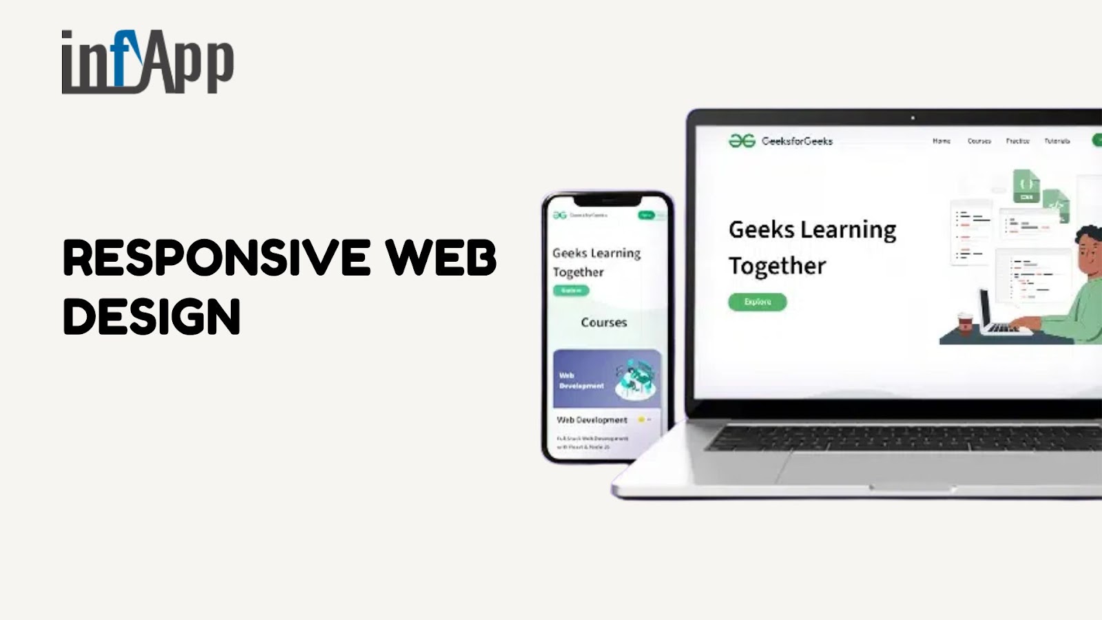
📱 What Is a Responsive Website?
A responsive website adjusts its layout and content automatically to fit any screen — from desktop computers to smartphones and tablets.
It ensures that:
Text is readable without zooming
Buttons are easy to tap
Images fit neatly within the screen
Layouts adapt to different devices and browsers
👉 At InfyApp Development, we build responsive websites that perform well on every screen size and deliver a seamless experience to all users.
😊 What Does “User-Friendly” Really Mean?
A user-friendly website is one that is:
Easy to navigate
Simple to understand
Fast to load
Accessible to all users
The goal is to remove friction — so visitors can find what they’re looking for quickly and complete actions (like contacting you or buying something) without getting confused or frustrated.
🔧 Key Features of a Responsive & User-Friendly Website
1. 📱 Mobile-First Design
Most users now browse from their phones. A mobile-first design approach ensures that:
Content loads fast on mobile data
Menus are touch-friendly
Layouts scroll smoothly
Responsive websites prioritize the mobile experience first, then scale up for tablets and desktops.
2. 🧭 Clear Navigation
Good navigation helps users move through your site easily.
Use a simple menu structure
Keep important pages (like Contact or Services) easy to find
Use sticky headers or mobile menus that don’t get in the way
If users can’t find what they need in a few seconds, they’re likely to leave.
3. ⏱️Fast Load Speed
Slow websites lead to high bounce rates.
Speed can be improved by:
Optimizing images
Minimizing scripts
Using browser caching and clean code
We focus on Core Web Vitals during every project at InfyApp to ensure smooth performance.
4. 🔲 Readable Content and Fonts
Good readability means:
Using clear fonts
Keeping text size appropriate for all devices
Maintaining line spacing and contrast for easy scanning
Avoid long blocks of text — break content into short paragraphs and bullet points.
5. 🎯 Strong Visual Hierarchy
Users should know what to look at first.
Use:
Headings (H1, H2)
Bold CTAs (Call-to-Actions)
Icons or visuals to separate sections
Visual flow helps guide users without overwhelming them.
6. 🎨 Consistent Design & Branding
Consistency builds trust. Use:
A matching color palette across all pages
Uniform button styles and icons
Predictable layouts
A unified experience helps users feel comfortable — and keeps them engaged longer.
🙋 Frequently Asked Questions
Q1: What’s the difference between mobile-friendly and responsive?
Mobile-friendly sites work on phones, but may not fully adapt to screen sizes
Responsive sites dynamically adjust layout, content, and design for each device
Responsive design is more flexible and user-focused.
Q2: How can I check if my website is responsive?
Use:
Google’s Mobile-Friendly Test
Your own phone and tablet
Chrome DevTools (Inspect → Toggle device toolbar)
Or contact InfyApp — we’ll review it for you.
Q3: Can a responsive website improve SEO?
Yes. Google uses mobile-first indexing and considers load speed, usability, and responsiveness as ranking signals.
Q4: What are some signs my site isn’t user-friendly?
Users leave after a few seconds (high bounce rate)
Confusing menus or layouts
Slow load times
Buttons too small to tap on phones
✅ Final Thoughts
A responsive and user-friendly website isn’t just a “nice-to-have” — it’s essential.
It helps:
Keep visitors engaged
Improve search rankings
Boost conversions
Build long-term trust with your audience
At InfyApp Development, we build websites that work beautifully on every device — with smart layouts, clean design, and a focus on real user needs.
📞 Ready to make your website faster, smoother, and easier to use? Let’s talk — we’re here to help you grow online.
Subscribe to my newsletter
Read articles from InfyApp Development directly inside your inbox. Subscribe to the newsletter, and don't miss out.
Written by
InfyApp Development
InfyApp Development
Infyapp Development Private Limited is a premier provider of mobile app development, digital marketing, and website design & development services in India. Established with a commitment to excellence, we specialize in crafting bespoke solutions that cater to diverse business needs across various industries. Services: Mobile App Development: We excel in creating cutting-edge mobile applications for Android and iOS platforms. Our team leverages the latest technologies to deliver intuitive and robust apps that enhance user engagement and drive business growth. Digital Marketing Services: As a digital-first company, we offer comprehensive digital marketing solutions tailored to amplify online presence and maximize ROI. From SEO and SEM to social media marketing and content strategy, we help businesses achieve their marketing objectives effectively. Website Design & Development: Our expertise extends to designing and developing visually appealing and functional websites. Whether it's a corporate website, e-commerce platform, or custom web application, we ensure seamless user experiences and responsive designs. Mission: At Infyapp Development, our mission is to empower businesses with innovative digital solutions that exceed expectations. We are dedicated to delivering high-quality services that align with industry standards and drive measurable results for our clients. Vision: To be recognized as a trusted partner for businesses seeking transformative digital solutions in India and beyond. We aim to foster long-term relationships built on integrity, professionalism, and excellence. Why Choose Us? Expertise: Our team comprises skilled professionals with extensive industry experience. Customization: Tailored solutions to meet unique business requirements. Result-Driven: Focus on achieving tangible outcomes and ROI for our clients. Customer Support: Dedicated support throughout the project lifecycle and beyond.