The Ultimate Guide to Accessibility & Web Accessibility
 Prateek Bajpai
Table of contents
- What Does Accessibility Mean?
- What Is Web Accessibility?
- Why Is Web Accessibility Important?
- Introducing WCAG — The Web Accessibility Gold Standard
- What is WCAG?
- The Four WCAG Principles
- WCAG Levels & Versions
- Common Accessibility Challenges — With Solutions & Code
- Keyboard Navigation Barriers
- Landmarks and Page Structure
- Heading Structure
- Color and Contrast
- Images and Media
- Forms & Errors
- ARIA — Making Complex Interfaces Accessible
- How to Make Accessible Websites — Checklist
- Conclusion
What Does Accessibility Mean?
Accessibility means making things usable for everyone — including people with disabilities like visual, hearing, or cognitive challenges.
It’s not just about physical spaces but applies to information, activities, and digital environments, ensuring comfort, independence, and equal opportunity for all. For example, a building with ramps and elevators is accessible for wheelchair users, but so is a website designed so everyone can access its content, no matter their abilities.
Universal design is the process of creating products and technologies that work for as many people as possible; accessibility goes a step further to remove barriers so no one is left out.
What Is Web Accessibility?
Web accessibility makes websites easy for people with disabilities to use. This means:
People who can’t see well can use screen readers.
People who can’t hear can read captions.
People who can’t use a mouse can navigate with a keyboard.
Content is readable for those with cognitive disabilities.
Websites work well even with slow connections or small screens.
If a website uses semantic HTML, good color contrast, meaningful link names, keyboard navigation, and captions for media, it’s helpful for everyone, not just those with disabilities. Inaccessible sites make it hard and sometimes impossible for millions to get the information or services they need.
Why Is Web Accessibility Important?
Legal requirement: Many countries mandate accessible websites (ADA in the US, AODA in Canada, etc.).
Inclusive society: Makes sure everyone can participate equally.
Business benefits: Reach a wider audience, improve SEO, increase user satisfaction, and avoid lawsuits.
Better user experience: Accessible features like clear language, proper headings, and keyboard shortcuts help everyone, not just those with disabilities.
“Web accessibility isn’t just a buzzword; it’s fundamental to creating an inclusive online environment.”
Introducing WCAG — The Web Accessibility Gold Standard
What is WCAG?
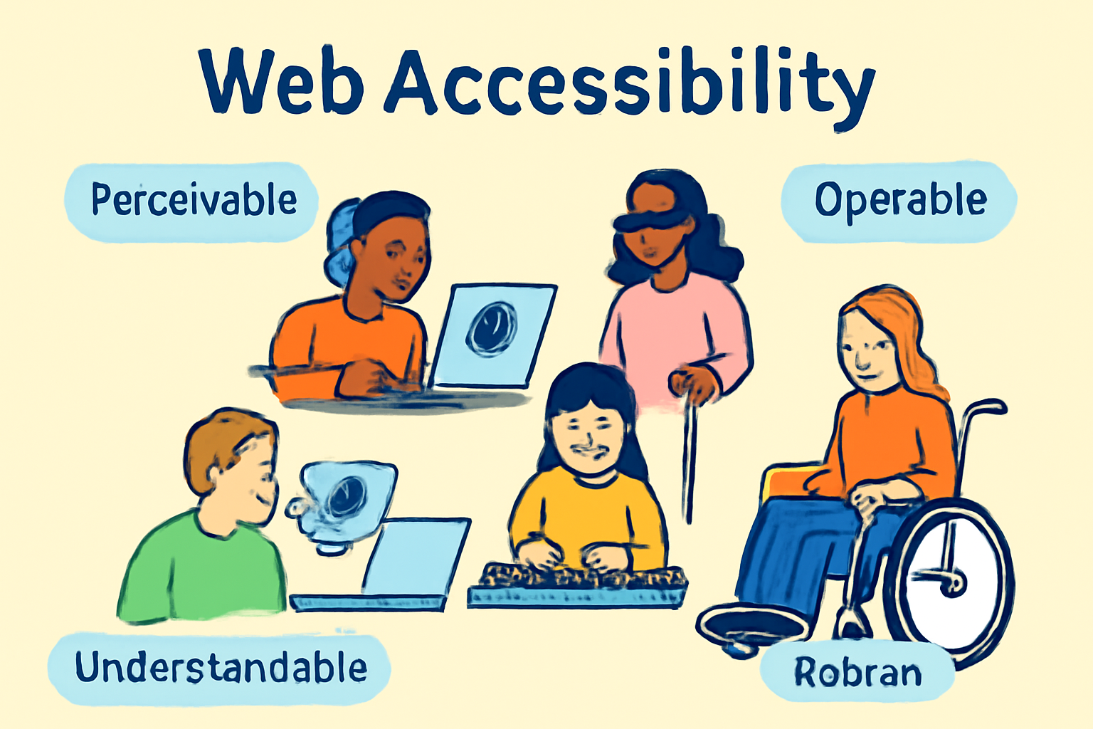
WCAG (Web Content Accessibility Guidelines) are global standards that help make websites accessible. Created by the W3C, they break accessibility into four key principles: POUR.
The Four WCAG Principles
Perceivable: All users can perceive the information — visual, audio, or tactile. For example, images need alternative text (alt text), and videos need captions.
Operable: Everyone can use all functionalities, even without a mouse. For example, forms must be usable by keyboard only.
Understandable: Content and navigation are easy to understand, with logical headings and clear instructions.
Robust: Websites work well with assistive technologies and across devices now and in future.
WCAG Levels & Versions
Level A: Basic accessibility
Level AA: Most sites aim for this (best practice)
Level AAA: Highest, ideal but often difficult for all sites
Latest version is WCAG 2.2, but 2.0 and 2.1 are still widely used.
Common Accessibility Challenges — With Solutions & Code
Keyboard Navigation Barriers
People who can’t use a mouse rely entirely on Tab, Shift+Tab, and other keyboard shortcuts to navigate.
Problem: Keyboard traps and unfocusable elements
Wrong:
<!-- Using div as button without tabindex or keyboard handlers -->
<div class="btn">Submit</div>
Cannot tab to this "button."
No focus outline.
Not announced as a button by screen readers.
Correct:
<!-- Use native button element -->
<button>Submit</button>
Keyboard focus works naturally.
Screen readers recognize it.
Focus outline appears by default.
How to fix:
Always use native HTML elements for links, buttons, and forms
Ensure interactive elements have clear focus indicators (
outlinein CSS)Test your site using only the keyboard.
Landmarks and Page Structure
Problem: Missing landmarks or incorrect roles
Wrong:
<!-- Using generic div without any role or label -->
<div>
  <!-- Navigation links -->
  <ul>
    <li><a href="/">Home</a></li>
  </ul>
</div>
Assistive tech cannot identify this as navigation.
Users must tab through all content sequentially.
Correct:
Semantics matter! Landmarks help screen readers jump to sections like navigation, main content, and footer.
<header>Logo & Site Title</header>
<nav>Main Navigation</nav>
<main>Core Content</main>
<footer>Contact Info</footer>
✅ Correct Accessible page structure using <div> + roles
<div role="banner">
<h1>Logo & Site Title</h1>
</div>
<div role="navigation" aria-label="Main Navigation">
<ul>
<li><a href="#home">Home</a></li>
<li><a href="#about">About</a></li>
<li><a href="#contact">Contact</a></li>
</ul>
</div>
<div role="main">
<h2>Core Content</h2>
<p>This is where the primary content of the page will be displayed.</p>
</div>
<div role="contentinfo">
<p>Contact Info: email@example.com | +1 555‑555‑5555</p>
</div>
Benefit: Landmarks make navigation fast and easy for assistive tools.
Heading Structure
Problem: Unordered or missing headings confuse users
Wrong:
<!-- Misused headings for styling -->
<div style="font-size:24px; font-weight:bold;">Welcome</div>
<div style="font-size:20px;">Section 1</div>
No semantic structure.
Screen readers cannot build an outline.
Users relying on headings get lost.
Correct:
Descriptive, ordered headings make content easy to scan.
<h1>Welcome to Safety Tips</h1>
<h2>Flood Preparation</h2>
<h3>Supplies You Need</h3>
Always use only one <h1> per page and go in order (h2, h3, etc).
Proper hierarchy.
Supports navigation by heading in screen readers.
Improves page structure.
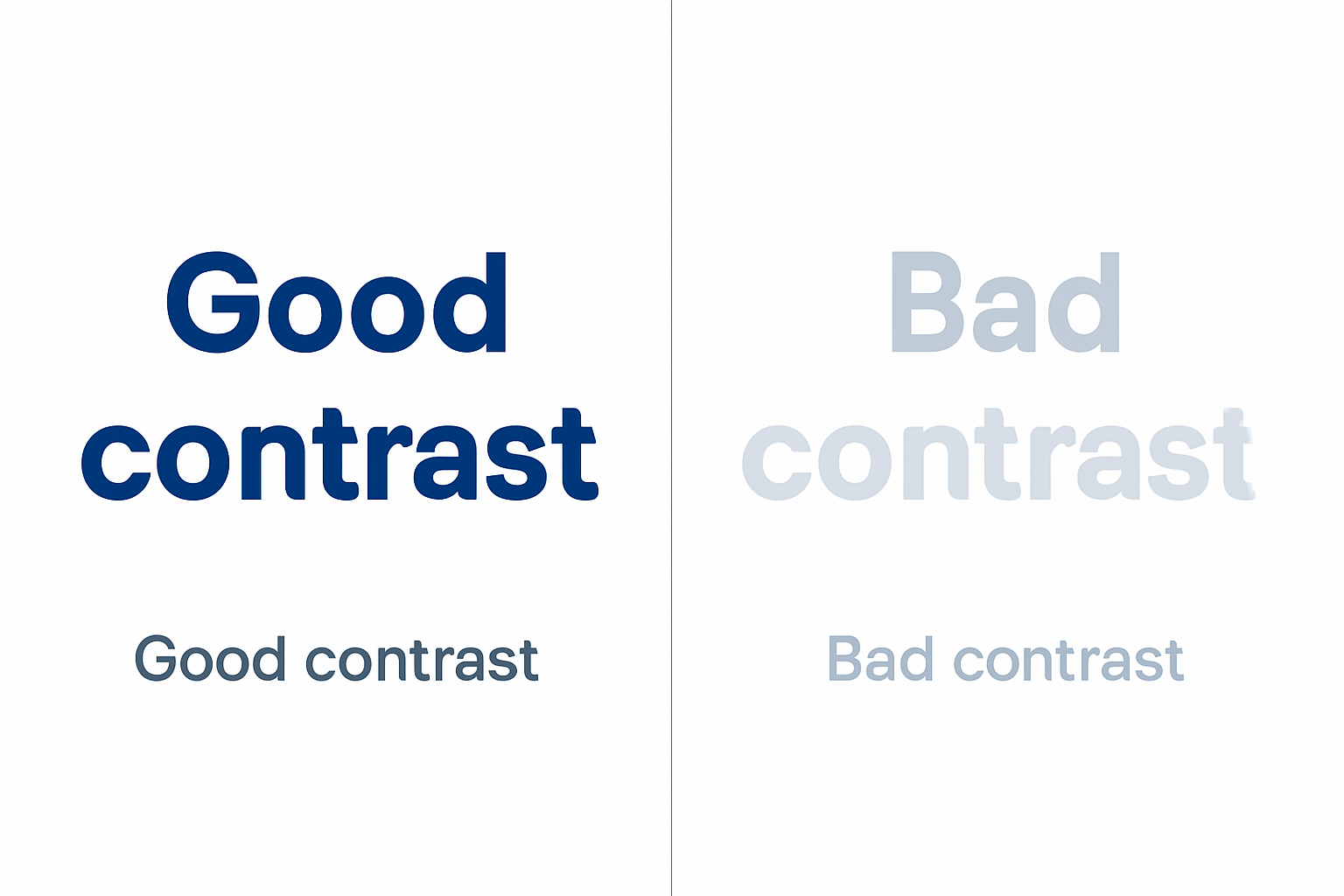
Color and Contrast
Problem: Low contrast text that is hard to read
Wrong:
<p style="color: #ccc; background-color: #fff;">This text is too light.</p>
Insufficient contrast ratio.
Difficult for low vision users to read.
Correct:
<p style="color: #222; background-color: #fff;">This text has sufficient contrast.</p>
Text must have at least a 4.5:1 contrast ratio with the background so people with vision issues can read it.
Example:
Good: Dark blue on white
Bad: Light gray on white
Images and Media
Problem: Missing or non-informative alt attributes
Wrong:
<img src="team.jpg">
Screen readers announce nothing.
Users don’t get meaningful info.
Correct:
<img src="team.jpg" alt="Our diverse team members smiling at a conference">
Describes the image.
Provides equal experience to screen reader users.
For decorative images:
Wrong:
<img src="decorative-line.jpg" alt="Decorative line">
- Screen readers announce unnecessary info (clutter).
Correct:
<img src="decorative-line.jpg" alt="">
- Screen readers skip it.
Always give images meaningful alt text.
Videos: Provide captions and transcripts.
Forms & Errors
Problem: Inputs without labels or unclear error messages
Wrong:
<input type="text" placeholder="Email">
Placeholder is not a label.
Screen readers may not announce the purpose.
No error feedback provided.
Correct:
<label for="email">Email address</label>
<input type="email" id="email" aria-describedby="email-hint" required>
<span id="email-hint">We will never share your email.</span>
Clear label connected to input.
Help text linked for screen readers.
Required attribute for validation.
Every input should have a label. Use ARIA for extra descriptions or error messages.
ARIA — Making Complex Interfaces Accessible
ARIA (Accessible Rich Internet Applications) attributes fill gaps where HTML falls short, so custom widgets are still accessible.
role: What kind of object this is (navigation, dialog, alert)
<div role="dialog" aria-modal="true">...</div>aria-label: Gives an invisible label
<button aria-label="Open menu"></button>aria-labelledby: Points to visible text elsewhere for a label
  <div aria-labelledby="dialog_title">...</div>
  <h2 id="dialog_title">File Delete Confirmation</h2>
aria-describedby: Extra description, like hints
  <input aria-describedby="hint1">
  <span id="hint1">Must be 10 characters long.</span>
aria-expanded: Says if dropdowns/menus are open
  <button aria-expanded="false" aria-controls="details">Details</button>
  <div id="details">...</div>
aria-required, aria-disabled, aria-live: Mark required fields, disabled buttons, announce updates.
How to Make Accessible Websites — Checklist
Use semantic HTML (
<button>,<main>,<nav>, etc.) before reaching for ARIA.Make every feature keyboard accessible. No traps!
Add landmarks so screen readers can jump around quickly.
Check color contrast and text readability.
Provide proper labels and descriptions for forms, images, and controls.
Use ARIA responsibly — only when native HTML does not suffice.
Automate testing with accessibility tools (like Axe or WAVE, or Lighthouse).
Always test with real users and assistive technology.
Conclusion
Web accessibility is not just something “nice to have” — it’s a necessity. By following accessibility and WCAG guidelines, you not only help people with disabilities but also make your website better for everyone.
Accessibility means inclusion, equality, and a better internet for all.
Subscribe to my newsletter
Read articles from Prateek Bajpai directly inside your inbox. Subscribe to the newsletter, and don't miss out.
Written by