Easily Visualize Indian Airline Traffic (2024) Using React HeatMap
 syncfusion
TL;DR: Learn how to visualize Indian airline passenger traffic data for 2024 using Syncfusion® React HeatMap in a React application. This guide walks through setting up the component, binding structured JSON data, configuring axes for monthly and airline-wise segmentation, applying gradient color palettes, and enabling interactive tooltips. You’ll also learn how to customize labels, enhance responsiveness, and integrate the HeatMap into real-world dashboards for production-ready insights.
Welcome to our Weekly Data Visualization blog series!
India’s aviation sector soared in 2024, with passenger numbers reaching new heights. But how do we make sense of this surge in data? As millions of passengers traverse the skies each month, understanding the patterns and trends in airline traffic becomes crucial for policymakers, businesses, and travelers alike.
To make sense of this surge, we turn to data visualization, specifically, the Syncfusion® React HeatMap Chart component. In this guide, we’ll show developers how to build an interactive airline traffic visualization using Syncfusion React HeatMap, turning raw numbers into meaningful insights.
Let’s get started!
Why use Syncfusion React HeatMap for airline data?
The Syncfusion® React HeatMap is an ideal tool for building rich, interactive visualizations of complex datasets like airline passenger traffic. It simplifies the process of mapping large volumes of data into an intuitive grid format, making patterns and anomalies easy to spot. With its seamless integration into React applications and a wide range of customization options, Syncfusion® empowers developers to create visually compelling dashboards without the overhead of manual charting logic.
Key reasons:
Ease of integration: Works smoothly with React projects using simple component-based architecture.
Customizable appearance: Offers flexible color palettes, labels, legends, and themes to match your design.
Interactive features: Built-in tooltips, hover effects, and responsive layout enhance user experience.
Data binding support: Easily binds to JSON, arrays, or external data sources for dynamic updates.
Accessibility & responsiveness: Ensures compatibility across devices and supports accessibility standards.
Note: To begin using the React HeatMap component, please refer to our official documentation.
Steps to build a React HeatMap for airline passenger data
Follow these steps to implement a Syncfusion® React HeatMap that visualizes monthly passenger statistics for major Indian airlines, allowing users to quickly compare performance and identify trends within your application.
Step 1: Setting up the React project
To install the React HeatMap package by run the following command.
npm install @syncfusion/ej2-react-heatmap –save
Step 2: Collecting data
Before visualizing airline passenger data in the React HeatMap, it’s essential to use accurate and relevant statistics. For this example, monthly passenger numbers for scheduled domestic services operated by various Indian airlines in 2024 were sourced from the official DGCA government portal. This dataset offers a comprehensive overview of travel trends and airline activity across India’s domestic aviation sector.
Step 3: Structuring data for HeatMap
After collecting the data, organize the statistics for use in the React HeatMap. Monthly passenger counts for each airline should be extracted from the raw dataset and structured into a two-dimensional array, where each row represents a different airline, and each column corresponds to a specific month.
This format is essential for accurate rendering, as it enables the HeatMap to correctly map airline names and months to their respective passenger numbers. As a result, users can effectively compare trends in airline activity throughout the year.
const heatMapData = [
    [1336709, 1332374, ...], // Airline 1
    [262203, 284271, ...], // Airline 2
    // ...
];
Step 4: Configuring the HeatMap Component
Begin by adding the HeatMapComponent and configuring its xAxis and yAxis properties to define the structure of the HeatMap. The xAxis should be configured with labels representing the months, while the yAxis should include labels for the airlines. You can also optionally adjust the text style for better readability and presentation.
<HeatMapComponent
    xAxis={{
        labels: ['Air India', 'Air India Express', 'IndiaOne', 'Akasa Air', 'Indigo', 'SpiceJet', 'Star Air'],
        textStyle: { size: '13px', color: 'black', fontWeight: '500' }
  }}
    yAxis={{
        labels: ['Jan', 'Feb', 'Mar', 'Apr', 'May', 'Jun', 'Jul', 'Aug', 'Sep', 'Oct', 'Nov', 'Dec'],
        textStyle: { size: '13px', color: 'black', fontWeight: '500' }
  }}>
</HeatMapComponent>
Using multilevel labels to group months:
To enhance the readability and visual structure of the HeatMap, you can use multilevel labels to group months into logical time periods, such as quarters or half-years. These groupings appear as bracket-like visuals alongside the axis, making it easier for viewers to understand how months are organized, similar to quarterly or seasonal groupings in business charts.
Below is an example configuration for multiLevelLabels in the yAxis of Syncfusion® HeatMap. In this example, months are grouped into custom clusters that could represent quarters, larger periods, or other business-related segments:
multiLevelLabels: [
  {
    border: {
      width: 2,
      type: 'WithoutTopBorder',
      color: 'black'
    },
    categories: [
      { start: 0.5, end: 1.5, text: 'Q1' },
      { start: 3.5, end: 4.5, text: 'Q2' },
      { start: 6.5, end: 7.5, text: 'Q3' },
      { start: 9.5, end: 10.5, text: 'Q4' }
    ],
    textStyle: {
      size: '12px',
      fontFamily: 'inherit',
      color: 'black',
      fontWeight: '500'
    }
  },
  {
    border: {
      width: 2,
      type: 'WithoutTopBorder',
      color: 'black'
    },
    categories: [
      { start: 1.5, end: 3.5, text: 'H1' },
      { start: 7.5, end: 9.5, text: 'H2' }
    ],
    textStyle: {
      size: '0px',
      fontFamily: 'inherit'
    }
  },
  {
    border: {
      width: 2,
      type: 'Brace',
      color: 'black'
    },
    categories: [
      { start: 2.5, end: 7.5, text: 'Annual' }
    ],
    textStyle: {
      size: '12px',
      fontFamily: 'inherit',
      color: 'black',
      fontWeight: '500'
    }
  }
]
The multiLevelLabels array can include multiple grouping layers, each defined by a categories entry that specifies a range on the axis using start and end values. For example, { start: 0.5, end: 1.5 } visually groups January, February, and March together. Larger brackets can be created to represent longer periods, such as half-yearly and yearly.
The border property controls the appearance of the bracket lines, allowing customization of their style. To customize the group label, set the size property in textStyle to “ 12px ”.
Step 5: Customizing the HeatMap appearance
Once you’ve set up the data structure, axes, and groupings, you can customize the HeatMap’s appearance to enhance its readability and interactivity. Syncfusion® React HeatMap offers flexible options for configuring the color palette, enabling tooltips, and fine-tuning cell presentation.
These customizations allow you to highlight specific value ranges, provide instant insights via hover interactions, and improve overall chart clarity. In this example, both the legend and individual cell labels are enabled to maintain a clean visual layout and help users focus on trends. This is done using the showLabel property and by setting the visible property of legendSettings to true, allowing users to interpret data based on the legend, color gradient, and cell labels.
Here’s how you can configure these settings:
legendSettings={{
    visible: true,
    enableSmartLegend: true,
    position: 'Bottom'
}}
cellSettings={{
    showLabel: true,
    format: 'n3',
}}
Customizing the color palette
The paletteSettings in the HeatMap component assign specific colors to data ranges, making complex airline passenger statistics easier to interpret at a glance. Intuitive color mapping helps users quickly identify patterns and outliers, highlighting peak periods and differences between airlines without needing to compare individual numbers.
By mapping passenger counts to gradient color shades, the palette visually encodes information directly within the chart. A blend of pastel and vibrant colors ensures that mid-range values stand out with brighter tones, while the lowest and highest values are represented with softer shades. This balance draws attention to potential outliers and trends across the dataset.
In Syncfusion® HeatMap component, you can customize colors using the palette property. Define an array of color-value pairs to map each cell’s color based on its data value:
paletteSettings={{
      palette: [
          { color: '#c6dbef', value: 0.0001, label: 'Low' },
          { color: '#6baed6', value: 1, label: 'Medium' },
          { color: '#08306b', value: 10, label: 'High' },
      ],
}}
Adding interactive tooltips
To enhance interactivity in the HeatMap, tooltips can be enabled to display precise details for each data point. This feature allows users to understand the data without relying solely on axis labels. The tooltipSettings property lets you customize the appearance of tooltips, including text styling. Tooltips are enabled by default, but you can further personalize them using the textStyle property.
For advanced customization, the tooltipRender event is triggered before a tooltip appears. This event provides access to xLabel, yLabel, and value, allowing you to format the tooltip content dynamically and display detailed information.
tooltipSettings={{
    textStyle: { fontFamily: 'inherit' }
}}
tooltipRender={args => {
    args.content = [`${args.xLabel} | ${args.yLabel} : ${args.value}`];
}}
With these enhancements in place, your airline passenger HeatMap now delivers a polished, interactive visualization of monthly traffic across Indian carriers, as illustrated below.
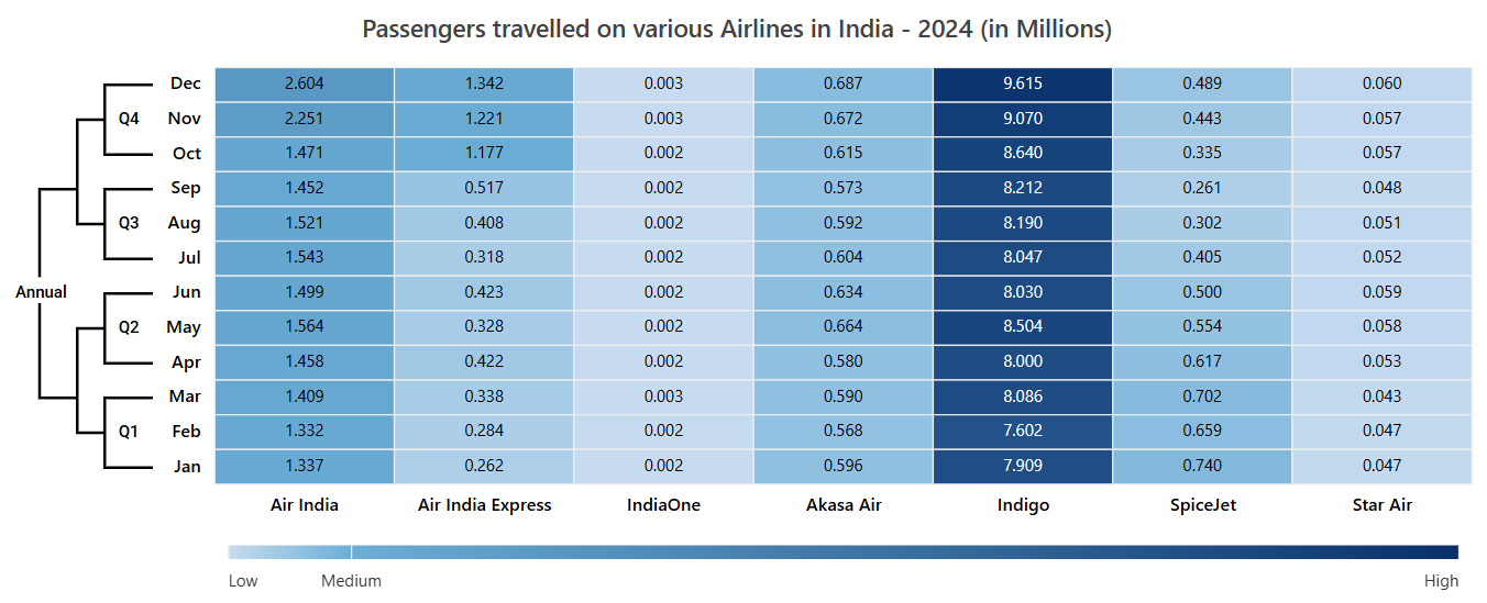
Syncfusion React HeatMap showing Indian airline data (2024)
Reference
For more details, refer to this StackBlitz sample.
Conclusion
By following these steps, you’ve successfully transformed raw airline passenger data into a compelling, interactive HeatMap visualization using React. This approach enables clear, data-driven insights into travel trends across Indian airlines, making complex information accessible and engaging for users.
Syncfusion® comprehensive React component library streamlines the entire process, from data binding and advanced formatting to smooth interactivity. With a rich set of customizable controls like HeatMap, Syncfusion® empowers developers to build powerful, visually stunning data visualizations for real-world scenarios. View the live demo of the React HeatMap component here.
Ready to implement these interactive data visualizations in your next project? Start with Syncfusion® 30-day free trial and explore the full potential of React HeatMap for your data visualizations. The new version of Essential Studio® is available for current customers from the license and downloads page.
If you have queries, contact us through our support forums, support portal, or feedback portal. We are always happy to assist you. Happy coding!
Related Blogs
Subscribe to my newsletter
Read articles from syncfusion directly inside your inbox. Subscribe to the newsletter, and don't miss out.
Written by
syncfusion
syncfusion
Syncfusion provides third-party UI components for React, Vue, Angular, JavaScript, Blazor, .NET MAUI, ASP.NET MVC, Core, WinForms, WPF, UWP and Xamarin.