How to Create Sparklines in Excel to Track Sales Trends Using C#
 syncfusion
TL;DR: Developers often struggle with cluttered Excel dashboards. Using Syncfusion® XlsIO and C#, you can embed sparklines, compact, cell-level charts that visualize data trends directly within Excel cells. The implementation supports line, column, and win/loss sparklines, with customization options for markers, colors, and axis settings.
In modern Excel reporting, clarity is everything. Traditional Excel charts are powerful but bulky. What if you could visualize trends right inside a cell? Sparklines offer compact, cell-level visualizations, perfect for dashboards and summaries.
In this guide, we’ll show you how to use Syncfusion® Excel Library ( XlsIO ) with C# to create sparklines, tiny, powerful charts that make your Excel dashboards smarter and cleaner. You’ll learn how to build a Sales Trend Dashboard that highlights monthly performance directly within Excel rows.
What is Syncfusion® .NET Excel Library?
Syncfusion®XlsIO is a high-performance .NET library for Excel automation. It supports:
Excel formulas, formatting, charts, and sparklines.
Import/export from various data sources.
Excel to PDF, JSON, CSV, HTML, and more.
No Excel installation required.
Why use sparklines?
Sparklines are ideal for:
Compact dashboards: Embed trends directly in rows
Quick insights: Spot growth, decline, or anomalies
Performance: Lightweight compared to full charts
Types of sparklines
XlsIO supports three types of sparklines:
| Sparkline Type | Description | Use case |
| Line | Displays trends over time. | Monthly sales, temperature readings |
| Column | Shows the magnitude of values. | Comparing product performance |
| Win/Loss | Indicates binary outcomes. | Profit/Loss, Pass/Fail |
Use cases
Here are some practical scenarios where sparklines enhance Excel dashboards:
Sales trend: Track monthly or quarterly sales trends across regions or products.
Student progress: Visualize academic performance across subjects.
IoT monitoring: Display sensor data trends like temperature or humidity.
Financial reports: Show profit/loss patterns over time.
Use case: Sales trend dashboard
Let’s say you manage monthly sales data across regions. You want to visualize trends directly in Excel, without clutter. Sparklines let you embed these trends next to the data rows.
We’ll use Line Sparklines to show how sales figures evolve.
Step-by-Step: Create sparklines in Excel using C
Create a .NET Core Console application in Visual Studio.
Install the latest Syncfusion.XlsIO.NET.Core NuGet package in your app.
Load the Excel document with the sales data.
Add line sparklines for the data.
Save the Excel document.
The following code shows how to create sparklines to track sales trends in an Excel document using C#.
using Syncfusion.XlsIO;
using Syncfusion.Drawing;
using System.IO;

namespace SalesTrendWithSparklines
{
    class Program
    {
        static void Main()
        {
            using (ExcelEngine excelEngine = new ExcelEngine())
            {
                // Initialize Excel application
                IApplication application = excelEngine.Excel;
                application.DefaultVersion = ExcelVersion.Xlsx;

                // Load the Excel file with sales data
                using (FileStream inputStream = new FileStream("../../../Data/Sales Data.xlsx", FileMode.Open, FileAccess.Read))
                {
                    IWorkbook workbook = application.Workbooks.Open(inputStream);
                    IWorksheet sheet = workbook.Worksheets[0];

                    // Set header for sparkline column
                    sheet["G1"].Text = "Sales Trend";
                    sheet["G1"].CellStyle.Font.Bold = true;

                    // Create a sparkline group
                    ISparklineGroup sparklineGroup = sheet.SparklineGroups.Add();

                    // Add line sparklines to the group
                    ISparklines sparklines = sparklineGroup.Add();

                    // Define data and reference ranges for the sparkline
                    IRange dataRange = sheet.Range["B2:F26"];
                    IRange referenceRange = sheet.Range["G2:G26"];
                    sparklines.Add(dataRange, referenceRange);

                    // Configure sparkline properties
                    sparklineGroup.SparklineType = SparklineType.Line;
                    sparklineGroup.LineWeight = 1;
                    sparklineGroup.ShowMarkers = true;
                    sparklineGroup.SparklineColor = Color.Orange;
                    sparklineGroup.HighPointColor = Color.Red;
                    sparklineGroup.LowPointColor = Color.Green;
                    sparklineGroup.MarkersColor = Color.Blue;

                    // Save the modified Excel file
                    using (FileStream stream = new FileStream("SalesDataTrend.xlsx", FileMode.Create, FileAccess.Write))
                    {
                        workbook.SaveAs(stream);
                    }
                }
            }
        }
    }
}
The following image illustrates the output Excel document.
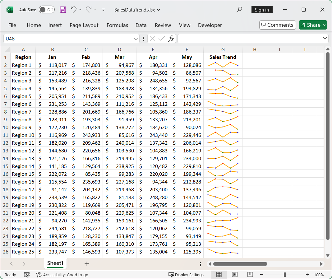
Excel Document with Sparklines
FAQs
Q1: Is it possible to customize the appearance of sparklines?
Yes. You can customize line weight, marker visibility, colors, and more using the ISparklineGroup properties.
Q2: Can I use sparklines with other Excel features like formulas or conditional formatting?
Yes. Sparklines can be used alongside formulas, conditional formatting, pivot tables, and other Excel features to build rich, interactive dashboards.
Q3: Can I apply sparklines to columns instead of rows?
Yes. Sparklines can be applied to both rows and columns. For column-based data (e.g., quarterly sales per product), adjust the data range accordingly.
Q4: How do I handle missing or zero values in sparkline data?
Sparklines will reflect missing or zero values as gaps or flat lines. You can preprocess your data to handle such cases or use Excel formulas to clean the input before applying sparklines.
GitHub reference
You can download the complete XlsIO use case examples from the GitHub demo.
Conclusion
Thank you for reading! Sparklines offer a sleek way to visualize trends without overwhelming your Excel sheets. With Syncfusion® Excel Library ( XlsIO ) and C#, you can build compact and insightful dashboards. This approach is ideal for tracking sales, performance, or sensor data trends.
Explore the official documentation to discover more features and detailed code examples. Using the library, you can also export or write Excel data to PDF, images, data tables, HTML, CSV, TSV, collections of objects, ODS, and JSON. For more insights, please refer to our online demos.
If you are new to our .NET Excel library, it is highly recommended that you follow our Getting Started guide.
Existing customers can download the new version of Essential Studio® on the license and downloads page. If you are not a Syncfusion® customer, try our 30-day free trial to check our incredible features.
If you have questions, comment below. You can also contact us through our support forum, support portal, or feedback portal. We are always eager to help you!
Related Blogs
Subscribe to my newsletter
Read articles from syncfusion directly inside your inbox. Subscribe to the newsletter, and don't miss out.
Written by
syncfusion
syncfusion
Syncfusion provides third-party UI components for React, Vue, Angular, JavaScript, Blazor, .NET MAUI, ASP.NET MVC, Core, WinForms, WPF, UWP and Xamarin.