Turn Default into Delight: MAUI DataGrid Customization, Part 2—Summary Styling Simplified
 syncfusion
TL;DR: Developers often struggle with visually aligning summary rows in MAUI DataGrids. This guide shows how to use Syncfusion’s styling options to customize TableSummaryRow, CaptionSummaryRow, and GroupSummaryRow using XAML for a polished, theme-consistent UI.
Want your MAUI DataGrid to look less default and more delightful? With Syncfusion’s powerful styling options, you can easily customize summary rows to match your app’s theme.
Syncfusion® MAUI controls support both light and dark themes, allowing you to easily tailor the appearance of your application. The MAUI DataGrid’s look can be further customized by adjusting elements such as text color, font, font size, headers, and gridlines to match your app’s theme. Additionally, you can apply custom styles to selected rows and cells to offer users visual cues.
In this blog, we’ll explore how to customize the appearance of the MAUI DataGrid using theme resource keys. These keys provide the flexibility to personalize every element of the DataGrid.
We’ll cover the customization options available for the following elements:
TableSummaryRow
CaptionSummaryRow
GroupSummaryRow
Table summary row customization
The appearance of TableSummaryRows, colors can be modified through the following approaches.
Method 1: Applying a default style
The code snippet below demonstrates how to apply custom styling to the summary row of a DataGrid. It adjusts the background color, font style, font family, font size, and text color to enhance the row’s visibility and emphasize important summary information, such as totals or key metrics. These customizations help make the summary row stand out from regular data rows, improving both readability and user experience.
<syncfusion:SfDataGrid.DefaultStyle>
    <syncfusion:DataGridStyle TableSummaryRowBackground="Beige"
                              TableSummaryRowFontAttributes="Bold"
                              TableSummaryRowFontFamily="Congenial Black"
                              TableSummaryRowFontSize="20"
                              TableSummaryRowTextColor="Red"/>
</syncfusion:SfDataGrid.DefaultStyle>
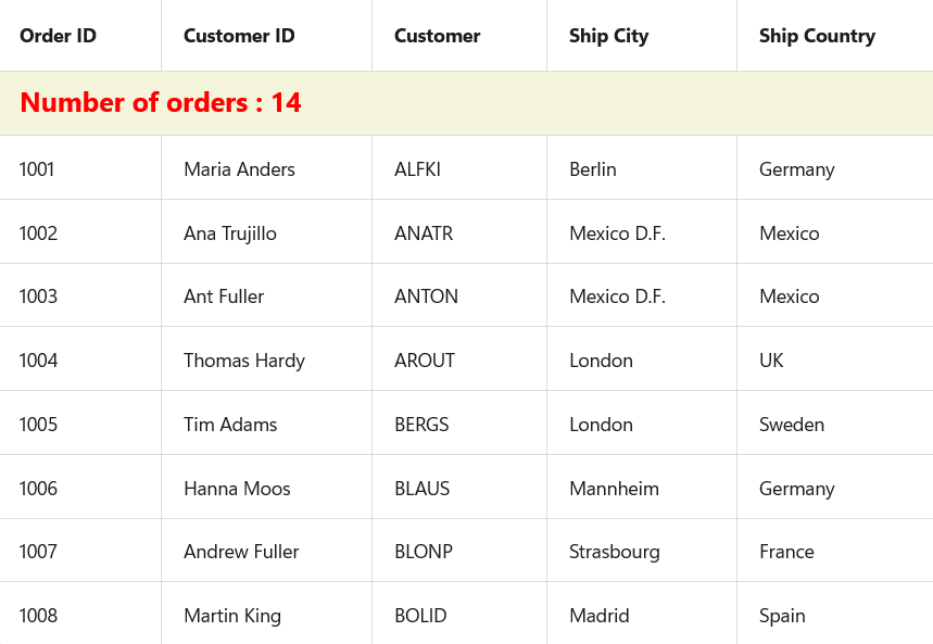
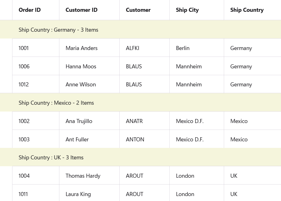
Default style in table summary row customization .NET MAUI DataGrid
Method 2: Applying a target type
By setting a Style.TargetType property to DataGridTableSummaryRowView, you can easily tailor the look and feel of your grid to match your application’s design language. Styles can be placed in a ResourceDictionary for reusability and consistency across the application.
This approach helps improve user experience by making the UI more visually intuitive and polished.
<Style TargetType="syncfusion:DataGridTableSummaryRowView">
    <Setter Property="Background" Value="Beige"/>
</Style>
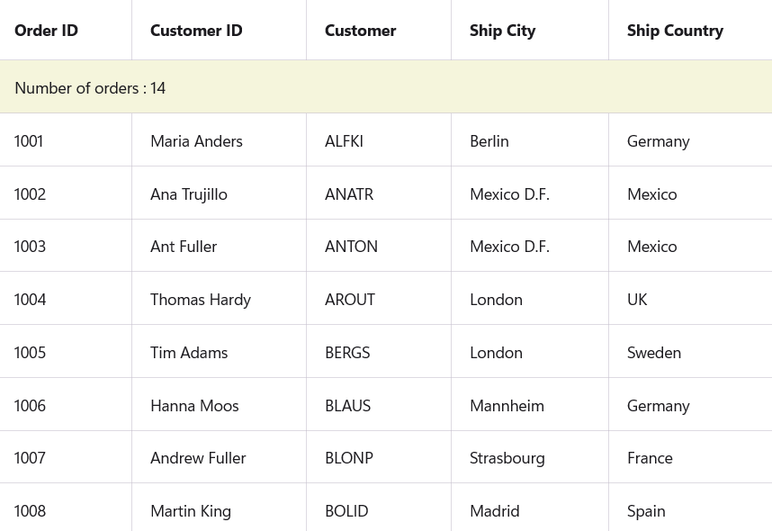
Target type in the table summary row customization .NET MAUI DataGrid
Method 3: Applying styles to summary cells
Improving the visual presentation of a data grid enhances both usability and clarity, especially when dealing with important summary information. One effective customization is applying styles to summary cells, which typically display key metrics like totals, averages, or other aggregate values.
By defining styles through a layout language like XAML (or similar), developers can tailor the appearance of these cells to align with the application’s overall design. For instance, you might choose to:
Set a background color to visually separate summary cells from regular data rows.
Apply bold text to emphasize important figures.
Use a custom font to reflect branding or improve aesthetics.
Increase the font size to make key data more readable.
Change the text color to draw attention to the summarized content.
Applying such styles centrally, like within a shared resource or theme, ensures consistency across the entire data grid. This not only enhances readability but also contributes to a polished, professional user interface.
Ultimately, styling summary cells is a small yet impactful way to improve data comprehension and create a more user-friendly experience.
<Style TargetType="syncfusion:DataGridTableSummaryCell">
    <Setter Property="Background" Value="Beige"/>
    <Setter Property="FontAttributes" Value="Bold"/>
    <Setter Property="FontFamily" Value="Congenial Black"/>
    <Setter Property="FontSize" Value="20"/>
    <Setter Property="TextColor" Value="Red"/>
</Style>
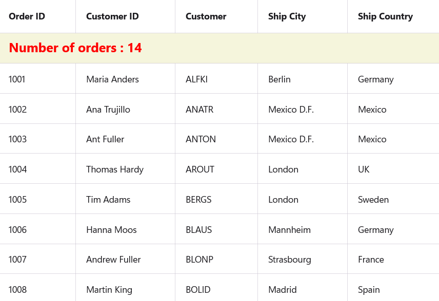
Styles to summary cells in table summary row customization .NET MAUI DataGrid
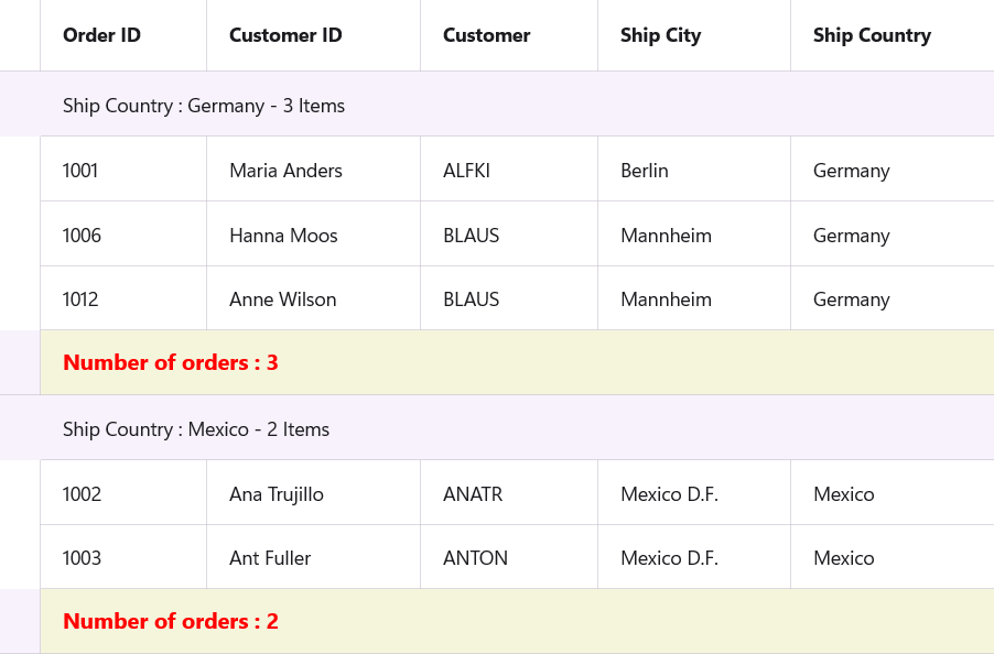
Caption summary row customization
In modern user interface development, establishing consistent visual styling across components is essential for creating a polished and user-friendly experience. Within data grids, the caption summary row plays an important role by displaying summary or group-level information above sections of data.
Method 1: Applying a default style
Enhance its appearance and ensure visual consistency, developers can define a default style for this row. Defining these styles within the grid’s DefaultStyle ensures that all caption summary rows are rendered consistently throughout the application. This centralized styling approach promotes maintainability, reduces redundancy, and contributes to a cleaner, more cohesive user interface.
By customizing these aspects, developers can enhance the clarity, emphasis, and visual appeal of summarized data, leading to a better and more intuitive user experience.
CaptionSummaryRowBackground: Configures the background color of the caption summary row to visually distinguish it from other grid elements.
CaptionSummaryRowFontAttributes: Defines the font weight or style (such as bold or italic), helping emphasize the summary text.
CaptionSummaryRowFontFamily: Specifies the font type used in the row, allowing alignment with the application’s typography or branding.
CaptionSummaryRowFontSize: Adjusts the size of the text to improve legibility and focus.
CaptionSummaryRowTextColor: Sets the color of the text, making the summary content more prominent or harmonized with the overall theme.
<syncfusion:SfDataGrid.DefaultStyle>
    <syncfusion:DataGridStyle CaptionSummaryRowBackground="Beige"
                              CaptionSummaryRowFontAttributes="Bold"
                              CaptionSummaryRowFontFamily="Congenial Black"
                              CaptionSummaryRowFontSize="18"
                              CaptionSummaryRowTextColor="Red"/>
</syncfusion:SfDataGrid.DefaultStyle>
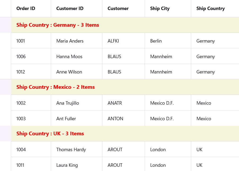
Default style in caption summary row customization .NET MAUI DataGrid
Method 2: Applying a target type
Set the TargetType to the DataGridCaptionSummaryRowView to display group-level summary information within a data grid.
TargetType: Specifies that the style should be applied to caption summary row views in the grid.
Background property: Sets a custom background color for the row, which helps distinguish it from other data rows and improves overall readability.
<Style TargetType="syncfusion:DataGridCaptionSummaryRowView">
    <Setter Property="Background" Value="Beige"/>
</Style>
Target type in caption summary row customization .NET MAUI DataGrid
Method 3: Applying styles
In data-rich applications, effectively differentiating summary information within grids enhances both clarity and user experience. Caption summary cells, which typically display aggregated data or group labels, benefit significantly from targeted styling that makes them visually distinct from regular data cells.
Background: Setting a specific background color helps to visually separate the summary cells from the rest of the grid, reinforcing their role as distinct summary elements.
FontAttributes: Adjusting font weight or style, such as bolding, provides emphasis on the summary text, improving its visibility.
FontFamily: Customizing the font type supports branding consistency and contributes to a polished, cohesive user interface.
FontSize: Modifying font size ensures that summary information is legible and stands out appropriately within the grid.
TextColor: Defining the text color allows for additional contrast or thematic alignment, further drawing attention to key summary data.
Custom styling of caption summary cells is a subtle yet impactful way to elevate the usability and professionalism of data grids. Thoughtful control over background, typography, and color properties ensures that important summary data is both accessible and visually prominent, enhancing the overall user experience.
<Style TargetType="syncfusion:DataGridCaptionSummaryCell">
    <Setter Property="Background" Value="Beige"/>
    <Setter Property="FontAttributes" Value="Bold"/>
    <Setter Property="FontFamily" Value="Congenial Black"/>
    <Setter Property="FontSize" Value="16"/>
    <Setter Property="TextColor" Value="Red"/>
</Style>
Styles to summary cells in caption summary row customization .NET MAUI DataGrid
Group summary row customization
Method 1: Applying a default style
Group summary rows in a data grid provide summarized values, such as totals, counts, or averages, for each group of records. Ensuring that these rows are visually distinct allows users to quickly recognize and interpret important aggregate data.
The Syncfusion® DataGrid control supports flexible styling of group summary rows through its DefaultStyle property. The example below demonstrates how to define a set of custom visual properties to tailor the appearance of group summary rows consistently across the grid:
The properties configured here specifically target the group summary row, the section of the grid used to display aggregated values for grouped records. These include:
GroupSummaryRowBackground: Defines the background appearance.
GroupSummaryRowFontAttributes: Adjusts the text emphasis.
GroupSummaryRowFontFamily: Specifies the font type for the text.
GroupSummaryRowFontSize: Controls the size of the displayed summary text.
GroupSummaryRowTextColor: Sets the color of the summary text.
<syncfusion:SfDataGrid.DefaultStyle>
    <syncfusion:DataGridStyle GroupSummaryRowBackground="Beige"
                              GroupSummaryRowFontAttributes="Bold"
                              GroupSummaryRowFontFamily="Congenial Black"
                              GroupSummaryRowFontSize="18"
                              GroupSummaryRowTextColor="Red"/>
</syncfusion:SfDataGrid.DefaultStyle>
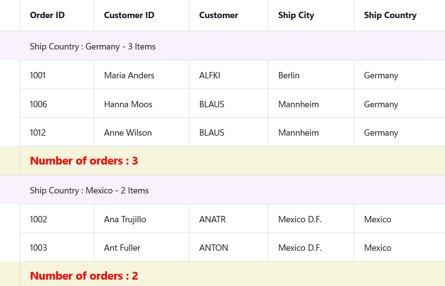
Default style in group summary row customization .NET MAUI DataGrid
Method 2: Applying a target type
In data-driven applications, group summary rows are crucial for presenting aggregated information for grouped records within a data grid.
This style applies to the DataGridGroupSummaryRowView, which is responsible for rendering the group summary section in the data grid. By setting the Background property, the style introduces a distinct visual background, making it easier for users to recognize group-level summaries.
<Style TargetType="syncfusion:DataGridGroupSummaryRowView">
     <Setter Property="Background" Value="Beige"/>
 </Style>
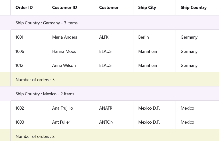
Target type in group summary row customization .NET MAUI DataGrid
Method 3: Applying styles
Group summary cells in a data grid provide essential aggregate information such as totals, counts, or averages for grouped datasets. Developers can apply targeted visual customizations to ensure that this information stands out and aligns with the application’s overall design.
This style is applied to DataGridGroupSummaryCell , the visual element responsible for rendering the individual cells that display grouped summary data. Here’s a breakdown of the style elements configured:
Background: Sets the fill color of the summary cell to visually distinguish it from regular data cells.
FontAttributes: Adjusts the emphasis of the text (e.g., bold), making it easier to spot summary values.
FontFamily: Defines the typeface used, helping maintain branding or design consistency across the application.
FontSize: Controls the size of the text to ensure readability.
TextColor: Sets the color of the text to enhance contrast and visual appeal.
<Style TargetType="syncfusion:DataGridGroupSummaryCell">
    <Setter Property="Background" Value="Beige"/>
    <Setter Property="FontAttributes" Value="Bold"/>
    <Setter Property="FontFamily" Value="Congenial Black"/>
    <Setter Property="FontSize" Value="16"/>
    <Setter Property="TextColor" Value="Red"/>
</Style>
Styles to summary cells in group summary row customization .NET MAUI DataGrid
GitHub references
For more details, refer to the GitHub demo.
FAQs
Q1: How can customize the appearance of summary rows in a MAUI DataGrid?
You can customize summary rows using:
Default style: Applies global styles to all summary rows.
Targeted styles: Use Style tags to customize specific rows or cell types.
Q2: What are properties available for customizing summary rows and cells in MAUI DataGrid?
| Property | Description |
| Background | Sets the background color of the row or cell. |
| FontAttributes | Defines text style such as Bold, Italic, or None. |
| FontFamily | Specifies the font type (e.g., “Congenial Black”). |
| FontSize | Adjusts the size of the text. |
| TextColor | Sets the color of the text. |
Q3: How can we customize individual caption summary cells?
To customize individual caption summary cells in a MAUI DataGrid, you can define a style targeting the DataGridCaptionSummaryCell element. This allows you to control the appearance of each cell within the caption summary row, such as background color, font, and text color.
Q4: What are the styling options for group summary?
To style group summary rows in a MAUI DataGrid, you have three main options, each offering different levels of control and flexibility.
Using DefaultStyle (Global styling).
Using style for row view (Row-Level styling).
Using style for summary cells (Cell-Level styling).
Conclusion
Thank you for reading! Customizing summary rows in your MAUI DataGrid doesn’t have to be complex. With Syncfusion’s built-in styling support, you can create a visually cohesive and user-friendly experience. Try these techniques in your next project and explore more customization options in our MAUI documentation.
The latest version of Essential Studio® is available from the license and downloads page for our customers. If you’re not a Syncfusion® customer, try our 30-day free trial to evaluate our components.
If you have any questions or need assistance, you can reach us through our support forum, support portal, or feedback portal. We’re always here to help!
Related Blogs
Build a School Gradesheet App Easily with .NET MAUI DataGrid
How to Build a Student Attendance App with .NET MAUI ListView and DataGrid
Boost .NET MAUI DataGrid Performance with Efficient Pagination Techniques
Turn Default into Delight: MAUI DataGrid Customization, Part 1—Row Styling Simplified
This article was originally published at Syncfusion.com.
Subscribe to my newsletter
Read articles from syncfusion directly inside your inbox. Subscribe to the newsletter, and don't miss out.
Written by
syncfusion
syncfusion
Syncfusion provides third-party UI components for React, Vue, Angular, JavaScript, Blazor, .NET MAUI, ASP.NET MVC, Core, WinForms, WPF, UWP and Xamarin.