Mastering CSS Fundamentals: Box Model, Specificity, and Styling Best Practices
 shrihari katti
Introduction: The Building Blocks of Visual Design
Imagine trying to design a magazine layout without understanding how margins, borders, and spacing work, or attempting to style text without knowing which formatting rules take precedence. This is what many beginners experience when learning CSS without grasping its fundamental concepts.
CSS (Cascading Style Sheets) transforms plain HTML into visually appealing web pages, but its power comes with complexity. At its heart lie two critical concepts that every web developer must master: the Box Model and Specificity.
The Box Model defines how every element occupies space on a webpage, controlling everything from button padding to page margins. Specificity determines which styles actually get applied when multiple rules target the same element. Together, these concepts form the foundation for creating consistent, maintainable designs.
Today, we'll demystify these essential CSS principles, explore practical examples that show their impact, and learn best practices that will make your stylesheets more predictable and professional.
Chapter 1: Understanding the CSS Box Model - The Architecture of Web Elements
What is the Box Model?
Every HTML element on a webpage exists within an invisible rectangular box. The CSS Box Model describes how this box is structured and how its dimensions are calculated. Understanding this model is crucial because it affects how elements are positioned, how much space they occupy, and how they interact with neighboring elements.

CSS Box Model Diagram
Think of the box model like a picture frame with multiple layers:
Content: The actual picture
Padding: The mat board around the picture
Border: The frame itself
Margin: The space between this frame and others on the wall
The Four Layers of the Box Model
1. Content Area
The content area contains the actual content like text, images, or other HTML elements.
.content-example {
    width: 200px;
    height: 100px;
    background-color: lightblue;
}
<div class="content-example">
    This text lives in the content area
</div>
The width and height properties directly control the content area dimensions.
2. Padding - Internal Spacing
Padding creates space between the content and the border. It's inside the element and inherits the background color.
.padding-example {
    width: 200px;
    height: 100px;
    padding: 20px;           /* All sides */
    /* Or specify individually: */
    padding-top: 10px;
    padding-right: 15px;
    padding-bottom: 10px;
    padding-left: 15px;

    background-color: lightgreen;
    border: 2px solid darkgreen;
}
Padding Shorthand Options:
.padding-shorthand {
    padding: 20px;                    /* All sides */
    padding: 10px 20px;              /* Top/bottom, left/right */
    padding: 10px 15px 20px;         /* Top, left/right, bottom */
    padding: 10px 15px 20px 25px;    /* Top, right, bottom, left */
}
3. Border - The Visible Boundary
The border surrounds the padding and content, providing a visible edge to the element.
.border-example {
    width: 200px;
    height: 100px;
    padding: 15px;
    border: 3px solid #333;          /* Width, style, color */

    /* Or specify each property: */
    border-width: 3px;
    border-style: solid;
    border-color: #333;

    /* Different borders for each side: */
    border-top: 2px solid red;
    border-right: 4px dashed blue;
    border-bottom: 2px solid red;
    border-left: 4px dashed blue;
}
Border Style Options:
.border-styles {
    border-style: solid;    /* Most common */
    border-style: dashed;
    border-style: dotted;
    border-style: double;
    border-style: none;     /* No border */
}
4. Margin - External Spacing
Margin creates space outside the border, separating the element from its neighbors.
.margin-example {
    width: 200px;
    height: 100px;
    padding: 15px;
    border: 2px solid #333;
    margin: 25px;                    /* Space around the element */

    background-color: lightyellow;
}
Margin Behavior:
.margin-behaviors {
    margin: 20px;                    /* All sides */
    margin: 0 auto;                  /* Top/bottom 0, left/right auto (centers block element) */
    margin-top: 10px;
    margin-bottom: 15px;
}
Box Model Calculation Example
Let's see how the box model affects total element size:
<div class="box-calculation">Content goes here</div>
.box-calculation {
    width: 300px;           /* Content width */
    height: 150px;          /* Content height */
    padding: 25px;          /* 25px on all sides */
    border: 5px solid #333; /* 5px border all around */
    margin: 20px;           /* 20px margin all around */

    background-color: lightcoral;
}
Total space calculation:
Content: 300px × 150px
Total width: 300px (content) + 25px (left padding) + 25px (right padding) + 5px (left border) + 5px (right border) = 360px
Total height: 150px (content) + 25px (top padding) + 25px (bottom padding) + 5px (top border) + 5px (bottom border) = 210px
Space on page: 360px + 40px (margins) × 210px + 40px (margins) = 400px × 250px
The box-sizing Property
By default, CSS uses the "content-box" model, but you can change this behavior:
/* Default behavior */
.content-box {
    box-sizing: content-box;  /* width/height apply only to content */
    width: 300px;
    padding: 20px;
    border: 5px solid black;
    /* Total width = 300 + 20 + 20 + 5 + 5 = 350px */
}

/* Alternative behavior */
.border-box {
    box-sizing: border-box;   /* width/height include padding and border */
    width: 300px;
    padding: 20px;
    border: 5px solid black;
    /* Total width = 300px (padding and border included) */
    /* Content width = 300 - 20 - 20 - 5 - 5 = 250px */
}

/* Global reset (recommended) */
* {
    box-sizing: border-box;
}
Practical Box Model Examples
Card Component
<div class="card">
    <h3>Product Name</h3>
    <p>Product description goes here.</p>
    <button class="btn">Buy Now</button>
</div>
.card {
    width: 280px;
    padding: 20px;
    border: 1px solid #ddd;
    margin: 15px;
    border-radius: 8px;
    background-color: white;
    box-shadow: 0 2px 4px rgba(0,0,0,0.1);
}

.btn {
    padding: 10px 20px;
    border: none;
    border-radius: 4px;
    background-color: #007bff;
    color: white;
    margin-top: 10px;
}
Navigation Bar
<nav class="navbar">
    <ul class="nav-list">
        <li class="nav-item"><a href="#">Home</a></li>
        <li class="nav-item"><a href="#">About</a></li>
        <li class="nav-item"><a href="#">Services</a></li>
        <li class="nav-item"><a href="#">Contact</a></li>
    </ul>
</nav>
.navbar {
    background-color: #333;
    padding: 0;
    margin: 0;
    border-bottom: 3px solid #007bff;
}

.nav-list {
    list-style: none;
    margin: 0;
    padding: 0;
    display: flex;
}

.nav-item a {
    display: block;
    padding: 15px 20px;      /* Generous padding for clickable area */
    color: white;
    text-decoration: none;
    border-right: 1px solid #555;
}

.nav-item a:hover {
    background-color: #555;
}
Chapter 2: CSS Specificity Algorithm - Understanding Style Priority
What is CSS Specificity?
CSS Specificity is the algorithm that determines which CSS rule applies when multiple rules target the same element. Think of it as a ranking system where more specific selectors override less specific ones, regardless of the order in your stylesheet.
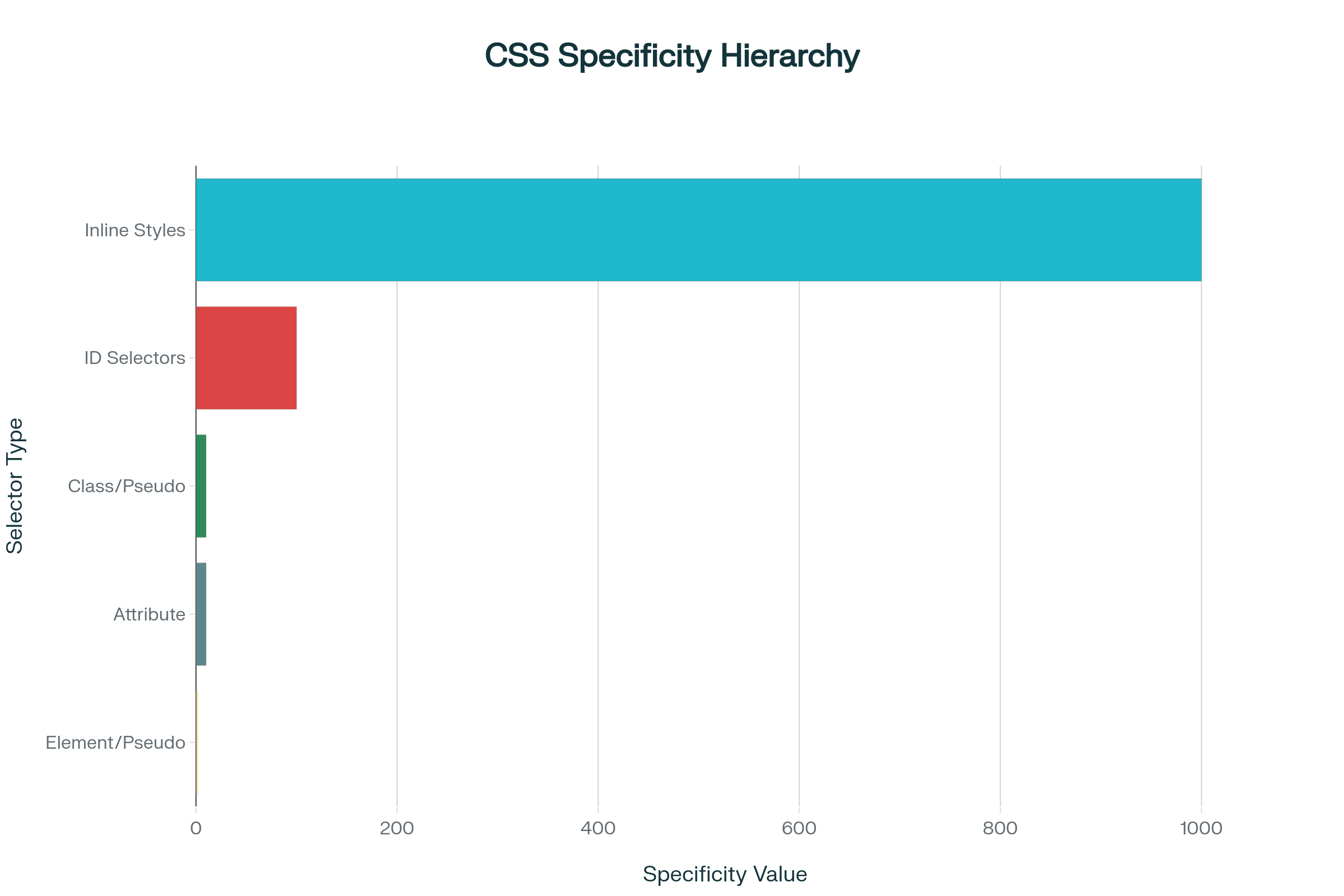
CSS Specificity Hierarchy Diagram
The Specificity Hierarchy
CSS specificity is calculated based on four categories, arranged from highest to lowest priority:
1. Inline Styles (Highest Priority)
<!-- Specificity: 1000 -->
<p style="color: red; font-size: 16px;">This text is red</p>
Inline styles have the highest specificity and will override any stylesheet rules.
2. IDs
/* Specificity: 100 */
#header {
    color: blue;
}

#navigation {
    background-color: navy;
}
ID selectors are highly specific because each ID should be unique on a page.
3. Classes, Pseudo-classes, and Attributes
/* Classes - Specificity: 10 */
.highlight {
    background-color: yellow;
}

.btn-primary {
    background-color: blue;
    color: white;
}

/* Pseudo-classes - Specificity: 10 */
a:hover {
    color: red;
}

.menu-item:nth-child(odd) {
    background-color: #f0f0f0;
}

/* Attribute selectors - Specificity: 10 */
input[type="text"] {
    border: 1px solid #ccc;
}

a[target="_blank"] {
    color: orange;
}
4. Elements and Pseudo-elements (Lowest Priority)
/* Elements - Specificity: 1 */
p {
    font-size: 14px;
}

h1 {
    color: black;
}

/* Pseudo-elements - Specificity: 1 */
p::before {
    content: "→ ";
}

h2::after {
    content: " ←";
}
Calculating Specificity
Specificity is calculated by counting selectors in each category:
/* Examples with their specificity values */

/* Specificity: 0-0-0-1 */
p {
    color: black;
}

/* Specificity: 0-0-1-0 */
.text {
    color: blue;
}

/* Specificity: 0-1-0-0 */
#content {
    color: green;
}

/* Specificity: 0-1-1-1 */
#content .text p {
    color: red;
}

/* Specificity: 0-0-2-1 */
.sidebar .widget p {
    color: purple;
}

/* Specificity: 0-1-2-2 */
#main .content .text p {
    color: orange;
}
Practical Specificity Examples
Example 1: Conflicting Rules
<p id="intro" class="highlight">This paragraph has multiple selectors targeting it.</p>
/* These rules all target the same element */
p {                           /* Specificity: 0-0-0-1 */
    color: black;
}

.highlight {                  /* Specificity: 0-0-1-0 */
    color: blue;             /* This wins over p {} */
}

#intro {                     /* Specificity: 0-1-0-0 */
    color: red;              /* This wins overall */
}
Result: The text will be red because the ID selector has the highest specificity.
Example 2: Complex Selectors
<div id="sidebar">
    <div class="widget">
        <p class="text">Widget content</p>
    </div>
</div>
/* Lower specificity: 0-0-1-1 */
.widget p {
    color: green;
}

/* Higher specificity: 0-1-1-1 */
#sidebar .widget p {
    color: purple;           /* This wins */
}

/* Even higher specificity: 0-1-2-1 */
#sidebar .widget .text {
    color: orange;           /* This wins */
}
Common Specificity Mistakes and Solutions
Mistake 1: Overusing !important
/* ❌ Bad practice */
.button {
    background-color: blue !important;
    color: white !important;
    padding: 10px !important;
}

/* ✅ Better approach - understand specificity */
.btn-primary {
    background-color: blue;
    color: white;
    padding: 10px;
}

/* Override with higher specificity when needed */
.header .btn-primary {
    background-color: darkblue;
}
Mistake 2: Excessive Inline Styles
<!-- ❌ Bad practice -->
<div style="margin: 10px; padding: 15px; background: blue; color: white; border-radius: 4px;">
    Content
</div>

<!-- ✅ Better approach -->
<div class="card">
    Content
</div>
.card {
    margin: 10px;
    padding: 15px;
    background: blue;
    color: white;
    border-radius: 4px;
}
Mistake 3: Overly Specific Selectors
/* ❌ Unnecessarily specific */
body div#main div.content div.article p.intro span.highlight {
    color: red;
}

/* ✅ More maintainable */
.article .intro .highlight {
    color: red;
}

/* Or even simpler */
.text-highlight {
    color: red;
}
Chapter 3: Classes vs IDs - Choosing the Right Selector
Understanding the Difference
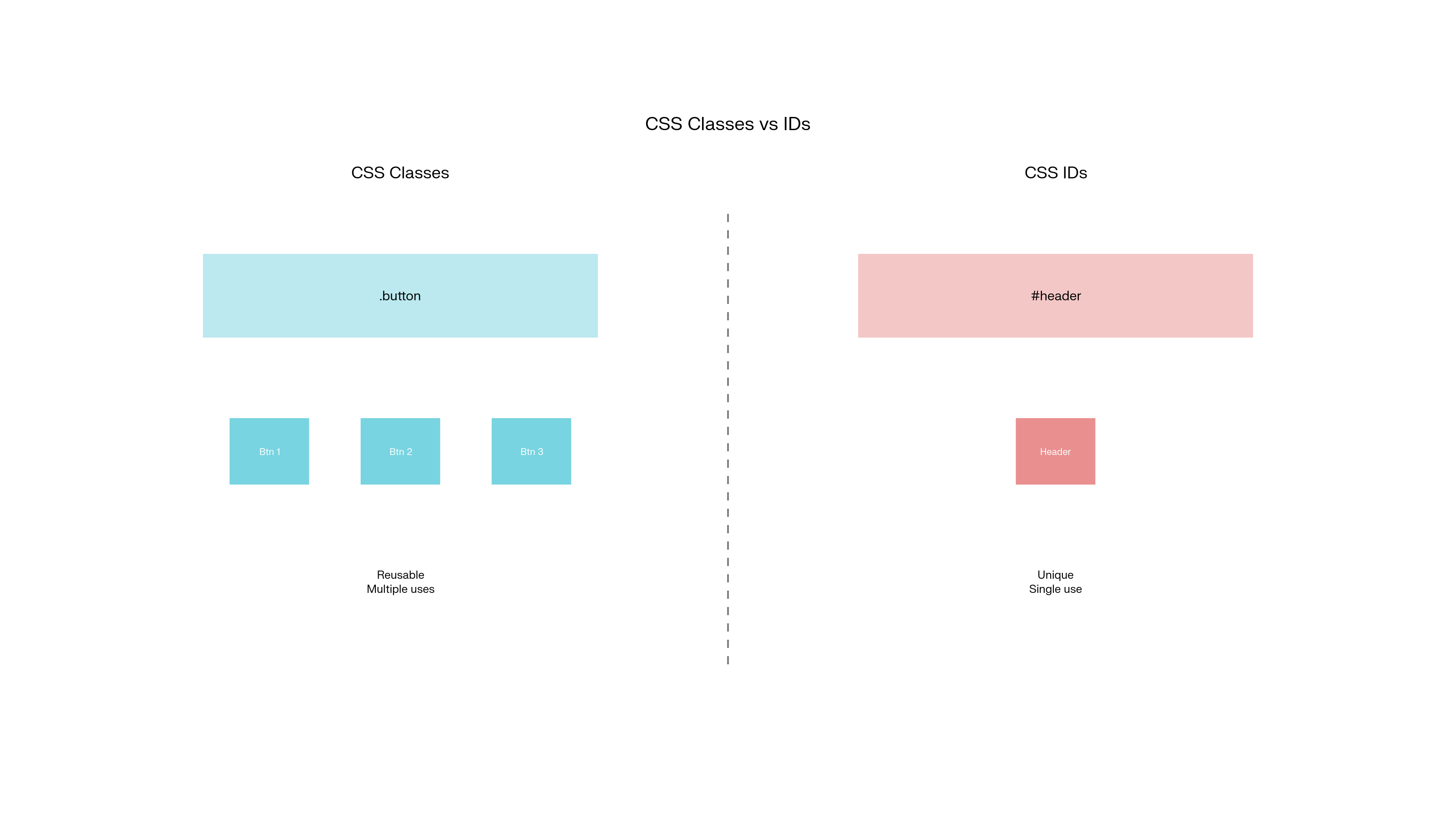
CSS Classes vs IDs Comparison
Classes and IDs are both ways to identify and style HTML elements, but they serve different purposes and have different characteristics.
When to Use IDs
IDs should be unique - only one element per page should have a specific ID.
<!DOCTYPE html>
<html>
<head>
<title>My Website</title>
</head>
<body>
<header id="main-header">
<nav id="primary-navigation">
<ul>
<li><a href="#home">Home</a></li>
<li><a href="#about">About</a></li>
</ul>
</nav>
</header>
<main id="content">
<section id="hero-section">
<h1>Welcome to Our Website</h1>
</section>
</main>
<footer id="site-footer">
<p>© 2024 My Website</p>
</footer>
</body>
</html>
/* Styling unique page sections */
#main-header {
    background-color: #333;
    color: white;
    padding: 1rem;
}

#primary-navigation ul {
    list-style: none;
    display: flex;
    gap: 1rem;
}

#hero-section {
    background: linear-gradient(to right, #667eea, #764ba2);
    color: white;
    text-align: center;
    padding: 4rem 2rem;
}

#site-footer {
    background-color: #f8f9fa;
    text-align: center;
    padding: 2rem;
    margin-top: 2rem;
}
When to Use Classes
Classes can be reused - multiple elements can share the same class.
<div class="card">
    <h3 class="card-title">Product 1</h3>
    <p class="card-description">Description for product 1</p>
    <button class="btn btn-primary">Buy Now</button>
</div>

<div class="card">
    <h3 class="card-title">Product 2</h3>
    <p class="card-description">Description for product 2</p>
    <button class="btn btn-secondary">Learn More</button>
</div>

<div class="card featured">
    <h3 class="card-title">Featured Product</h3>
    <p class="card-description">Our most popular item</p>
    <button class="btn btn-primary">Buy Now</button>
</div>
/* Reusable component styles */
.card {
    border: 1px solid #ddd;
    border-radius: 8px;
    padding: 1.5rem;
    margin: 1rem;
    background-color: white;
    box-shadow: 0 2px 4px rgba(0,0,0,0.1);
}

.card-title {
    color: #333;
    margin-bottom: 0.5rem;
    font-size: 1.25rem;
}

.card-description {
    color: #666;
    margin-bottom: 1rem;
    line-height: 1.5;
}

/* Reusable button styles */
.btn {
    padding: 0.75rem 1.5rem;
    border: none;
    border-radius: 4px;
    cursor: pointer;
    font-size: 1rem;
    text-decoration: none;
    display: inline-block;
}

.btn-primary {
    background-color: #007bff;
    color: white;
}

.btn-secondary {
    background-color: #6c757d;
    color: white;
}

.btn:hover {
    opacity: 0.9;
}

/* Modifier class for featured cards */
.card.featured {
    border-color: #007bff;
    border-width: 2px;
    box-shadow: 0 4px 8px rgba(0,123,255,0.3);
}
Best Practices for Classes and IDs
Use Meaningful Names
/* ✅ Good names */
.navigation-menu { }
.product-card { }
.hero-section { }
.btn-submit { }

/* ❌ Poor names */
.div1 { }
.redtext { }
.box { }
.thing { }
Follow Naming Conventions
/* BEM (Block Element Modifier) methodology */
.card { }                    /* Block */
.card__title { }            /* Element */
.card__description { }      /* Element */
.card--featured { }         /* Modifier */
.card__button { }           /* Element */
.card__button--primary { }  /* Element with modifier */

/* Or use simple, descriptive names */
.product-card { }
.product-title { }
.product-description { }
.featured-product { }
Combine Classes for Modularity
<!-- Multiple classes for flexible styling -->
<button class="btn btn-large btn-primary">Large Primary Button</button>
<button class="btn btn-small btn-secondary">Small Secondary Button</button>
<div class="card product-card featured">Featured Product</div>
/* Base styles */
.btn {
    padding: 0.5rem 1rem;
    border: none;
    border-radius: 4px;
    cursor: pointer;
}

/* Size modifiers */
.btn-small {
    padding: 0.25rem 0.5rem;
    font-size: 0.875rem;
}

.btn-large {
    padding: 1rem 2rem;
    font-size: 1.125rem;
}

/* Color modifiers */
.btn-primary {
    background-color: #007bff;
    color: white;
}

.btn-secondary {
    background-color: #6c757d;
    color: white;
}
Chapter 4: Common CSS Mistakes and Best Practices
Avoiding Common Pitfalls
1. Box Model Misconceptions
Mistake: Not accounting for padding and borders in width calculations
/* ❌ This creates a 340px wide element, not 300px */
.container {
    width: 300px;
    padding: 15px;
    border: 5px solid black;
    /* Total width: 300 + 15 + 15 + 5 + 5 = 340px */
}
Solution: Use box-sizing: border-box
/* ✅ This creates a 300px wide element total */
.container {
    box-sizing: border-box;
    width: 300px;
    padding: 15px;
    border: 5px solid black;
    /* Content width automatically adjusts to maintain 300px total */
}

/* Apply to all elements globally */
*, *::before, *::after {
    box-sizing: border-box;
}
2. Specificity Wars
Mistake: Fighting specificity with !important
/* ❌ Overusing !important */
.button {
    background-color: blue !important;
    color: white !important;
}

.special-button {
    background-color: red !important;  /* Now you need !important everywhere */
}
Solution: Understand and work with specificity
/* ✅ Use specificity strategically */
.button {
    background-color: blue;
    color: white;
}

.header .button {              /* Higher specificity */
    background-color: darkblue;
}

.sidebar .button.special {     /* Even higher specificity */
    background-color: red;
}
3. Inline Style Overuse
Mistake: Styling in HTML
<!-- ❌ Inline styles are hard to maintain -->
<div style="background-color: blue; padding: 20px; margin: 10px; border-radius: 5px;">
    <p style="color: white; font-size: 16px;">Content</p>
</div>
Solution: Use external stylesheets
<!-- ✅ Clean, maintainable HTML -->
<div class="card">
    <p class="card-text">Content</p>
</div>
.card {
    background-color: blue;
    padding: 20px;
    margin: 10px;
    border-radius: 5px;
}

.card-text {
    color: white;
    font-size: 16px;
}
Best Practices Summary
1. Organize Your CSS
/* Group related styles together */

/* === RESET/BASE STYLES === */
* {
    box-sizing: border-box;
}

body {
    margin: 0;
    padding: 0;
    font-family: Arial, sans-serif;
}

/* === LAYOUT COMPONENTS === */
.container {
    max-width: 1200px;
    margin: 0 auto;
    padding: 0 1rem;
}

.header { }
.main { }
.footer { }

/* === UI COMPONENTS === */
.btn { }
.card { }
.form { }

/* === UTILITIES === */
.text-center { text-align: center; }
.mt-1 { margin-top: 1rem; }
.hidden { display: none; }
2. Use Consistent Naming
/* Follow a consistent pattern */
.component-name { }
.component-name__element { }
.component-name--modifier { }

/* Examples */
.product-card { }
.product-card__image { }
.product-card__title { }
.product-card--featured { }
3. Keep Specificity Low
/* ✅ Good - low specificity, easy to override */
.card { }
.card-title { }
.featured-card { }

/* ❌ Bad - high specificity, hard to override */
#sidebar div.widget ul.menu li.item a.link { }
4. Use Comments and Documentation
/*
================================================================================
BUTTON COMPONENT
================================================================================
Base button styles with size and color variations

Usage:
<button class="btn btn-primary">Primary Button</button>
<button class="btn btn-secondary btn-large">Large Secondary</button>
================================================================================
*/

.btn {
    /* Base button styles */
    display: inline-block;
    padding: 0.75rem 1.5rem;
    border: none;
    border-radius: 0.25rem;
    cursor: pointer;
    text-decoration: none;
    text-align: center;
    transition: all 0.2s ease;
}

/* Size variations */
.btn-small { padding: 0.5rem 1rem; font-size: 0.875rem; }
.btn-large { padding: 1rem 2rem; font-size: 1.125rem; }

/* Color variations */
.btn-primary { background-color: #007bff; color: white; }
.btn-secondary { background-color: #6c757d; color: white; }
Conclusion
Understanding the CSS Box Model and Specificity algorithm forms the foundation for creating predictable, maintainable stylesheets. These concepts control how elements occupy space and which styles get applied, directly impacting the visual design and user experience of web pages.
Core Concepts Mastered
Box Model Proficiency: Mastering content, padding, border, and margin relationships enables precise control over element spacing and layout calculations. Understanding box-sizing behavior prevents common sizing miscalculations.
Specificity Navigation: Knowing the selector hierarchy prevents style conflicts and reduces reliance on !important declarations. Strategic use of classes, IDs, and nested selectors creates maintainable CSS architecture.
Selector Strategy: Distinguishing between classes for reusable styles and IDs for unique elements creates organized, semantic stylesheets that scale effectively across large projects.
Practical Applications
These fundamentals enable:
Consistent Layouts: Predictable spacing and sizing across different screen sizes and browsers
Maintainable Code: Logical organization and naming conventions that support team collaboration
Performance Optimization: Efficient selectors that render quickly and avoid unnecessary specificity battles
Responsive Design: Flexible box model understanding that adapts to various viewport dimensions
Development Excellence
Mastering these CSS fundamentals transforms styling from trial-and-error to systematic design implementation. The box model provides mathematical precision for layouts, while specificity knowledge ensures styles apply as intended.
Professional Growth: Understanding these concepts deeply distinguishes proficient developers from beginners. They form the foundation for advanced CSS techniques including Flexbox, Grid, and complex animations.
Long-term Benefits: Strong fundamentals reduce debugging time, improve code quality, and create more intuitive development workflows. Every complex design challenge becomes more manageable with solid box model and specificity knowledge.
These skills compound over time, making every subsequent CSS concept easier to understand and implement effectively.
Subscribe to my newsletter
Read articles from shrihari katti directly inside your inbox. Subscribe to the newsletter, and don't miss out.
Written by