How we monitor our Make instance at FINN
 FINN
FINN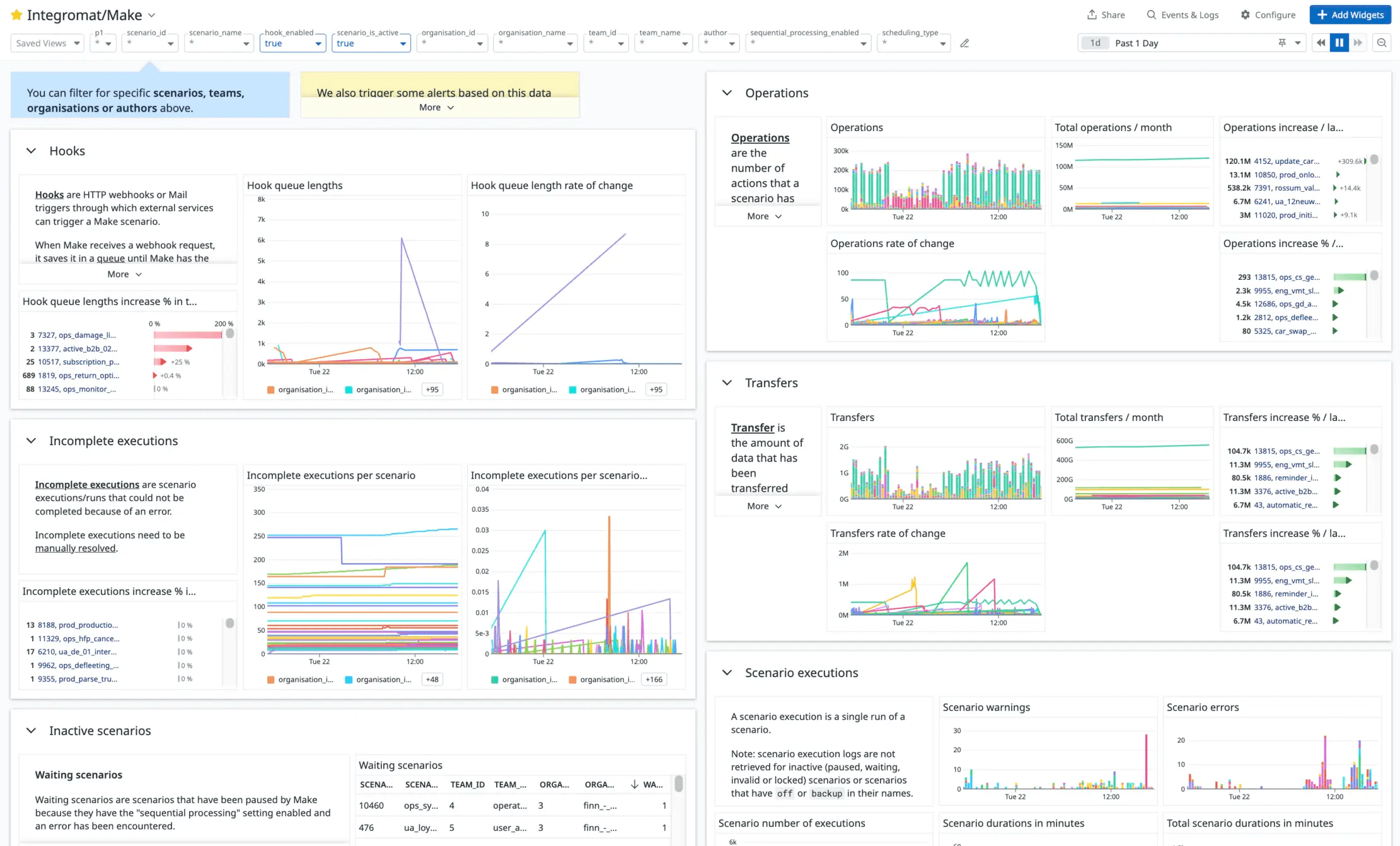
by Delena Malan
Introduction
In this post, I’m going to show you how we monitor our Make instance at FINN as a Make Enterprise customer. I’ll run you through why we monitor our instance, how the technical setup works, and how Datadog helps us to stay on top of problematic Make scenarios.
Background
At FINN, we use Make extensively to help us automate business processes. We are one of Make’s biggest customers, with about 3,500 active scenarios, running for a total of about 20,000 minutes (or 13.8 days) per day.
We use Make Enterprise, meaning we have a private Make instance that runs on its own infrastructure. Our extensive use of Make often pushes our instance to its limits. When the instance has too much work to do simultaneously, a backlog of scenario executions forms and it becomes slow.
Many of our scenarios are time-sensitive, and it is vital that they are executed within a reasonable amount of time. Some scenarios are critical to our business operations; therefore, we need to stay on top of any issues or errors.
Infrastructure dashboard
Although we don’t have direct access to our instance’s underlying infrastructure, Make has provided us with a Datadog dashboard to help us monitor it. Most importantly, this dashboard shows us at what capacity our workers are running and how many scenario executions are currently queued:

Figure 1. Our Make Infrastructure Datadog dashboard.
Although this dashboard helps us identify when our instance is close to reaching its capacity, it doesn’t allow us to identify why.
In the past, we had to contact Make’s support team to help us figure out which scenarios or modules might be causing our infrastructure to struggle.
To help us identify which specific scenarios use most of our instance’s capacity, we created our own monitoring setup for Make using the Make API, AWS Lambda functions, and Datadog.
Technical Overview
In this section, I’ll give you a quick overview of the technical architecture behind our monitoring setup before showing you what our dashboards look like and running you through some of Datadog’s benefits.
In a nutshell, we fetch data from Make’s API using scheduled Python AWS Lambda functions and push it to Datadog’s API as metrics. We store the Make data in a PostgreSQL database to use as a cache and for record-keeping.
In Figure 2, you can see a diagram of our setup:
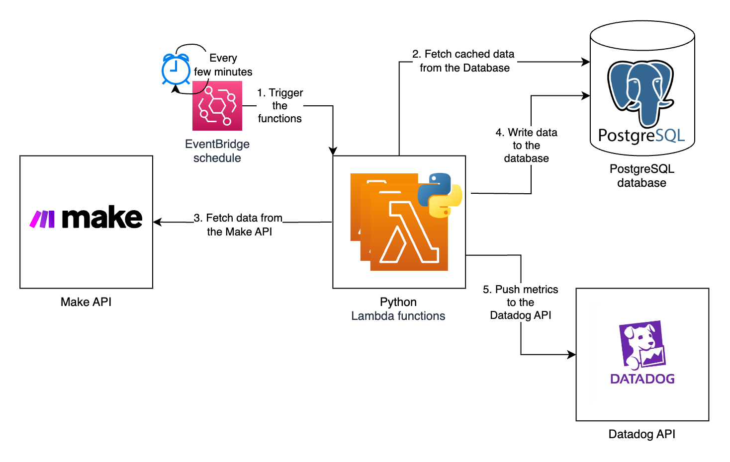
Figure 2. Architecture of our monitoring setup.
As shown in Figure 2, we use AWS EventBridge to schedule Lambda functions to run every few minutes. We have a few different Lambda functions that run on different schedules depending on which data they fetch and which metrics they create.
The public Make API gives us most of the data we need for our metrics. In the following sections, I’ll highlight which API routes we use for which metrics.
To get an in-depth analysis of individual executions, we use one of the Make web application’s API routes, which isn’t part of the official public Make API.
Each Lambda function starts by querying our PostgreSQL database to get cached data. Next, the function calls the Make API to retrieve the latest data. It caches this data in our database to decrease the number of API calls it needs to make the next time it runs. The function transforms the data and pushes it as metrics to the Datadog API.
We use the datadog Python package to interface with the Datadog API.
Datadog supports a list of metric types. We use “GAUGE” metrics to keep track of current values, such as queue lengths, data store usage, scenario consumptions, and others.
The following code sample shows how we use the datadog.api.Metric.send method to send the make.hook.length gauge metric to Datadog for each scenario:
now = int(time.time())

for scenario in scenarios:
    datadog.api.Metric.send(
        metric="make.hook.length",
        metric_type="gauge",
        points=[(now, scenario["dlqCount"])],
        tags=[
            f"scenario_id:{scenario['id']}",
            f"scenario_name:{scenario['name']}",
            f"hook_id:{scenario['hookId']}",
        ],
        attach_host_name=False,
    )
For individual data points on which we want to do statistical analysis, for example, scenario execution times, we use the “DISTRIBUTION” metric type. The following code sample shows how one of our Lambda functions collects scenario logs and bundles them up into a list of points to send to Datadog’s Submit distribution points API route:
datadog_api.Distribution.send(
    distributions=[
        {
            "metric": "make.scenario.duration",
            "points": [
                (
                    int(log["end_time_ms"] / 1000),  # timestamp in seconds
                    [log["duration"]],
                ),
            ],
            "tags": [
                "scenario_id:1",
                "scenario_name:my_scenario",
                "team_id:1",
            ],
            "type": "distribution",
        }
    ],
    attach_host_name=False,
)
Why Datadog?
Before we move on to the different metrics we track, I want to give you a quick rundown of why we use Datadog to monitor our Make instance:
Datadog’s dashboards can display thousands of metrics on a single dashboard. We wanted our dashboards to display the metrics of each of our 3,500 (and counting) scenarios.
Datadog allows you to create beautiful dashboards using various types of graphs and widgets. We wanted to make our dashboards available to everyone in the company. Thus, the dashboards needed to be accessible to everyone, including non-technical users.
Datadog metrics support custom tags. Figure 3 shows how we use custom metric tags to display and filter our metrics by, for example, organization, team, author, or scenario:

Figure 3. Our dashboard filters.
Datadog’s context links allow us to link to external applications from graphs. We use context links to add links to our scenarios in Make for quick access. Figure 4 shows an example of a context link to a scenario:
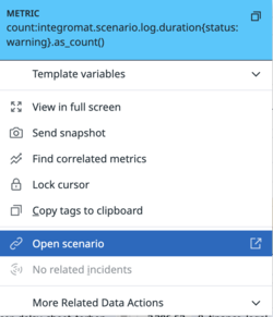
Figure 4. Screenshot of a context link to open a scenario.
Datadog supports single-sign-on (SSO) with Google Workspace. SSO allows for seamless onboarding and offboarding of our employees to the platform.
Setting up monitors/alerts in Datadog and sending them to Slack is easy. Figure 5 shows an example of an alert that we received in Slack:
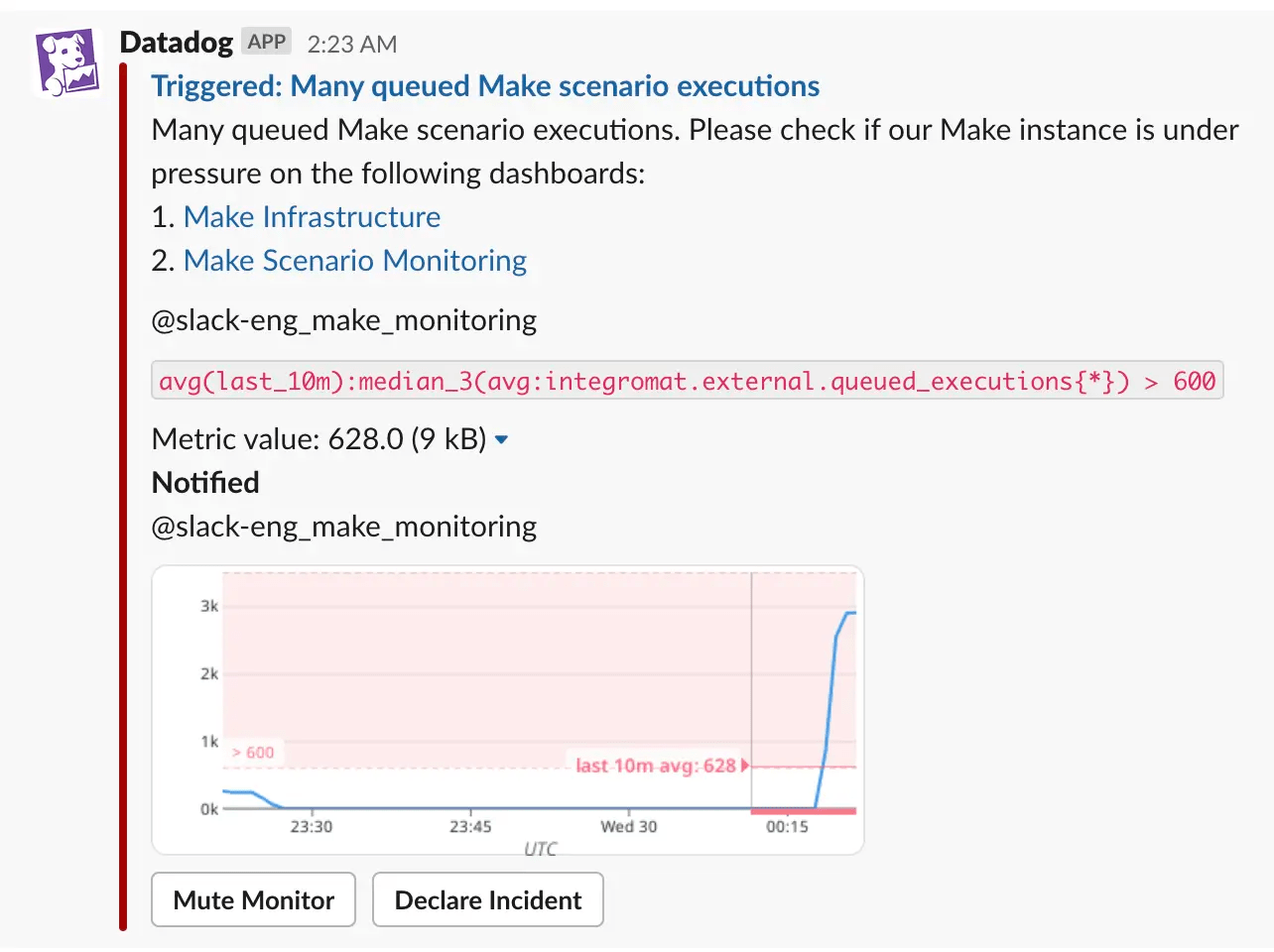
Figure 5. An example alert in Slack.
Datadog allows you to do aggregations and get statistics on metrics to, for example, get the sum of a metric over a period of time or to get the top 10 values of a metric.
Last but not least, we already had some experience using Datadog and have used it to monitor some of our internal services at FINN.
Using Datadog isn’t without its downsides, the high cost being the main one. We generate thousands of custom metrics per hour because we submit unique metrics per scenario to Datadog, which can become expensive.
We managed to keep our Datadog costs under control, however, by:
using Datadog’s “Metrics without Limits” feature to limit the number of metrics that are indexed,
not sending zero-value metrics to Datadog, and
by creating a dashboard to keep track of our estimated costs using Datadog’s estimated usage metrics:
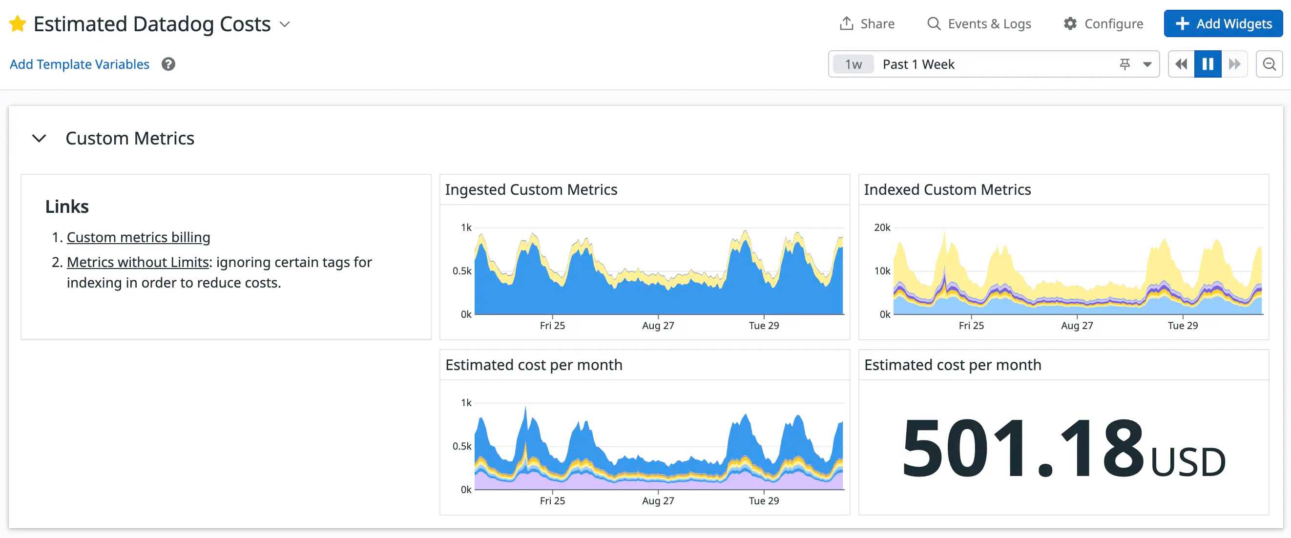
Figure 6. Our “Estimated Datadog Costs” dashboard.
Our metrics and dashboards
In the following sections, I’ll run you through the metrics we track, why we track them, and how we use them.
Hook queue lengths
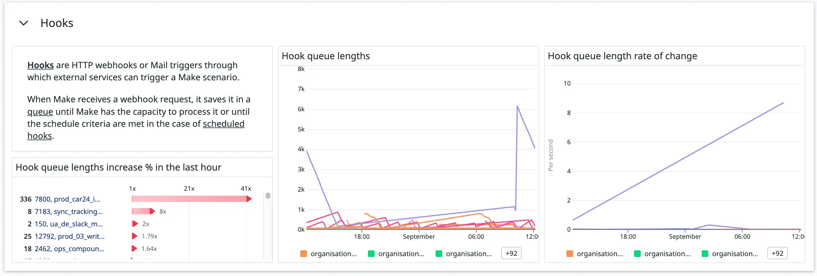
Figure 7. The “Hooks” section in our Make-monitoring dashboard.
A key feature of Make is its incoming hooks functionality. Hooks support both webhooks and email triggers.
We use hooks to trigger Make scenarios from other Make scenarios — in other words, “chaining” scenarios — third-party services, and our own services.
It’s important to us to keep an eye out for hook queues that are too long or are rapidly increasing. Something downstream may be taking too long, or an upstream service might be calling the hook too frequently. We don’t want our workers to be overwhelmed by the number of hook executions they need to process.
We get the hook queue lengths from the /hooks API route, and we have a monitor to notify us when a hook’s queue is growing too quickly.
Incomplete Executions

Figure 8. The “Incomplete executions” section in our Make-monitoring dashboard.
Make allows us to store incomplete executions when scenarios encounter errors. We can fix the error and reprocess these executions.
We have a monitor to notify us when the incomplete executions of a scenario are rapidly growing so that we can stay on top of scenarios that are raising errors.
We get the number of incomplete executions for each scenario from the dlqCount field in the /scenarios API route’s response.
Operations and Transfers

Figure 9. The “Operations” section of our Make-monitoring dashboard.

Figure 10. The “Transfers” section of our Make-monitoring dashboard.
Make’s pricing plans are determined according to the number of operations you purchase. For every 10,000 operations, you receive a number of allowed transfers. We track how many operations and transfers each of our scenarios uses to see how our allocated operations and transfers are used.
These graphs also assist us in our investigations when our Make workers’ usage is close to capacity to see which scenarios have been running operation-intensive or transfer-intensive workloads.
We get these metrics from the consumptions field in the /scenarios API route’s response.
Data stores

Figure 11. The “Data Stores” section of our Make-monitoring dashboard.
Make’s data stores allow scenarios to save data within the Make platform. We keep track of two data store metrics:
The percentage of data store slots used per organization. Make limits the number of data stores you can create according to your Make license. We created a Datadog monitor to notify us when we’re about to run out of data stores so that we can either clean up unused data stores or request to increase this limit.
The used capacity of each data store. When you create a data store in Make, you need to specify its storage size capacity. We created a Datadog monitor to notify us when a data store is about to run out of space so that we can proactively increase its size and thereby prevent scenarios from running into errors.
We get the number of data stores, their current storage usage, and their storage capacities from the /data-stores API route. The maximum number of data stores that each organization is allowed to have, we get from the license.dslimit field from the /organizations API route.
Scenario executions
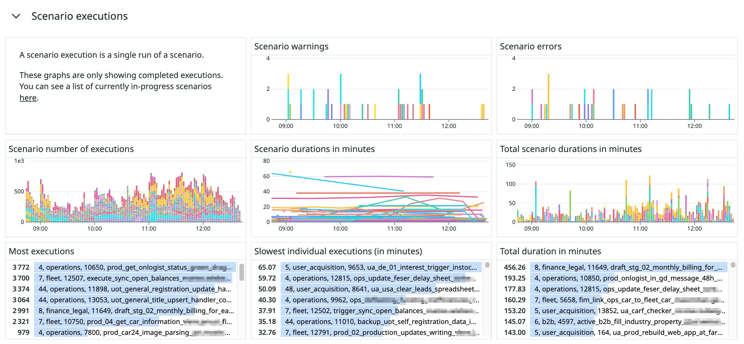
Figure 12. The “Scenario executions” section of our Make-monitoring dashboard.
This section is my personal favorite part of our monitoring dashboard. It is arguably the most useful for investigating the cause of incidents.
We use an undocumented API route, /api/v2/admin/scenarios/logs, to get a list of recent scenario executions and their execution durations. We send these durations as a metric, make.scenario.duration, to Datadog. We use Datadog tags to indicate their statuses, the scenario’s ID and name, the team’s ID and name, and the organization’s ID and name.
Using this metric, we can generate various valuable graphs and tables. We created bar charts to show the number of warnings and errors raised per scenario and the number of executions each scenario had. We used “top list” widgets to show the top most executed scenarios, the slowest individual executions, and the highest total duration of scenarios.
We created another bar chart to visually represent how much time the workers spent on each scenario. During a recent incident, we could use this graph to see that almost all of the workers’ time was spent on processing a single scenario (the purple bars in Figure 13):
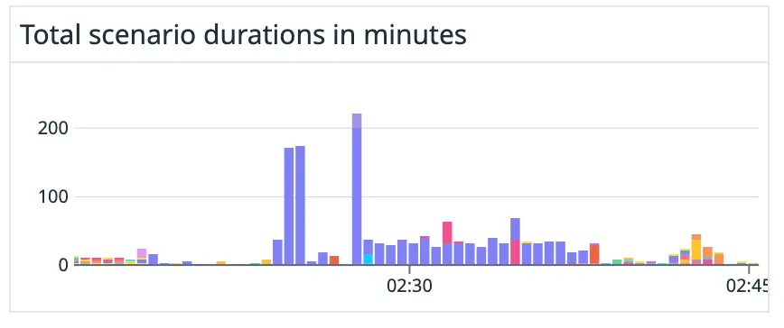
Figure 13. Scenario durations during a recent incident indicating that a single scenario (purple bars) was taking up most of the processing time.
In Figure 14, you can see how our workers were affected during the time of the incident:
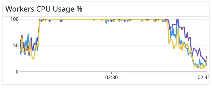
Figure 14. Workers usage during the incident.
Scenarios that don’t have sequential processing enabled

Figure 15. Screenshot of the table of scenarios that don’t have sequential processing enabled.
This is a new metric we recently started monitoring after we noticed that scenarios that don’t have sequential processing enabled have the biggest potential to cause significant bottlenecks.
Queued executions of scenarios that do have sequential processing enabled are processed sequentially, i.e. one after the other. This means that, at most, the scenario will occupy one worker at a time. However, queued executions of scenarios that don’t have sequential processing enabled can be processed in any order, even in parallel. Thus, all of our workers could be occupied by a single scenario, leaving no capacity to process other critical scenarios.
We have considered whether we could turn sequential processing on for all scenarios, but scenarios with sequential processing enabled cannot respond to the webhooks. Another downside is that Make stops these scenarios when an error occurs. They cannot process any further executions until their incomplete executions are manually resolved.
Module analysis
The preceding metrics give us a good indication of the performance and usage of our scenarios. However, when many scenarios suddenly become slow to respond, these metrics don’t help us identify which downstream module might be causing the sudden slowness.
For this reason, we have started to track metrics about individual steps in scenario executions to see which specific module or operation might be slow or faulty.
We experimented with different ways to display metrics about modules and operations, including using Datadog traces:
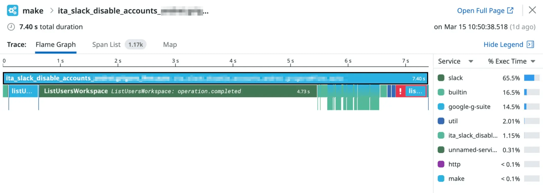
Figure 16. A Datadog trace visualisation of a scenario execution.
However, we settled on building a Datadog dashboard according to the types of questions we might have about our Make modules and operations.
For example, we created this section to help answer the question: “Which Make modules are the slowest?”
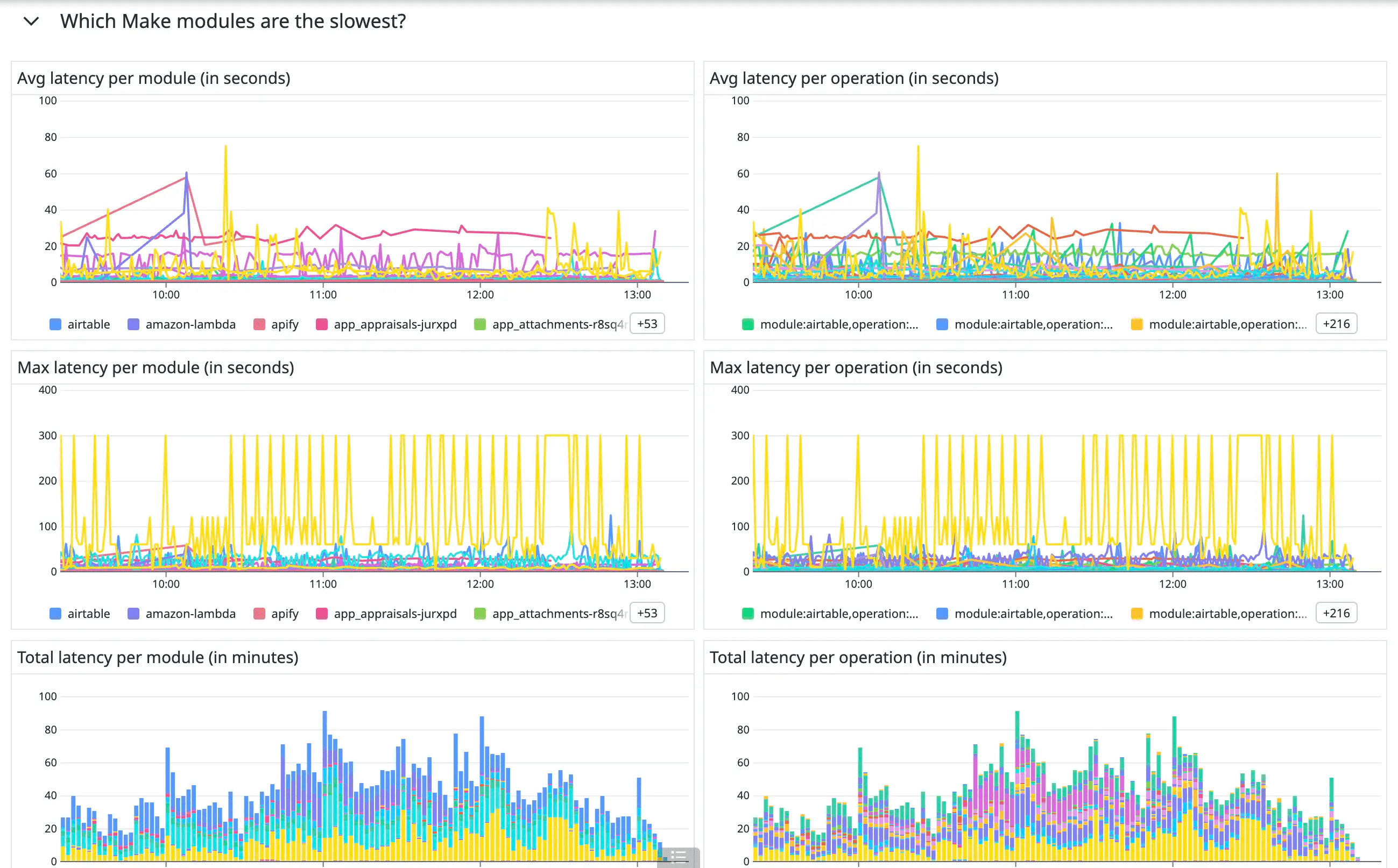
Figure 17. The “Which Make modules are the slowest?” section of our Make module monitoring dashboard.
We added the following section to help us answer the question: “Which scenarios call which modules the most often?”:
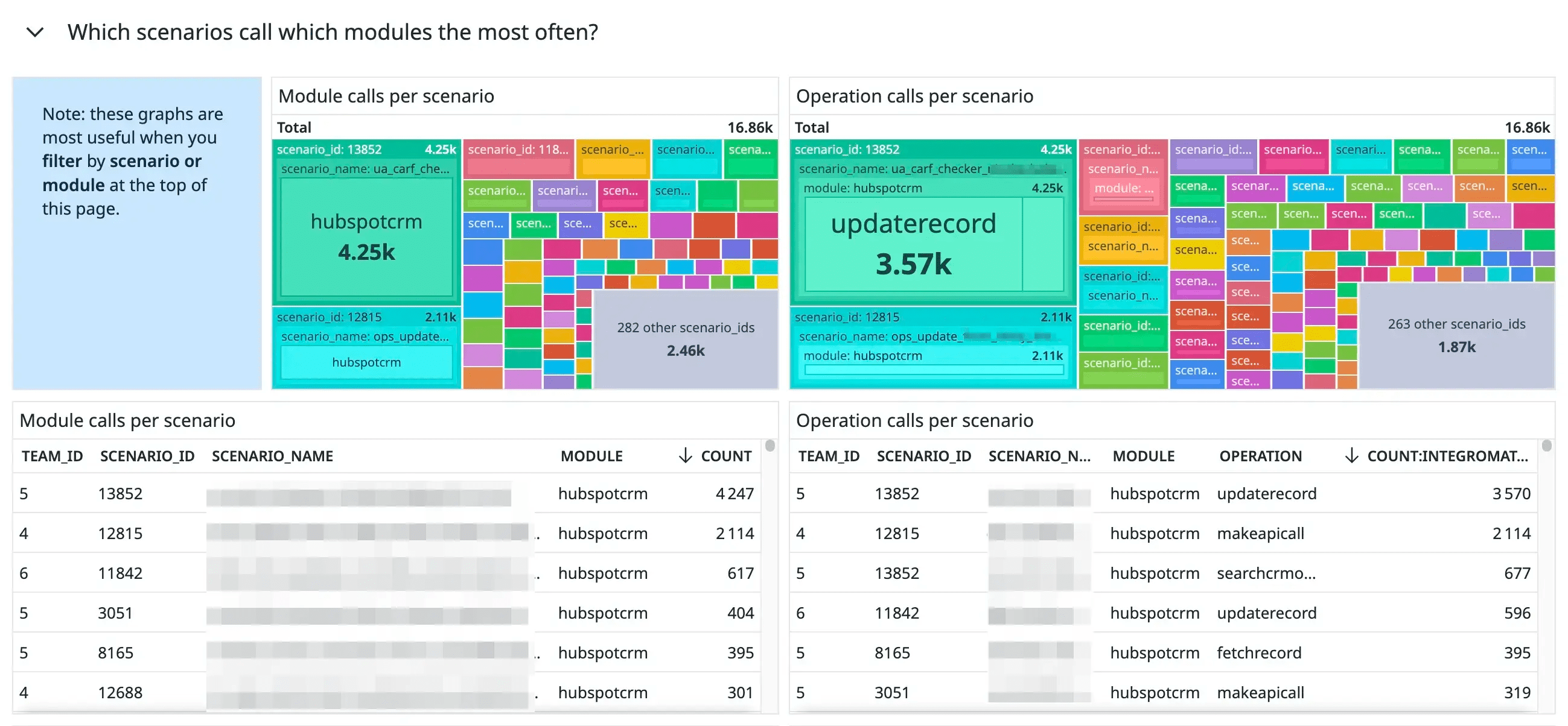
Figure 18. The “Which scenarios call which modules the most often?” section of our Make module monitoring dashboard.
Conclusion
Before we created our monitoring setup for Make, it would sometimes take us hours to understand why our Make infrastructure was running slow. Now, we can detect faulty scenarios and resolve normal operations within minutes.
Our Datadog dashboards give us a comprehensive overview of our Make instance’s current and past state, helping us to make further improvements to get the most out of our instance.
How do you monitor your Make instance or other low-code tools? Let us know in the comments!
Subscribe to my newsletter
Read articles from FINN directly inside your inbox. Subscribe to the newsletter, and don't miss out.
Written by

FINN
FINN
We make mobility fun and sustainable